


About Contact Form Field Element

Summary: Shopify Contact Form Field element is designed to help you easily customize your Contact Form.
With its user-friendly interface, you can efficiently modify various aspects of the form to enhance user experience and capture essential information effectively.
Please note that:
You can check more details in the video tutorial below:
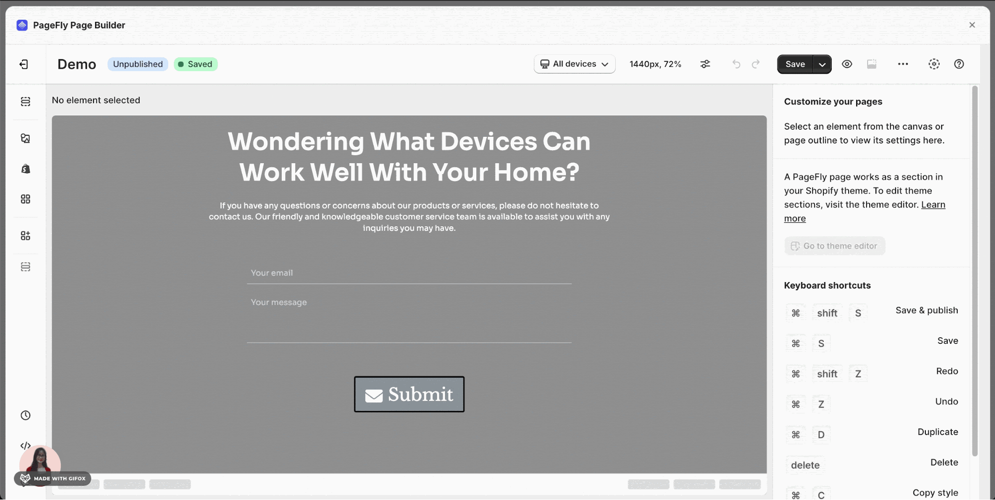
How To Access Contact Form Field Element
Simply follow these steps to access the Contact Form Field element feature:
- Step 1: Click on the 2nd icon in the Element Catalog which is the Add Shopify element function.
- Step 2: Click on the Contact Form Field element in the dropdown menu.
- Step 3: Drag and drop the element into the page editor and then start using it.
The Contact Form Field includes Email, Single Line Text, Multiple Lines Text, Single Choice, Checkbox, Dropdown, Number, Date and Time elements.

How To Configure For Contact Form Field Element
This element comes with plenty of parameters allowing you to fine-tune content appearance to reach the best possible conversion rate. All the elements in Contact Form Field have similar parameters.
To start, drag one element to the layout and select it to see its variables.


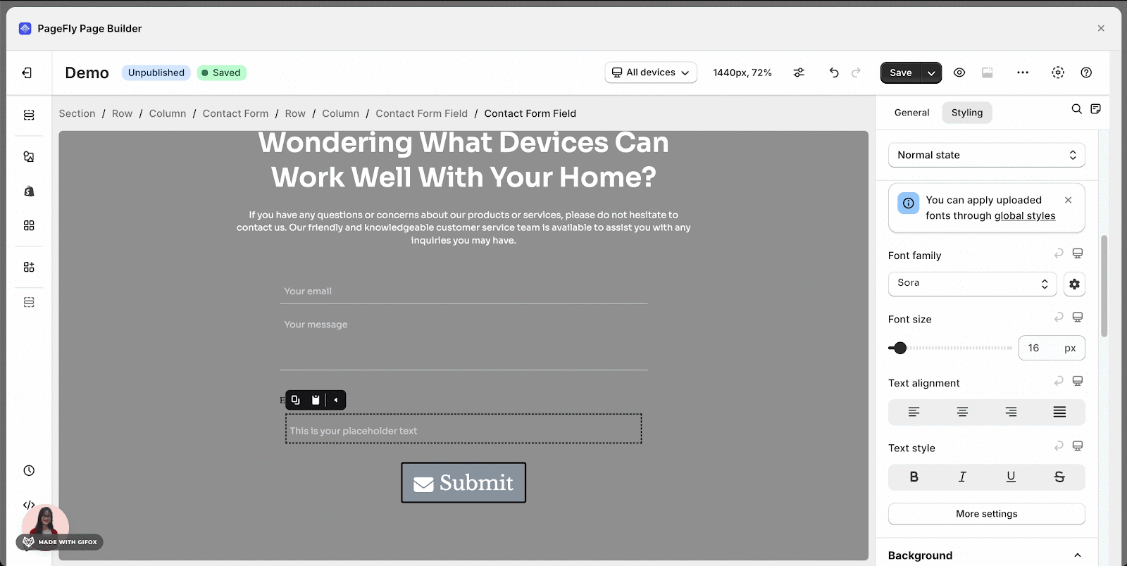
General Settings
| Contact Form Field | |
| Input type: Available options include Email, Single line text, Less, Single choice, Checkbox, Dropdown, Number, Date, Time
|  |
| Placeholder text: Name of the field. |  |
| Show label: Hide / Show the label. |  |
| Label position: Position of the label with respect to the input box. |  |
| Make field required: Make this field a required field | 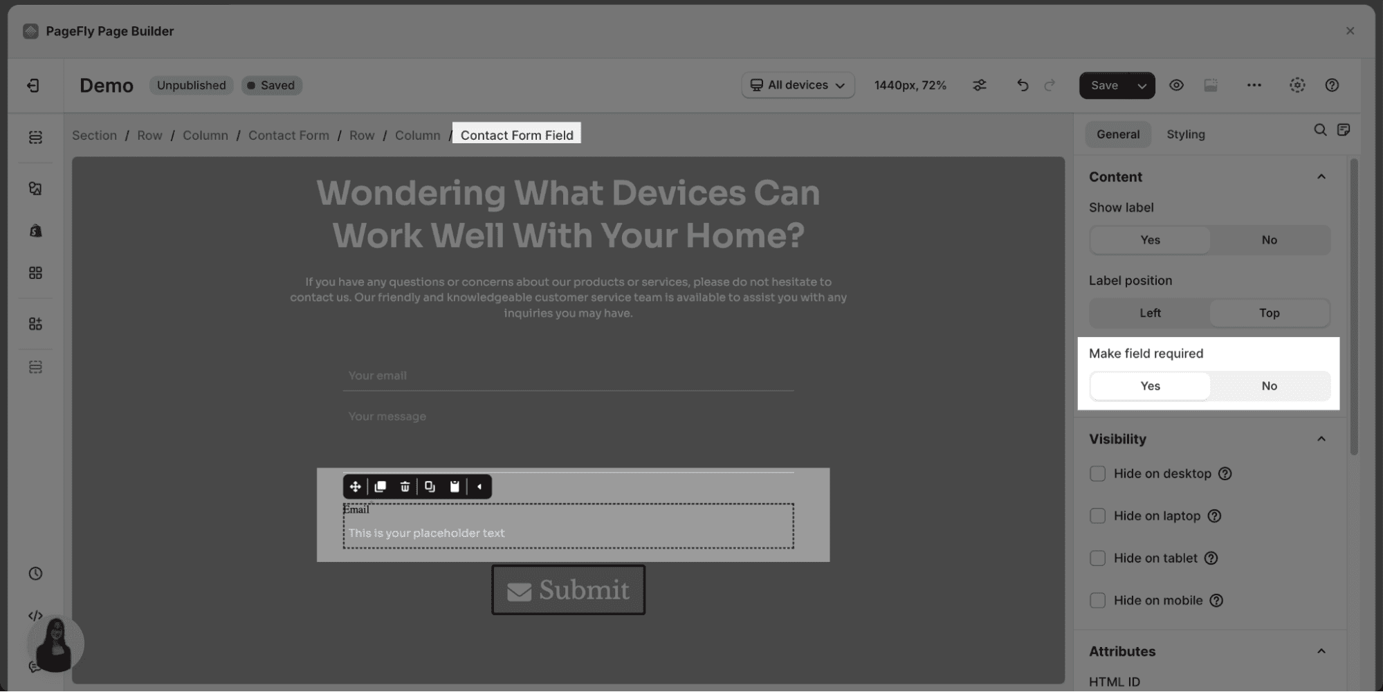 |
| Field Input | |
| Email Placeholder Text: Text to show in the input box until your visitors start typing. | 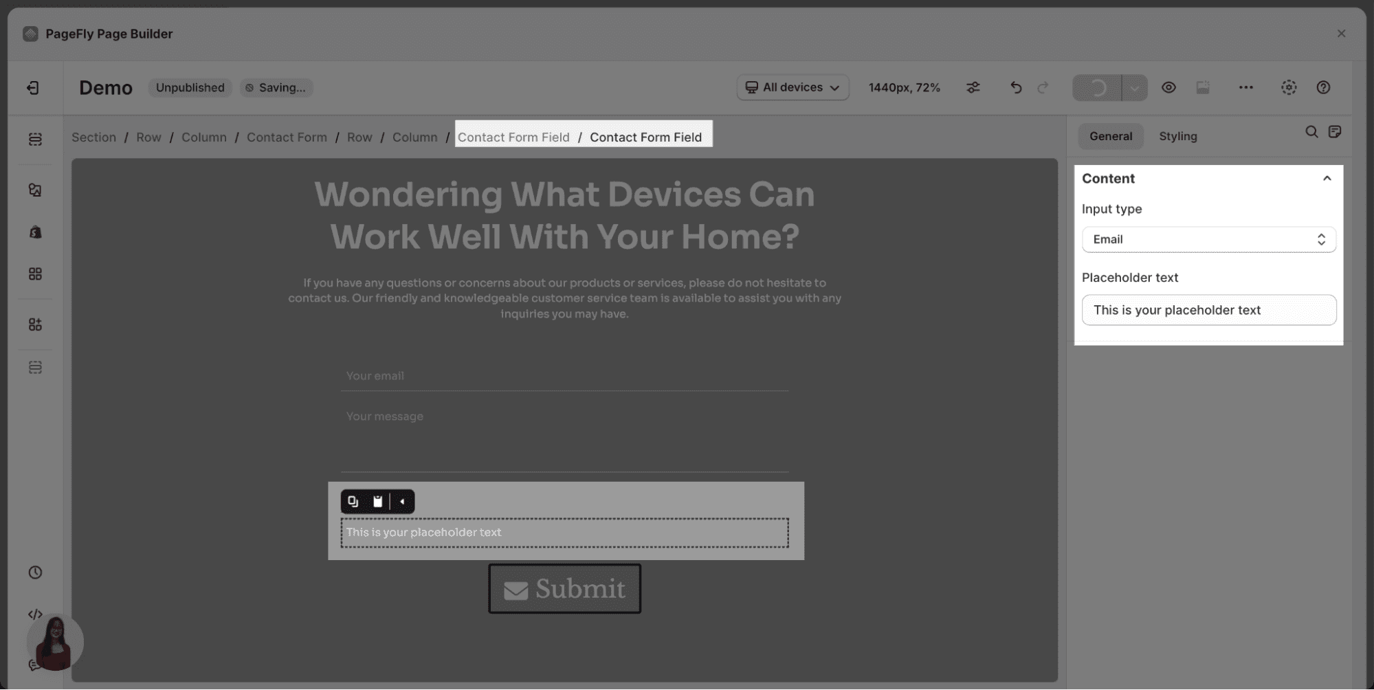 |
| Single Line Text Placeholder Text: Text to show in the input box until your visitors start typing. | 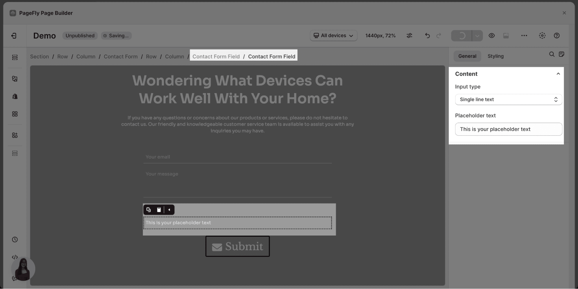 |
| Less Line Number: The height of the text counted in lines (min value is 1, max value is 20). |  |
| Single Choice Choice items: You can rename, add or remove options. |  |
| Checkbox Checkbox Label: Name of the checkbox. | 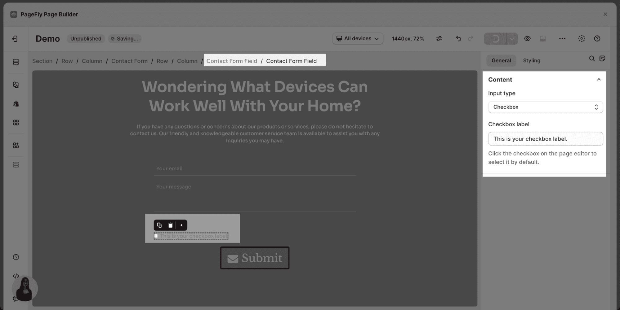 |
| Dropdown Choice items: You can rename, add or remove options. |   |
| Number Default number: Default option given to customers. | 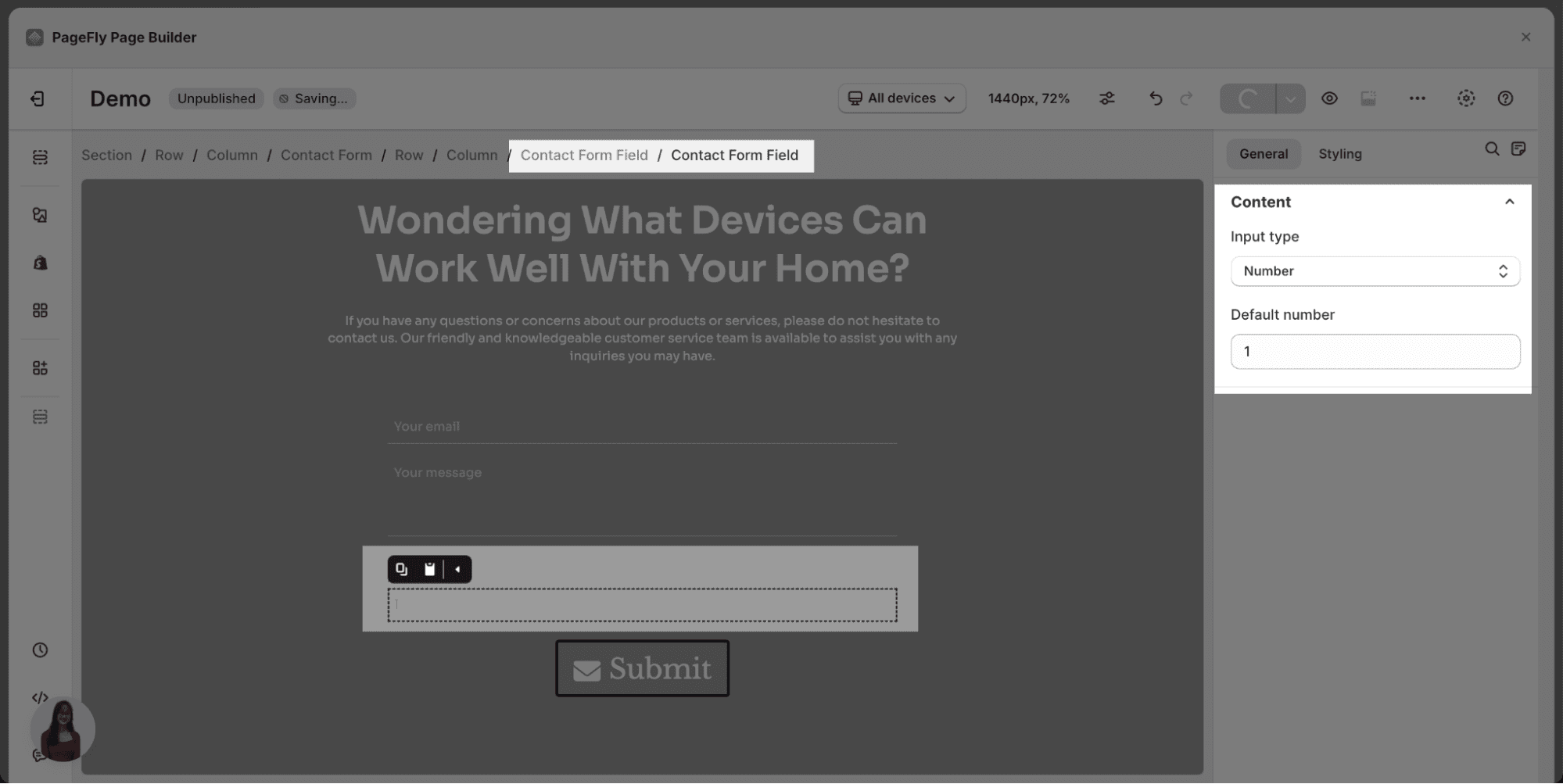 |
| Date Default date: Default option given to customers. |  |
| Time Default time: Default option given to customers. | 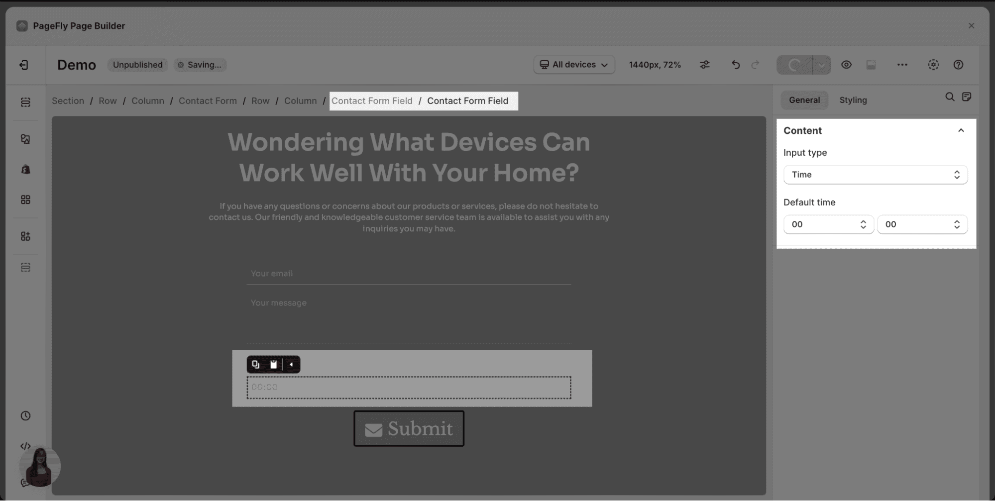 |
You can get further information about VISIBILITY, ATTRIBUTES, ANIMATION parameters here.
Styling Settings
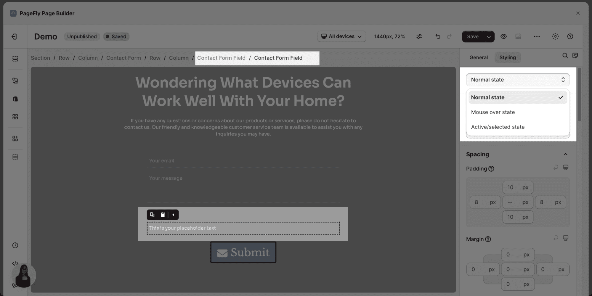
There are three state options for Contact Form Field element:
- Normal state
- Mouse over state
- Active/selected state
| Content Color: Change the color of contact form field content by using the available parameter | 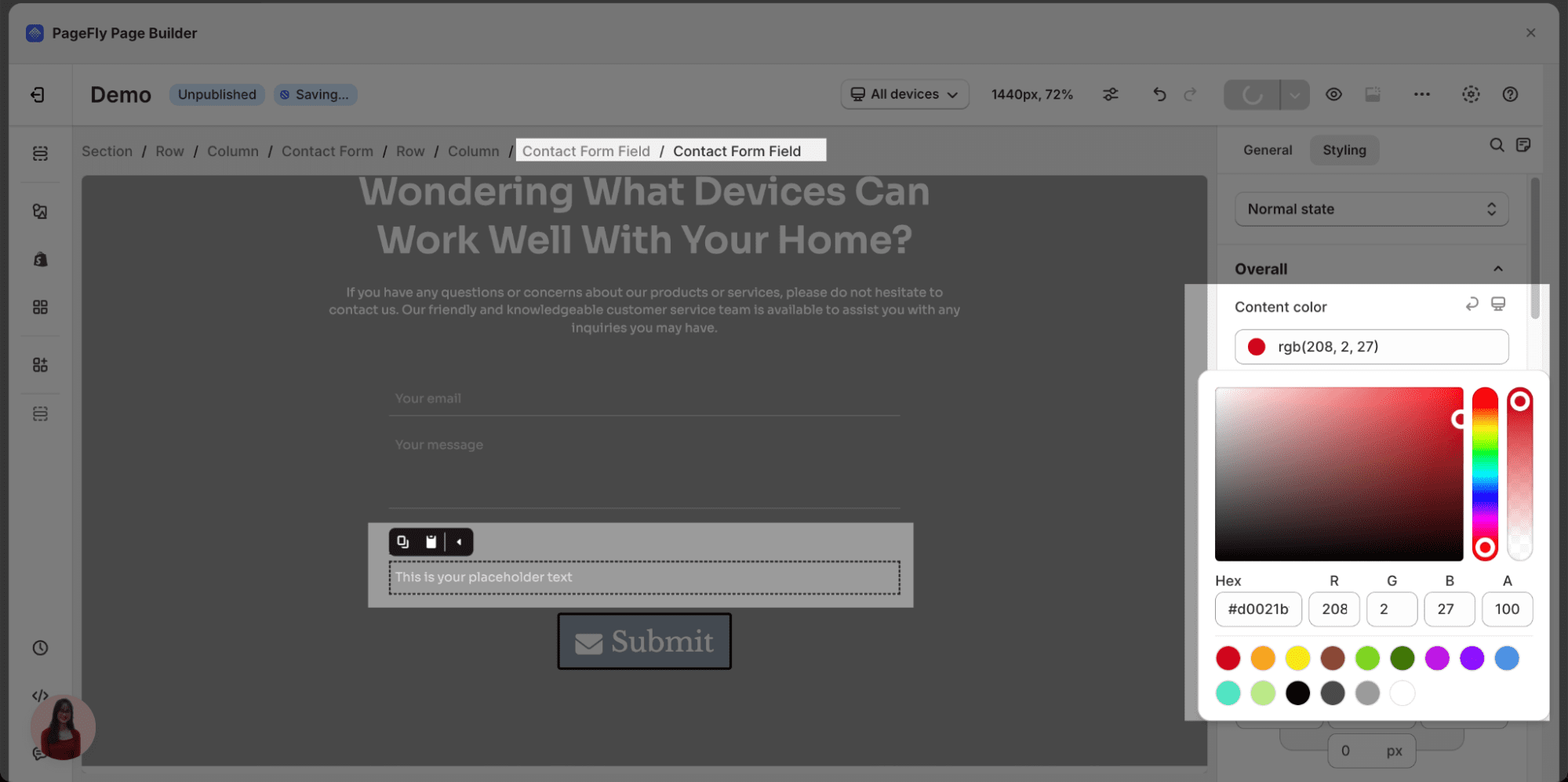 |
Spacing
| 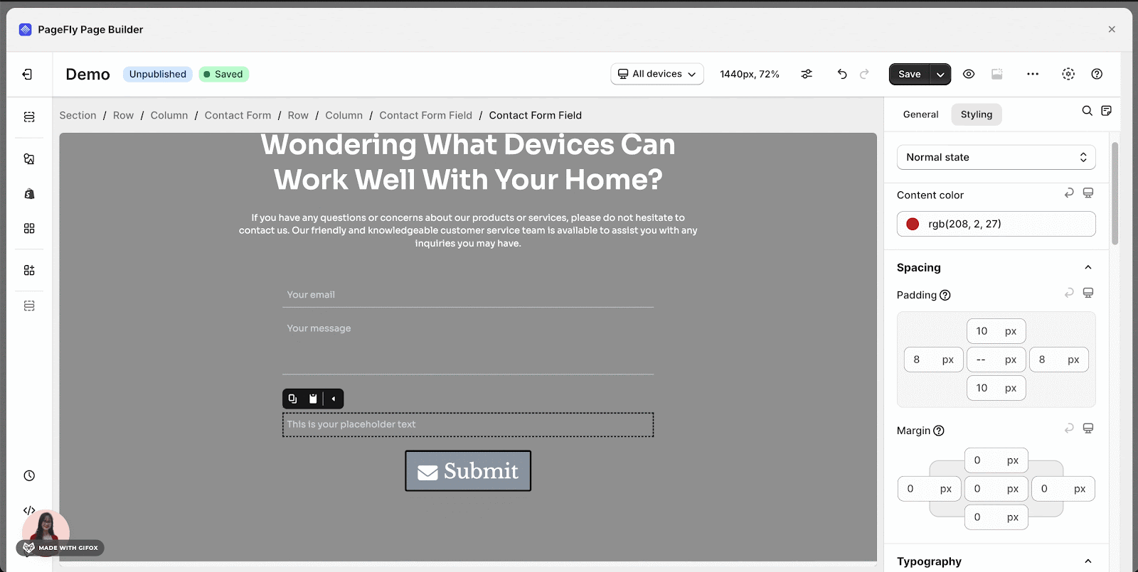 |
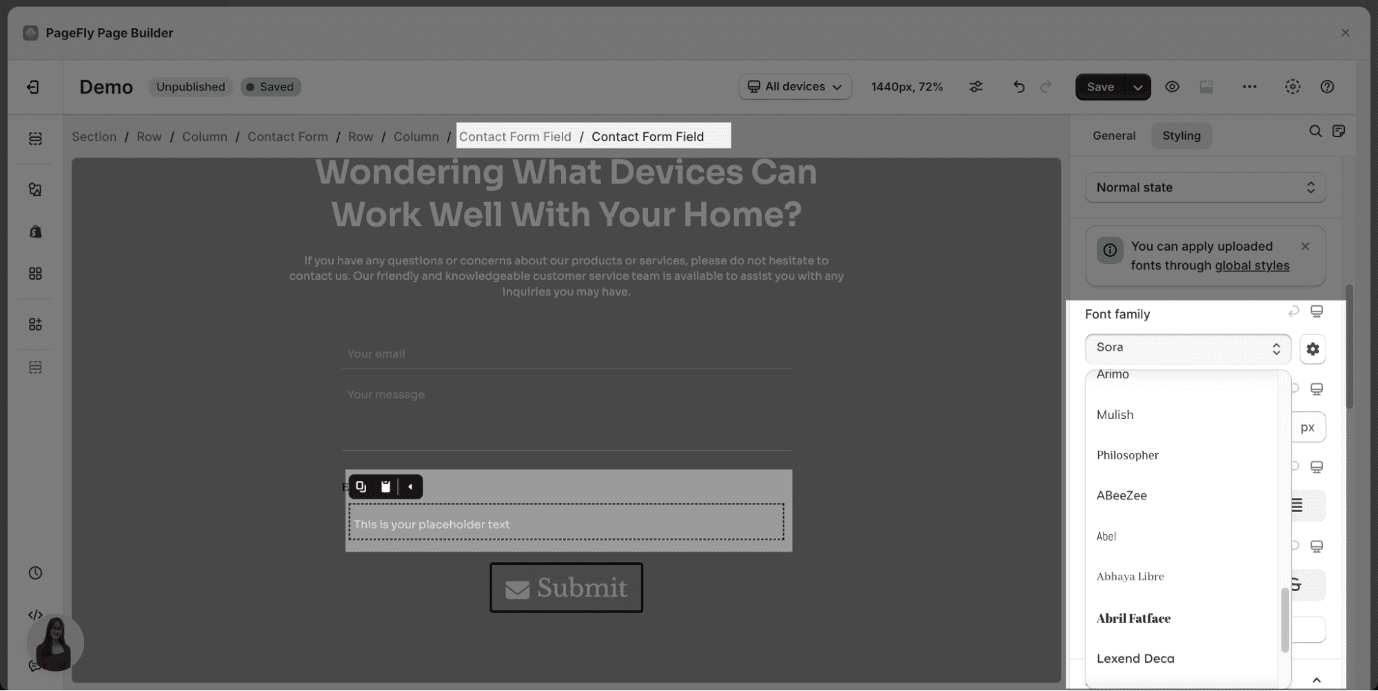
| Typography | Font Family: choose your desired font for the contact form field
Font Size: Adjust font size by dragging the black dot or by entering a number in the box on the right
Text alignment: left, center, right, justify
|
| Background | Background Color: choose background color for contact form field by using the available parameters
Background image: Click Select image > Choose image > Click Select
|
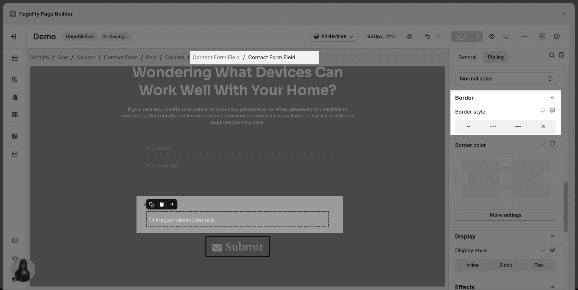
| Border | Border style: there are 3 border styles for contact form field element, which are: solid, dotted, dashed
Border color: you can adjust the color of each border and click More settings to see more parameters. Please note that this setting is available if you select one out of 3 border styles above.
|
| Display There are 3 display style options: Inline, Block, Flex | 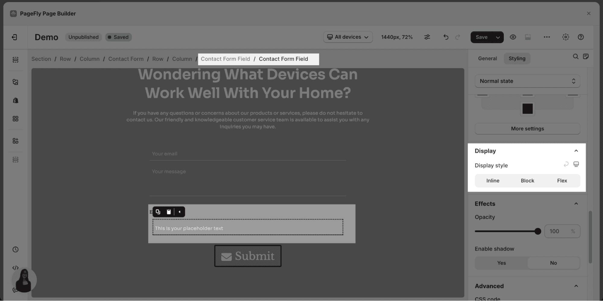 |


You can check more information in the Styling tab.
Common Cases
- Focus on collecting only the essential information you need to address user inquiries. This could include name, email address, phone number (optional), and a message field
- Use clear and concise labels for each form field that accurately describe what information is needed
- Organize the contact form fields logically, with the most important fields (e.g., name, email) at the beginning to encourage completion
Frequently Asked Questions
What’s Included In The Contact Form Field?
It comprises Email, Single Line Text, Multiple Lines Text, Single Choice, Checkbox, Dropdown, Number, Date, and Time fields.
What’s Included In The Field Input?
It comprises Email, Single Line Text, Multiple Lines Text, Single Choice, Checkbox, Dropdown, Number, Date, and Time options.