


About Tabs Element

The Tabs Element, one of the four layout elements from PageFly, is designed to present content in separate tabs to increase the conversion rate. You can use the Tabs element to show various elements as the tab’s content, independently for each tab or in one tab.
How To Access The Tabs Element
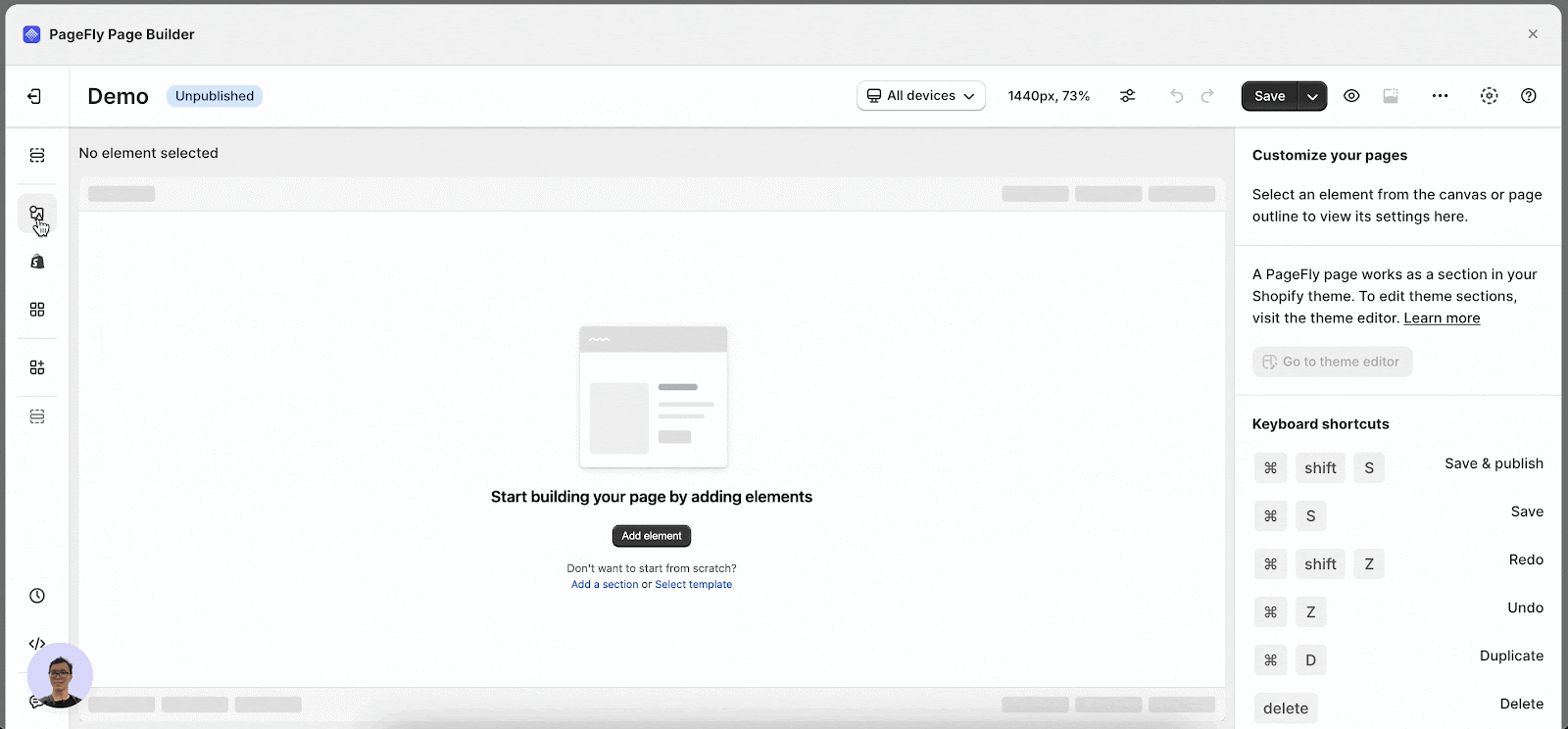
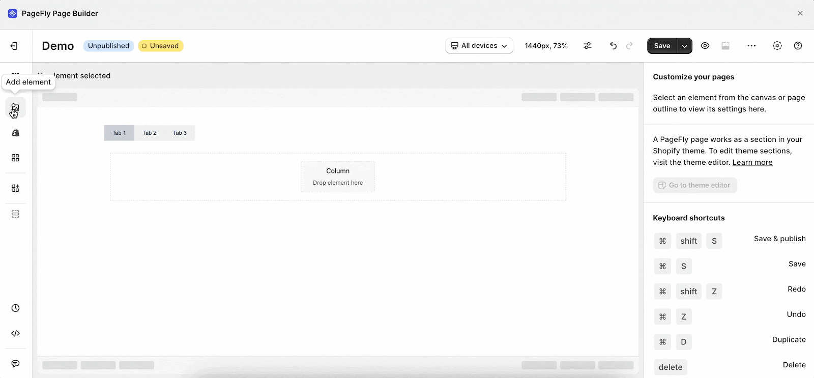
- Step 1: Click on the Add element icon
- Step 2: Click on the Tabs element in the catalog
- Step 3: Drag and drop the variations you want into the page editor and start using it.
The Tabs element comes with multiple variations covering most of your needs. But we will continue to add more variations to help you save time.
Drag a variation to the canvas and see how it can be configured.
Configure The Tabs Element
The Tabs element has plenty of parameters allowing you to fine-tune content appearance to reach the best possible conversion rate.
Note that you need to drag and drop elements into the content box of the Tab. For example, Paragraph, Product Variant, Product Image, etc. However, not all elements can be added here.
The parameters in the General and Styling tabs are specific for this element. Read about them in this article.
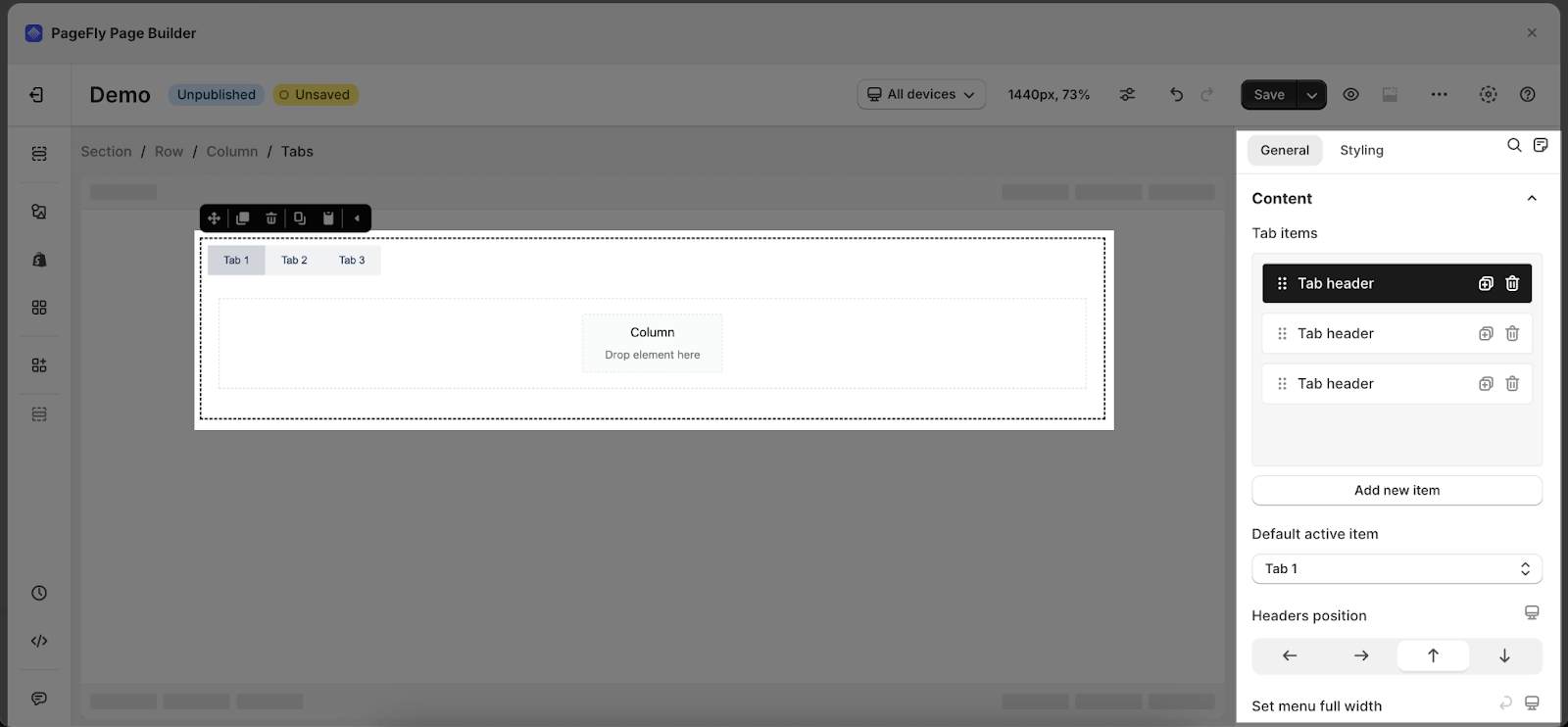
Tabs Element Settings
| Tab items: Add/Duplicate/Remove new tabs to the element. | 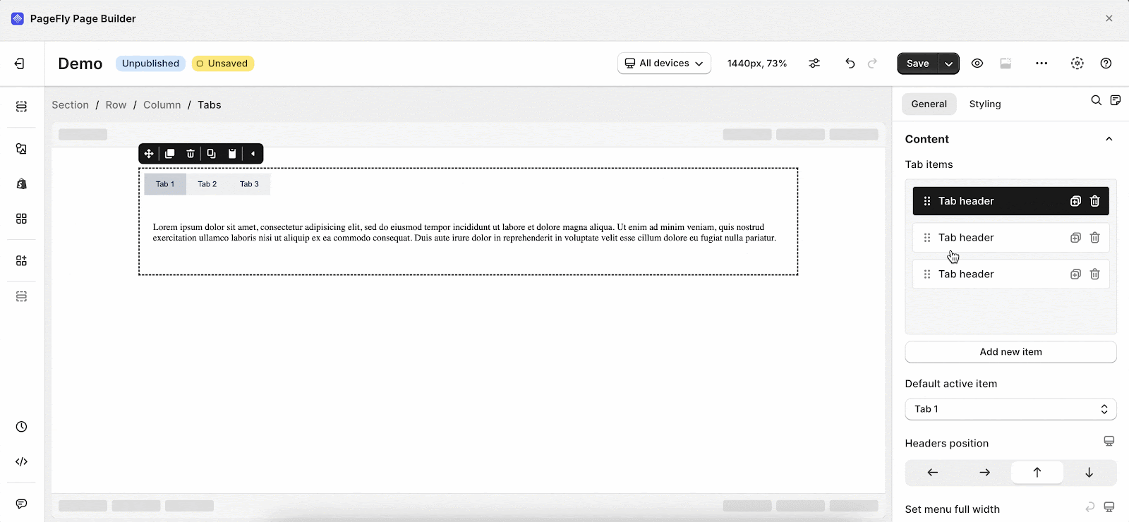 |
| Default active item: The tab will be seen first when showing on the live page. |  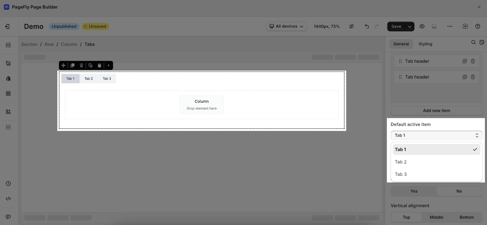 |
| Headers position: 4 positions for the headers such as Top; Left; Button; and Right. | 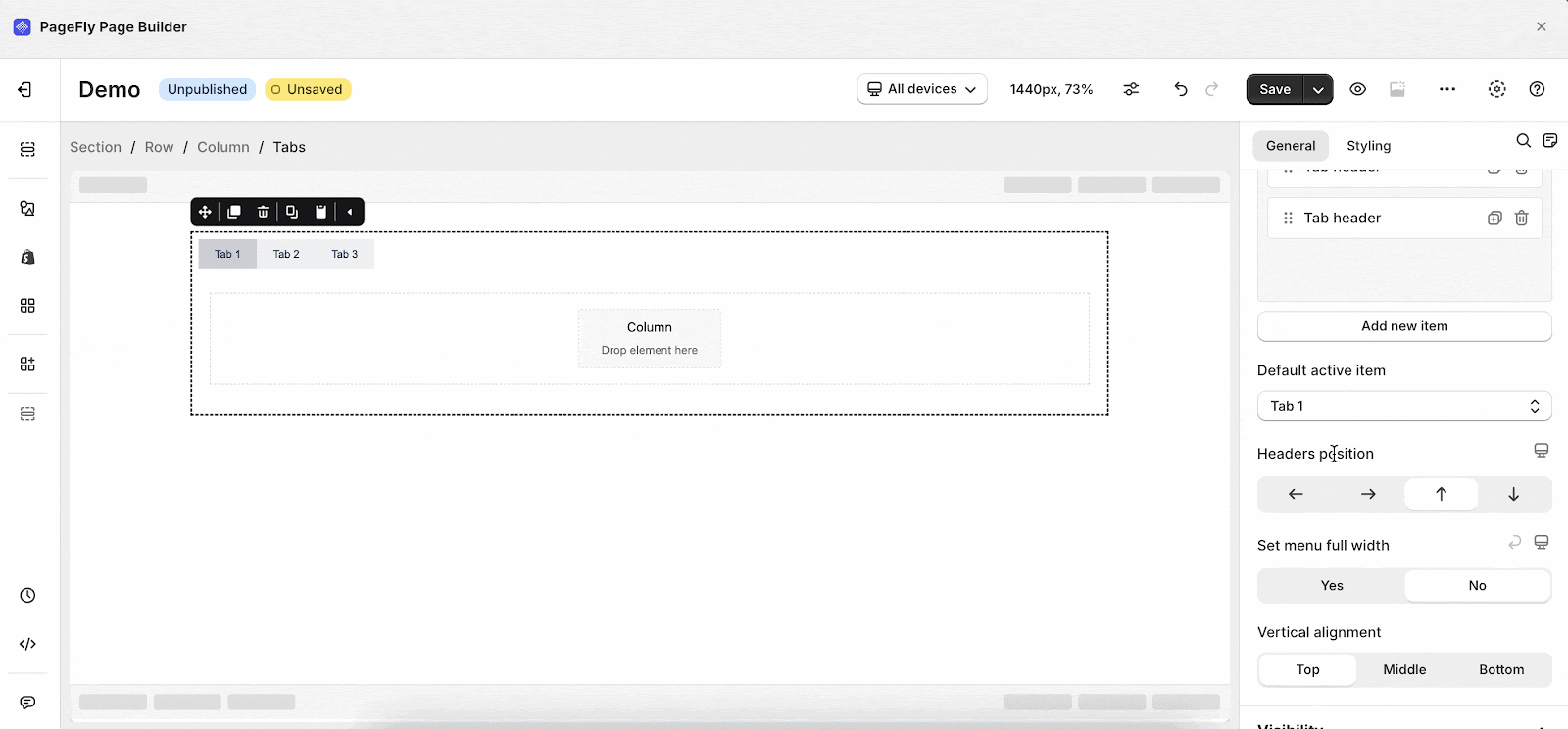 |
| Set menu full width: Make your Tab Menu full-width in the line | 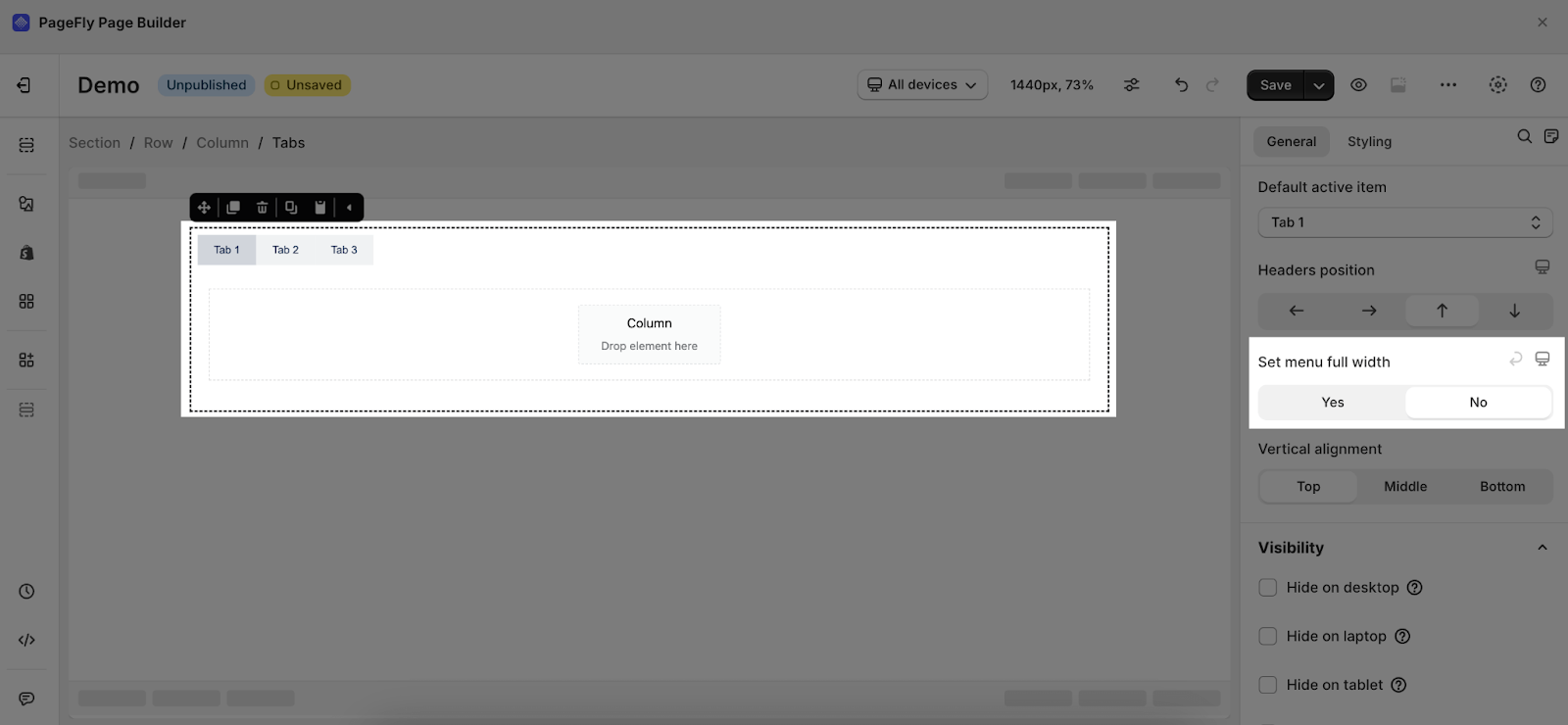 |
| Vertical alignment: Move the position of the Tab Header Menu to Left, Center or Right. | 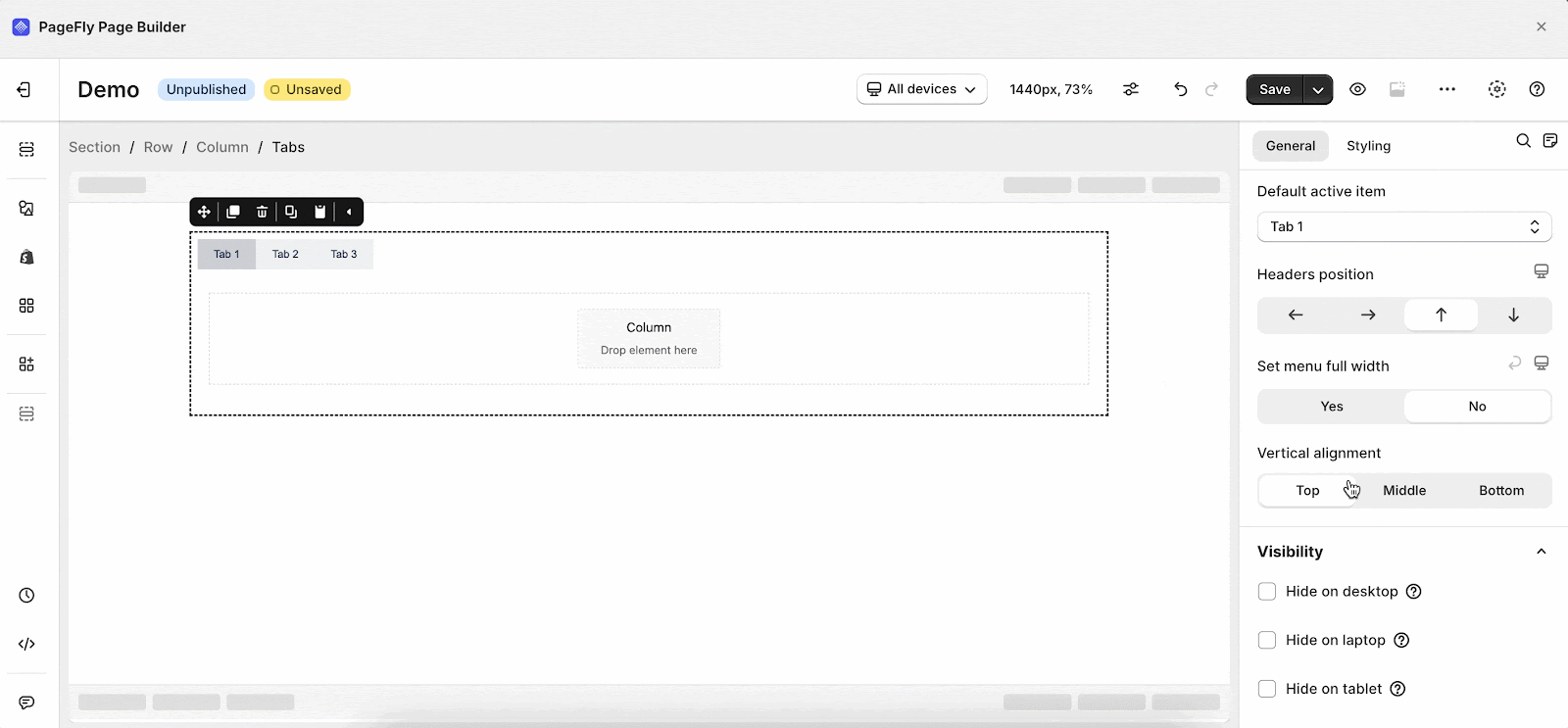 |
You can get further information about ATTRIBUTES, VISIBILITY, and ANIMATION parameters here. You can also check more information about the Styling tab here.
Tabs Header Settings
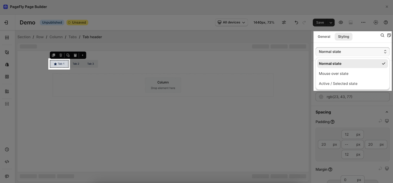
To edit a tab header of the Tabs element, choose one tab header separately.
| Tab items: Add/Duplicate/Remove new tabs to the element. | 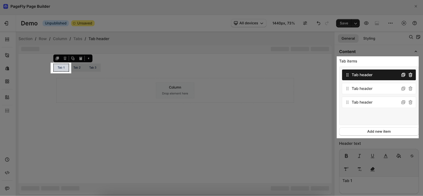 |
| Header text: Change the name of the tab header | 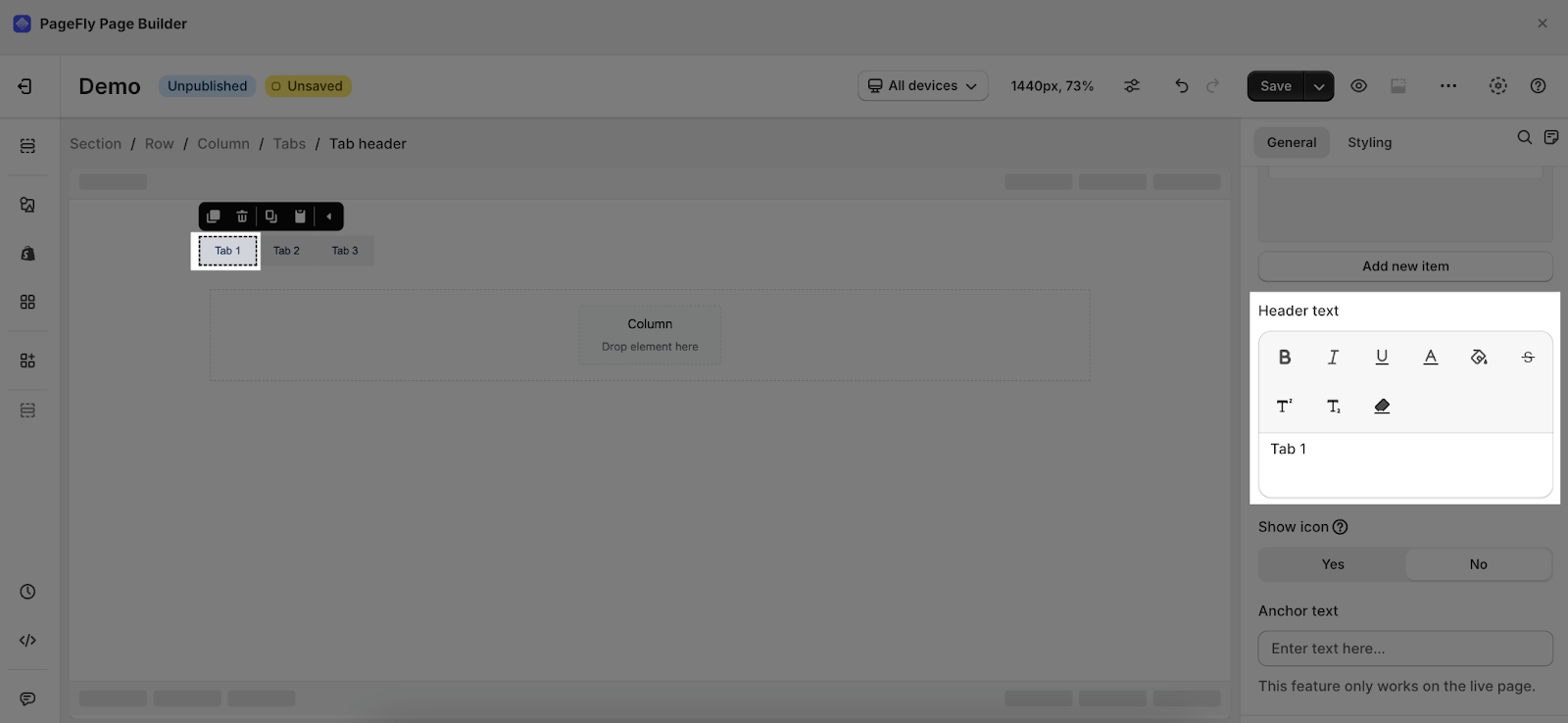 |
| Show icon: Add icon into the Tab Header | 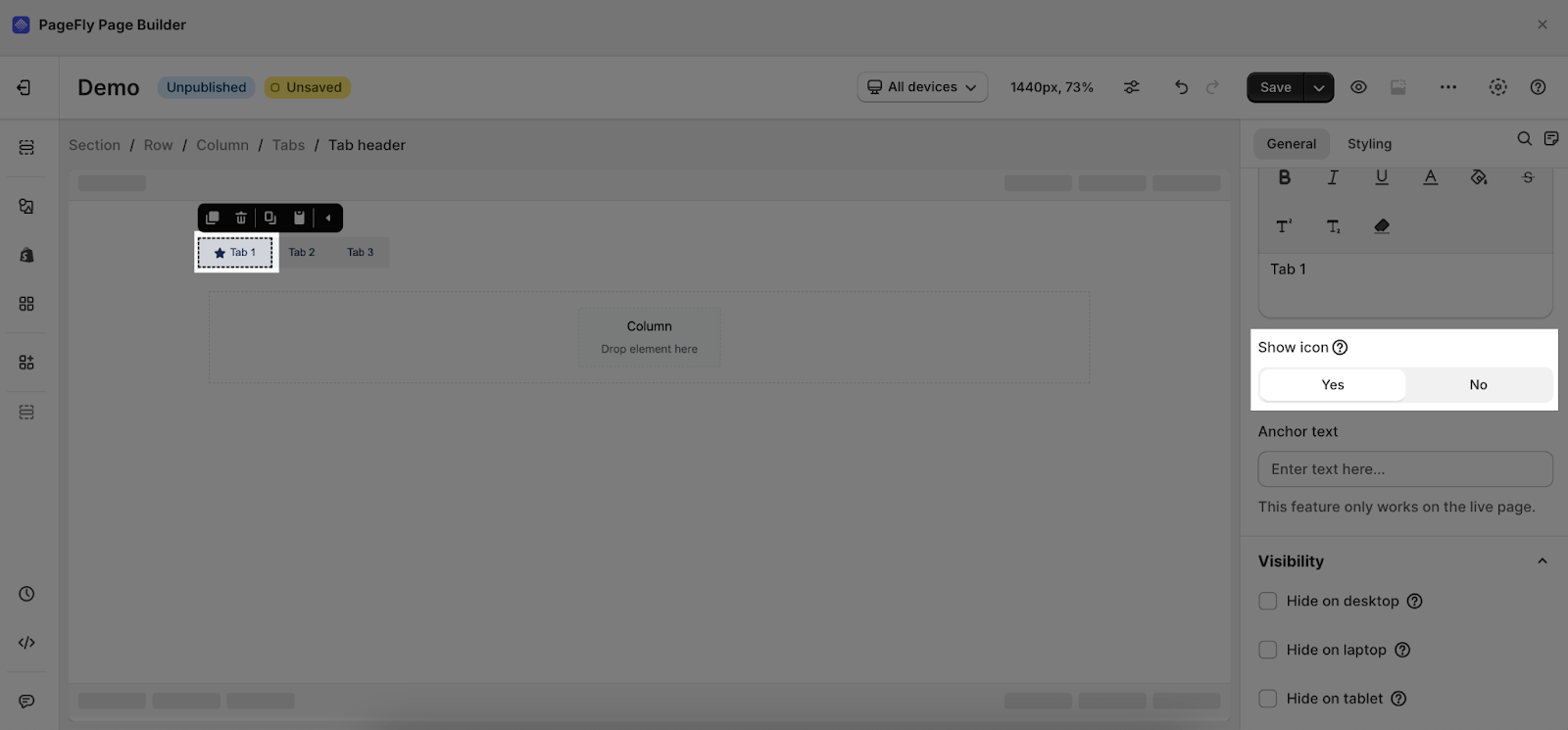 |
| Anchor Text: Add link label or link text is the visible, clickable text in an HTML hyperlink for Tab Header.
This feature only works on the live page! | 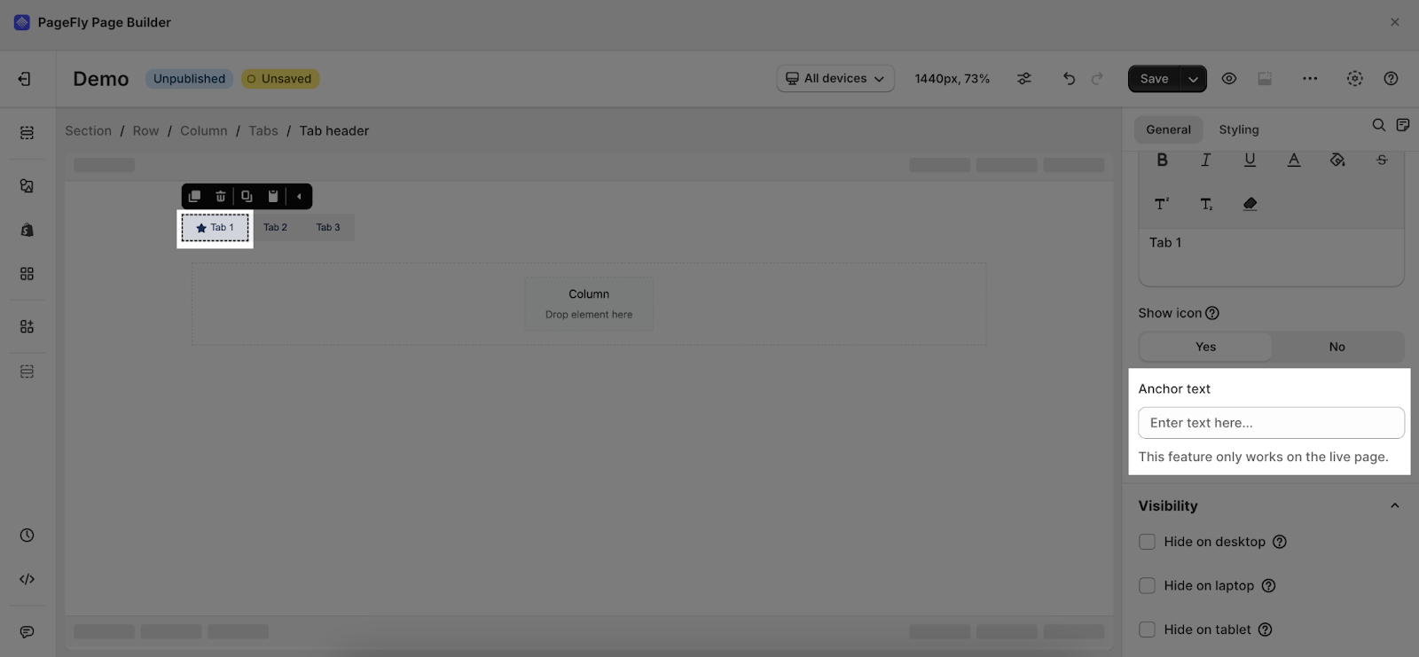 |
You can get further information about ATTRIBUTES, VISIBILITY, and ANIMATION parameters here.
In the Styling tab, you can choose one of three styling states for Tab Header: Normal state, Mouse over state, and Active/Selected state.
You can check more information about the Styling tab here.
Frequently Asked Questions
What Is Tabs Element?
PageFly Tabs is an element that helps to break down the contents into separate tabs, which helps to increase the conversion rate.
Can I Style The Tabs?
Of course, you can. You can style each state separately, simply by hovering and each of them: the Normal state, Mouse over state, and Active – Selected state, then check out PageFly Element Styling to style your elements better!