


About Divider Element

The Divider Element is the designed line break to separate two elements or sections on your page. This feature helps increase the conversation rates by improving the readability and scannability for visitors, especially on pages with multiple sections.
This article introduces you to the Divider Element and provides guidance on customizing it to suit your needs.
How To Access Divider Element
In the PageFly dashboard, follow the below steps to navigate to the Divider Element:
- Step 1: Click Add element on the left toolbar.
- Step 2: Select Divider and choose the desired style. Instead of browsing through the sidebar, you can also type Divider in the search box to quickly locate the feature.
- Step 3: Drag and drop the chosen element onto the layout for editing.

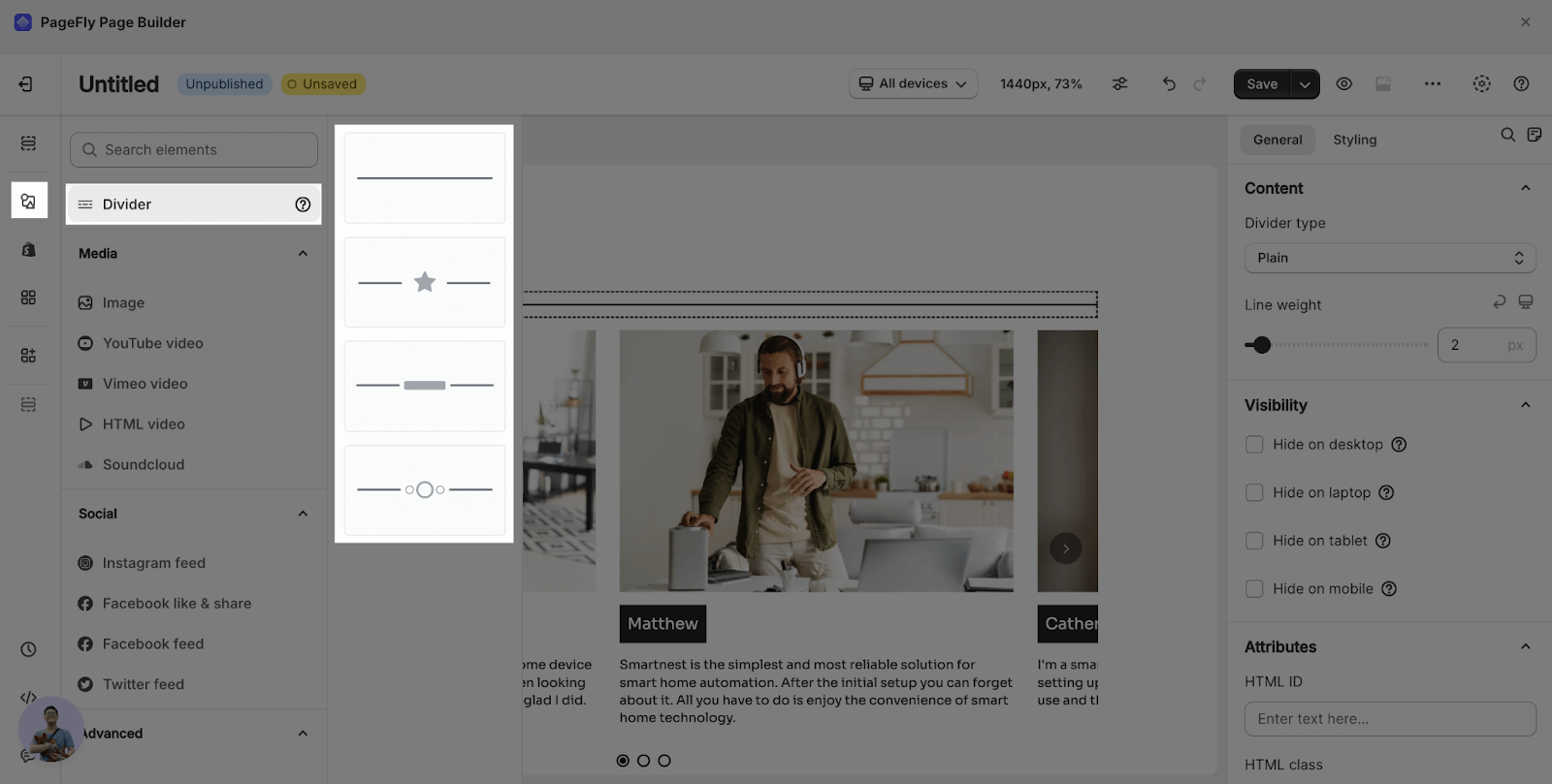
Currently, PageFly offers four options of lines tailored to your preference. Additional options will soon be added to save your time.
Please read the below instructions to learn how to customize Divider Element.
How To Customize Divider Element
General Customization
PageFly enables you to refine the appearance of the line for conversion rate optimal. Select the line to access its parameters.
Follow these steps to begin customizing your line:
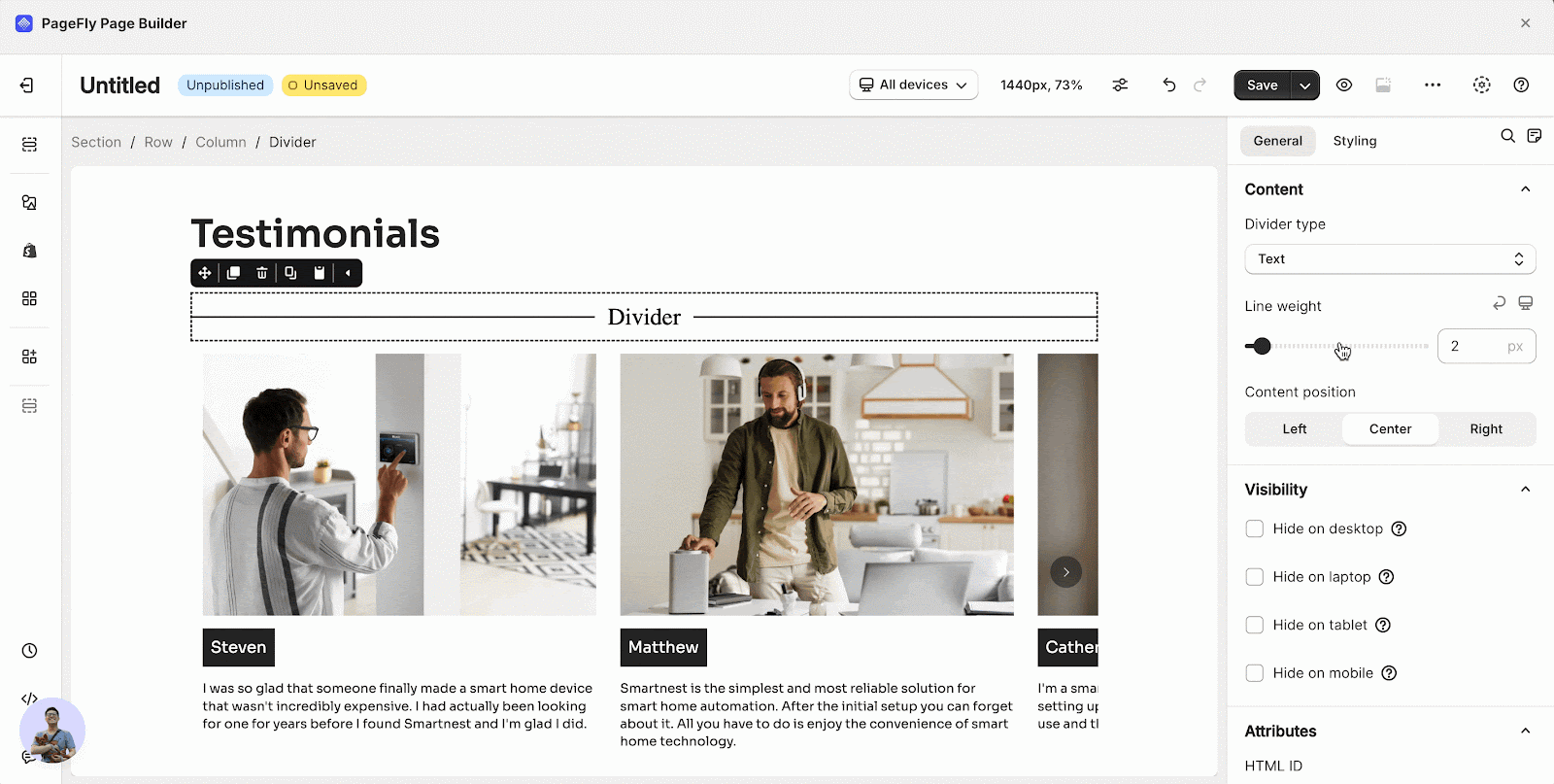
Step 1: Click on your line to open a modal as shown below.

Step 2: Select the Divider Type. You can choose and customize one of the available options:
- Plain: a simple straight line with no additional content.
- Icon: a simple line with an icon.
- Text: a simple line with a text.
- Symbol: a simple line with a symbol.
Check the How to customize Divider Type section for more details on customizing Icon, Text, and Symbol types.

Step 3: Adjust the thickness of your line.

Styling Customization
Check here to explore the Styling Configuration guide.
How To Customize Divider Type (Icon, Text, Symbol)
Icon
Step 1: Choose Icon from the Divider Type and select the position of the icon.

Step 2: Choose the icon you wish to display by one of two methods:
- Click on the icon and select from available options.
- Type the icon name into the search bar.

Step 3: Resize the icon by sliding the Size bar.

Text
Step 1: Choose Text from the Divider Type and select the position of the text.
Step 2: Click on the text and edit the content.

Symbol
Step 1: Choose Symbol from the Divider Type and select the position of the symbol.

Step 2: Click Select symbol to select from the available symbols.

Step 3: Resize the symbol by sliding the Size bar.

Frequently Asked Questions
What Is PageFly Divider Element?
Divider Element is used to segment your content, sections and other components, thereby enhancing the readability and scannability for page visitors.
Can I Add An Icon To The Line?
Yes. Among four given Divider Types, there is an Icon option. Select the desired type and style it as you wish to display.
How Many Divider Types?
There are four options for Divider Types.
What’s Another Term For “Line Weight”?
Line Thickness.
