About PageFly Button Element
PageFly Button Element is one of the fundamental elements of any page. It acts as a Call To Action (CTA) for whatever goal you are trying to achieve on your page.
You can check details in the video tutorial below.
How To Access The Button Element
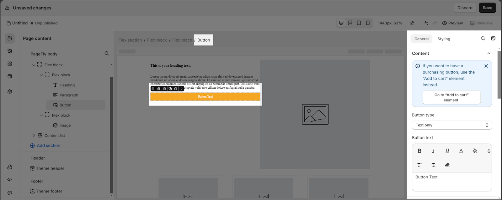
- Step 1: Click on “Elements“
- Step 2: From the PageFly tab, you can find and select “Button”
- Step 3: The Button element comes with 6 button variations, each with different styling. We will continue to add more variations to help you save time. Drag and drop one of these variants you want on the page editor
How To Configure The Button Element
The Button element comes with plenty of parameters, allowing you to fine-tune content appearance to reach the best possible click-through rate for your Call To Action.
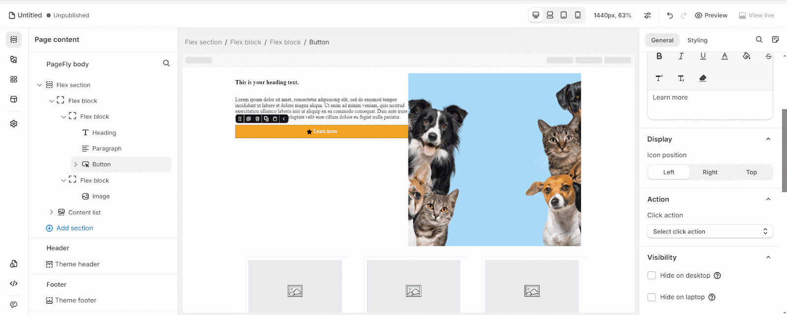
Select the element in the layout to see its parameters. The parameters in the General and Styling tabs are specific to this element.
General Configuration
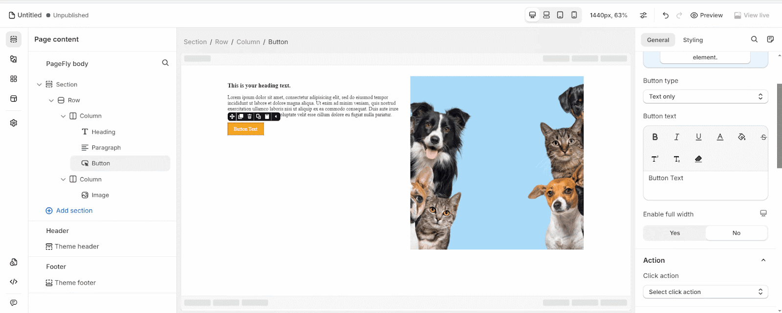
- Button Type
There are 3 options to choose from: Text only, Text with icon and Icon only.
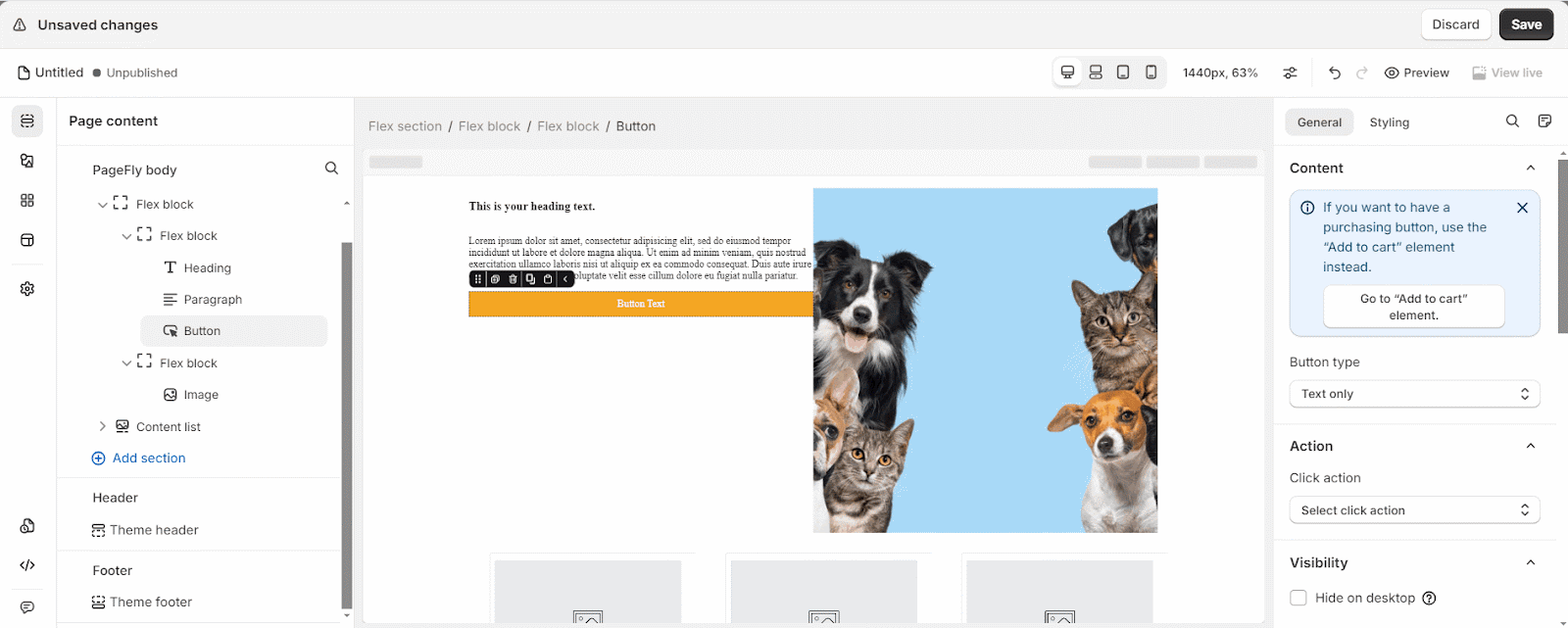
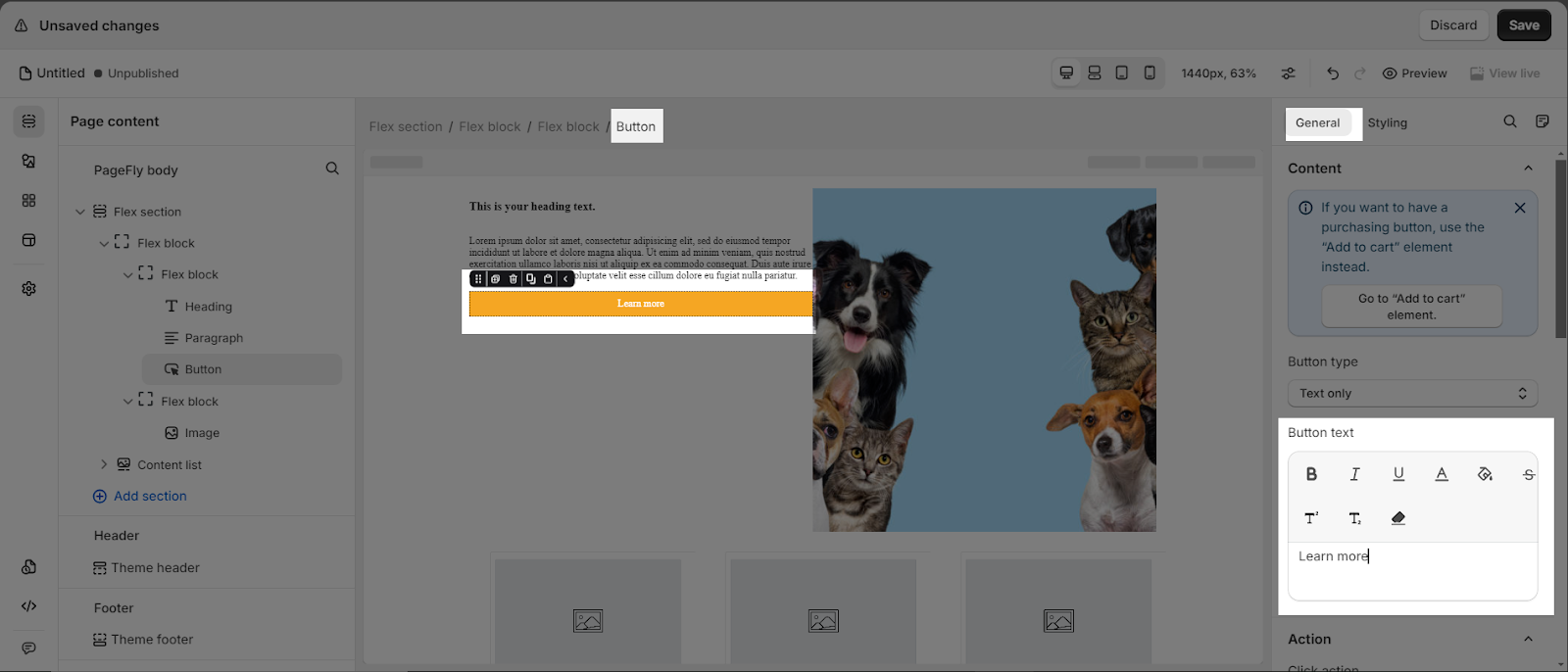
- Button Text
This setting is unavailable if the Button type is Icon only. You can insert and style the content of the button.
- Icon Position: Choose among left, right or top for the icon position
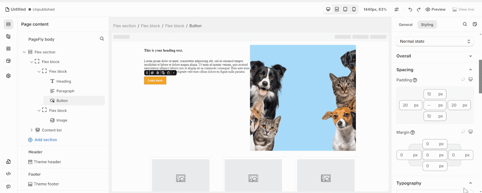
- Enable full width: Choose to show the button as full width of its container. This will make the button stretch horizontally to fill the entire width of its parent container element, as shown in the example below
- Action
You can direct to a link, a section, a pop-up, an email address or a phone number by using the Click action parameter.
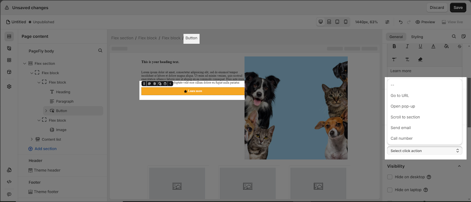
Please read more about the ACTION parameter here.
You can get further information about ATTRIBUTES, VISIBILITY, ANIMATION parameters.
Styling Configuration
Below are main settings you will see in the Styling tab:
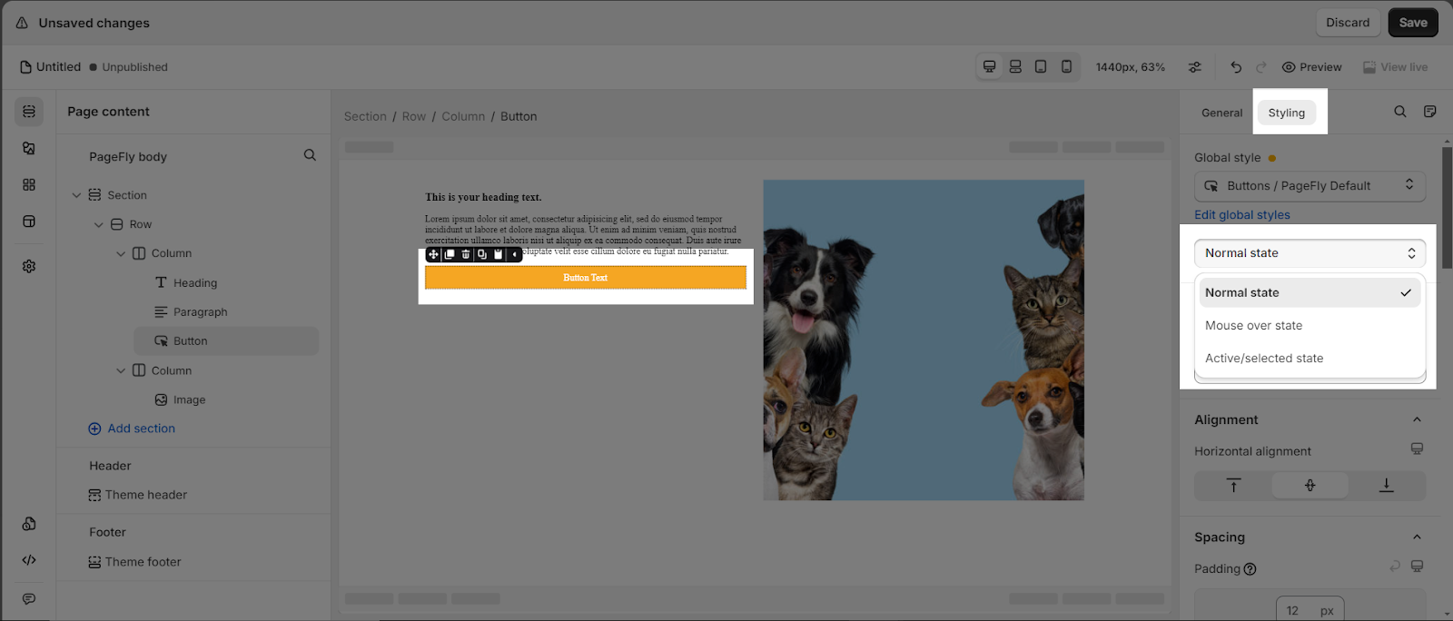
- Global Style: Choose to style for the button with 6 variants.
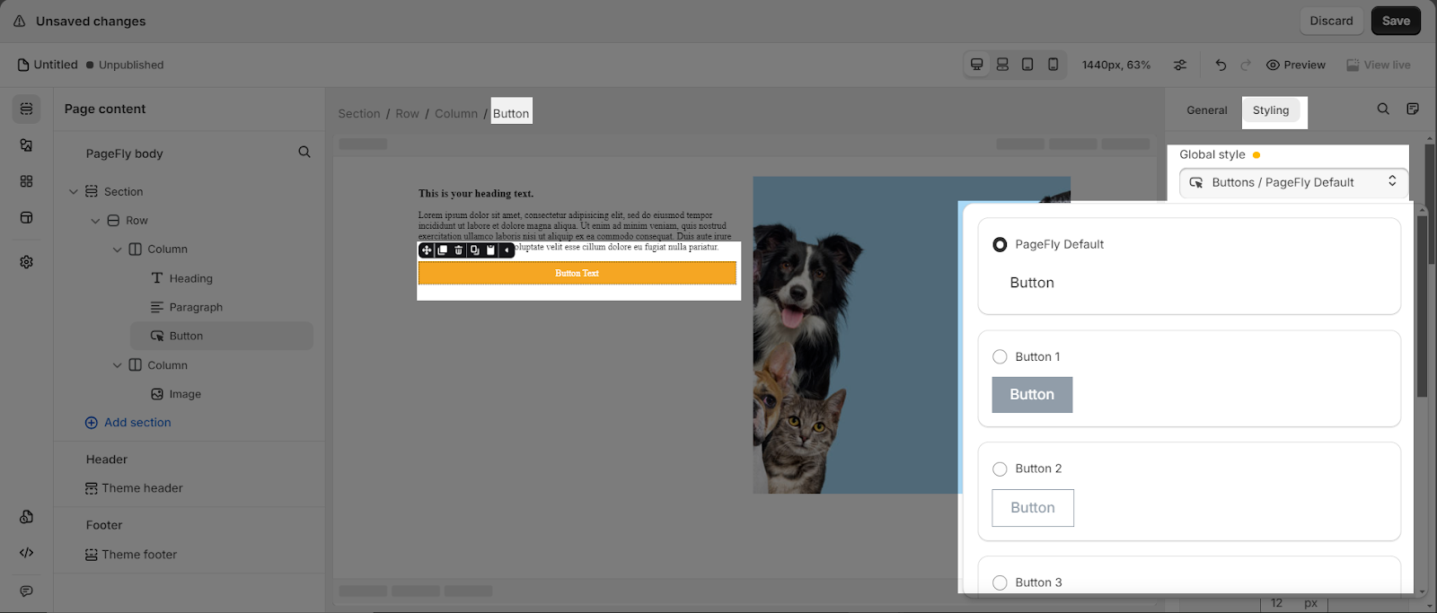
- State Styling: contains 3 options (Normal state, Mouse over state, and Active/Selected state) that you can choose for your button.
You can check information about other settings in the Styling tab such as Typography, Background, Border using this guide.
Use Cases
How To Increase The Button Size?
Basically, if you increase the button’s content, then the button size will also automatically increase. In another case, you can change the Padding for the Button element. You can check the GIF below.
In this case, we increase the right and left padding from 20 px to 30px and top and bottom padding from 12px to 50px.
How To Change The Button Color?
You can easily customize the color of your button to match your branding or design preferences by using the color pickers for “Background Color” in the Styling tab.
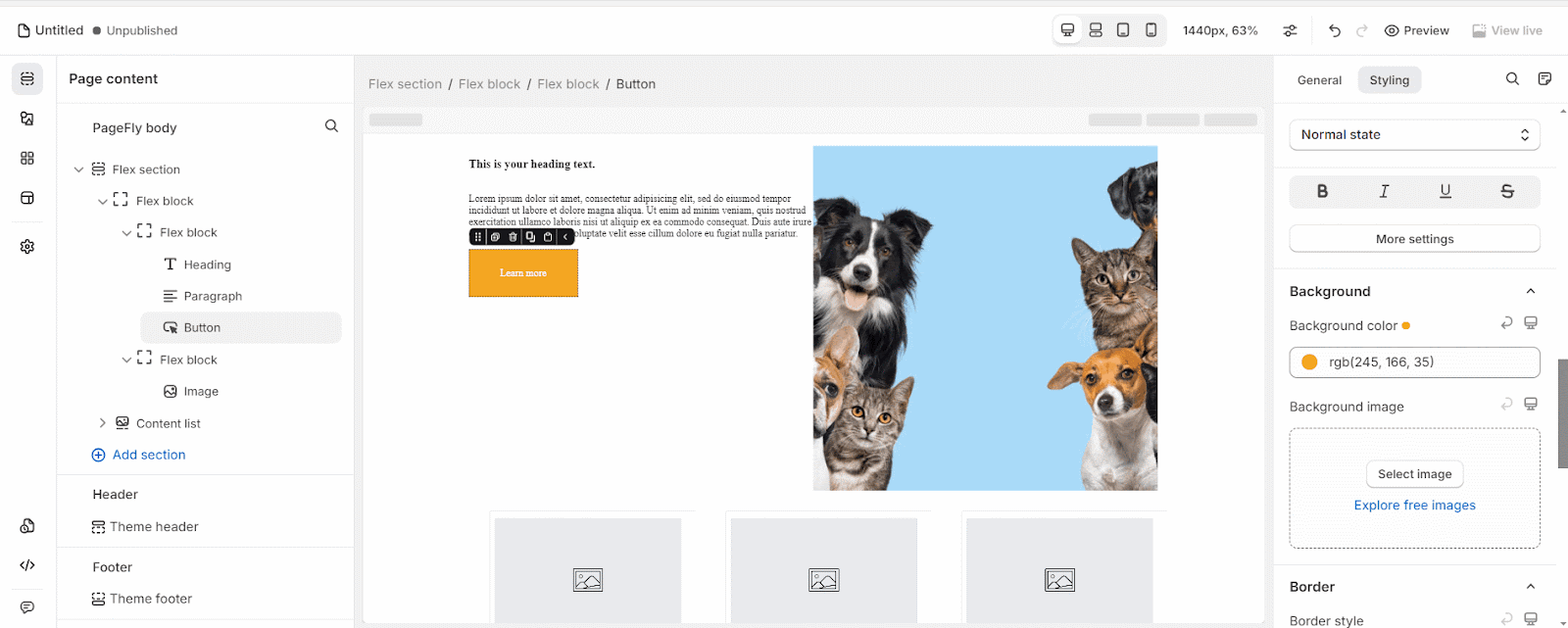
By adjusting the color settings, you can create buttons that complement your site’s color scheme, draw attention to important calls-to-action, or simply align with your brand’s visual identity.
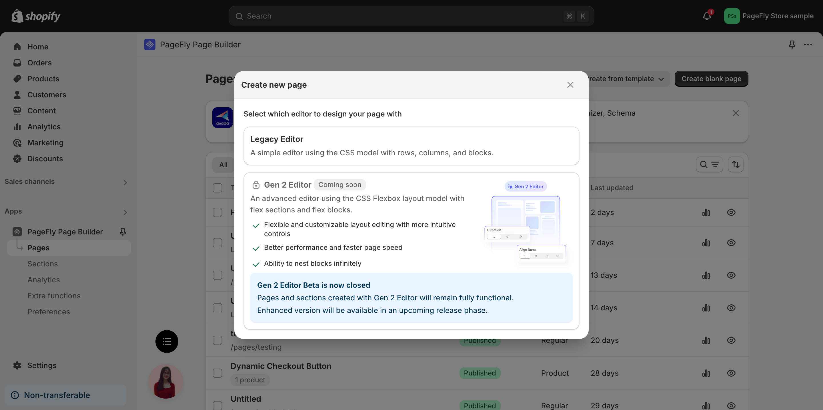
How To Create A Dynamic Checkout Button?
To create a Dynamic Checkout Button with PageFly, you have two options:
- Legacy Editor: Use an HTML/Liquid element to add the custom code.
- Gen 2 Editor: Simply drag and drop the Dynamic Checkout Button element onto your page and customize its appearance.
For detailed instructions, please refer to our guide here.
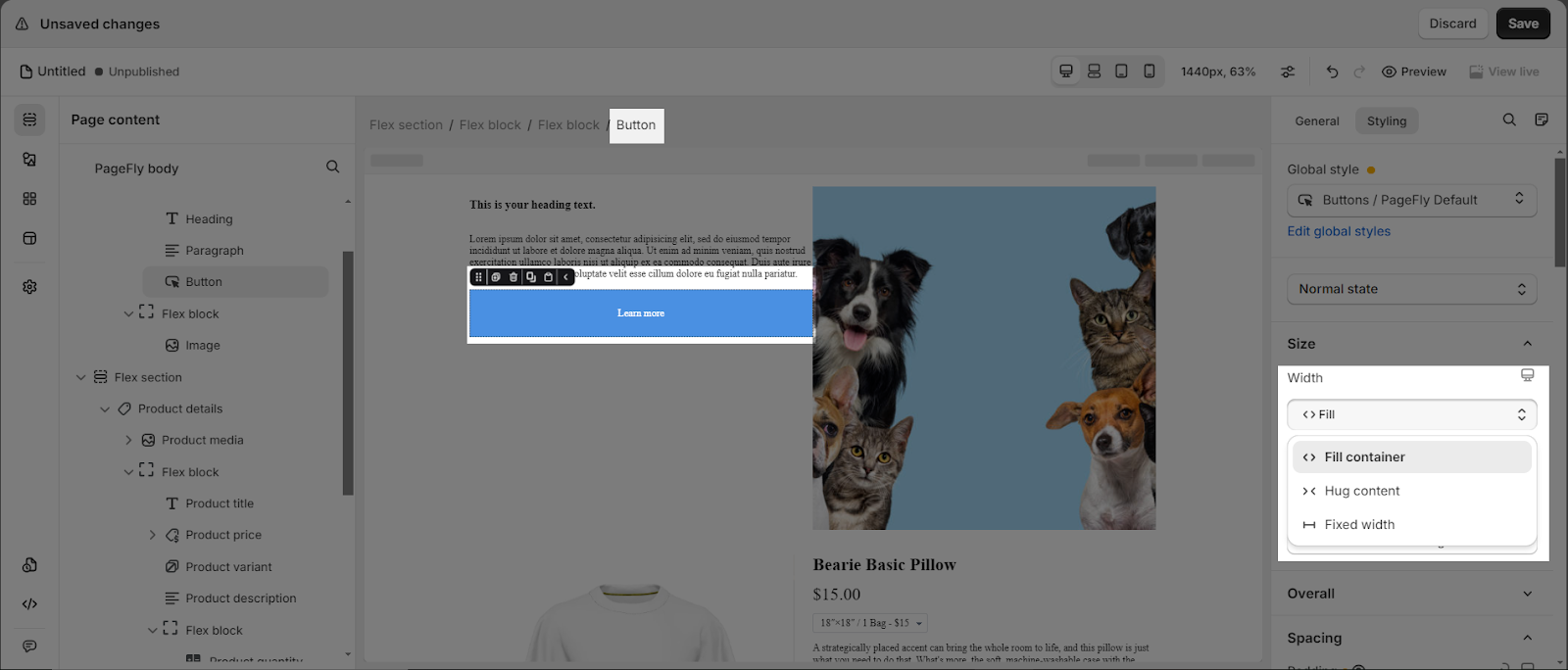
How To Make A Full-Width Button?
- In Legacy editor: Choose your Button > General Tab > choose Yes to Enable Full-Width.

- In Gen 2 editor: Simply choose the “Fill container width” option in the Width setting, under the Size parameters group in the Styling tab.
Best Practices For Using Buttons
- Use clear and concise text for your button CTAs, such as “Buy Now”, “Sign Up”, or “Learn More”.
- Make sure your button stands out visually with contrasting colors and proper spacing.
- Place buttons in strategic locations on your page, such as near important information or at the end of sections.
- Consider accessibility by using larger button sizes and ensuring proper color contrast for users with visual impairments.
- Test different button styles, colors, and placements to see what works best for your audience and goals.
- Set up “Global styles” to streamline page creation and ensure consistent styling across all buttons on your website.
Version Update
With the release of PageFly version 4.16.0, we introduced flex sections and blocks, offering greater flexibility and control over page layouts. You can now choose between the Flex editor (flex sections and blocks) or the Basic editor (column and row) when creating a new page.
Notably, the general settings for the Flex editor have removed the “Enable full width” option and added Size parameters to the styling settings.
Frequently Asked Questions
1. What are examples of Call to action (CTA)?
The 5 best examples are: ‘Call now’, ‘Buy now’, ‘Subscribe’, ‘Sign Up’ and ‘Learn More’
2. Can I style the button element?
Yes, you can. The PageFly Button Element comes with 5 variants, with 3 state styling options for Normal state, Mouse over state, and Active/Selected state.
3. How do I add an icon to my button?
In the General Configuration settings, you can choose the “Text with icon” or “Icon only” button type.
4. Can I make my button clickable?
Yes, you can add click actions to your buttons using the “Action” parameter in the General Configuration settings. This allows you to direct users to a specific link, section, pop-up, email address, or phone number when they click the button.