


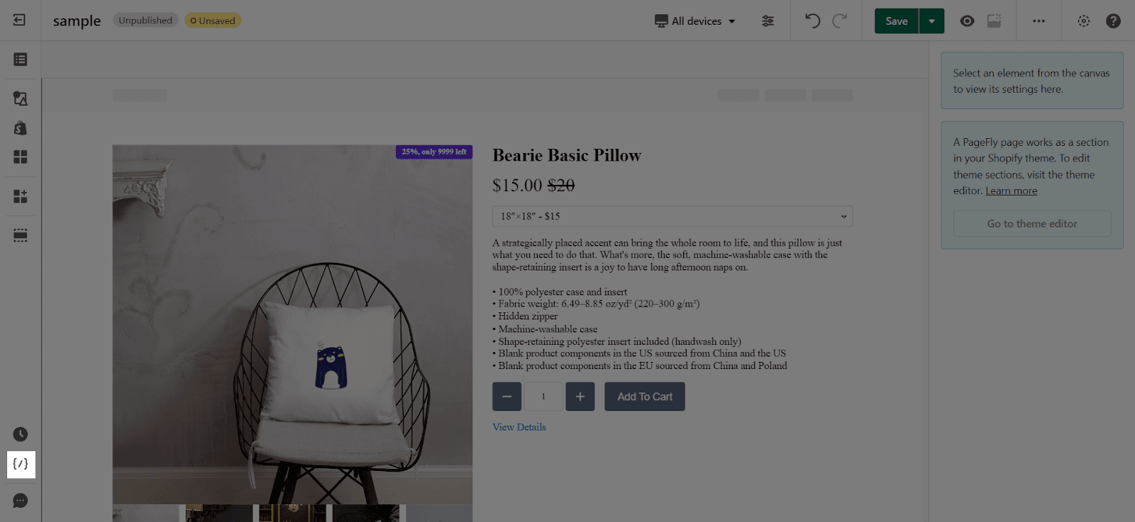
About Responsive Mobile Horizontal Scroll Issue

Responsive mobile horizontal scroll issue happens when viewing the page on the mobile, the page has an undesired extra space to the right, which slides from the left to the right.
Learn how to avoid this issue with this article:
Why Does This Issue happen?
The main reason for Responsive Mobile Horizontal Scroll Issue is that the page’s content has a bigger width than the device’s width.
For example, the mobile device’s width is 375px, but elements within this page are more than 375px in width, so that you have to scroll horizontally to see all elements.
In some cases, if you set the negative margin left and right for an element, it can cause this issue.
How To Fix This Issue?
Step 1: Open the Custom Code Editor
Navigate to the bottom left corner, hover over it to see the feature Add Custom Code popping up, and make a left-click.
Step 2: Paste The Custom CSS Code
Visit this link to get the code and paste it into the Custom CSS box like the image below
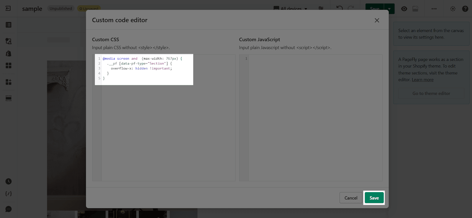

Click the Save change button and publish the page to see the result.
Note: If the above code does not work, you can change it to this code. Please notice this CSS when the page has a sticky section or sticky header on mobile. This code will disable sticky sections.
To gain a better understanding, you can view this video for step-by-step solutions, ensuring a seamless and user-friendly experience!
If you still counter this problem while editing your page, please get in touch with us by clicking on the Chat Bubble on the bottom-left of the page.
