


About PageFly Button Element

PageFly Button Element is one of the fundamental elements of any page. It acts as a Call To Action (CTA) for whatever goal you are trying to achieve on your page.
You can check details in the video tutorial below.
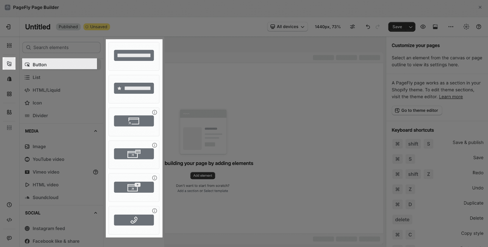
How To Access The Button Element
- Step 1: Click on the Plus icon, which is the Add element function
- Step 2: Click on the Button element in the dropdown menu
- Step 3: The Button element comes with 6 button variations, each with different styling. We will continue to add more variations to help you save time. Drag and drop one of these variants you want on the page editor
How To Configure The Button Element
The Button element comes with plenty of parameters, allowing you to fine-tune content appearance to reach the best possible click-through rate for your Call To Action.
Select the element in the layout to see its parameters. The parameters in the General and Styling tabs are specific to this element.
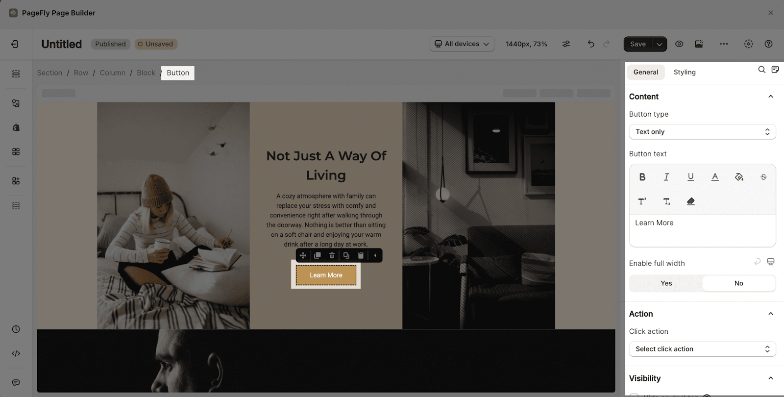
General Configuration
Button Type
There are 3 options to choose from: Text Only, Text With Icon and Icon Only.
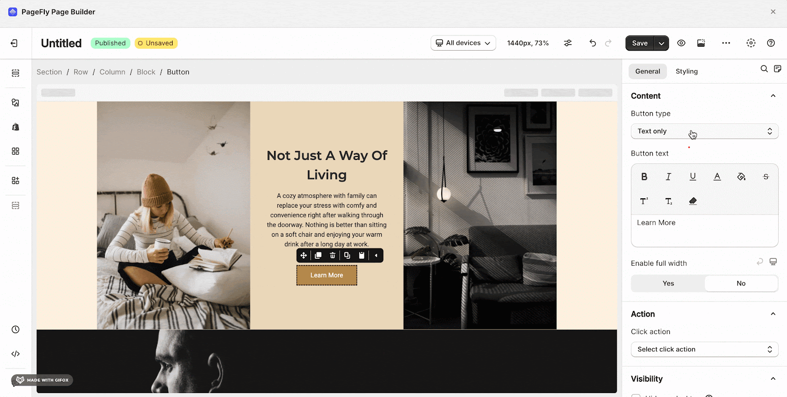
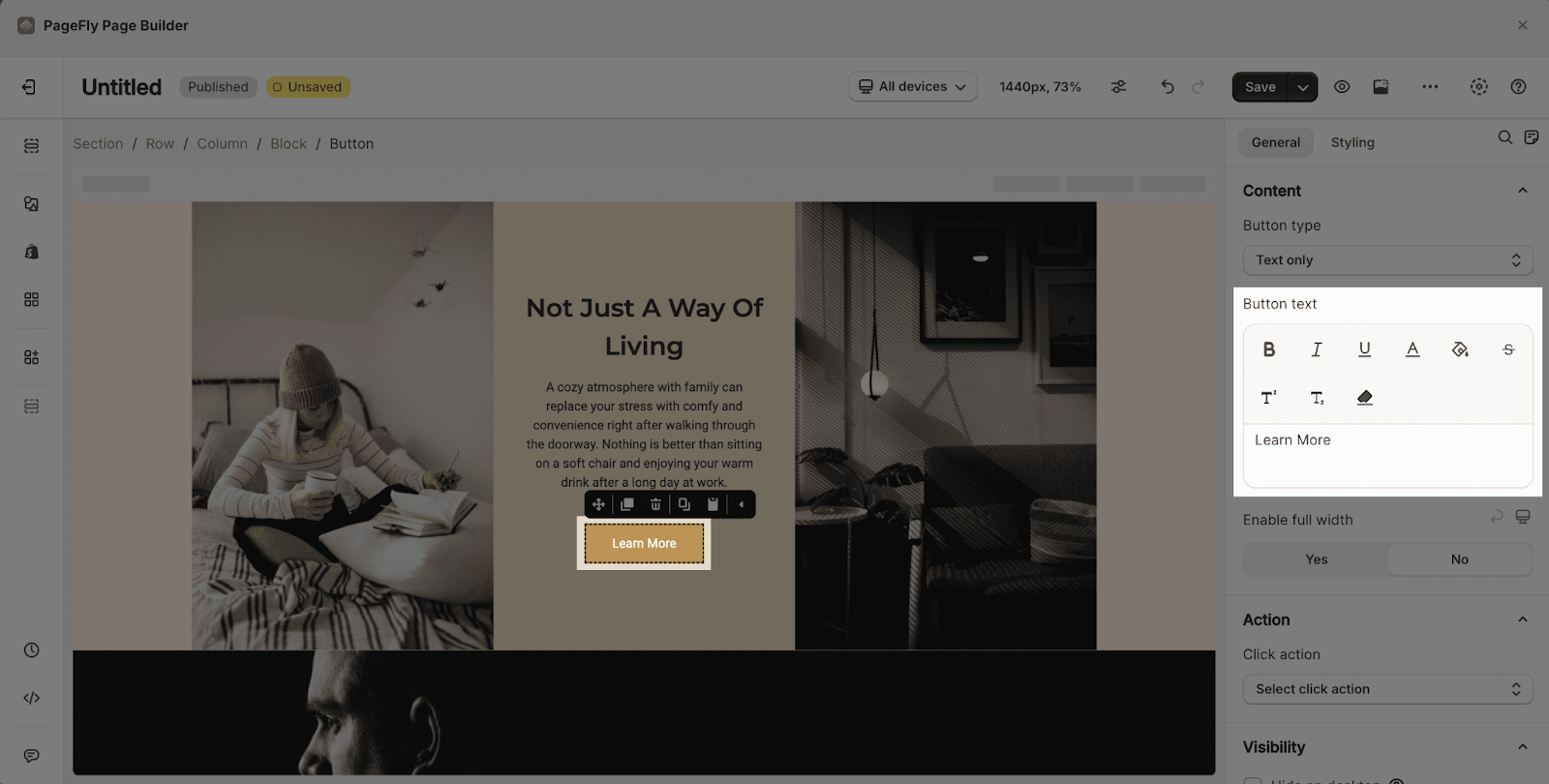
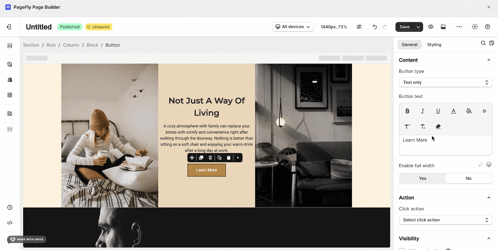
Button Text
Insert and style the content of the button. The button’s width will expand based on the length of this text.
Edit Icons
- Icon Position: Choose among left, right or top for the icon position
Note: this parameter only shows when the “Text with icon” has been selected.

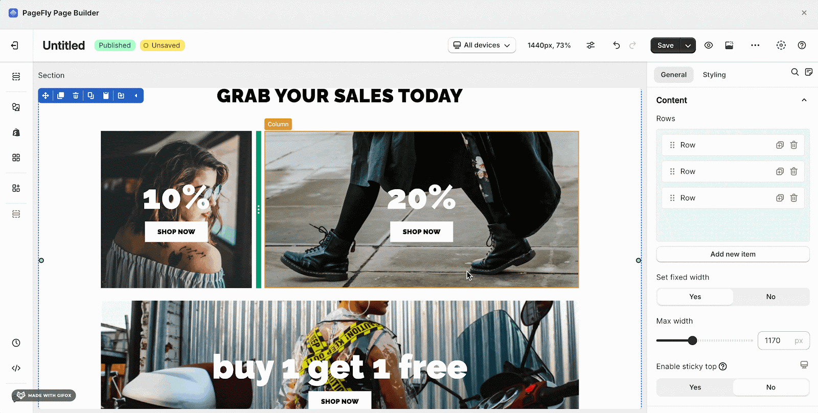
- Enable full width: Choose to show the button as full width of its container. This will make the button stretch horizontally to fill the entire width of its parent container element, as shown in the example below
Action
You can direct to a link, a section, a pop-up, an email address or a phone number by Click Action.
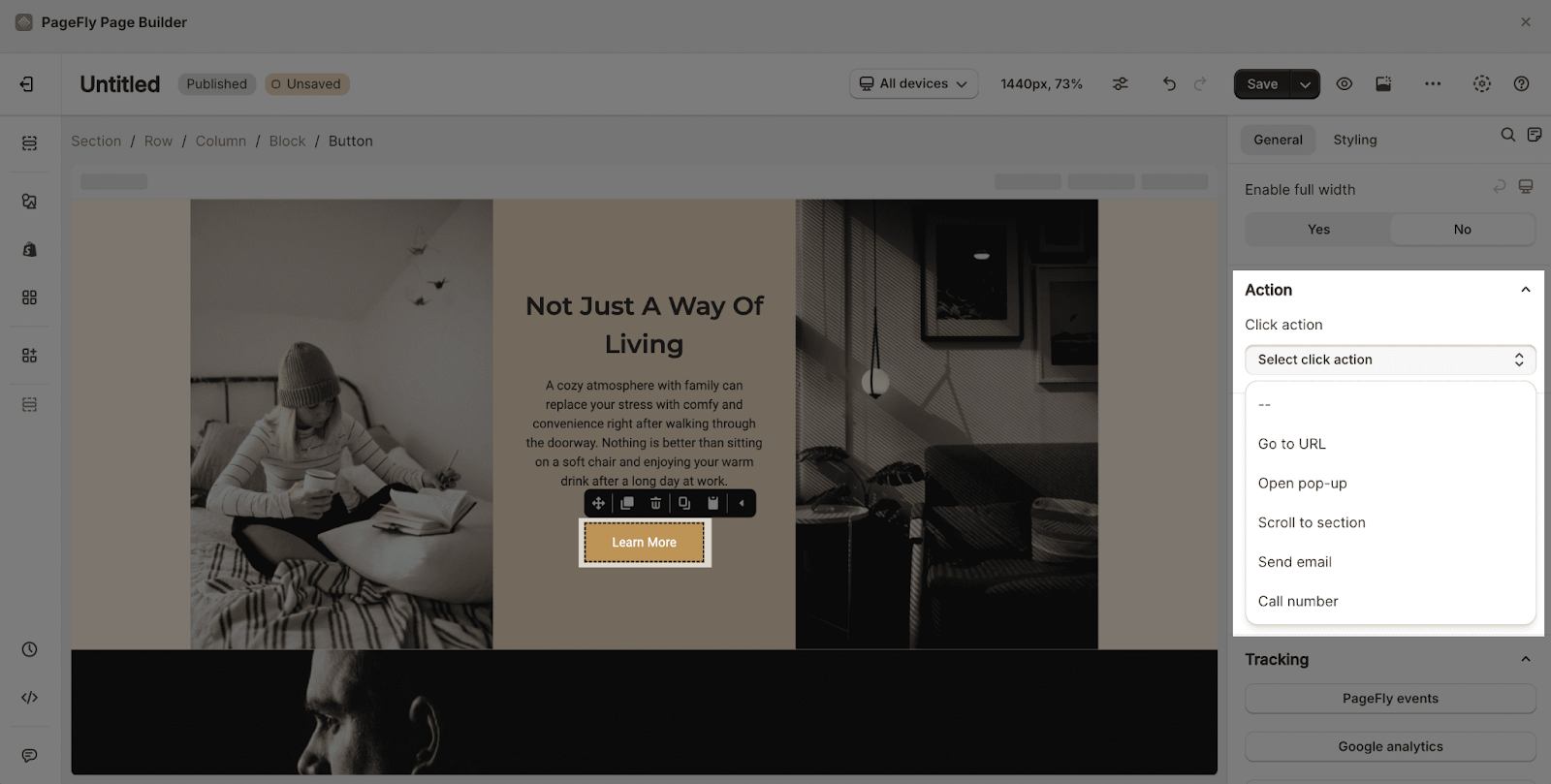
Please read more about the ACTION parameter here.
You can get further information about ATTRIBUTES, VISIBILITY, ANIMATION parameters.
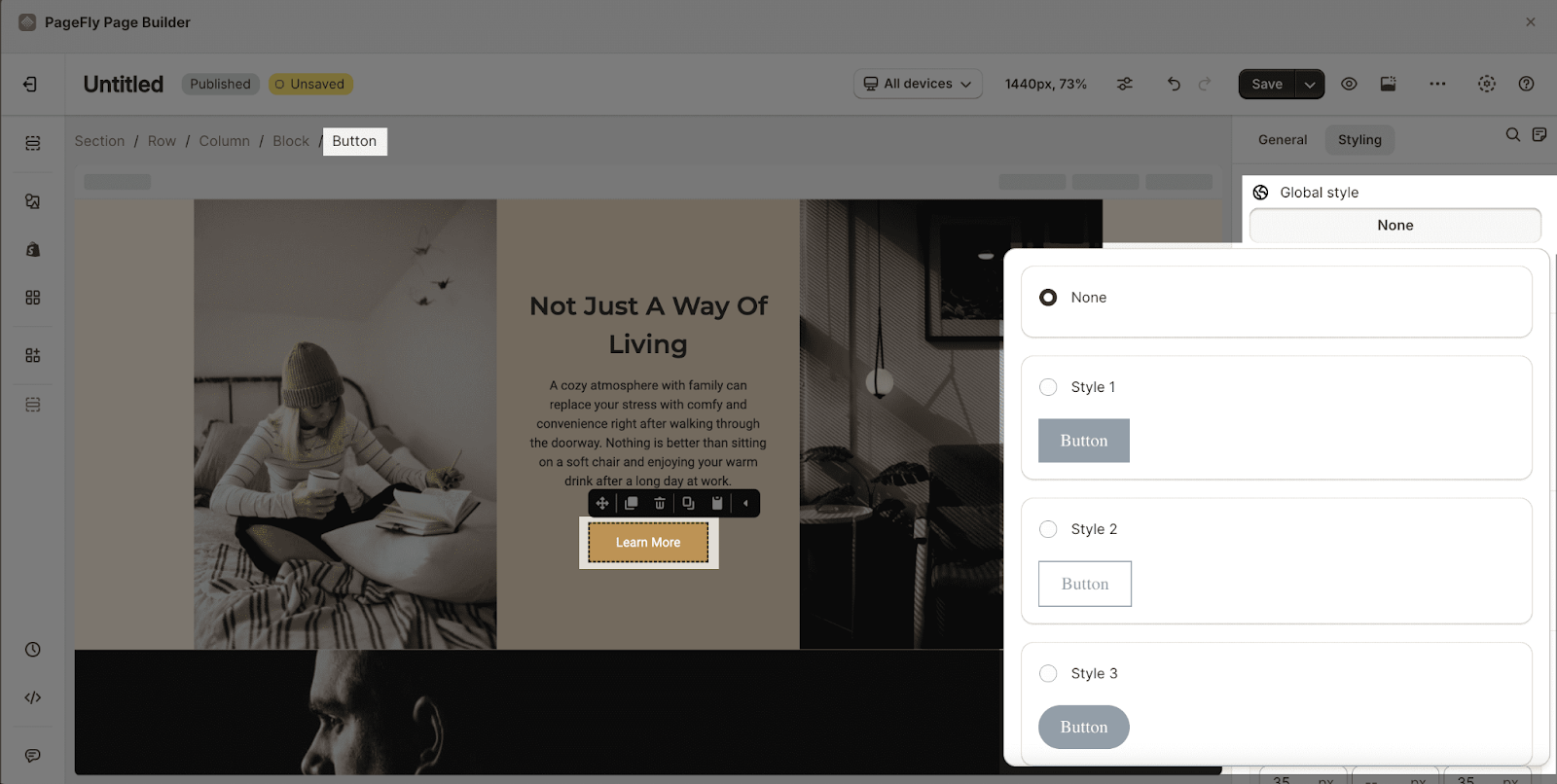
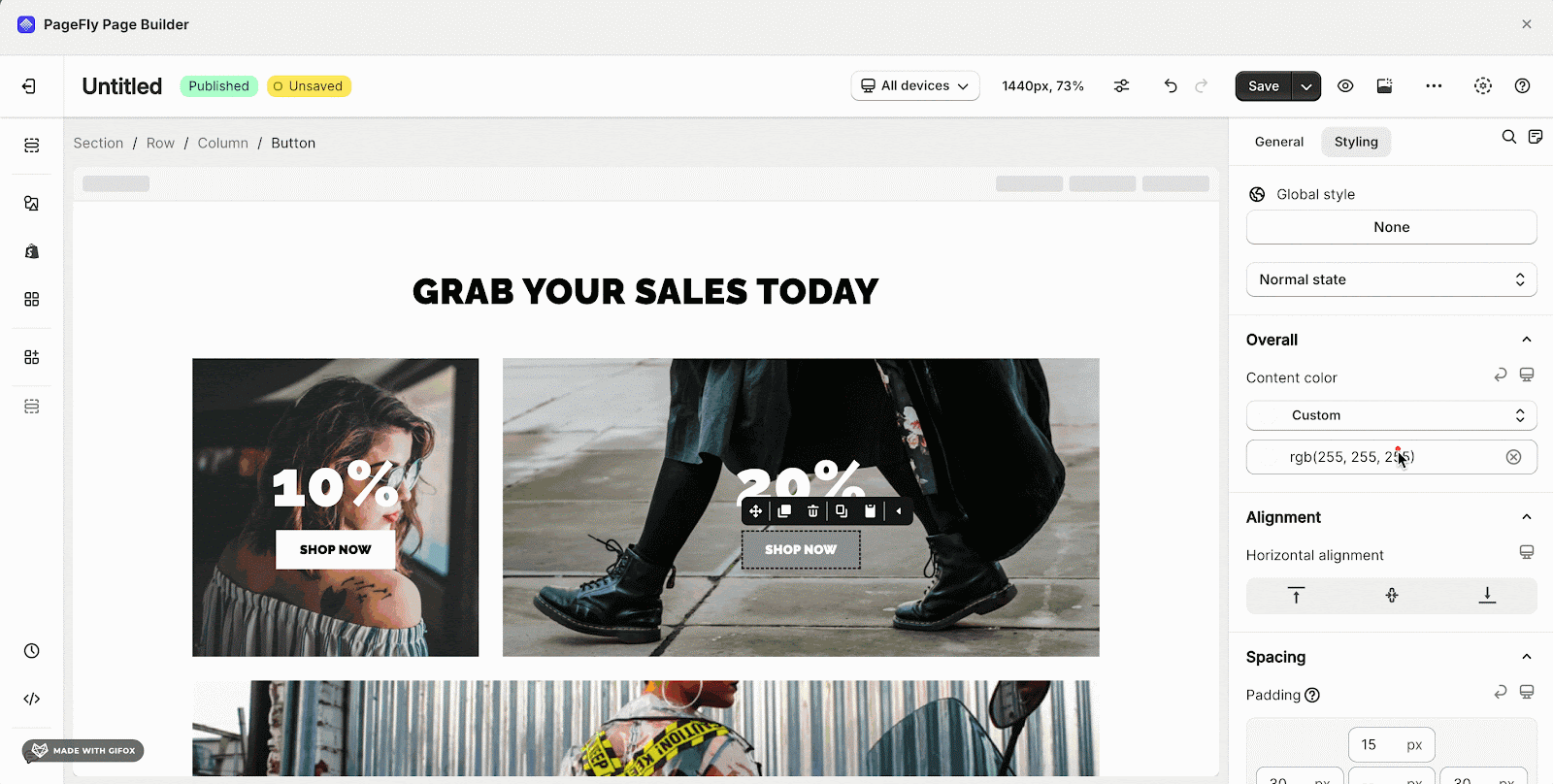
Styling Configuration
- Global Style: Choose to style for the button with 5 variants.
- State Styling: contains 3 options (Normal state, Mouse over state, and Active/Selected state) that you can choose for your button.
 You can check more information about the Styling tab.
You can add click action for button by following this video tutorial:
Use Cases
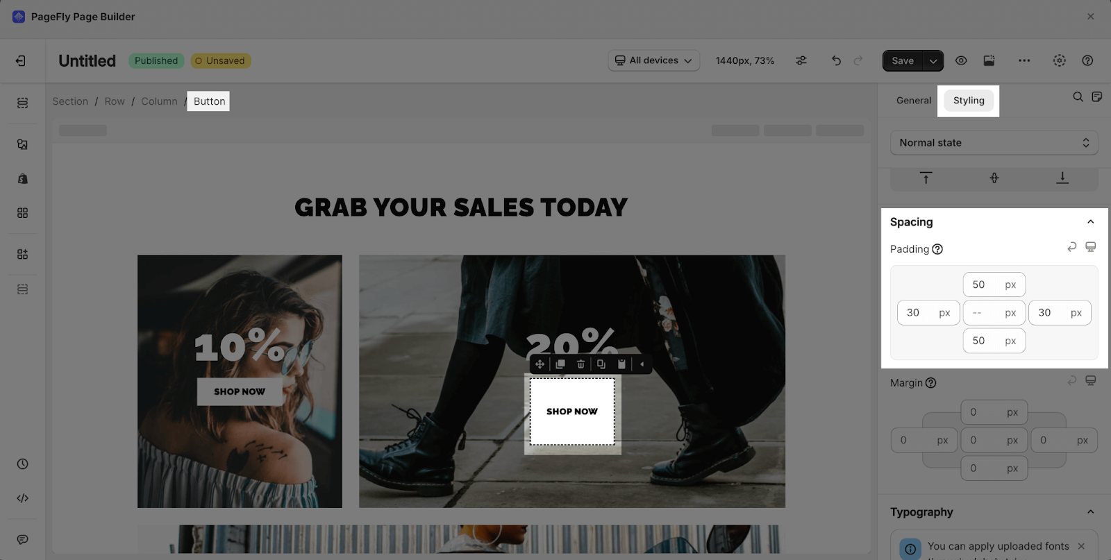
1. How To Increase The Button Size?
Basically, if you increase the button’s content, then the button size will also automatically increase. In another case, you can change the Padding for the Button element. You can check the GIF below.
In this case, we increase the Padding right and left from 20 px to 30px and Padding top and bottom from 12px to 50px.
2. How To Change The Button Color?
You can easily customize the color of your button to match your branding or design preferences. Here are the steps:
- Step 1: Select the Button element.
- Step 2: Go to the Styling tab.
- Step 3: Expand the “State Styling” section.
- Step 4: Click on the state you want to modify (Normal, Mouse Over, Active/Selected).
- Step 5: Use the color pickers for “Background Color” and “Text Color” to change the button and text colors respectively.
By adjusting the color settings, you can create buttons that complement your site’s color scheme, draw attention to important calls-to-action, or simply align with your brand’s visual identity.
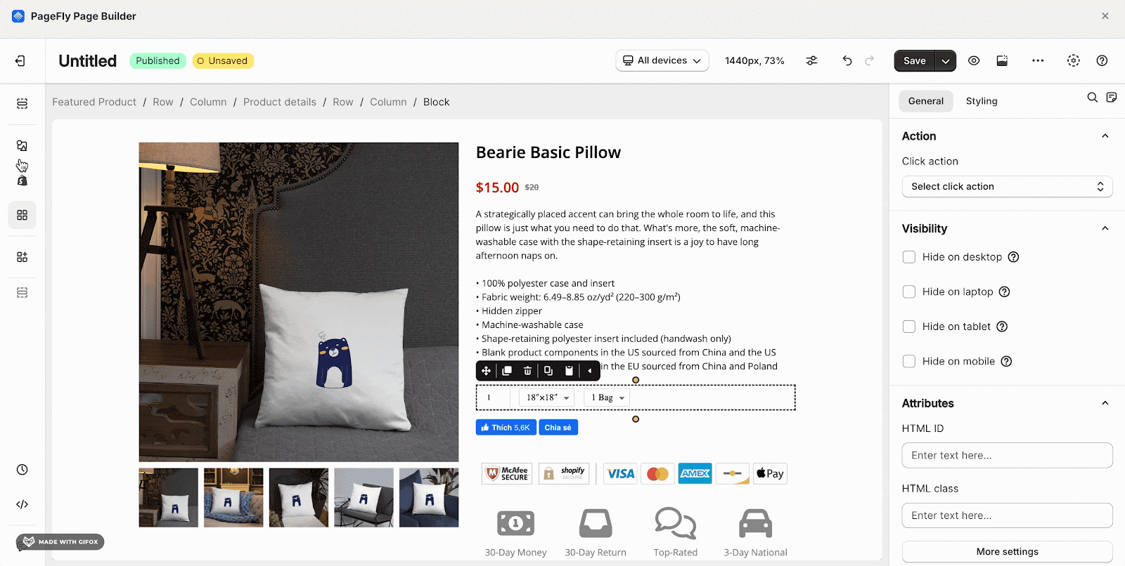
3. How To Create A Dynamic Checkout Button?
This is the ‘’BUY IT NOW’ Button.
Please note that this only works inside the Product Details element (You have to add this into the Product Details element with the option Combined Variant turned on)
In this case, we need to use the HTML/Liquid element and add code into it. Please follow these steps below:
- Step 1: Click the icon named Add element on the left sidebar
- Step 2: Scroll down to Basic section > choose the HTML/Liquid element
- Step 3: Drag and drop this element into the page editor
- Step 4: Click on the Open Code Editor button in the General tab to open the HTML/ Liquid Code Editor
- Step 5: Paste this code below into: {{ form | payment_button }}
You can check the gif below. Note that you need to publish to see the result.
In order to add the Paypal button, you need to set up the Paypal in your Shopify store and then use the code above.
4. How To Make A Full-Width Button?
In case you want your Button to be Full-Width, choose your Button > General Tab > turn on Enable Full-Width.
Best Practices For Using Buttons
- Use clear and concise text for your button CTAs, such as “Buy Now,” “Sign Up,” or “Learn More.”
- Make sure your button stands out visually with contrasting colors and proper spacing.
- Place buttons in strategic locations on your page, such as near important information or at the end of sections.
- Consider accessibility by using larger button sizes and ensuring proper color contrast for users with visual impairments.
- Test different button styles, colors, and placements to see what works best for your audience and goals.
Frequently Asked Questions
What Are Examples Of Call To Action?
The 5 best examples are: ‘Call now’, ‘Buy now’, ‘Subscribe’, ‘Sign Up’ and ‘Learn More’
Can I Style The Button Element?
Yes, you can. The PageFly Button Element comes with 5 variants, with 3 state styling options for Normal state, Mouse over state, and Active/Selected state.
How Do I Add An Icon To My Button?
In the General Configuration settings, you can choose the “Text With Icon” or “Icon Only” button type. Then, use the “Edit Icons” settings to enable/disable the icon, choose the icon position (left, right, or top), and select your desired icon.
Can I Make My Button Clickable?
Yes, you can add click actions to your buttons using the “Action” parameter in the General Configuration settings. This allows you to direct users to a specific link, section, pop-up, email address, or phone number when they click the button.