### Resources
* [Video Tutorials](https://www.youtube.com/c/PageFlyShopifyPageBuilderApp)
* [Slack Community](https://join.slack.com/t/pageflycommunity/shared_invite/zt-33zygl73a-U4BiyVBFPjyuK07Od8DgkQ)
* [Contact Us](https://pagefly.io/pages/contact)
* [PageFly Feedback](https://pagefly.canny.io/feedback)
# Overview
### About Getting Started
Getting Started with PageFly!
This Getting Started section is your launchpad for a smooth and successful e-commerce journey. In minutes, you'll be creating stunning pages that convert visitors into customers, even without design experience.
Already ready to start but still concerned about the investment? No worries! We offer flexible pricing plans to perfectly match your store's needs. Take a peek and find the fuel that propels your business forward.
Let's build something amazing together!
### Related Resources
* [How to Use PageFly Dashboard](https://help.pagefly.io/manual/dashboard/)
* [Make Your Shopify Store Responsive With PageFly](https://academy.pagefly.io/guides/shopify-responsive-store-with-pagefly/)
* [Optimize Pages for CRO with PageFly Elements](https://help.pagefly.io/manual/optimize-pages-for-cro-with-pagefly-elements/)
# Quick start
### About Quick Start Category
Welcome to the Quick Start Category!
This Quick Start Category helps you learn about PageFly easily. It shows you the basic steps to make a page for your store quickly.
After you look through this guide, you'll be able to make your first page with PageFly and understand how to use its main features. This is a great starting point for anyone new to PageFly, giving you all you need to get going with creating pages for your store.
### Related Resources
* [Pricing and billing](https://help.pagefly.io/manual/pricing-and-billing/)
* [How to create section and use it in your theme](https://help.pagefly.io/manual/create-a-section-with-image-and-text/)
* [Shopify Theme Customization: How to Create a Unique and Professional Online Store](https://pagefly.io/blogs/shopify/shopify-theme-customization)
# How to Install PageFly
### About PageFly
PageFly is an advanced, easy-to-use landing page builder designed for Shopify stores. We offer a wide selection of premade templates and customizable elements, catering to various page types like home, product, and sales landing pages. With our user-friendly interface, PageFly is suitable for users of all skill levels, enhancing eCommerce websites through 100+ seamless integration with various Shopify apps.
#### PageFly Key Features
* Free Plan: There's a forever free plan available that lets you try out PageFly's features before committing to a paid plan.
* Drag-and-Drop Editing: PageFly uses an intuitive drag-and-drop interface, making it easy to add, edit, and arrange elements on your pages.
* Templates: Get started quickly with a library of pre-designed templates for various purposes and holiday occasions.
* Extensive Element Library: Choose from a wide range of elements like buttons, videos, forms, and more to build engaging and informative pages.
* Mobile Responsive: All pages created with PageFly are responsive for mobile, and tablet. Customize every screen size individually.
* SEO Optimization: Build pages that are friendly to search engines to improve your online store's visibility.
* Integration: Compatibility with 100+ most loved apps on Shopify, enhancing your store's functionality.
* Analytics and Tracking: Features that allow you to monitor your landing page's performance, helping you make data-driven decisions.
### How to Install PageFly on Shopify
To install PageFly, go to [PageFly app listing](https://apps.shopify.com/pagefly) on Shopify > hit Install button

Next, you will be directed to the Install page inside of Shopify > click Install again and you are all set! No payment information is required!

{% hint style="info" %}
**Note**: Before you click Install, please carefully review our [Privacy Policy](https://pagefly.io/pages/privacy-policy).
{% endhint %}
To access the app every time you are in Shopify, you can refer to “[How to access PageFly](https://docs.google.com/document/d/1MESi2BMaH3e-o0OXWxdmGaEx4KUR9ZcQ8rifOvy-mg4/edit%23heading%3Dh.7mq13qda0web)” article.
### Frequently Asked Questions
**1. Is there a free trial?**
Yes, PageFly offers a free plan that lets you explore its core features and draft an unlimited number of pages, you only pay if you publish the pages/ sections.
**2. What kind of pages can I build with PageFly?**
PageFly goes beyond landing pages. You can create product pages, customize your homepage, build blog posts, and even design password pages.
**3. Do I need coding experience to use PageFly?**
Not at all! PageFly utilizes a drag-and-drop interface, making it easy for anyone to add, edit, and arrange elements on their pages.
**4. Are the pages mobile-friendly?**
Yes! PageFly ensures all your creations are responsive, meaning they will display beautifully on any device, from desktops to smartphones.
**5. What are the different pricing plans?**
PageFly offers a free plan and several paid tiers with varying limitations on published slots (pages/ sections). You can choose the plan that best suits your needs.
**6. Can I upgrade my plan later?**
Absolutely! PageFly allows you to seamlessly upgrade your plan whenever your store grows and requires more publish slots.
**7. Does PageFly offer any tutorials or help resources?**
Yes! PageFly has a comprehensive Help Center with video tutorials, articles, and guides to answer your questions and walk you through the app's functionalities.
**8. Is there any customer support available?**
PageFly provides 24/7 customer support through their website, in-app, and help center to assist you with any difficulties you might encounter.
# How To Use PageFly | Get started in 5 mins
### Overview of PageFly
PageFly is a powerful page-building tool designed to help Shopify merchants create customized, high-converting store pages. With its intuitive interface, advanced features, and compatibility with Shopify’s ecosystem, PageFly enables users to build professional-grade pages tailored to their business needs.
Key benefits of PageFly include:
* No Custom Code Needed: Easily create custom designs with a simple drag-and-drop interface—no coding skills required.
* Templates for Fast Start: Access a wide selection of professionally designed templates for product pages, landing pages, and full websites. Customize them in minutes to fit your needs.
* Page Speed Optimized: Ensure fast-loading pages for a seamless browsing experience and improved performance.
* Works with All Themes: Compatible with all Shopify themes for smooth integration without compatibility issues.
Whether you're a beginner or a seasoned Shopify user, PageFly is the perfect companion for your eCommerce journey.
### How To Install PageFly
If you already installed the app, skip this step and move to the next one.
If not, let’s visit the [PageFly page](https://apps.shopify.com/pagefly?_gl%3D1*8xh9jt*_ga*MTkwMjIwOTMyOS4xNzA5NzgzNDQ5*_ga_0BK6F6GXYF*MTcwOTc5OTQ0Ni4zLjAuMTcwOTc5OTQ1Mi41NC4wLjA.) on Shopify App Store, click the Add App button and fill in your store’s URL to install the app to your Shopify store.
### How To Access PageFly
In the Shopify admin sidebar, click Apps > PageFly Landing Page Builder. After that, you will be redirected to the PageFly Dashboard.

### PageFly Menu Navigation
On the menu sidebar below PageFly Page Builder, you will see:
* Dashboard: Access guides, Slot Usages, Recent Pages, Support Channels, Integrations, and What’s New

* Pages: Create your page

* Sections: Create global sections for your page or theme.

* Analytics: View page performance.

* Extra Functions: Additional functions like Integrations, Global Styles, Option Swatches, Uploaded fonts, Trash and Media Files.

* Preferences: Manage account, Billing, Analytics, User Interface, Theme app extensions and Referral program

### Step To Get Started With PageFly
#### Step 1: Onboarding
If you’re new to PageFly, after installing the app, the Onboarding process will be displayed:

You can choose to create your first page or sections with PageFly. Clicking "**Next: Select page type**" will bring you to the Page/Section Type Selection screen.

Finally, after clicking “**Next: Start Creating**”, you will be taken to the Editor screen.

If you click on the “**Skip all**” button, you will be directed to PageFly’s dashboard.
#### Step 2: Complete The Guiding Tasks
On PageFly dashboard, let’s finish four tasks to get started with PageFly, including:
* View a quick introduction about PageFly
* Create your first page
* Enable PageFly analytics
* Enable UI optimization

Click on a task to begin your journey with PageFly.

After completing each task, click on the circle and the status bar will show your progress.

Once you have finished all four steps, you are ready to customize your store and increase your conversion rate with PageFly.
#### Step 3: Create A New Page
In the PageFly Dashboard, head to Pages. You can find all page types here.

To start creating a new page, click on the “**Create blank page**” button and select the type of page you want to create. This will open a blank page where you can freely add elements to create your desired design.

Alternatively, you can choose to “**Create from a template**” > Select a template that suits your needs, and you’ll be directed to a page with a pre-designed layout and settings. You can then customize the elements to match your preferences.

If you are wondering about how to create a landing page with PageFly, you can watch the video below:
{% embed url="" %}
#### Step 4: Getting To Know The Key Features
Here are some features in the Page Editor to help you understand how PageFly works:

| | |
| --------------------------------------------------------------------------- | ---------------------------------------------------------------------------------------------------------------------------------------------------------------------------------------------------------------------------------------------------------------------------------------------------------------------------------------------------------------------------------- |
| 1. Top navigation bar |
See and set up general information on your page, including:
- Device layout monitor
- Adjust canva width
- Enable theme styling, view page structure, show canvas size: only showed when click on the icon below
– Redo & Undo action
– Preview and view live page.
|
| 2. [Page content](https://help.pagefly.io/manual/page-outline/) | Displays the page content inside the editor. |
| 3. PageFly & Shopify elements |
- Offers PageFly basic elements divided into different categories.
- Offers Shopify elements. Elements related to Product, Collection, Blog Posts.
|
| 4. Third party elements | Offers third party app elements in multiple categories. This feature is updated continuously. |
| 5. Page templates | Offers pre-made templates for all page types |
| 6. Page settings | Change the page title, page type, show theme’s header & footer and enable image lazy loading |
| 7. [Version history](https://help.pagefly.io/manual/version-history/) | Shows auto-saved and published versions. This feature will only be activated once you publish the page. |
| 8. [Custom code editor](https://help.pagefly.io/manual/custom-code-editor/) | Section to add your CSS and JavaScript code to the page. |
| 9. Open live chat | Open the window to chat 24/7 with our human supporters. |
#### Step 5: Use Elements On Your Page
First, click Add Element > Element. Select the element and you can edit it with 2 tools:

1. [Element toolbar](https://help.pagefly.io/manual/page-editor-element-toolbar/): Quickly take action on the element, including move; duplicate; delete; copy style; paste style.
2. [Element inspector](https://help.pagefly.io/manual/page-editor-element-inspector/): Edit the settings and stylings of the element with 2 tabs: [General](https://help.pagefly.io/manual/elements-general-settings) and [Styling](https://help.pagefly.io/manual/elements-style-settings).
You have more ways to add information to your pages besides PageFly elements:
* Shopify elements: These are built-in features from Shopify itself.
* Third-party app elements: These come from other apps that connect to PageFly. There are many to choose from!
PageFly works with over 80 third-party apps, so you can personalize your pages exactly as you want. To find out more about [which apps PageFly works](https://help.pagefly.io/manual/what-apps-does-pagefly-integrate-with/) with and [how to use PageFly integrations](https://help.pagefly.io/manual/integrations/), check out this article.
#### Step 6: Preview Or Publish The Page
Once you’re done building the page, hit Save. This option saves the page to a database but does not make it public yet. You can see the preview of the page by clicking on the Eye icon here.

When your page is ready to go on live, the Publish button to make it public for you! You can see the live page via Live View. The page will link to your store with the address “[your-shop-name.myshopify.com/pages/page-name](http://your-shop-name.myshopify.com/pages/page-name)”.

You can check the PageFly page in the Shopify database by going to Shopify home > Sales Channels > Online Store > Pages.
If you are still wondering about how to have a beautiful and attractive page with PageFly, do not worry, [this guide](https://academy.pagefly.io/guides/crafting-the-perfect-page-with-pagefly/?utm_source%253Dmanual%2526utm_medium%253Darticle%2526utm_campaign%253Dguides%26_gl%3D1*jzem6t*_ga*NjA1MTQ0OTU3LjE3MTAxNDE4MjY.*_ga_0BK6F6GXYF*MTcxMDE0MTgyNi4xLjEuMTcxMDE0MjE2NS41OS4wLjA.) will surely help you and give you the knowledge and practical information for PageFly users about crafting a perfect e-commerce page.
### Page Statuses and What They Mean
Page statuses in PageFly indicate the current state of your pages. Understanding these statuses can help you manage your content effectively:
**1. Published**: A live page visible to your store visitors. It is linked to your Shopify store.
* After making changes to a published page, click Save and Publish to update the live version. Simply clicking Save will only store updates in preview mode.

**2. Unpublished**: The “**unpublished**” status means your page is not yet viewable by visitors in live view. This status is ideal for work-in-progress pages that are not ready for the public. You can save your work and continue editing until it is complete.

### Common Cases
After publishing your PageFly landing page, if you can't find it in your Shopify store, you need to link it to your Shopify navigation. Follow these steps:
* From the Shopify Admin, go to Online Stores
* Click on Navigation > Menus > Select the menu you want to add a link to for your PageFly page
* On that menu, click on Add menu item
* Find the page with the corresponding type or paste its URL
* Click Add and Save the work, it will appear in the Shopify menu navigation
For more details, please check this video tutorial:
{% embed url="" %}
### Frequently Asked Questions
**1. How many pages can I create in PageFly?**
PageFly allows you to create numerous pages, but the number you can publish depends on your chosen plan.
For instance, the Free plan lets you publish 1 page or section (equivalent to 1 slot). Upgrading to the 5-slot plan grants you the ability to publish 5 pages or sections.
**2. How many types of pages can I create in PageFly?**
In PageFly, you can create 6 page types including: Regular pages, Homepages, Product pages, Collection pages, Blog posts, and Password pages.For more details, you can read about [Type of Pages That PageFly Support](https://help.pagefly.io/manual/page-types/) article.
# How to Create a New Page from PageFly Templates
### Overview
Learn how to [create a new page from PageFly Templates](https://help.pagefly.io/manual/use-a-template-to-create-a-new-page/), with more than [110+ templates](https://pagefly.io/pages/templates?utm_campaign%3Dwebsite%26utm_source%3Dmanual%26utm_medium%3Darticle) in a huge variety, including homepages, landing pages, product pages, blog pages, and more that you can easily adapt to fit your needs.
By reading this article, you will learn about PageFly’s pre-designed templates. Install [PageFly for Free here](https://apps.shopify.com/pagefly?utm_campaign%3Dapp-listing%26utm_source%3Dmanual%26utm_medium%3Darticle%26utm_content%3Dtemplate) to use any templates.
You can check more details in the video tutorial below.
{% embed url="" %}
### Six Supported Page Types
#### Regular page
A standalone page, landing page, or subpage for your store and campaign. You can use regular pages to create an About Us page, FAQ page, Contact Us page, or even a landing page.
#### Homepage
A brand-new efficient home page that visitors first see when they go to your store.
#### Collection page
An embedded page that adds more content to your existing collection page below the Shopify content.
#### Product page
An embedded page that adds more content to your existing product page below the Shopify content.
#### Password page
A customized page to notify or entertain visitors when the front-end password is enabled.
#### Blog post
A blog post to talk about your brand or product.
In the [PageFly templates library](https://pagefly.io/pages/templates?utm_campaign%3Dwebsite%26utm_source%3Dmanual%26utm_medium%3Darticle), we provide all page types so you can choose.
### How To Access PageFly Templates
There are 2 ways to access PageFly templates: **From the Page Listing** and **From the Editor page**.
#### Access From Page Listing
* **Step 1**: On Page Listing, click Create From Template button, then select the page type you want to create
* **Step 2**: Choose the template you want.
* **Step 3**: Click on “**Select**” button.
Your new page will be created with the template applied.

#### Access From Editor page
* **Step 1**: On PageFly editor page, click on the 4th icon on the left tool menu to open the Page Template modal.
* **Step 2**: Choose the template you want.
* **Step 3**: Click on “**Select**” button.
* **Step 4**: Click on the checkbox “**I understand what I’m doing**”.
* **Step 5**: Click on “**Select template**” button.
The template will be applied to your current editor page for customization.

### Find Templates On PageFly Template Modal

On the Page Template modal, you can find templates using 8 functions:
1. **Search for templates**: Find templates by template name.
2. **Page type: Find templates by page types**: Landing, home, collection, product, about, contact, password, FAQ & Policy pages.
3. **Industry:** Find templates by 10+ different industries.
4. **Style**: Find templates by 7 different style
5. **Feature**: Find templates by 20+ features
6. **Collection**: Find templates by 2 collection: holiday theme or with app integration
7. **Sort**: Sort template by Update Date or Popularity.
8. **Device preview**: See how templates look on 2 viewmode: desktop and mobile.
### Customize PageFly Template
#### Change Element Content
* **Step 1**: Click on the element you want to change the content.
* **Step 2**: On the General tab, change the content in the Text box.

You can see [this article](https://help.pagefly.io/manual/elements-general-settings/) to understand all settings on the General tab.
#### Change Element Styling
* **Step 1**: Click on the element you want to change the styling.
* **Step 2**: On the Styling tab, change the styling as you wanted, including color, spacing, typography, background, and so on.

You can see [this article](https://help.pagefly.io/manual/elements-style-settings/) to understand all settings on the Styling tab.
#### Choose A Product/ Collection
To choose a product for your page
* **Step 1**: Click on the placeholder of the product element on your page.
* **Step 2**: On the General tab, select a product in the Custom Product option.
The same can be applied to Collection elements.

#### Change Image And Background Image
**1. Image Element:**
* **Step 1**: In the PageFly editor, select the Image element you want to change. Then, go to the General tab.
* **Step 2**: In the “**Image**” parameter, click the “**Change**” button to open the Image manager modal. Browse and select an image that fits your design.

**2. Background Image:**
* **Step 1**: In the PageFly editor, click on the container element (column, row, section, slide,...) that you want to change the background for. Then, go to the Styling tab.
* **Step 2**: In the Background image parameter, click the “**Select**” button. This will open the Image manager modal where you can browse and select an image to use as the background.
After selecting the image, it will be applied as the background for the container element.

#### Save and Publish
After finishing customizing your page, you can preview your page before making the page live by clicking on the Save button, and click Preview to see the preview mode.

After saving your page, if the page is ready to go live, you can publish it by clicking on the “**Publish**” button to make the page show in the Live view.

Then, click on the “**View Live**” button to see the page on live view.

### Build Page Using Premade Sections
Aside from templates, PageFly offers premade sections, which were originally parts of templates. These sections can be instantly added to new or existing pages. You can also save a premade section and use it later in the Theme editor for consistent design across pages. Refer to the [Saved Sections](https://help.pagefly.io/manual/saved-section/) article for using Premade sections and creating your own Saved sections effectively.
In order to add a Premade sections:
* **Step 1**: On PageFly editor page, click or hover on a section, then click on the “**+**” icon on the right side
* **Step 2**: In pop up Section, select a Premade section or your Saved section
* **Step 3**: Click on Select Section to add it on the page

### Tips And Best Practices
#### 1. Consider Image Aspect Ratios
When selecting or creating images, consider their aspect ratios and how they will fit within the layout of your page or template. Aspect ratios that differ significantly from the intended layout may result in distortion or cropping.
You can click on the **Image element > General tab**, then, scroll to Image width and Image height to find the correct aspect ratio for it.

#### 2. Resolution For Background Image
For background images, the height depends on how you want to display it in your design. As for the width, here are the recommended widths for different devices:
* Mobile = 767px and smaller
* Tablet = 768px - 1024px
* Laptop = 1025px - 1199px
* Desktop = 1200px and larger
#### 3. Optimize Images For Page
Before uploading images, ensure they are optimized for page use. Compress the images to reduce file size without significantly sacrificing quality. This will improve page load times and overall performance.
#### 4. Maintain Consistent Style
If using multiple images on a page or throughout your site, maintain a consistent style and theme. This could involve using similar color palettes, layouts, or graphic elements to create a cohesive and professional look.
#### 5. Use Descriptive ALT Text
Provide descriptive and relevant ALT text for your images. This improves accessibility and helps with search engine optimization (SEO) by describing the image content.

### Frequently Asked Questions
**1. What are PageFly templates?**
PageFly Templates describe pre-designed layouts or structures offered by PageFly. These templates are designed to help users quickly create and customize their online store pages without needing to start from scratch.
**2. How many PageFly templates are there?**
For Legacy Editor, there are 110+ options and for the new Gen 2 Editor, there are 40+ options. They are in a huge variety, including homepages, landing pages, product pages and blog pages…
{% hint style="warning" %}
**Important Note**: Gen 2 Layout will be available exclusively for Pay-as-you-go pricing model ([slot plans](https://help.pagefly.io/manual/pricing-plans/)).
{% endhint %}
# How can I access the PageFly LiveChat?
### Overview
In this article, you will learn how to access PageFly support services using various channels whenever you encounter difficulties or require assistance. PageFly provides the free 24/7/365 live chat support for all PageFly customers in all plans.
### Requirements
* Access to the PageFly in our website, live app or PageFly App Listing in Shopify App Store
* Email to contact PageFly support via email
### How To Access The PageFly Support?
#### From Our Websites
**Bubble Chat**
On our Main site, please click on the live chat symbol at the bottom right of the page. Our live chat will pop up and our operator will be ready to answer all of your questions regarding PageFly.
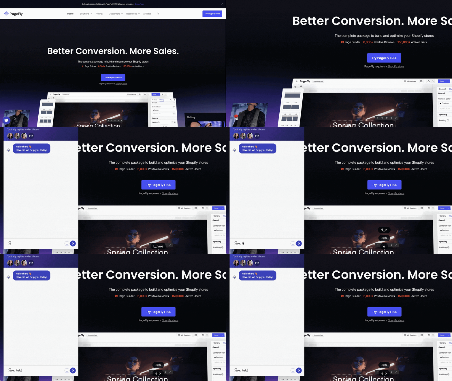
**“Chat With Us” Button**
Alternatively, you can access it from our Help Center. Simply scroll to the bottom of the page, where you'll find the "**Chat with Us**" button. Clicking on it will open our live chat, and our operators will be on hand to answer any questions you have about PageFly.
#### From The PageFly App
**Header Bar**
On the header bar of the PageFly dashboard, you can click on the 3-dot icon here and select the '**Get support**' option to contact our support team.
**Bubble Chat**
On the bottom left of the PageFly dashboard, you can see the button "**Open 24/7 Live Chat"**. You just need to click on this button, a chatbox will be shown up so you can compose your message to chat with our support team.
**PageFly Editor**
Within the PageFly editor's header bar, you can click on the icon “**?**” and choose the “**Start live chat**” option.
Alternatively, on the left-hand navigation bar, towards the bottom, you'll also find our live chat icon. Clicking on it will open the live chat window.
#### From The PageFly App Listing
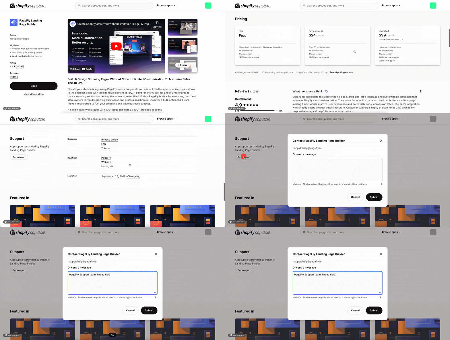
Access [PageFly App Listing](https://apps.shopify.com/pagefly?_gl%253D1*8xh9jt*_ga*MTkwMjIwOTMyOS4xNzA5NzgzNDQ5*_ga_0BK6F6GXYF*MTcwOTc5OTQ0Ni4zLjAuMTcwOTc5OTQ1Mi41NC4wLjA.%26_gl%3D1*49c7zo*_gcl_au*MjA2NjUxNjEwNS4xNzM0MzE0MzI1*_ga*NDcyNTc5MDAxLjE3MzQzMTUyNzI.*_ga_0BK6F6GXYF*MTczNDMxNTI3Mi4xLjEuMTczNDMxODI5OC41Mi4wLjA.) in Shopify App Store, then click on Get Support button, describe your issue in the form, and click Submit. Your message will be sent to PageFly support via email
#### Via Email
You can contact PageFly support by sending a direct email to
#### Via Contact Us Form
Simply submit a request through our convenient [Contact Us form](https://pagefly.io/pages/contact) to reach out to our expert support team for assistance.
### Use Case
For example, you are working on your page layout and encounter a problem with a PageFly element. You can get real-time help by accessing live chat directly in the PageFly editor. Alternatively, use the Contact Us form or join our social media communities to connect with us for assistance.
### Tips And Best Practice
#### Elaborate The Question/Issue With A Screenshot Or A Video
Share visuals - Send screenshots or videos ([Loom](https://www.loom.com/login) recommended) to explain your issue. English-speaking staff and translators are available.
#### Provide The Url Of The Live Page/The Url Of The Page Editor
In some cases, our operators need to see the page on live view to examine the issue and access to the PageFly page editor is also needed to resolve the problem.
#### Grant Access To Shopify Admin
If needed, we’ll request limited access to your Shopify Admin to resolve the issue. Simply visit your Shopify store administration => “**Home**” section and accept the request.
The request should look like this:
Last but not least, do not hesitate to contact us via the Live chat if you have any questions or need help, our Support team is available 24/7 to assist you!
### Frequently Asked Questions
**1. How quickly can I expect a response?**
Support is available 24/7, with initial responses typically within minutes.
**2. Can I send an email for support?**
Yes, send a direct email to or use the email option in the PageFly app.
### Additional Resources
Check out our[Support Policy](https://pagefly.io/pages/support-policy) for detailed guidelines on what our support covers and related information.
# How PageFly work with your Shopify theme?
### Overview
This guide explains [how PageFly Page Builder interacts with your Shopify theme](https://help.pagefly.io/manual/switch-theme-process-in-pagefly/), detailing the management of headers and footers, theme switching, and troubleshooting common issues for seamless integration.
### Requirements
* Install [PageFly app](https://apps.shopify.com/pagefly)
* Publish/choose the theme you want
* Basic knowledge of Shopify
### How PageFly Works with Your Theme Extension
The PageFly Theme Extension is an essential extension that must be enabled for PageFly to work properly with your current Shopify theme.
When the Theme Extension is disabled, you may encounter warnings:
* On the PageFly dashboard:

* On PageFly editor:

#### How to Enable PageFly Theme Extension
You can enable the PageFly Theme Extension using one of the following methods:
**1. Via Shopify Dashboard**
* Go to Shopify dashboard > Online Store > Themes > Navigate to the Current Theme section > Hit the button Customize.
* In the Theme Editor, select the App embeds button on the left menu.
* Search for PageFly Theme Extension and enable the app.

**2. Via PageFly Warning Message**
If you see a warning about the Theme Extension being disabled, select the Enable PageFly Theme Extension button directly from the warning.

**3. Via PageFly Dashboard**
* Go to PageFly dashboard > select Preferences on the left menu > choose Theme app extensions.
* Click the Enable now button to activate the Theme Extension.

**4. Publish a PageFly page**
When you publish a page in PageFly, the Theme Extension is automatically enabled once you hit the Publish button.

#### What To Do If I Switch The Theme?
Whenever you switch your Shopify theme, make sure to enable the PageFly Theme Extension using one of the methods mentioned above. This ensures that your new theme works properly with your PageFly pages.
### How To Switch Theme In Shopify
#### Switch Theme Process
* **Step 1: Access Themes**
From your Shopify Admin, go to Online Store > Themes.

* **Step 2: Publish Theme**
In the Theme library, select the theme you want and click Publish.

Note: For trial themes, there won’t be a Publish button. You must purchase the theme first to publish it.
For a better visual demonstration, you can watch the video tutorial below.
{% embed url="" %}
#### Switch Theme Process Function In PageFly
During the theme switch process, in the PageFly page editor, two pop-up notifications will appear automatically in the bottom right corner of all the pages you are working on. These notifications keep you informed about the status of your pages.

Click on the View details button in the pop-up at the bottom center to see detailed information about the status of all your pages.

Alternatively, you can check the process by clicking the button on the bottom left (above the Customer Support button) > select Background process > choose the process you want to check.

#### What To Do If The My Page Status Fails During Theme Switching?
If the status show fails, you can click on the failed page in the list, which will redirect you to the specific page. Then re-publish the page to ensure all pages are successfully published after switching the theme.
Note: After the theme switch process finishes, make sure to check if the PageFly Theme Extension is enabled. It should be enabled to ensure that your PageFly pages work properly with the new theme.
### How To Hide The Header/Footer of Shopify Theme With PageFly Pages
Excluding the password page; you can hide the footer and header on the regular, home, collection, product, and blog post pages created with PageFly.
By default, the header and footer come with the Shopify theme that you could use. You can hide them by opening the [Page Settings](https://help.pagefly.io/manual/page-settings) modal.
* **Step 1: Access Page Settings Modal**
In the PageFly editor, click on the Page Settings button on the left toolbar.

* **Step 2: Disable Header And Footer Option**
When the Page Settings modal appears, unselect the Show header & footer option. Click the Save button to apply your change.

* **Step 3: Publish The Page**
After saving the settings, click the Publish button to see the changes in the live view.
### Use Cases
#### Managing Consistent Headers and Footers Across Custom Pages
When creating custom pages using PageFly, maintaining a consistent header and footer can be crucial for brand identity. To maintain consistency, you can enable the header and footer in the PageFly Page Settings. This ensures that your custom pages align with the rest of your store’s design. Alternatively, if you prefer a unique layout without the default Shopify header and footer, you can disable them through the Page Settings and then publish the changes to see the result.
#### Custom PageFly Pages Do Not Display Correctly After Switching Shopify Themes
Switching Shopify themes can sometimes cause issues with the display of custom PageFly pages. To resolve this, it is essential to enable the PageFly Theme Extension within the Shopify Theme Editor. This ensures compatibility between the new theme and your PageFly customizations.
Additionally, monitoring the background processes in PageFly can help identify any failed page updates. If a page fails to display correctly, you can re-publish it from the PageFly editor to restore its proper functionality and appearance.
#### Hiding Default Product Details
To further customize product pages, you can hide Shopify's default product details:
With Theme OS 1.0
* Step 1: Click on the Page Settings icon in the left menu.
* Step 2: Scroll down to Theme’s Sections, disable Show default product details, and click Save.

For Newer Themes (OS 2.0):
* Step 1: Click on the Page Setting icon on the left menu then scroll down, choose Go to theme editor

* Step 2: In the Theme editor, click the eye icon next to default product details to hide them.

* Step 3: Save changes and check in Live view.

This customization allows for a cleaner layout that enhances user engagement by focusing attention on elements you choose to highlight.
### Tips And Best Practice
* **Enable PageFly Theme Extension**: Always enable the PageFly Theme Extension to ensure compatibility with your Shopify theme. This helps prevent display issues and maintains the functionality of your custom pages.
* **Maintain Theme Consistency**: Ensure your custom PageFly pages match the overall design of your Shopify theme. Use the same fonts, colors, and styles across all pages to create a cohesive look and feel for your store.
* **Manage Global Elements**: For elements like headers and footers, decide whether to use the Shopify theme’s default settings or customize them in PageFly. Consistent use of global elements across all pages helps maintain a unified brand identity.
### Frequently Asked Questions
**1. Can I use 2 themes for PageFly pages?**
No, you cannot. You can use only 1 theme for all PageFly pages. You must select and use a single theme for consistency.
**2. Is it possible to preview the unpublished theme for PageFly pages?**
No, it’s not possible. PageFly pages only work with the published theme. To see how your PageFly pages look with a new theme, you must publish the theme first.
**3. How can I make my PageFly pages use my new theme?**
Once you publish your theme or migrate the PageFly content from an old theme to a new one, PageFly pages will automatically apply that theme.
In some cases, some PageFly pages haven’t been synced, so you need to check again and republish these pages.
For example, if your store has too many pages that it might reach Shopify API’s limitation, some pages might not be synced properly at one time. Therefore, you should double-check all your PageFly pages.
**4. My cart is not updated automatically when adding products. How can I fix this?**
Basically, PageFly works well with Shopify themes. However, some themes with specific cart mechanisms can result in conflict with PageFly, leading to the cart drawer not updating automatically. You can check [this article](https://help.pagefly.io/manual/cart-drawer-does-not-automatically-update/) for more details about the issue.
**5. What happens if I don't turn on the Theme Extension?**
If you don't turn on the PageFly Theme Extension, many elements on your PageFly pages will not connect properly with your Shopify theme and may not function correctly. For example, interactive elements like Accordion and Tab elements may not work as intended, leading to a broken user experience.
Therefore, it's crucial to enable the Theme Extension to ensure all elements on your pages operate smoothly and are fully integrated with your theme.
# Pricing and billing
### About PageFly Pricing And Billing
It is obviously necessary for you to know all about the PageFly pricing & billing policies. The Pricing & billing section is full of information regarding this topic with related articles to all charging scenarios that may occur during PageFly use.
This section will help you to understand more about the amount you have been charged and why. You’ll also learn about the PageFly refund policy.
This section also has articles to fill you in on the details of downgrading your plan and canceling your subscription. Have a look at the articles below to learn more.
You can check our tutorial on getting started with PageFly below
{% embed url="" %}
### Related Resources
* [PageFly’s Terms Of Service](https://pagefly.io/pages/terms-of-service)
* [2024 Shopify Pricing Plans Demystified: Your Ultimate Guide To Calculating Costs](https://pagefly.io/blogs/shopify/shopify-pricing-plans)
# PageFly pricing plan
### About PageFly Pricing Plan
PageFly offers 5 pricing plans designed to match every stage of your Shopify growth — from launching your first page to running full AI-powered CRO at scale.
Each plan differs by: number of page/section slots, monthly AI credits (power AI features like AI Smart Page, AI page checkup, AI Translator), and CRO modules (analytics, A/B testing, heatmaps, and more).
#### All Plans In The Pricing Model
See the table below for all 5 plans, their pricing, slots, AI credits, and CRO modules:
All plans include: drag & drop editor, 320+ page & section templates, 200+ third-party integrations, 24/7 live chat support, and AI Smart Pages (early access).
### How To Access PageFly Pricing Plan
* Step 1: Go to the PageFly Dashboard.
* Step 2: Navigate to PageFly Plan under Preferences > Account.
* Step 3: Click on Change Plan to see all available plan options.

### How To Configure PageFly Pricing Plan
#### How To Upgrade
In the PageFly Dashboard:
* Step 1: Head to Preferences > Account > Account Status > choose Change Plan
* Step 2: Select the plan that best fits your needs.
* Step 3: Your Recurring Charge will be recalculated. Please ensure that you have selected the correct plan. Then, click the Proceed to Payment button to finalize your selection. After that, click Approve to process the payment.

#### How To Downgrade
**From Paid Subscription To Free Subscription**
To downgrade to a FREE plan, you need to UNPUBLISH your pages/ sections until 1, which is the number of published slots available on the PageFly free plan.
After you unpublish your pages or sections:
* You can still edit them and use all of the features and resources
* You are allowed to have 1 published page/ section at a time.

You can compare the FREE plan with the PAID plans from PageFly pricing plan.

{% hint style="warning" %}
**Important**: Once you downgrade to a Free plan, there's no other way to publish more than 1 page or section except for upgrading to a paid plan.
{% endhint %}

{% hint style="info" %}
**Note**: After downgrading, if you switch into a higher plan, its plan benefits still be performed fully as normal.
{% endhint %}
**From higher paid subscription to lower paid subscription**
To downgrade to a lower-paid plan, you need to UNPUBLISH your pages/ sections to the number of slots that your selected plan allows to publish.

For example, if you want to downgrade your paid plan from 40 slots to 10 slots, you have to unpublish the pages and section to 10. This number will vary depending on the plan you choose.
#### Transition From Old (Silver/Gold/Platinum) To New Pricing Model
1\. On your PageFly Dashboard, look for a notification. It says, "**We are switching to a usage-based pricing model to help you save more by only paying for what you actually use.**" Click “**Switch Now**” if you want to change.
2\. After clicking “**Change Plan**”, select the plan that suits your needs.

### Common Cases (Tips & Best Practices)
#### When Should You Upgrade?
* Optimize Sales Funnels: Build high-performing home, product, and landing pages to reduce bounce rates and boost conversions.
* Enhance Branding: Create essential pages like:
* Contact Us Page
* About Us Page
* FAQs Page
* Perform A/B Testing: Publish multiple versions of a page to identify the best design for conversions.
* Manage Multiple Products: Create personalized product pages for better audience targeting.
#### When Should You Downgrade?
* If you don’t need as many pages or saved sections, consider moving to a lower plan to save costs.
### Frequently Asked Questions
**1. Can I switch back to the old pricing plan after upgrading?** No, once you switch to the new pricing model, you cannot revert to the old plans.
**2. What happens if I downgrade to the Free Plan?** You’ll need to unpublish pages/sections until there’s only 1 slot remaining.
4. **Can I upgrade my plan anytime? Yes — your recurring charge updates automatically when you switch plans.**
**5. Will the slot price change depending on the page type?** No, all page types are counted equally as one slot.
### Version Update
The 5-tier pricing model (Free / Builder / Optimize / Accelerate / Power) replaces the previous slot-based model. Key changes:
* Plans are now differentiated by CRO modules and AI credits, not just slot count.
* Unlimited slots available from Accelerate ($99/mo) and above.
* All plans are monthly only — no annual toggle.
If you want to know more about our old pricing plan, kindly check [this](https://pagefly.io/blogs/shopify/pagefly-2-9-0-new-pricing-plans-page-analytics-covid-19-response) out.
# How PageFly billing work?
While Shopify simplifies the subscription and billing cycle of PageFly, changing your pricing plan could lead to different scenarios.This article will help you [calculate the charged amount when you cancel PageFly, or downgrade/upgrade your current plan.](https://help.pagefly.io/manual/billing-description-month-charge/)
### About PageFly Recurring Charges
You pay a monthly subscription to PageFly via [Shopify App charges](https://help.shopify.com/en/manual/your-account/manage-billing/your-invoice/apps). We do not have any special charging model except the one that’s officially allowed and supported by [Shopify](https://www.shopify.com/).
There are a few things to keep in mind:
* PageFly offers a forever Free plan; therefore, the billing cycle only begins when you start using a paid plan. For example, you will be charged when you explicitly approve the charge in the store administration interface.
* PageFly’s subscriptions are billed on an independent, 30-day billing cycle. Although the subscription is billed at the same time as Shopify subscription, due to the independent billing cycle, PageFly's cycle may end before Shopify's.
For more information about Shopify billing, you can check these articles here:
* [Shopify billing overview](https://help.shopify.com/en/manual/your-account/manage-billing/your-invoice/invoice-overview)
* [Shopify charges](https://help.shopify.com/en/manual/your-account/manage-billing/your-invoice/charges)
PageFly’s current pricing plan can be reviewed below:

### Switch PageFly Plan
You can switch your PageFly plan anytime you want.
When you switch to another PageFly paid plan, PageFly will prompt you to agree to a new recurring subscription. This is because Shopify only allows one subscription to be enabled at a time. The existing subscription will be canceled immediately and replaced by the new one.
#### Switch Plan At The End Of Billing Cycle
When you switch your PageFly plan at the end of your current billing cycle, the charge for your old plan stops immediately, and the charge for your next cycle is automatically updated to reflect your new subscription. This process works the same way whether you're upgrading or downgrading your plan.
When you downgrade to a Free plan, your current subscription will be canceled immediately, and Shopify will not create a new subscription for you.
#### Switch Plan In The Middle Of Billing Cycle
When you switch PageFly plan in the middle of your current PageFly billing cycle, the charge is prorated based on the difference in plan price and the number of days remaining in the billing cycle. This is to ensure that you will not be overcharged by the plan you are not using.
After you have switched the plan, at the end of your Shopify billing cycle (when you receive your bill), PageFly charges can be calculated as:
With 30 as the total number of days in a cycle.
**In Case Of Upgrade**
For example, if you upgrade from $29 plan to $59 plan when your PageFly billing cycle has started for 10 days, your PageFly charges at the end of that billing cycle will be:
So in this billing cycle, Shopify will charge you $49.
**In Case Of Downgrade**
Using the similar calculation method, if you downgrade from $59 plan to $29 plan when your PageFly billing cycle has started for 10 days, your PageFly charges at the end of that billing cycle will be:
So in this billing cycle, Shopify will charge you $39.
In case when you downgrade to Free plan in the middle of your current billing cycle, Shopify will still charge you the full amount of that billing cycle, following [Shopify’s policy here](https://shopify.dev/docs/apps/billing/subscriptions).
However, should you perceive any discrepancy or unfairness, please kindly contact our team via Live Chat. We will recheck your billing cycle, and in reasonable cases, initiate a request to Shopify for a refund for the remaining duration of the PageFly billing cycle.
### Uninstall & Reinstall PageFly app
#### Uninstall PageFly app
When you [uninstall the app](https://help.pagefly.io/documentation/pagefly-what-happens-if-i-uninstall/), your subscription will be automatically canceled, and you won’t be charged for any following PageFly billing cycles.
In case when you uninstall PageFly in the middle of your current billing cycle, Shopify will still charge you the full amount of that billing cycle, following [Shopify’s policy here](https://shopify.dev/docs/apps/billing/subscriptions).
However, should you perceive any discrepancy or unfairness, please kindly contact our team via Live Chat. We will recheck your billing cycle, and in reasonable cases, initiate a request to Shopify for a refund for the remaining duration of the PageFly billing cycle.
#### Reinstall PageFly app
When you reinstall the app and upgrade to a new plan, Shopify will create a new PageFly’s billing cycle. This new billing cycle will work separately from any previous billing cycle you had before upgrading, with a different end date.
### Pause & Unpause Shopify Store
#### Pause Shopify Store
According to [Shopify](https://help.shopify.com/en/manual/your-account/pause-deactivate-store%23pause-and-build-your-store), pausing your store means downgrading to a Shopify plan with a lower cost of $9 per month. You still have the ability to enter your Shopify admin to modify your products as necessary; however, your checkout functionality is turned off. As a result, while customers can browse your products, they are unable to complete purchases.
If you pause your store when PageFly app is not downgraded to Free plan, or uninstalled, PageFly app and your current subscription will still remain active.
If you want to avoid being charged during the pausing period, you can consider [downgrade to Free plan](https://help.pagefly.io/manual/billing-description-month-charge/#in-case-of-downgrade).
#### Unpause Shopify Store
When you're ready to start selling your products again, you can unpause your store. PageFly subscription will remain the same after you unpause your store.
### Close & Reopen Shopify Store
If you close your store when PageFly app is not downgraded to Free plan, or uninstalled, PageFly app will remain installed in your store, but the subscription will be canceled immediately.
However, if you close your store in the middle of the billing cycle, you will still have to pay for the cycle that started before you closed the store. If you did not pay for this cycle, you are still charged once you reopen your store.
### Freeze & Unfreeze Your Store
Your store will be frozen if you refuse to approve charges for Shopify multiple times, and will not be unfreezed until you have paid all outstanding charges, following [Shopify’s policy](https://help.shopify.com/en/manual/your-account/frozen-store).
If your store is frozen when PageFly app is not downgraded to Free plan, or uninstalled, PageFly app will remain installed in your store, but the subscription will be canceled immediately.
To reactivate or unfreeze your store, you need to pay any outstanding charge. In case the store is re-opened within 30 days, Shopify will unfreeze your account and the recurring app charges resume.
### Frequently Asked Questions
**1. Why am I getting charged twice for the same month?**
If PageFly app charges happen after your Shopify bill period ends but before the app's bill starts over, those extra app fees will show up on your next Shopify bill, following [Shopify’s policy here](https://help.shopify.com/en/manual/your-account/manage-billing/your-invoice/apps). Rest assured that you will not be billed two times for the same PageFly billing cycle.
**2. Why am I getting charged even when I canceled my subscription right after upgrading?**
When you first agree to pay for an app, you get charged. Then, you get charged again on the first day of the app's billing period. So, if you add an app and remove it just a day or two later, you'll still see a charge for it on your bill, following [Shopify’s policy here](https://help.shopify.com/en/manual/your-account/manage-billing/your-invoice/apps).
# What happens if I uninstall PageFly?
## Overview
In this article, you will learn about how to uninstall PageFly and what will happen to your PageFly pages if you uninstall the app from your Shopify store.
By following this article, you can uninstall PageFly without encountering any unexpected obstacles.
{% hint style="danger" %}
**Important warning**: Once uninstalled, all your PageFly data and published content will be permanently deleted and cannot be recovered, even if you reinstall the app.
{% endhint %}
## PageFly Uninstall Agreement
You must agree to the uninstallation terms before proceeding:
{% hint style="info" %}
By proceeding with the uninstallation, you agree to the following terms and acknowledge the consequences of removing PageFly from your store.
**1. Data deletion**
* All data stored within PageFly will be permanently deleted.
* All content published through PageFly will be removed from your Shopify theme and will no longer be visible on your live store.
* This deletion is immediate upon confirmation and is irreversible.
**2. Subscription and Billing**
* Your PageFly subscription will be terminated immediately, thereby ending any contractual obligations between you and PageFly.
* Billing and charges may continue until the end of your current Shopify billing cycle, as governed by Shopify's App Billing Cycle Policies.
* Any pricing policies, discounts, special offers, or promotional rates managed by PageFly will end.
**3. Process and Irreversibility**
* Once initiated, the uninstallation and data deletion process can't be paused or canceled.
* Interrupting the process by closing the browser or quitting may result in partial deletion, potentially causing display issues on your store.
* PageFly doesn't retain backups of your data after uninstallation.
{% endhint %}
**Before proceeding, please note**
* The uninstall process will automatically terminate your subscription; Shopify will handle all billing matters according to Shopify's policies.
* Backing up your created pages, sections, or any important content you may want to use later. See [how to export PageFly pages and sections](https://help.pagefly.io/pages-and-sections-creation/general/export-import-pages#how-to-export-pagefly-page)
* You can follow [this article](https://help.pagefly.io/manual/pricing-plans/%23how-to-downgrade) to downgrade your plan to the Free plan instead of uninstalling.
## How To Uninstall PageFly
### Step 1: Access the uninstall process
Go to **Preferences > Account > Uninstall PageFly**

### Step 2: Survey questions
You'll be presented with a brief survey about your reasons for uninstalling PageFly.

### Step 3: Agreement acceptance (Required)
You must agree to the uninstallation terms to proceed. Read the terms, then check the agreement box.

### Step 4: Data deletion (Required)
Once you confirm delete, PageFly will begin removing **all data**, including:
**PageFly app data:**
* All PageFly pages and sections
* All Page analytics data
* All A/B testing campaigns and analytics data
* All option swatches
* All uploaded fonts
* All configured global styles
* All saved templates and sections
* All trashed items
**Published theme content:**
* All published PageFly pages and sections
* All PageFly code and theme modifications made by PageFly
{% hint style="danger" %}
**Critical note**: This process cannot be reversed once started. Closing your browser during this process may result in partial deletion and display issues on your store.
{% endhint %}

### Step 5: Final step
After data removal is complete, you'll see a "One final step" message. Click the **"Go to Shopify settings"** button to complete the process.
You'll be redirected to **Shopify Settings > Apps and sales channels**. Click the **Uninstall** button next to PageFly.

A notification on the Shopify Apps page will confirm that PageFly has been successfully deleted.
## Tips and best practices
### Double-check and remove all PageFly code in your Shopify store
Please kindly follow these steps:
1. Go to your **Online store** > **Themes** > **Edit Code**
2. Enter “**PageFly**” in the search bar to filter all PageFly liquid files
3. Delete liquid files containing "pagefly" in their name.
4. Open the **Theme.liquid** file > Find all PageFly code and delete it
Scroll down > Open Locales folder > Open en.default.json file > Find and delete this PageFly code:
```jsx
"pagefly": {
"products": {
"product": {
"regular_price": "Regular price",
"sold_out": "Sold out",
"unavailable": "Unavailable",
"on_sale": "Sale",
"quantity": "Quantity",
"add_to_cart": "Add to cart",
"back_to_collection": "Back to {{ title }}",
"view_details": "View details"
}
},
"article": {
"tags": "Tags:",
"all_topics": "All topics",
"by_author": "by {{ author }}",
"posted_in": "Posted in",
"read_more": "Read more",
"back_to_blog": "Back to {{ title }}"
},
"comments": {
"title": "Leave a comment",
"name": "Name",
"email": "Email",
"message": "Message",
"post": "Post comment",
"moderated": "Please note, comments must be approved before they are published",
"success_moderated": "Your comment was posted successfully. We will publish it in a little while, as our blog is moderated.",
"success": "Your comment was posted successfully! Thank you!",
"comments_with_count": {
"one": "{{ count }} comment",
"other": "{{ count }} comments"
}
},
"password_page": {
"login_form_message": "Enter store using password:",
"login_form_password_label": "Password",
"login_form_password_placeholder": "Your password",
"login_form_submit": "Enter",
"signup_form_email_label": "Email",
"signup_form_success": "We will send you an email right before we open!",
"password_link": "Enter using password"
}
}
```
If you have assigned a single product page to multiple products, locate the **product.liquid, collection.liquid, and index.liquid** files in your theme directory to revert each file to its original version.
{% hint style="warning" %}
Please note that if you notice any remaining code or require assistance, please contact our 24/7 support team for help.
{% endhint %}
## Alternative to Uninstalling
**If you're unsure about permanently removing PageFly**, consider these alternatives:
1. **Downgrade to Free plan**: If cost is a concern, you can downgrade to continue using PageFly with 1 publishable page/section.
2. **Archive important content**: Export and save your pages and sections before uninstalling.
{% hint style="danger" %}
**Important**: If you uninstall PageFly and later reinstall the app, you'll be subject to current pricing plans. Previous pricing arrangements, discounts, or grandfathered rates will not be restored.
{% endhint %}
## Need help?
If you're experiencing issues or have concerns, please contact our **24/7 support team** before uninstalling. We're here to help resolve problems and may offer solutions you haven't considered.
## Frequently Asked Questions
### 1. Is it possible to restore data after uninstalling PageFly?
**No, data restoration is not possible since you confirmed the deletion.**
Once the data deletion process begins, all data will be permanently deleted immediately and cannot be recovered. There is no grace period or temporary storage of your data.
If you need to keep any designs or content, you must manually back them up before starting the uninstall process.
### 2. What happens to my live store after uninstalling PageFly?
**Your live store will be immediately affected:**
* All pages and sections created with PageFly will be removed from your store.
* Your store will revert to using default theme templates where PageFly was previously active.
* Any custom PageFly styling or functionality will be lost.
**To minimize disruption**, ensure you have alternative pages ready or be prepared for temporary display issues while you rebuild your store's design.
### 3. What about my subscription and billing?
**Billing changes:**
* Your PageFly subscription is terminated immediately upon uninstallation.
* You may continue to be charged until the end of your current Shopify billing cycle (this is managed by Shopify's billing system, not PageFly).
* Any special pricing, discounts, or promotional rates will be permanently lost.
* If you reinstall PageFly later, you will be subject to the pricing plans in effect at the time of your installation.
### 4. Can I stop the data deletion process once it starts?
**The process behavior depends on which stage you're at:**
**During the data removal process:**
* If you close or reload the page while data is being removed, the process will stop
* However, any data that was already deleted before the interruption will remain permanently irrecoverable
* You may end up with partially deleted data, which can cause display issues on your store
**After data removal is complete:**
* If you don't complete the final step (deleting PageFly in Shopify settings), you will be redirected to the PageFly dashboard
* At this point, your PageFly data will already be gone and cannot be restored
* Your app will still be technically installed in Shopify, but with no usable data
**Important considerations:**
* Interrupting the process can leave your store in an unstable state with some PageFly elements removed but others remaining
* If you accidentally interrupt the process, you should still complete the final Shopify uninstall step to avoid confusion
* Contact our support team immediately if you experience issues due to an interrupted uninstall process
**Recommendation:** Once you start the uninstall process, it's best to let it complete fully without interruption to avoid potential issues with your store's display and functionality.
### 5. Will I receive confirmation of the uninstallation?
**Yes**, you will receive:
* Visual confirmation within the PageFly app during the process.
* Confirmation from Shopify once you complete the final uninstall step in the Shopify admin.
* Email notification confirming the completion of uninstallation.
### 6. What if I change my mind after uninstalling?
**Unfortunately, there's no way to recover your previous data.**
If you decide to use PageFly again:
* You'll need to reinstall the app from the Shopify App Store
* You'll start with a completely fresh PageFly app.
* You’ll be subject to the pricing plans in effect at the time of your installation.
***
**Still need help?** Contact our 24/7 support team through live chat before making your final decision. We're here to help you find the best solution for your needs.
# PageFly refund policy
*Last updated: July 10, 2026 · Applies to all PageFly paid subscriptions billed through Shopify*
#### Our approach to refunds
PageFly's free plan lets you build and publish using our core editor at no cost, so you can evaluate the product before subscribing to a paid plan. Paid plans unlock additional capacity and features — more pages, advanced elements, and premium integrations — and because these become available immediately after upgrading, they're generally expected to be evaluated shortly after purchase. That's why our standard refund window is short.
We aim to apply this policy consistently while giving genuine consideration to exceptional circumstances. If your situation doesn't fit neatly into the categories below, we'd still rather hear from you than have you assume the answer is no — we review every request individually.
This page explains when a refund applies, when it doesn't, and how to request one.
#### 1. When you can get a refund
We review refund requests submitted within **7 days of the charge** for any of the following:
| Situation | Example |
| --------------------------------------------------------------- | ------------------------------------------------------------------------------------------------------------------------------------------------------------------------------------------ |
| A major problem affected your account | A confirmed PageFly bug caused data loss, broken pages, or a published page went down for reasons unrelated to a change you made |
| You cancelled a monthly plan mid-cycle | You downgraded on day 12 of a 30-day monthly cycle — the unused days are refunded on a prorated basis. *Prorated day-based refunds apply to monthly subscriptions only, not annual plans.* |
| You were charged after downgrading to Free | A new charge appeared after you had already moved to the Free plan, typically due to billing-cycle timing |
| A core paid feature you materially relied on became unavailable | A confirmed PageFly change removed or broke a feature your store's paid plan depended on — not a general product change or a third-party integration change unrelated to PageFly |
| An unresolved, active support case affected billing | You had an open support case tied to a billing or product issue, and your plan renewed while it was awaiting our response |
| An accidental or duplicate charge | Two charges for the same billing period, or a charge that should not have been triggered |
**Refunds are limited to the current or most recent billing cycle.** We don't issue refunds covering multiple historical billing periods, unless required by law or due to a confirmed, exceptional platform error.
**Refund requests should be submitted as soon as reasonably possible after the charge.** Requests submitted long after the relevant billing cycle are generally not eligible under this policy.
If your situation doesn't clearly fit one of the categories above, contact us with the details — exceptional circumstances may be considered on a case-by-case basis. Some non-billing issues, such as lost sales from a product defect, may be better addressed under our [Compensation Policy](https://pagefly.io/pages/compensation-policy) rather than this one.
*Submitting a refund request does not guarantee that a refund will be approved.*
#### 2. When a refund doesn't apply — and why
We've explained the reasoning behind each of these so it's clear where the charge comes from, not simply that a refund isn't available.
**The billing cycle was fully used.** PageFly bills in 30-day cycles. If a cycle already ran its full course before cancellation, it's considered used for that period, regardless of how actively the account was used. If a *new* charge was generated for the following cycle, that charge is evaluated separately — so it's worth reaching out if you think that applies to you.
**The plan was actively in use.** If published pages remained live under your paid subscription during the billing period, the plan was serving your store for that period, and the charge reflects that. If you believe the pages in question weren't actually live or functioning, let us know which pages and we'll review the account with you.
**The plan change was made from inside your store.** PageFly can't change your Shopify billing plan remotely — plan changes are approved by someone with admin access to the store, inside the Shopify admin. A charge resulting from an authorized plan change made on the store side isn't treated as a PageFly billing error, but we're glad to help you understand what happened and switch back.
**The charge belongs to Shopify or another app.** Taxes, your Shopify subscription, and charges from other installed apps fall outside PageFly's billing and outside what we can refund. We'll identify the PageFly portion, if any, and point you to the right party for the rest.
#### 3. What happens to your pages if you request a refund
**Please don't uninstall PageFly before your case has been reviewed.** While the app is installed, we can investigate and restore lost or disrupted data. Once uninstalled, PageFly data is deleted permanently and cannot be recovered.
* **Downgrading to Free** keeps your account and pages intact while your request is reviewed. → [What happens if I downgrade?](https://help.pagefly.io/getting-started/pricing-and-billing/pricing-plans#frequently-asked-questions)
* **Uninstalling** removes everything permanently and immediately. → [What happens if I uninstall?](https://help.pagefly.io/getting-started/pricing-and-billing/what-happens-if-i-uninstall-pagefly)
We recommend **downgrading to Free rather than uninstalling** while a refund request is under review.
#### 4. How to request a refund
| Step | What happens | Timeframe |
| ------------------------------------------ | ----------------------------------------------------------------------------------------------------------------------------------------------------------------------------------- | --------------------------------- |
| **1.** Check your case against this policy | Review sections 1–2 above | — |
| **2.** Contact us | [Live Chat](https://help.pagefly.io/getting-started/quick-start/how-can-i-access-the-pagefly-live-chat) in the app, or the [Contact Us](https://pagefly.io/pages/contact) page | Acknowledged within 24 hours |
| **3.** Share your billing details | Your Shopify bill for the relevant cycle (**Settings → Billing → Billing for target period → Download**, or a screenshot), and confirmation that your linked bank account is active | — |
| **4.** We review the request | Our team checks the account, billing history, and, where relevant, published pages | Decision within 3–5 business days |
| **5.** We process the outcome | A refund or App Credit is issued if approved | See Section 5 |
#### 5. How and when you'll receive your refund
| Bill status | Options |
| ------------------ | -------------------------------------------------------------------------------------------------------------------------------------------------------------------- |
| Cycle already paid | The refund is processed with Shopify back to your original payment method. |
| Cycle not yet paid | Wait until the charge settles and it's then refunded, or receive **App Credit** immediately — applied toward the PageFly portion only, and usually the faster route. |
Most refunds appear within **3–5 business days**, though some payment providers may take longer. If a refund is delayed, the most common causes are missing billing information or an issue with the linked bank account — so double-checking those first can save time.
*Nothing in this policy limits any statutory rights you may have as a consumer under the laws of your country or region.*
#### 6. How this compares to the platform standard
Per [Shopify's official policy on third-party app charges](https://help.shopify.com/en/manual/your-account/manage-billing/refund-policy-subscriptions), refunds for app subscriptions are at the developer's discretion, and Shopify generally facilitates them only within 7 days of the charge. We follow that same review window — and wherever we can, we explain the reasoning behind our decisions rather than simply pointing to a rule.
#### 7. Other terms
**Merchant responsibility.** Merchants are responsible for managing their subscriptions, plan changes, and app installations within Shopify. Forgetting to downgrade, uninstall, or cancel a subscription does not by itself make a charge refundable.
**Preventing abuse.** We reserve the right to decline refund requests where there is evidence of abuse, repeated or excessive requests, fraudulent activity, or attempts to circumvent this policy.
**Final decisions.** If, after review, we determine that a refund isn't appropriate under this policy, that decision is normally final unless new information becomes available.
**Choice of remedy.** PageFly determines the most appropriate remedy based on the circumstances, which may be a prorated refund, App Credit, or another reasonable resolution. A refund isn't automatically provided where another reasonable remedy is more appropriate.
**Definitions.** A "confirmed" PageFly issue means one reproduced or verified by our Support or Engineering team.
#### 8. Frequently Asked Questions
**How do I request a refund from PageFly?**
Check your case against Sections 1–2, then contact us via Live Chat or the Contact Us page with your billing details. Requests are acknowledged within 24 hours and decided within 3–5 business days.
**Will downgrading or uninstalling affect my refund?**
Downgrade to Free instead of uninstalling. Keeping the app installed allows us to investigate your case and verify account data more effectively. Uninstalling permanently removes PageFly data and may limit our ability to review your request.
**Why was I charged after I downgraded?**
Billing cycles and plan changes don't always line up to the same day. If a new billing cycle started just before your downgrade took effect, Shopify may have generated a charge for that cycle. Contact us with your store URL and the relevant Shopify billing invoice (or a screenshot of the charge), and we'll review whether the charge is eligible for a refund or App Credit.
**Why do I see two PageFly charges on one bill?**
This almost always happens when you switch plans mid-cycle. Shopify treats a plan change as a proration: it closes out the charge for your previous plan and opens one for the new plan, so both can land on the same bill. It looks like a double charge, but together the two amounts simply cover the single period split across two plans — you're not being billed twice for the same thing. If the numbers look off, send us the bill and we'll walk through it line by line.
**I'm on an annual plan — does the 7-day window still apply?**
Annual subscriptions follow the same 7-day review window. Note that the prorated, day-based refund for unused time applies to monthly plans only — it doesn't apply to annual subscriptions. If exceptional circumstances apply, reach out and we'll look at your specific situation.
**Can I get a refund if I simply changed my mind or found the app too complex?**
Because the free plan lets you evaluate the core editor before paying, a change of mind alone generally isn't eligible for a refund. If the issue relates to a specific paid feature not functioning as described, contact us with the details — that's something we can look into.
**I forgot to downgrade my plan. Can I get a refund?**
Plan management is the merchant's responsibility, so forgetting to downgrade or uninstall doesn't normally qualify for a refund on its own. That said, if you believe a billing error occurred, contact us and we'll review your account.
#### Related resources
* [What happens if I downgrade PageFly?](https://help.pagefly.io/getting-started/pricing-and-billing/pricing-plans#frequently-asked-questions)
* [What happens if I uninstall PageFly?](https://help.pagefly.io/getting-started/pricing-and-billing/what-happens-if-i-uninstall-pagefly)
* [How to access PageFly's 24/7 Live Chat](https://help.pagefly.io/getting-started/quick-start/how-can-i-access-the-pagefly-live-chat)
* [PageFly Compensation Policy](https://pagefly.io/pages/compensation-policy)
* [Shopify's official refund policy for app charges](https://help.shopify.com/en/manual/your-account/manage-billing/refund-policy-subscriptions)
# Overview
### About Pages And Sections Creation Category
Welcome to the Pages And Sections Creation Category!
The "Pages And Sections Creation" category provides comprehensive guidance on creating, customizing, and managing pages and sections within PageFly. It covers principles, best practices, and step-by-step tutorials for leveraging PageFly's powerful page builder tools to create visually appealing and functional websites.
# General
### About General Category
Welcome to the General Category!
The "General" category in the PageFly Help Center serves as an introduction to the fundamental concepts and functionalities related to pages and sections within the PageFly Page Builder. This category provides essential information and guidance for users of all levels, ensuring a solid understanding of the basics before delving into more advanced topics.
# Setting up PageFly Pages
### About PageFly Page Settings
[PageFly Page Settings](https://help.pagefly.io/manual/page-settings/) is the pack of settings to customize and optimize your PageFly page’s features, utilizing 6 page types: Regular, Home, Collection, Product, Password, and Blog Post pages.
The purpose of setting up pages in PageFly is to enhance the visual appeal and functionality of your online store, making it more engaging and user-friendly. Customization allows for a better shopping experience, potentially increasing conversion rates and customer retention.
This setup is applicable for creating stand-alone pages, landing pages, marketing campaign pages, and more.
Before diving into the specifics, a video tutorial is recommended for a comprehensive understanding of how to modify page settings from the PageFly page editor.
{% embed url="" %}
### How To Access PageFly Page Settings In Page Editor
You can find the Page Settings within the Page Editor interface.
Here is the way to access it:
* Step 1: Click on the gear icon on the left menu bar to access the Page Settings.
* Step 2: There are some options for you to set up. We will go through each option in the next section.

### What Can Be Set Up In PageFly Page Settings
Basic settings include configuring page titles, types and URLs, theme template names, and theme sections. This step-by-step guide ensures users can swiftly start enhancing their pages:
#### Page Title
Easy customization of the page’s title here:

#### Page Types & Page URL
Selection from six types, each with unique settings like Page URL, Additional Info, and Page Assignment based on the type chosen.
1. Regular Page: A standalone page, landing page ([About us](https://help.pagefly.io/manual/how-to-create-an-about-us-with-pagefly/), [Contact us](https://help.pagefly.io/manual/how-to-create-an-about-us-with-pagefly/),...) or subpage for a marketing campaign of your store promotion. The Page URL will look like “
2. [Home Page](https://help.pagefly.io/manual/how-to-create-a-homepage-with-pagefly/): A stunning brand-new introductory page for your store.
3. [Collection Page](https://help.pagefly.io/manual/add-more-content-to-my-shopify-collection-page/): An add-on to attach more content to your current Shopify collection page, or a new one to fully replace Shopify’s default collection page.
4. [Product Page](https://help.pagefly.io/manual/add-more-content-to-my-shopify-product-page/): An add-on to attach more content to your current Shopify product page, or a new one to fully replace your Shopify default product page.
5. [Password Page](https://help.pagefly.io/manual/create-password-page/): A beautiful look to notify, entertain, or capture contacts of visitors when your store is under construction.
6. [Blog Post](https://help.pagefly.io/manual/create-a-blog-post-page/): A custom blog entry page to promote marketing content, your products or your brand.

The URL address of the page is shown here

{% hint style="info" %}
**Note**: the Page URL, Additional Info and Page Assignment will change according to the Page Type
{% endhint %}
#### How to Switch Page Types
* Step 1: Click gear icon to open the Page Settings
* Step 2: Head to the Page Type option > Choose the page type you want. In this case, we choose the Regular page.
* Step 3: Save the page

#### Theme Template Name
When you create a page on PageFly, a new page template will be created on the Shopify theme too.
The Theme Template Name shows you the name of the page on Shopify theme so that you can use it to find a page on the theme or select the page for the Theme template on Shopify
{% hint style="info" %}
**Note**: This parameter won't show for Home page and Password page.
{% endhint %}

#### Theme’s Sections
PageFly allows you to show or hide the theme’s header and footer or choose specific theme sections to display with your PageFly pages.
To learn more about managing headers, footers, and theme integration, check out the guide [How PageFly work with your Shopify theme](https://help.pagefly.io/manual/switch-theme-process-in-pagefly/).
| | |
| -------------------------------------------------------------------------------------------------------------------------- | ---------------------------------------------------------------------------------------------------------------------------------------- |
| Regular page, Home page, Password page, Collection page, Product Page \| You can choose to hide/show the Header and Footer |  |
| Blog post page |
You can choose to hide/show:
- Header / footer - Blog post Info
- Assigned Tags - Featured Image
- Comment Form
|
| | |
#### Social Sharing Image
You can control the image shown when sharing on social media here (only applied for Regular page).
To use the Social Sharing Image, the page must be published.
Click on the “**Add files**” button to open the Image Manager > Select image > hit “**Done**” button.

You can click on the Check status to check if the image has been uploaded or not. But please note that there might be some delay from Facebook’s side so if you don’t see the image, please try to open the page in incognito mode or wait for a few minutes.

#### Optimization
Optimization allows enabling or disabling lazy loading for images to improve page load speed by reducing transferred data. This helps enhance performance and user experience.
{% hint style="info" %}
**Note**: From PageFly 4.13.0 onwards, the lazy loading settings will appear in each image's General tab. The Optimization option here will only affect old images that were added before version 4.13.0. You can read more about the Image element in this article.
{% endhint %}

### How To Work With PageFly Page Assignment
Specific to product or collection pages, the Page Assignment section will show up above the Page Settings icons so that you can assign product(s) or collection(s) for that page.

In Page Assignment, you can select which product(s) or collection(s) to apply to your corresponding product or collection page by following these steps:
* Step 1: Click on the tag icon above the Page Settings icon to access "Page Assignment"
* Step 2: Assign products/collections to the page. There are 2 ways to assign products/collections:
* All products / All collections: The page will be applied to all product or collection pages on your store

* Custom Products / Custom collections: The page will be applied to specific product or collection pages. Click on "Add products" or "Add collections" to select the pages to apply. You can select multiple products or collections.

### Frequently Asked Questions
**1. How many page types can I choose?**
Six, including Regular Page, Home Page, Collection Page, Product Page, Password Page and Blog Post.
**2. Can I Change The Page Types?**
Of course, you can easily change the page type by clicking the field “Page Type’’ and selecting it from the dropdown.
**3. Why Can't I Save The Settings?**
With Product and Collections Page, please make sure that you’ve assigned the corresponding product(s)/ collection(s) to the page before saving Page Settings.
# What type of pages that PageFly support?
So, what are types of page supported in PageFly Page Builder? In this article, you will learn about[page types](https://help.pagefly.io/manual/page-types/) supported by the PageFly page builder.
You can read more about creating a new page with PageFly [here](https://help.pagefly.io/manual/get-started-in-5-mins/).
### About PageFly subscription Plan
The number of pages and sections which you want to publish can be limited due to your PageFly plan.
Your pricing plan will be depended on the published page you want. For example, if you want to publish 20 pages, you can choose the 20 slots plan. Each slot here means a published page or section. And each slot can be any page type: home page, product page, collection page, regular page, blog post page, or saved section.
### Six Supported Page Types
#### Regular Page
A standalone page, landing page, or subpage for your store and campaign. You can use regular pages to create an About Us page, FAQ page, Contact Us page, or even a landing page.
#### Homepage
A brand-new efficient home page that visitors first see when they go to your store.
#### Collection Page
An embedded page that adds more content to your existing collection page below the Shopify content.
#### Product Page
An embedded page that adds more content to your existing product page below the Shopify content.
#### Password Page
A customized page to notify or entertain visitors when the front-end password is enabled.
#### Blog Post
A blog post to talk about your brand or product.
In the[PageFly templates library](https://pagefly.link/FDHBhqND), we provide all page types so you can choose.
Watch this playlist to learn more how to create each page type in PageFly:
[https://www.youtube.com/playlist?list=PLJrJOSZ-86tqQ8oWyHj8RjOgjMy18NxTy](https://www.youtube.com/playlist?list%3DPLJrJOSZ-86tqQ8oWyHj8RjOgjMy18NxTy)
### How To Switch Page Types
For example, if you want to change from a product page to a reqular page, you can follow the following steps.
* Step 1: Click gear icon to open the Page Settings
* Step 2: Head to the Page Type option > Choose the page type you want. In this case, we choose the Regular page.
* Step 3: Save the page

### Common Case
If you have unpublished PageFly homepage but theme’s homepage wouldn’t show up, please follow the following steps:
* Step 1: Go to Shopify admin > Online Store > Themes > Edit code
* Step 2: Find the index.liquid file in the search field > choose the index.liquid file
* Step 3: Click on the Older versions

* Step 4. Scroll down the dropdown and find the Original version as the gif below. Then remember to save this change.

### Frequently Asked Questions
**1. Can I have both of PageFly home page and the home page made by the Shopify theme?**
It’s impossible to have both the PageFly home page and the home page made by theme. Once you publish the PageFly home page, it replaces the home page made by your theme. And when you unpublish the PageFly home page, your home page made by your theme will be back.
**2. Can I import pages to PageFly Page Builder?**
Yes, you can. PageFly provides the import and export function, check out the below video: [https://www.youtube.com/watch?v=y9Vw1PTWSuA](https://www.youtube.com/watch?v%3Dy9Vw1PTWSuA)
**3. What is different between home page and landing page (regular page)?**
The home page gives an overview of your store and guides visitors to different sections to showcase your products, catering to all types of customers. A landing page is focused on a single product or promotion, designed to drive a specific action like making a purchase or signing up.
# How to use PageFly pages and sections?
### About PageFly Pages and Sections
PageFly pages and sections are essential components of this versatile page builder app for Shopify. They allow you to create custom layouts and designs for your online store without requiring coding skills. With PageFly, you can build entire pages from scratch or create sections to enhance existing pages, giving you the flexibility to tailor your store's appearance and functionality to your specific needs.
#### Types of PageFly Pages
PageFly offers six types of pages, each designed for a specific purpose in your Shopify store:
* **Regular Pages**: Perfect for creating standalone content such as About Us, Contact, or FAQ pages.
* **Home Page**: Customize your store's main landing page to create a compelling first impression.
* **Product Pages**: Design unique layouts to showcase your products effectively.
* **Collection Pages**: Create visually appealing displays for your product collections.
* **Blog Post Pages**: Enhance your content marketing with customized blog layouts.
* **Password Pages**: Design custom password protection pages for your store.
#### Types of PageFly Sections
PageFly provides two types of sections to further customize your store:
* Standard Sections: Pre-designed components that can be easily added to existing pages.
* Flex Sections: Offer greater design flexibility, allowing for complex arrangements of elements.
#### When to Use PageFly Pages and Sections
* Pages: Use when you want to create entirely new pages or completely redesign existing ones. Pages offer full control over layout and content.
* Sections: Ideal for adding custom elements to existing pages without rebuilding them from scratch. Sections integrate seamlessly with your current theme.
This guide will show you how to use PageFly pages and sections effectively. Make sure you have installed PageFly for your Shopify store before proceeding with this guide. Install PageFly for Free [here](https://apps.shopify.com/pagefly?show_store_picker%3D1%26utm_campaign%3Dapp-listing%26utm_medium%3Darticle%26utm_source%3Dmanual).
### How To Access PageFly Pages and Sections?
Follow these steps to access PageFly Pages and Sections from your Shopify admin dashboard:
* Step 1: From your Shopify admin dashboard, find and click on the PageFly Page Builder app
* Step 2: On the left menu bar, click on Pages or Sections to access PageFly Pages or Sections.

### How To Configure PageFly Pages and Sections?
In this section, we’ll guide you through the steps of configuring PageFly Pages and PageFly Sections:
#### Create A New Page/Section
**Create A Page In PageFly Pages**
There are two ways to create a PageFly page: **Create the page from scratch** or **Create the page from templates**.
Step 1: In the PageFly dashboard, go to the Pages tab
Step 2: Click on one of the two buttons: Create the page from scratch or Create the page from templates
Step 3: Select your desired page type from the dropdown menu
Step 4: Decide which kind of editor to use:
* Gen 2 Editor: An advanced editor utilizing the flex system with nested containers.
* Legacy Editor: A straightforward editor with a focus on traditional layout options.
Step 5: (only for Create from a template option): Select a suitable [PageFly template](https://pagefly.link/sZKZHnFY) for your PageFly page > Click on the Select button to choose and display it in the editor
{% hint style="warning" %}
**Important Note**: Gen 2 Layout will be available exclusively for the Pay-as-you-go pricing model (slot plans). You can check more information [here](https://help.pagefly.io/manual/pricing-plans/)
{% endhint %}

Additionally, if you already have a PageFly page or section from another Shopify store and wish to use it, you can use the Import feature. For more details about this feature, please check [this video tutorial](https://www.youtube.com/watch?v%3Dy9Vw1PTWSuA).

**Create A Section In PageFly Sections**
Similar to creating a PageFly page, there are two options in creating a new section: Create blank section or Create from a template. However, since there is only one type of section in PageFly Sections, you do not need to choose a section type

**Create A Flex Section In PageFly Page**
**Important note**: Flex section is only available when you choose to create your PageFly page using the Gen 2 Editor. You will not see this element if you select create PageFly page with Legacy Editor or your page have already built on Legacy Editor
* Step 1: In the Pages tab, choose one of two options to create the PageFly page: Create the page from scratch or Create the page from templates.
* Step 2: Select Gen 2 Editor
* Step 3: Click on the Elements icon > In the PageFly tab choose the Layout
* Step 4: Select Blank section then drag and drop it onto the canvas
* Step 5: Drag and drop desired element(s) for the Flex section

#### Understand The Page List And Section List
**Pages Configurations**
In PageFly Pages, you will see a table listing every page you have created on PageFly. Six parameters are included in the table: the page title, the state of your page (published or unpublished), page type, the latest updated, the analytics indicator, and the eye icon, which allows you to view the page in preview mode

You can also tick the box before a page title to highlight and open Page Functions by clicking on the three dots, located on the right side of Page list to show more functions:
* View Analytics: Check the performance metrics of the page.
* Preview: See how the page looks.
* Duplicate: Make a copy of the page.
* Export: Export the page in .pagefly format
* Delete: Remove the page.

**Sections Configurations**
In PageFly Sections, there is also a table listing every section you have made on PageFly. In this table, you can view the section title, its published or unpublished status, how many pages that section has been used on, the latest updated, and the eye icon, which opens the page in preview mode

Similar as PageFly Pages, you can also highlight the section and open Section Functions by clicking on the three dots:
* Preview: See how the page looks.
* View page: See the page that section has been used on
* Duplicate: Make a copy of the section.
* Export: Export the section in .pagefly format
* Delete: Remove the section.

#### Step 3: Understand Search, Filter, And Sort
**Search**
The search function allows you to quickly locate specific pages or sections within the Pages or Section list. In the top right corner of the Pages or Sections list, click on Search button > Type the title or keyword related to the page or section you are looking for. The list will automatically filter to display the pages or sections that match your search keywords

**Filter**
With the Filter function, you may find the pages or sections based on the options we offer. There are now two options available for the Page filter: Type and Status, and there is just one option for the Sections filter: Status. You can follow those steps below to access Page or Section filter
* Step 1: In the Pages or Sections list > Click on Add filter button
* Step 2: Decide the kind of filter to use. You can filter by using one or both of these types: Type or Status. There are seven values in Type: Regular, Home, Product, Collection, Blog post, and Password and two values: Published or Unpublished under Status.
After selecting your desired filter criteria, the Page list or Section list will automatically update to show only the items that match your selected filter.

You can also save your filters for future use, simply select the desired filter settings > click on Save as button and enter the filter name

**Sort**
Another useful feature available is the ability to sort your pages and sections based on updated time or alphabetical order. This can help you better manage your pages.

### Use Cases
* Change Shopify store: Import and Export page features will aid the process efficiently.
* Manage pages: Adjust the settings of the pages to your preference.
* Make new pages with existing sections: Use the [Saved Section](https://help.pagefly.io/manual/saved-section/) to add an existing section to the page instead of building a new section. This can help you save time and boost the process.
* Best uses for each page type:
* Regular Page: General content like Sale/Promotion page, About Us, Contact Us, and FAQ.
* Home Page: Main landing page of your store with featured products and promotions.
* Product Page: Individual product listings with detailed descriptions and images.
* Collection Page: Groups of related products, like seasonal sales.
* Blog Post Page: Articles, news, and updates to engage your audience.
* Password Page: Protect your store before launch or during maintenance.
* PageFly works with Shopify Theme: For a comprehensive understanding of how PageFly pages integrate with your Shopify theme, please refer to our [detailed article](https://help.pagefly.io/manual/switch-theme-process-in-pagefly/).
### Frequently Asked Questions
**1. Can I use PageFly to redesign my existing Shopify store pages, or is it only for creating new pages?**
PageFly can be used to both generate new pages and redesign ones that already exist. You can quickly and simply customize your Homepage, Product pages, Landing pages, and more without knowing any code with PageFly
**2. What is a Saved Section in PageFly, and how can I use it?**
A Saved Section in PageFly is a reusable block of content you can add to multiple pages. You can create a Saved section in PageFly sections then add it to your PageFly pages or Shopify pages. This feature helps you maintain consistency and save time by reusing content across your store.
**3. Can I change the page type of my current page?**
Yes, you can. In PageFly page editor, go to Page settings > You may change your current page type in Page type dropdown menu.
**4. What is the difference between Section and Flex section?**
Sections allows users to design page layout in row, column and can be added both in PageFly Sections and PageFly pages. Flex section, on the other hand, doesn’t have row-column structure and can only be added directly on PageFly pages.
### Additional Resources
* [How to publish or unpublish PageFly pages](https://help.pagefly.io/manual/how-to-publish-or-unpublish-pagefly-pages/)
* [How to Use PageFly Saved Section?](https://help.pagefly.io/manual/saved-section/)
* [3 Steps to Export and Import PageFly Pages](https://help.pagefly.io/manual/export-import-pages/)
* [How to Edit Page Settings with PageFly](https://help.pagefly.io/manual/page-settings/)
# How to export and import PageFly pages and sections
### Overview
Summary:
In this article, you’ll learn how to [export and import PageFly pages](https://help.pagefly.io/manual/export-import-pages/) and sections in .pagefly format to be used in different stores. It means that you can export PageFly pages/sections from a store and then import them to other stores. This helps you to save loads of time for building and redesigning your pages.
However, you can only use this function to export a page from a store and import it to other stores that use PageFly.
Check this video tutorial about importing/exporting pages and sections in PageFly:
{% embed url="" %}
### Requirements
When you export/import pages and sections across multiple stores, all the stores must use PageFly. Additionally, you can export/import both published and unpublished pages.
### How To Export PageFly Page
#### Step 1: Select The Page
On the PageFly dashboard, select the tab Pages. Then, click on the box next to the page(s) that you want to export

#### Step 2: Select Export Options
You can also export multiple pages at a time by clicking the Export button, and then we see 3 different options:
* All pages: By choosing this option, you will export all PageFly pages of your store.
* All selected pages: You can choose pages selectively by clicking on each of them.
* All filtered of page(s): You can export all pages listed in the filtered result in the filter bar.

#### Step 3: Check The Notification
There is a notification shown: Images used in the page will NOT be exported. You will need to download images and then upload them individually via Image Manager in the destination page.
#### Step 4: Click On The Export Button
Click on the Export button.
{% hint style="info" %}
Please NOTE that your exported files will be in format .pagefly to recognize easily.
{% endhint %}
When you export multiple pages, these pages are all in one zip file that will be downloaded to your computer.
### How To Import PageFly Page
You can easily import pages by clicking the “Import” button on the page listing and following these step:
#### Step 1: Click On The Import Button
Click on the Import button (next to the Export button)
#### Step 2: Choose The File To Upload
Select a .pagefly file to upload. Multiple pages can be imported. It’s only possible to import files once they are in .pagefly format.
You need to agree that all images will not be imported by selecting the tick box.

### How To Import/Export Section(S)
You can also export or import your PageFly sections so they can be used for multiple different stores. The steps will be similar to pages. First, you need to choose the Sections tab from the PageFly dashboard.

To export, choose the section(s) that you want to export, and hit the Export button.

To import, choose the Import button next to the Export button, select the PageFly section from your device and agree that all images will not be imported.

### Use Case
* **Selling internationally:** When you have multiple stores in several countries, you can export pages or sections from one store to others. Hence all your stores will be consistent.
* **Migrate to a new store:** It will save a lot of time to rebuild a store from nothing. You can still use the existing to adapt to the new one.
### Frequently Asked Questions
**1. Can I export an unpublished page/section?**
Yes, you can export an unpublished page/section.
**2. Do I need to upgrade to a paid plan to export/import a page?**
No, you still can export and import a page or a section in the PageFly free plan. However, you might need to be in a paid plan if you want to publish more than one page or section after you import to a new store.
**3. Why do the images disappear when I import the page to the new store?**
Note that images used in the page will NOT be exported. These images are still stored in the old store so if you delete them on the old page, they will be removed from the new one as well. You will need to download images and then upload them individually via Image Manager in the destination page.
### Additional Resources
* [Create Shopify Clothing Sale banner this Coachella Festival with PageFly](https://www.youtube.com/watch?v%3DRQHEUqiBdM0)
# Pages
### About Pages
Every thriving online store needs a well-structured website that guides customers seamlessly through their shopping journey.
This section empowers you to create every page crucial for your store's success.
The provided articles act as your comprehensive roadmap, offering a detailed breakdown of crafting each essential page. Whether you're a complete beginner or possess some experience, these guides cater to all skill levels. You'll find clear instructions that take you from the fundamental steps of building a page all the way to advanced optimization techniques.
### Related Resources
* [Pricing and billing](https://help.pagefly.io/manual/pricing-and-billing/)
* [How to create pages in PageFly](http://pages)
* [How to create section and use it in your theme](https://help.pagefly.io/manual/create-a-section-with-image-and-text/)
# How to create a Homepage with PageFly?
### Overview
Summary: Your homepage is the storefront window of your online store. It's the first thing visitors see, and it sets the tone for their entire shopping experience.
The homepage is prime real estate for promoting your products. You can highlight best-sellers, new arrivals, or special offers through high-quality images, clear descriptions, and calls to action that encourage visitors to click and learn more, ultimately leading to sales.
In this article, we will explore how to [create a homepage](https://help.pagefly.io/manual/how-to-create-a-homepage-with-pagefly/) with [PageFly Page Builder](https://apps.shopify.com/pagefly?utm_campaign%3Dapp-listing%26utm_source%3Dmanual%26utm_medium%3Darticle%26utm_content%3Dhomepage).
You can also check this video about how to create a homepage with PageFly:
{% embed url="" %}
### Gen 2 Editor - How To Create A Homepage With PageFly
{% hint style="warning" %}
**Important Note**: Gen 2 Layout will be available exclusively for Pay-as-you-go pricing model ([slot plans](https://help.pagefly.io/manual/pricing-plans/)).
{% endhint %}
#### Step 1: Make A Homepage
There are 2 ways to create a PageFly home page:
* Create the page from scratch
* Create the page from templates
**Create New Homepage From Scratch**
In the PageFly dashboard, head to the Pages tab > Click on the Create blank page button on the right sidebar to start building your page from scratch > Select Home.
**Create New Homepage From Templates**
From the Pages Dashboard, hit the Create from template button > Choose Home. Once the Template Library is opened, you can pick a suitable [PageFly template](https://pagefly.link/sZKZHnFY) for your Homepage. Click Select after you have chosen one.

#### Step 2: Create A Banner For Your Homepage
**Add A Section On The Page Canvas.**
In the PageFly editor, click on the Element icon > PageFly tab > choose the [Layout element](https://help.pagefly.io/manual/layout-element/) > Drag and drop the Full Section option into the page editor.

**Add A Background Image For The Banner**
Click on the section, then head to the Styling tab, scroll down to the BACKGROUND parameter > Choose an image from the Background Image option.
You can upload the image which is available in the Image Manager or upload it from the Internet. Read more [here](https://help.pagefly.io/manual/how-to-use-mighty-image-uploader-with-pagefly/) to know more details.
Scroll down to the BACKGROUND parameter > Click on the More Settings button.
Choose the Center Center for the Background Position and Cover for Background Size.

In the Styling tab, find the SPACING section.
* Edit the top-padding and bottom-padding values to change the height of the section to fit your image's height.
* The little box in the middle will set the same value for all four sides of the [Padding and Margin](https://help.pagefly.io/manual/edit-spacing-margin-and-padding).
In this case, we set 250px for the Padding top and bottom.

**Add A Slogan For Your Store**
A quote or a slogan makes your store unique. Customers will remember your store if you have a special slogan, especially when you customize it visually prominent.
So we will use a Heading element on the banner
On the element catalog, click on the Element icon > PageFly tab > choose the Heading element > Drag and drop the first variant into the page editor.

After dragging and dropping the element on the banner, we will change the content for it.
* Heading over to the General tab, change the content in the Heading Text box of the CONTENT parameter.
* Change the HTML Tag to H1. Adding HTML Tag is good for SEO for your store.

Switching to the Styling tab and change the styles for it:
* Choose red color for Content Color
* Change the font family to Roboto Slab font
* Adjust the font size to 80px
* Click on the More Settings button and choose the font weight as Bold style and Line height to 2px
* Set 20px for the Padding top and 20px for the Padding bottom

**Add A Primary Call To Action Button On The Banner**
It's very important to determine a primary call to action for an online store, especially on the home page. This call to action button will let users take action that you – the store owner expect the most.
* On the element catalog, click on the Element icon > PageFly tab > choose the Button element > drag and drop the first variant on the banner
* Now, head over to the General tab and change the content for the button. In the Button Text box, change the default content to DISCOVER NOW.
* Switch to the Styling tab, we will style the button in the normal state. Set up 15px for the Padding top and bottom and 30px for the Padding right and left.
* And we will set up the Montserrat font and Font size to 20px for the text in the TYPOGRAPHY parameter.
* Scroll down to the BACKGROUND parameter, we will set rgba(74, 144, 226, 0.99) code for the background color.
In the Styling tab, we will style for the button of the Mouse over and Active state. Set rgba(74, 144, 226, 0.99) for the BACKGROUND COLOR. And finally, when you hover on the button, you can see the change.

#### Step 3: Show Highlight Collections Of Your Store
Featuring a broad range of product types in your store will let customers have the best general view of all products.
If your store provides different types of products and they are not featured, this can lead to misinterpretations for customers, and losing sales can be the result of this.
And PageFly has the Collection List element to help you to feature your collections.
**Adding A Heading**
Before adding the collection list element, we will add a Heading element and give it a name.
* On the element catalog, click on the Element icon > PageFly tab > choose the Heading element > Drag and drop the first variant.
* Go to the General tab, change the content of the heading in the Heading Text box. Here we change to EXPLORE OUR COLLECTIONS.
* Switch to the Styling tab, style for the heading as following options:
* Adjust the margin-top to 0px and 60px for the margin bottom
* Change the Font family to Roboto Slab font
* Adjust the Font size to 50px
* Set the Font weight as Bold and Line height as 1.5em

Click on the Row which contains the heading and align center for the Row so the heading can be centered.
**Adding Collection List Elements**
After we have a heading, we will use the Collection List element to display your store's collections.
On the element catalog, click on the Elements icon > Shopify tab > choose the Collection List > Drag and drop the first variant into the same Row with the heading element above.

It will automatically show all collections of your store and you can adjust the items per loading to display the number of items you want. And by default, it shows 4 items. You can check [this article](https://help.pagefly.io/manual/shopify-elements-collection-list/) to know more about the settings configuration for the Collection List.

#### Step 4: Add An "About Us" Section
When customers visit your store, one of the essential things you need to do is to let them know what products/ services your store provides. Don't make customers confused or make them wonder what is sold in this store.
**Add A Section Layout**
On the element catalog, click the Element icon > PageFly tab > Choose the Layout element > Drag and drop the 1/2-1/2 option into the page editor.
**Add A Paragraph Element To The Left Column**
On the element catalog, click the Element icon > PageFly tab > Choose the Paragraph element > Drag and drop the first variant on the first column of the section.
* Click on the Paragraph element to change the content. In the General tab, put the content that describes shortly about your store you want here
* Continue to the Styling tab to customize the style for the paragraph:
* Change the font family to Montserrat font
* Adjust the font size to 20px
* Set 0px for the Margin top and bottom
* Click on the More Settings button and choose the font weight as Regular style and set up 1.5 em for Line Height.

**Add An Image For The Right Column**
* Click on Element icon > PageFly tab > choose Image element > Drag and drop the first variant into the second column of the section
You can upload the image which is available in the Image Manager or upload it from the Internet. Read more [here](https://help.pagefly.io/manual/use-image-manager-to-upload-media-files) to know more details.
#### Step 5: Add Product Details
* Click on the Elements icon > Shopify tab > Choose the Product Details> Drag and drop the first variant into the page editor.
* Head over to the General tab > Choose the Custom Product option > Select the Product you want to display.
#### Step 7: Add Testimonials
Testimonials as well as social proof will be helpful for your online store because basically, they help to build trust and credibility for your store's products. And this encourages other customers to buy products from your store.
PageFly provides a Testimonial option as one of the premade sections so you can use it to show customer feedback.
Hover or click on the section and you will see the plus icon on the bottom right > Hit the icon > Select Template.
In the template library popup, head to the Category dropdown button > Choose Testimonials > Select the pre-made sections.

Or you can create your own unique testimonial by using the Content list element in the Element icon > PageFly tab.

* Click on the image element to choose the customer's image in the General tab.
* Switch to the Styling tab to change the Style Preset for the image.
* Click on the Paragraph element to change the customer's content review in the General tab.
* Switch to the Styling tab, you can customize the style for the paragraph here.
* Click on the Testimonial section.
* Go to the Styling tab > Scroll down to the BACKGROUND parameter > Choose a background color.

Voila! We've just finished making a home page with PageFly.
This home page's structure helps you to have a basic and standard home page for a Shopify online store, just remember that you need to show the store's products on the home page, a primary call to action and tell customers what you are selling.
Click on the Publish button to see it on the live view.
### Legacy Editor - How To Create A Homepage With PageFly
#### Step 1: Make A Homepage
There are 2 ways to create a PageFly home page:
* Create the page from scratch
* Create the page from templates
**Create New Homepage From Scratch**
In the PageFly dashboard, head to the Pages tab > Click on the Create blank page button on the right sidebar to start building your page from scratch > Select Home.
**Create New Homepage From Templates**
From the Pages Dashboard, hit the Create from template button > Choose Home. Once the Template Library is opened, you can pick a suitable [PageFly template](https://pagefly.link/sZKZHnFY) for your Homepage. Click Select after you have chosen one.

#### Step 2: Create A Banner For Your Homepage
**Add A Section On The Page Canvas.**
In the PageFly editor, click on the Element icon > PageFly tab > choose the [Layout element](https://help.pagefly.io/manual/layout-element/) > Drag and drop the Full Section option into the page editor.

**Add A Background Image For The Banner**
Click on the section, then head to the Styling tab, scroll down to the BACKGROUND parameter > Choose an image from the Background Image option.
You can upload the image which is available in the Image Manager or upload it from the Internet. Read more [here](https://help.pagefly.io/manual/how-to-use-mighty-image-uploader-with-pagefly/) to know more details.
Scroll down to the BACKGROUND parameter > Click on the More Settings button.
Choose the Center Center for the Background Position and Cover for Background Size.

In the Styling tab, find the SPACING section.
* Edit the top-padding and bottom-padding values to change the height of the section to fit your image's height.
* The little box in the middle will set the same value for all four sides of the [Padding and Margin](https://help.pagefly.io/manual/edit-spacing-margin-and-padding).
In this case, we set 250px for the Padding top and bottom.

**Add A Slogan For Your Store**
A quote or a slogan makes your store unique. Customers will remember your store if you have a special slogan, especially when you customize it visually prominent.
So we will use a Heading element on the banner
On the element catalog, click on the Element icon > PageFly tab > choose the Heading element > Drag and drop the first variant into the page editor.

After dragging and dropping the element on the banner, we will change the content for it.
* Heading over to the General tab, change the content in the Heading Text box of the CONTENT parameter.
* Change the HTML Tag to H1. Adding HTML Tag is good for SEO for your store.

Switching to the Styling tab and change the styles for it:
* Choose red color for Content Color
* Change the font family to Roboto Slab font
* Adjust the font size to 80px
* Click on the More Settings button and choose the font weight as Bold style and Line height to 2px
* Set 20px for the Padding top and 20px for the Padding bottom

**Add A Primary Call To Action Button On The Banner**
It's very important to determine a primary call to action for an online store, especially on the home page. This call to action button will let users take action that you – the store owner expect the most.
* On the element catalog, click on the Element icon > PageFly tab > choose the Button element > drag and drop the first variant on the banner
* Now, head over to the General tab and change the content for the button. In the Button Text box, change the default content to DISCOVER NOW.
* Switch to the Styling tab, we will style the button in the normal state. Set up 15px for the Padding top and bottom and 30px for the Padding right and left.
* And we will set up the Montserrat font and Font size to 20px for the text in the TYPOGRAPHY parameter.
* Scroll down to the BACKGROUND parameter, we will set rgba(74, 144, 226, 0.99) code for the background color.
In the Styling tab, we will style for the button of the Mouse over and Active state. Set rgba(74, 144, 226, 0.99) for the BACKGROUND COLOR. And finally, when you hover on the button, you can see the change.

#### Step 3: Show Highlight Collections Of Your Store
Featuring a broad range of product types in your store will let customers have the best general view of all products.
If your store provides different types of products and they are not featured, this can lead to misinterpretations for customers, and losing sales can be the result of this.
And PageFly has the Collection List element to help you to feature your collections.
**Adding A Heading**
Before adding the collection list element, we will add a Heading element and give it a name.
* On the element catalog, click on the Element icon > PageFly tab > choose the Heading element > Drag and drop the first variant.
* Go to the General tab, change the content of the heading in the Heading Text box. Here we change to EXPLORE OUR COLLECTIONS.
* Switch to the Styling tab, style for the heading as following options:
* Adjust the margin-top to 0px and 60px for the margin bottom
* Change the Font family to Roboto Slab font
* Adjust the Font size to 50px
* Set the Font weight as Bold and Line height as 1.5em

Click on the Row which contains the heading and align center for the Row so the heading can be centered.
**Adding Collection List Elements**
After we have a heading, we will use the Collection List element to display your store's collections.
On the element catalog, click on the Elements icon > Shopify tab > choose the Collection List > Drag and drop the first variant into the same Row with the heading element above.

It will automatically show all collections of your store and you can adjust the items per loading to display the number of items you want. And by default, it shows 4 items. You can check [this article](https://help.pagefly.io/manual/shopify-elements-collection-list/) to know more about the settings configuration for the Collection List.

#### Step 4: Add An "About Us" Section
When customers visit your store, one of the essential things you need to do is to let them know what products/ services your store provides. Don't make customers confused or make them wonder what is sold in this store.
**Add A Section Layout**
On the element catalog, click the Element icon > PageFly tab > Choose the Layout element > Drag and drop the 1/2-1/2 option into the page editor.
**Add A Paragraph Element To The Left Column**
On the element catalog, click the Element icon > PageFly tab > Choose the Paragraph element > Drag and drop the first variant on the first column of the section.
* Click on the Paragraph element to change the content. In the General tab, put the content that describes shortly about your store you want here
* Continue to the Styling tab to customize the style for the paragraph:
* Change the font family to Montserrat font
* Adjust the font size to 20px
* Set 0px for the Margin top and bottom
* Click on the More Settings button and choose the font weight as Regular style and set up 1.5 em for Line Height.

**Add An Image For The Right Column**
* Click on Element icon > PageFly tab > choose Image element > Drag and drop the first variant into the second column of the section
You can upload the image which is available in the Image Manager or upload it from the Internet. Read more [here](https://help.pagefly.io/manual/use-image-manager-to-upload-media-files) to know more details.
#### Step 5: Add Product Details
* Click on the Elements icon > Shopify tab > Choose the Product Details> Drag and drop the first variant into the page editor.
* Head over to the General tab > Choose the Custom Product option > Select the Product you want to display.
#### Step 7: Add Testimonials
Testimonials as well as social proof will be helpful for your online store because basically, they help to build trust and credibility for your store's products. And this encourages other customers to buy products from your store.
PageFly provides a Testimonial option as one of the premade sections so you can use it to show customer feedback.
Hover or click on the section and you will see the plus icon on the bottom right > Hit the icon > Select Template.
In the template library popup, head to the Category dropdown button > Choose Testimonials > Select the pre-made sections.

Or you can create your own unique testimonial by using the Content list element in the Element icon > PageFly tab.

* Click on the image element to choose the customer's image in the General tab.
* Switch to the Styling tab to change the Style Preset for the image.
* Click on the Paragraph element to change the customer's content review in the General tab.
* Switch to the Styling tab, you can customize the style for the paragraph here.
* Click on the Testimonial section.
* Go to the Styling tab > Scroll down to the BACKGROUND parameter > Choose a background color.

Voila! We've just finished making a home page with PageFly.
This home page's structure helps you to have a basic and standard home page for a Shopify online store, just remember that you need to show the store's products on the home page, a primary call to action and tell customers what you are selling.
Click on the Publish button to see it on the live view.
### Tips And Best Practice
* When you publish the PageFly home page, it will replace the current home page of your store which was made by theme. If you unpublish the PageFly home page, the home page made by the theme will be displayed back.
* You can consult this article for building a landing page.
* Note that you cannot use PageFly to edit the home page made by your theme.
### Frequently Asked Questions
**1. What is a homepage on Shopify?**
A Homepage is a web page, can be made from scratch or template, is the starting point for your Shopify store
**2. How many websites can you host on Shopify?**
Up to 20 domains or subdomains, however, it must be in the Shopify admin, as you cannot create these in the PageFly dashboard.
**3. What should be included in the homepage?**
* Banner with clear value proposition and proper navigation
* Clear call-to-action (Around 1 or 2) ...
* Highlights of your content
* Client Testimonials
* Information about products, services and features
* Contact information
### Additional Resources
* [How to personalize your homepage](https://pagefly.link/EnDSJRya)
* [How to make full use of your homepage on PageFly](https://pagefly.link/enGEMqzX)
* [20+ Best Shopify Sites Built With PageFly That Increase Your Brand Trust](https://pagefly.io/blogs/shopify/shopify-sites-built-with-pagefly?utm_campaign%3Dblog%26utm_source%3Dmanual%26utm_medium%3Dblog-post%26utm_content%3Darticle)
* [How to build a complete Shopify Home page in PageFly](https://youtu.be/W97SoP9rWuw)
# How to create a Product page with PageFly
### Overview
This guide will show you [how to enhance your PageFly Product Page](https://help.pagefly.io/manual/add-more-content-to-my-shopify-product-page/), offering detailed product information to elevate conversion rates. By integrating PageFly elements efficiently, you'll be able to boost your product page's conversion rate optimization (CRO) and search engine optimization (SEO) performance.
### Requirements
* Install PageFly for Free: Get it for your Shopify store [here](https://apps.shopify.com/pagefly).
* Understand the Synergy Between Shopify and PageFly: The default Shopify Product Page provides basic product information. PageFly takes it a step further by allowing you to add comprehensive details about your products, significantly improving your chances of converting visitors into customers. It's important to note that PageFly's product pages complement the default Shopify pages by enhancing them with additional content.
### How To Create A New Product Page
Before diving into the specifics, watch this tutorial on creating a basic Shopify Product Page with PageFly:
{% embed url="" %}
### Getting Started
Below is how we used PageFly elements to empower a default Shopify product page.
#### Step 1: Create A New Product Page
There are 2 ways you can choose to create a new product page.
* Create from scratch:
Navigate to the PageFly dashboard, click on "**Pages**", then select "**Create blank page**". Choose "**Product**" from the dropdown menu to begin crafting your product page from scratch.

* Create from PageFly’s templates:
Click on the “**Create form template**” option and choose “**Product**”.

You can filter to choose the proper templates based on your store niche. And then, hover and hit the “**Select**” button.

#### Step 2: Assign Product(S)
Once your page is set up, it's time to link it with your products.
In the Product Page Editor, access the Page Assignment modal by clicking the “**Page Assignments**”. Here, you can assign one or multiple products to the page.

* If you want to assign the PageFly product page for all product pages on your store, click dropdown inside “**Page Assignment**” > Choose "**All products**" > hit "**Save**".

* If you want to assign the PageFly product page for specific product pages, click the "**Browse**" button > Select products from the products list > Click “**Select**”. Remember to hit the “**Save**” button at the top-right.

Manage the assigned product quantity directly from the PageFly Dashboard. A quick link in the quantity section directs you to Page Assignments for easy management.
#### Step 3: Add Product Details Element
In the Element Catalog, click on the **Element** icon. On the **Shopify** tab, drag and drop the [Product Details](https://help.pagefly.io/manual/shopify-elements-product-details/) element onto the page canvas.

### Enhancing Your Page
#### Step 1: Add Brand Logos Section
1. Use pre-made sections to add a Brand Logos section.
2. Hover to any section, then click the “+” icon , select "**Template**", then navigate to "**Client Logos**" within the category section to choose your preferred section.

3. Change image: Click on each **Image** **element**, then go to the **General** tab, click on the “**Select**” button to choose another image for your store needs.

#### Step 2: Add Product Unique Selling Points
By adding a product unique selling point (USP) section that contains the product highlight feature and information, this section can help customers understand and believe more on your product and easier to make buying decisions.
You can add the USP by using premade template Product information or Product Specification category.

After adding a premade section on the page, click on each element to change content and image to suitable for your product.
#### Step 3: Add Customer Testimonials
It’s very important to have customer reviews/ testimonials for your store. This helps to increase trust for your store. You can use our Testimonials premade sections
* **Step 1**: Click on the **Plus icon** at the bottom right of the section, then select **Template** to open the premade section library.
* **Step 2**: In the premade section library pop-up, click on **Category** > **Testimonials** and choose a section you want.

#### Step 4: Add A Cross-Sell Section
You can use a Product suggestion pre-made section to create this section.
In the **General** tab, click the **Custom Collection** option and select a collection you want.

This helps customers see other products in your store and encourage them to take action.
#### Step 5: Hide Default Product Details
* For Theme OS 1.0:
There is a product preview section above the product details. It’s a default section when you create a new product page. This is the placeholder of the product details generated by your theme. Here you can hide it in the Page Settings by untick the “**Show default product details**” option.

* For Theme OS 2.0:
If you use the Dawn theme of Shopify Online Store 2.0, you can click on the **More Action** icon in the top right corner, then click on Go to theme editor.

In the theme editor, you will see the product detail twice, one from the theme and another from PageFly
You can hide one of them by clicking on the eye icon

You can also move the section made with PageFly freely on the product page. Click and hold the six-dot icon next to each section in the theme editor to move around.

Finally, click **Save** to save your changes
### Tips And Best Practices
1. The Product page should include essential product information, unique selling points, customer feedback, and cross-sell product list.
2. Ensure product images cover all angles and incorporate lifestyle shots for enhanced engagement.
3. Clearly detail unique selling points, avoiding lengthy paragraphs for better readability.
4. Enable direct customer reviews on the product page to foster engagement and trust.
5. Optimize your page for responsiveness, particularly for mobile viewing.
### Frequently Asked Questions
**1. Why I cannot find the product when searching for it?**
In this case, in order to find the product you want, you have to type the full title of the product or type the URL and URL handle of the product. To find the URL and handle of the product, you can follow the following steps
1. Shopify admin > Products > Choose the product you want
2. Scroll down to Search engine listing > Edit, then you can find the product’s URL and handle.

**2. What is a product page in Shopify?**
Shopify product page is a dedicated web page, existing in the Shopify e-commerce system, as it shows full information of a specific product. You can now create a Shopify Product Page that is now available in the PageFly Admin Dashboard, which can be referred to ‘PageFly Product Page’.
**3. How to create mobile-friendly Shopify product page?**
Create a mobile-friendly Shopify Product Page using PageFly’s powerful elements and features:
{% embed url="" %}
# How to create a Collection page with PageFly
### About PageFly Collection Page
With PageFly, you can customize the layout and design of your collection pages without any coding skills.
In this article, you’ll learn how to enrich the content of your [PageFly Collection Page](https://help.pagefly.io/manual/add-more-content-to-my-shopify-collection-page/) to convey more information about collections and increase your conversion rate accordingly.
#### Relationship Between Shopify And PageFly Collection Page
The default Shopify Collection page contains just a few pieces of information.
Therefore, PageFly allows you to add more information about your collections to increase your chances of converting your visitors to customers.
Install PageFly for Free [here](https://apps.shopify.com/pagefly?utm_campaign%3Dapp-listing%26utm_source%3Dmanual%26utm_medium%3Darticle%26utm_content%3Dcreate-shopify-collection-page).
It’s worth remembering that a PageFly collection page does not thoroughly replace the Shopify Collection page, but it will be appended to the default collection page and will re-use all the parts from the default collection page. Below is how we used PageFly elements to empower a default Shopify Collection page.
You can watch this video to learn how to create a Shopify Collection page in PageFly.
{% embed url="" %}
### How To Create A Collection Page With PageFly
#### Create New PageFly Collection Page
* Step 1: On the PageFly dashboard, click on Pages.
* Step 2: Click on the Create blank page button > Select Collection in the dropdown menu

#### Assign Collection(S)
After creating a collection page, you need to assign one or many collections for this collection page. There are many ways to quickly head to assign collection(s) for your collection page.
First, in the Page Editor: Click on the tag icon to open the Page Assignment modal. You need to select one or many collections for the collection page. You can also assign all collections of your store. Please check this GIF for detailed instructions:

After assigning, you can also manage the quantity of collections assigned for each collection page directly on the PageFly Dashboard. Moreover, you can click in the quantity to quickly head to Page Assignments. Kindly check this GIF for details:

#### Add A Hero Banner
You can add a hero banner to introduce your store’s collection:
* Step 1: In the Element Catalog, click on the first tab which is the PageFly elements
* Step 2: Choose Layout, then drag and drop the Full Section onto the page editor

* Step 3: Switch to the Styling tab, scroll down to the Background parameter, and choose a background image for the section. Click on the More Settings button:
* Choose the position: Center
* Choose the size: Cover

* Step 4: Scroll up to the Spacing parameter. Add 200px for the padding-top and bottom

#### Add A Heading To Introduce The Collection
* Step 1: In the Element Catalog, click on the first tab which is the PageFly elements
* Step 2: Drag and drop a Heading element.

* Step 3: In the General tab, change the content for the heading in the Heading Text box

* Step 4: Switch to the Styling tab, change the content color for the heading and font size

#### Add A Product List
On a collection page, you need to show all products of the collection you assigned before.
You can assign to all or custom collections, or choose the auto option, it will display the collection you assigned before.
* Step 1: In the Element Catalog, click on the second tab which is Shopify elements.
* Step 2: Drag and drop the Product List element.
* Step 3: In the General tab, choose the Auto option in the Product Source.

#### Add “You May Also Like” Section
**1. Add A Heading**
* Step 1: In the Element Catalog, click on the PageFly elements.
* Step 2: Drag and drop a Heading element.

* Step 3: In the General tab, change the content for the heading in the Heading Text box.

* Step 4: Switch to the Styling tab, change the styling of the heading.

**2. Add A Product List**
* Step 1: In the Element Catalog, click on the second tab which is Shopify elements.
* Step 2: Drag and drop the Product List element
* Step 3: In the General tab, choose the Custom Collection option in the Product Source. Now you can select the collection you want to promote.

#### Publish The Page
Click on the Save button to save all changes that have been made on the page.

After the page has been saved, the “Publish” button will show up. Click on it to make the page show on the collection page in your store.

#### Hide The Default Collection Details
There is a collection preview section on top of the page. It’s the default section when you create a new collection page. This is the placeholder of the collection details generated by your theme.
If you are using a Shopify OS 2.0 theme like Dawn, you will need to hide default collection in Shopify Admin Dashboard.
* Step 1: Click on the More Action icon in the top right corner > Click on Go to theme editor.

* Step 2: In the theme editor, you will see the product list from the collection twice, one from your theme and another from PageFly.

* Step 3: You can hide one of them by clicking on the eye icon.

* Step 4: You can move the section made with PageFly freely on the collection page. Click and hold the collection block in the theme editor.

* Step 5: Click Save to save your changes.
### Frequently Asked Questions
**1. What is a collection page?**
Collection page is the place to gather your products living in the same context: For Black Friday (Flash Sale), Summer, Winter seasons, etc. They also could include different types of content, such as blog posts, help articles and landing pages.
**2. How do I create a collection page from scratch in PageFly?**
On the PageFly dashboard, click on Pages, then choose the ‘Create blank page’ button, and select ‘Collection’ in the dropdown.
# How to create a Blog post page with PageFly
### About PageFly Blog Post Page
PageFly empowers you to craft a visually appealing Shopify blog post page without any coding skills. Our intuitive drag-and-drop interface gives you all the freedom to control the layout and design of your Shopify blog post page.
Follow our comprehensive step-by-step guides to learn how to create a [Shopify blog post](https://help.pagefly.io/manual/create-a-blog-post-page/) with PageFly.
### Requirements
You can install PageFly Drag & Drop Page Builder for Free [here](https://apps.shopify.com/pagefly?utm_campaign%3Dapp-listing%26utm_source%3Dmanual%26utm_medium%3Darticle%26utm_content%3Dblog-post-page).
### How To Create A Shopify Blog Post Page With PageFly
Before going to know how to create a blog post page, this video tutorial will help you to have a clear view of how to create a blog post page:
{% embed url="" %}
#### Step 1: Create A PageFly Blog Post Page
There are 2 ways to create a PageFly blog post page: Create the page from scratch or Create the page from templates
**Option 1: Create Page From Scratch**
In the **PageFly** **dashboard** > head to the **Pages** > Click on the **Create blank page** button > Select Blog post to start building your blog post page from scratch

**Option 2: Create Page From Templates**
Click on **Create from template** button > Choose **Blog post**. Once the Page templates is opened, you can pick a suitable [PageFly template](https://pagefly.link/sZKZHnFY) for your Blog Post page.
In Page templates, you may preview the template by clicking the Preview button then if you decide to use that template, click on Select button to choose and display it in editor

#### Step 2: Edit Blog Post Page Settings
There are several settings you must make for the Blog post page when you click on Page settings.

**Page Title And Page URL**
The first configurations you have to do are adding Page title and Page URL for the Blog post page. These parameters will be displayed at the top when you click on Page settings

**Themes Sections**
In Theme’s section, you will see the Show header and footer option that allows you to to **display** or **hide** the header and footer on the blog post page. If you unselect this option, those sections will be removed on your page.

When you select all types of pages - aside from the [Password Page](https://help.pagefly.io/manual/create-password-page/) - the Header and Footer sections appear by default. After publishing, you can click on Go to theme editor to edit the header and footer in theme editor

**Page Optimization**
The Page Optimization configures settings for the optimization of your page. It is located in Page Settings' Optimization tab
You can choose to Enable Image lazyloading for your blog post page. For the page that you set up Lazyload Images on, when you scroll down, the images below will be loaded gradually. It is applicable to all the images such as Collection Image, Background Image, Product Image, etc.
Your [page loading speed](https://help.pagefly.io/manual/pagespeed-optimization) can be optimized with the help of the Lazyload Images feature. It facilitates quick page loading.

#### Step 3: Update Contents And Design For Your Shopify Blog Post
We have selected the Cipi template to be used as an example for step 3 because this template can be found in the Blog Post page type. You can use another templates or create your blog post page from a blank page, then add information to suit your store
Here is an overview of the Cipi template.

In the PageFly editor, you can use the [Blog Posts element](https://help.pagefly.io/manual/shopify-elements-blog-posts) to to display a single blog or a list of blogs from your Shopify store on a page. You also can take some time to check [this blog](https://pagefly.link/AApZUEgS) out to understand more about how to make full use of your Blog post page.
Check out this video tutorial about using the Layout element on your page.
{% embed url="" %}
#### Step 4: Save And Publish Your PageFly Blog Post Page
Click on the Save then Publish button to publish your blog post page. You can click on Live view button to see the page in the live
 After publish your page, you can go to Page settings > In Blog post source, you can click on Go to linked blog post to configure SEO settings, excerpt, author, parent blog, tags, etc

In Shopify blog post, you can add Featured image, write a summary of the post in Excerpt, assign Tags, edit blog post info and website SEO.

You can also enable Comment for your blog post page. For instance, if I want the comments to be displayed, click on the New blog > In the Comments section on the left screen, choose “Comments are allowed, and are automatically published” option > Click on the Save button.

You can also choose the second option if you don’t want any comments to be automatically published. If you choose this option, you will control and moderate any comments in your blog post.
Another way is you can go to the Online Store of Shopify admin > Blog posts in the dropdown menu > Manage blogs > New

### Frequently Asked Questions
**1. Can you do Blog Posts on Shopify?**
Yes, you can freely create a blog post on Shopify, as this worldwide online store comes with a built-in blogging engine.
**2. Is Shopify blog free?**
Yes, it is, if you plan to create a Shopify Blog Post from scratch.
**3. Is Shopify Blog SEO friendly?**
Shopify is standard for SEO optimization, as it has clean coding and organized structure, however, you cannot install common SEO third-party plug-ins to SEO admin, such as RankMath and YoastSEO… Therefore, you should still have a subdomain parallel with Shopify Online Store to do blog posting for well-SEO-written articles.
# How to create a Password page with PageFly
### Overview
Summary: While getting your business ready, you can use a password page as a coming soon page to let your customers know about new products, collections, or upcoming sales
This guide will show you [how to create a Password Page using PageFly.](https://help.pagefly.io/manual/create-password-page/) For a visual guide, you can check this video tutorial:
{% embed url="" %}
### Requirements
Before creating a new password page, you need to activate your Shopify password. Here’s how to do it:
1. Navigate to Shopify Admin > Sales Channels > Online Store > Preferences.
2. Scroll down to the Password Protection section, enable your store’s password.
3. Click Save to apply the changes.

### Gen 2 Editor - How To Create A Password Page With PageFly
{% hint style="warning" %}
**Important Note**: Gen 2 Layout will be available exclusively for Pay-as-you-go pricing model ([slot plans](https://help.pagefly.io/manual/pricing-plans/)).
{% endhint %}
#### Step 1: Create A Password Page
From the PageFly dashboard, go to Pages.
Click on Create from template and select Password in the dropdown menu.
Choose the template you want in the Page Template library and hit the Select button.

#### Step 2: Customize Your Password Page
Once you have chosen a password page template, it’s time to customize it. Focus on adjusting the following key elements:
|
Change The Announcement Heading
1. Click to select the main announcement text.
2. Under the General tab, update the text in the Heading Text box.
3. Switch to the Styling tab to adjust Spacing (including Padding, Margin) and Typography (including Font family, Font size, Text alignment, Text direction) parameters.
2. In the General tab, modify the text in the Paragraph box.
3. For additional styling, switch to the Styling tab to change parameters such as Spacing and Typography, similar to the heading customization.
|  |
|
Change The Background Section
1. Click on the background section.
2. In the Styling tab, locate the Background parameter to update the background in the Background Image option.
3. Use the More Settings button to adjust Background Position and Background Size. In this example, we choose the Center position and Cover size.
|  |
|
Change The Countdown Timer
1. Select the Countdown Timer element.
2. In the General tab, set the desired start and end time.
3. Under More Settings, toggle Set Full Width to expand the countdown timer across the full width of the page.
|  |
#### Step 3: Save The Settings And Publish The Page
1. Click the setting icon on the top right of the screen to open [Page Settings](https://help.pagefly.io/manual/page-settings/).
2. You can update the page name in the Page Title and Page Type field.
3. Click Save to apply the changes.
4. Press Publish to make your page live and check it by selecting View Page in live view.

### Legacy Editor - How To Create A Password Page With PageFly
#### Step 1: Create A Password Page
1. From the PageFly dashboard, go to Pages.
2. Click on Create from template and select Password in the dropdown menu.
3. Choose the template you want in the Page Template library and hit the Select button.

#### Step 2: Customize Your Password Page
Once you have chosen a password page template, it’s time to customize it. Focus on adjusting the following key elements:
|
Change The Announcement Heading
1. Click to select the main announcement text.
2. Under the General tab, update the text in the Heading Text box.
3. Switch to the Styling tab to adjust Spacing (including Padding, Margin) and Typography (including Font family, Font size, Text alignment, Text direction) parameters.
2. In the General tab, modify the text in the Paragraph box.
3. For additional styling, switch to the Styling tab to change parameters such as Spacing and Typography, similar to the heading customization.
|  |
|
Change The Background Section
1. Click on the background section.
2. In the Styling tab, locate the Background parameter to update the background in the Background Image option.
3. Use the More Settings button to adjust Background Position and Background Size. In this example, we choose the Center position and Cover size.
|  |
|
Change The Countdown Timer
1. Select the Countdown Timer element.
2. In the General tab, set the desired start and end time.
3. Under More Settings, toggle Set Full Width to expand the countdown timer across the full width of the page.
|  |
#### Step 3: Save The Settings And Publish The Page
1. Click the three dots icon on the top right of the screen to open [Page Settings](https://help.pagefly.io/manual/page-settings/).
2. You can update the page name in the Page Title field.
3. Ensure the Storefront Password option is set to "**Allow visitors to view page content by entering password.**"
4. Click Save to apply the changes.
5. Press Publish to make your page live and check it by selecting View Page in live view.

### Use Cases
* Pre-Launch Promotions: Ideal for businesses preparing to launch a new website, product, or service. Use a password page to build anticipation and gather emails from interested customers.
* Exclusive Access: Offer exclusive content or early access to a select group of customers, such as members, VIPs, or newsletter subscribers, by protecting specific pages with a password.
* Event Preparation: Use during the setup phase of online events, such as webinars or sales, to keep the event exclusive until it officially starts.
### Tips And Best Practice
* Design for Impact: Use a simple, contrasting background that complements your brand. Arrange elements like the call-to-action (CTA) button clearly and accessibly.
* Optimize for Mobile: Ensure your password page is responsive. Check its appearance and functionality on various devices, particularly mobile, to confirm all elements display correctly.
* Engage with Pre-Sales: Implement a pre-sale strategy on your password page to build a community and gather early customer feedback, enhancing credibility and customer satisfaction.
* Incentivize Return Visits: Offer exclusive discounts or special deals to pre-sale customers to encourage them to revisit your store at launch.
### Frequently Asked Questions
**1. Why Can't I Publish My Password Page In The PageFly App?**
Make sure you've activated the storefront password in your Shopify settings and that all changes in PageFly have been saved correctly. If problems persist, double-check for error messages or contact PageFly support for further assistance.
**2. Why Is A Password Page Important?**
A password page helps grab attention, lets you collect email addresses, and allows you to get feedback before you start launching your business.
**3. Can I Hide Footers And Headers On Password Page?**
Unfortunately no. You could hide footers and headers on any other pages, but not the Password Page. Check out this guide: [Hide Headers and Footers](https://help.pagefly.io/manual/hide-header-and-footer-on-your-pages/)
### Additional Resources
* [How to Create a Coming Soon page with PageFly?](https://help.pagefly.io/manual/how-to-create-a-coming-soon-page-with-pagefly/)
* [How To Create an About Us Page with PageFly](https://help.pagefly.io/manual/how-to-create-an-about-us-with-pagefly/)
# How to create a FAQs page with PageFly?
### Overview
A [FAQ (Frequently Asked Questions) page](https://help.pagefly.io/manual/how-to-create-faqs-pagefly-page/) is an essential part of any website. It helps answer common questions your customers might have, saving them time and providing them with immediate assistance.
An effective FAQ page can improve customer satisfaction, reduce support requests, and build trust with your audience. In this guide, we'll walk you through the steps to create a professional and functional FAQ page using PageFly.
### Requirements
Before you start creating your FAQ page with PageFly, make sure you have the following prepared:
* List of Frequently Asked Questions: Prepare common questions and answers organized into categories if needed.
* PageFly Installed on Shopify: Ensure the PageFly app is installed and set up on your Shopify store.
* Content and Images: Prepare any additional content and images you might need for your FAQ page, such as product images, icons, or graphics to enhance the visual appeal.
### Gen 2 Editor - How To Create A FAQ Page With PageFly?
{% hint style="warning" %}
**Important Note**: Gen 2 Layout will be available exclusively for Pay-as-you-go pricing model ([slot plans](https://help.pagefly.io/manual/pricing-plans/)).
{% endhint %}
#### Step 1: Create A Regular Page
1. In the PageFly dashboard, select the **Pages** tab.
2. Click on the "**Create blank page**" button on the right side of the screen, then select "**Regular**"
3. Select "**Legacy Editor**"
Alternatively, you can click on the **Create from a template** button to use PageFly templates for your FAQ page.

#### Step 2: Build Your FAQ Page
**1. Add A Heading**
Start by adding a heading:
* Navigate to the left menu, select **Elements**, go to the **PageFly** tab, and drag the **Heading** element to the canvas.

* Navigate to the **General** tab and enter the heading in the heading text box.
* Move to the **Styling** tab to adjust the heading's size, color, font, spacing, etc.

For more information, check out the [Styling tab](https://help.pagefly.io/manual/elements-style-settings/) here.
**2. Add A Paragraph**
Next, add a paragraph to your FAQ page. This can be a short introduction for your FAQ page:
* Select the **Paragraph element** from the left menu and drag it to the canvas.

* Navigate to the **General** tab and enter your content in the Paragraph text box.
* Move to the **Styling** tab to adjust the heading's size, color, font, spacing, etc. You can also set the background color or add a background image (optional).

For more information, check out the [Styling tab](https://help.pagefly.io/manual/elements-style-settings/) here.
**3. Organize Your FAQs**
For organizing your FAQs, consider the Accordion and Tab elements.
**3.1 Using Accordion Element**
Use this element to create collapsible content.
* Navigate to the left menu, select **Elements**, go to the **PageFly** tab, and select the **Accordion** element and drag its variant to the canvas.

* Clicking on the **Accordion** item and navigate to the **General** tab > enter your question in the Header text.

* Add the answer by dragging the **Paragraph element** to the **Accordion** item.

* Navigate to the **General** tab to type the answer into the Paragraph text box.

Below is an example of an FAQ section using the Accordion element:

**3.2 Using Tab Element**
Use this element to categorize questions, such as "**Shipping**" or "**Sizing & Fit**".
* Navigate to the left menu > select **Elements** > go to the **PageFly** tab > select the **Tab** element and drag its variant to the canvas.

* Name your question categories by clicking on the Tab and navigating to the **General** tab > enter the category name in the **Header text** box.

* Add the questions and answers for each category using the **Heading** and **Paragraph** element. Select them in the **PageFly** tab from the left menu and then drag and drop them to the **Tab** element.

* Navigate to the **General tab** of **Heading** and **Paragraph** elements to add questions and answers.

Below is an example of an FAQ section using the Tab element:

To save time, you can also use the FAQ section from PageFly's premade sections:
* On the left menu, go to **Page content** > hit the **Add section** button.
* Click **Template** > select "**FAQs**" in the Category dropdown menu > hit the **Select** button.

* Customize the content in this section with your prepared FAQs.

#### Step 3: Save And Publish The Page
* After completing your page, click on the **Save** button to save your page.
* Click the **Publish** button to publish it.

* Check the live view by clicking the **Live view** button.

#### Step 4: Add FAQ Page To Your Shopify Store's Menu
Now your FAQ page is ready, let's add it to your Shopify Store's menu so your customer can access it:
1. Go to your Shopify dashboard > navigate to **Online Store** > Click on **Navigation**.
2. Decide where you want customers to access the FAQ page (Footer, Main Menu, Quick Links). In the following example, we choose Footer.

3. Click **Add menu item**.
4. Enter the name (FAQs) and select the FAQ page you created.
5. Hit the **Add** button and then click **Save menu** to save your change.

### Legacy Editor - How To Create A FAQ Page With PageFly?
{% embed url="" %}
#### Step 1: Create A Regular Page
1. In the PageFly dashboard, select the **Pages** tab.
2. Click on the "**Create blank page**" button on the right side of the screen, then select "**Regular**"
3. Select "**Legacy Editor**"
Alternatively, you can click on the **Create from a template** button to use PageFly templates for your FAQ page.
#### Step 2: Build Your FAQ Page
**1. Add A Heading**
Start by adding a heading:
* Navigate to the left menu, select **Elements**, go to the **PageFly** tab, and drag the **Heading element** to the canvas.

* Navigate to the **General** tab and enter the heading in the heading text box.
* Move to the **Styling** tab to adjust the heading's size, color, font, spacing, etc.

* Set the background color or upload a background image (optional):
* Set the background color: Select the section covering the heading > navigate to the **Styling** tab > scroll down to **Background** color > choose your desired background color.

* **Add a background image**: Select the section covering the heading > navigate to the **Styling** tab. Scroll down to **Background image** > Choose your desired image from the **Image Manager** or **upload one from your device**.

For more information, check out the [Styling tab](https://help.pagefly.io/manual/elements-style-settings/) here.
**2. Add A Paragraph**
Next, add a paragraph to your FAQ page. This can be a short introduction for your FAQ page:
* Select the **Paragraph element** from the left menu and drag it to the canvas.

* Navigate to the **General** tab and enter your content in the Paragraph text box.
* Move to the **Styling** tab to adjust the heading's size, color, font, spacing, etc. You can also set the background color or add a background image (optional).

For more information, check out the [Styling tab](https://help.pagefly.io/manual/elements-style-settings/) here.
**3. Organize Your FAQs**
For organizing your FAQs, consider the Accordion and Tab elements.
**3.1 Using Accordion Element**
Use this element to create collapsible content.
* Navigate to the left menu, select **Elements**, go to the **PageFly** tab, and select the **Accordion element** and drag its variant to the canvas.

* Clicking on the **Accordion** item and navigate to the **General** tab > enter your question in the Header text.

* Add the answer by dragging the **Paragraph element** to the **Accordion** item.

* Navigate to the **General** tab to type the answer into the Paragraph text box.

Below is an example of an FAQ section using the Accordion element:

**3.2 Using Tab Element**
Use this element to categorize questions, such as "**Shipping**" or "**Sizing & Fit**".
* Navigate to the left menu > select **Elements** > go to the **PageFly** tab > select the **Tab** element and drag its variant to the canvas.

* Name your question categories by clicking on the Tab and navigating to the **General** tab > enter the category name in the **Header text** box.

* Add the questions and answers for each category using the **Heading** and **Paragraph** element. Select them in the **PageFly** tab from the left menu and then drag and drop them to the **Tab** element.

* Navigate to the **General tab** of Heading and Paragraph elements to add questions and answers.

Below is an example of an FAQ section using the Tab element:

To save time, you can also use the FAQ section from PageFly's premade sections:
* On the left menu, go to **Page content** > hit the **Add section** button.
* Click **Template** > select "**FAQs**" in the Category dropdown menu > hit the **Select** button.

* Customize the content in this section with your prepared FAQs.

#### Step 3: Save And Publish The Page
* After completing your page, click on the **Save** button to save your page.
* Click the **Publish** button to publish it.

* Check the live view by clicking the **Live view** button.

#### Step 4: Add FAQ Page To Your Shopify Store's Menu
Now your FAQ page is ready, let's add it to your Shopify Store's menu so your customer can access it:
1. Go to your Shopify dashboard > navigate to **Online Store** > Click on **Navigation**.
2. Decide where you want customers to access the FAQ page (Footer, Main Menu, Quick Links). In the following example, we choose Footer.

3. Click **Add menu item**.
4. Enter the name (FAQs) and select the FAQ page you created.
5. Hit the **Add** button and then click **Save menu** to save your change.

### Use Cases
* **Customer Support**: An FAQ page helps answer common questions, reducing the number of support tickets and emails. Customers can find answers quickly, leading to higher satisfaction.
* **Product Information**: It provides detailed information about products, such as specifications, usage instructions, and troubleshooting tips, helping customers make informed purchasing decisions.
* **Shipping and Returns**: FAQs about shipping policies, delivery times, and return processes give customers clarity on what to expect, reducing confusion and potential disputes.
* **Company Policies**: An FAQ page can outline company policies, such as privacy, security, and terms of service, ensuring transparency and building trust with customers.
### Tips And Best Practices
* **Write Clear, Concise Answers**: Craft straightforward, easy-to-understand answers, avoiding jargon.
* **Optimize for Mobile**: Ensure your FAQ page is optimized for seamless viewing on mobile devices.
* **Include Relevant Visuals**: Add supporting images, graphics, or videos to illustrate concepts.
* **Link to Other Resources**: Include links to related pages like returns, shipping, and contact info.
### Frequently Asked Questions
**1. Can I customize the design of my FAQ page?**
Yes, PageFly allows you to fully customize the design of your FAQ page, including fonts, colors, and layout, to match your brand's style.
**2. What should be included in a FAQ page?**
A FAQ page should include common questions and answers about your products or services, shipping and returns policies, company information, and any other relevant details that customers frequently inquire about.
**3. How do I ensure my FAQ page is easy to navigate?**
Use elements like Accordions and Tabs to organize questions into categories. This helps visitors find the information they need quickly and efficiently.
**4. What is the difference between section and flex section (Gen 2)?**
Sections allow users to design page layout in row-column container structure and can be added both in PageFly Sections and PageFly pages. Flex sections, on the other hand, don't have row-column structure. It allows adding elements directly on PageFly pages and more flexible customized layout by Flex blocks.
### Version Update
In addition to the traditional page building mechanism (row, column), PageFly 4.23.0 adds Gen 2 Editor, a more flexible and efficient technology that allows creation of complex and highly customizable layouts, which comes with an intuitive and user-friendly interface.
### Additional Resources
* [How To Use PageFly | Get started in 5 mins](https://help.pagefly.io/manual/get-started-in-5-mins/)
* [Page Editor – Page Canvas | Contains All elements of your Page](https://help.pagefly.io/manual/page-editor-page-canvas/)
# How to create a Coming soon page with PageFly
### Overview
In this guide, we will go through the steps to create a captivating coming soon page using PageFly. By following along, you’ll end up with a visually attractive landing page that generates excitement for your upcoming product or website launch.
A well-designed coming soon page is a powerful tool for any entrepreneur as it allows them to snag potential customers’ attention and engage them before the official opening. This guide is perfect for anyone who wants to create a buzz around their upcoming site and start building an audience early on.
In this article
* Requirement
* How to create a coming soon page with PageFly
* Tips and best practice
* Frequently asked question
### Requirement
The primary requirement is really the content and any visual assets you want to include on your page. This could involve text about your upcoming launch, images or videos that represent your brand, and perhaps a signup form to capture email leads.
Building your coming soon page with PageFly is just a breeze with the following clear and digestible steps below. And if you are a visual learner, we’ve covered you with this helpful video on creating a password/coming soon page with PageFly.
{% embed url="" %}
### How to Configure Password on Shopify
#### Set A Store Password
You need to set up a store password before creating any password-typed page. Follow the below steps to set up password for your store:
* **Step 1**: Navigate to **Online Store > Preferences >** **See store password**

* **Step 2**: Set store password. For example: password123
* **Step 3**: Click “**Save**” to apply the changes

#### Create A Password Page
**Create Blank Page**
On PageFly’s Dashboard, to create a Coming Soon Page, head to **Apps** > Select **PageFly** > Select **Pages**

Select **Create blank page** at the top right corner > Click on **Password**

**Create From Template**
If you don’t want to start building a page from scratch, you could select a pre-designed template by clicking “**Create from template**” > Password

Click “**Select**” on desired template

### Gen 2 Editor - How to Create a Coming Soon Page with PageFly
{% hint style="warning" %}
**Important Note**: Gen 2 Layout will be available exclusively for Pay-as-you-go pricing model ([slot plans](https://help.pagefly.io/manual/pricing-plans/)).
{% endhint %}
#### 1. Set Up Layout And Background For the Coming Soon Page
Visually captivating visuals on a coming soon page create anticipation, convey brand identity, and entice potential customers to engage and subscribe for updates before the official launch. Follow the guides below on how to create stunning visuals for your coming soon page.
**1.1. Add Section On The Page Canvas**
Click on **Add element >** Select **Layout element** > Drag & drop the one-column layout into the page editor.

**1.2. Add A Background Image**
**1.2.1. Choose An Image**
In the **Styling** tab, scroll down to the **BACKGROUND** parameter > Choose an image from Background image option > Select image
You can upload the image which is available in the [Image Manager](https://help.pagefly.io/manual/use-image-manager-to-upload-media-files) or upload it from the Internet.

**1.2.2. Style The Image**
In the **Styling** tab, head to **SPACING** parameter > **Padding**
* Edit the top-padding and bottom-padding values to change the height of the section to fit your image’s height.
* The little box in the middle will set the same value for all four sides of [Padding and Margin](https://help.pagefly.io/manual/edit-spacing-margin-and-padding). In this case, we set 300px for both Padding top and bottom.

**1.2.3. More Settings**
Scroll down to the **BACKGROUND** parameter, and click on the **More Settings** button.
In this case, we choose:
* Center Center for Background Position
* Cover for Background Size

#### 2. Add Store Information
**2.1 Add Heading**
PageFly Heading Element is essential to create and optimize catchy content aka SEO title, to grab customer attention, in order to increase conversion rate. For more information, refer to this [article](https://help.pagefly.io/manual/heading-element/).
**2.1.1. Choose The Heading**
* **Step 1**: Click on the **Plus icon** which is the Elements function
* **Step 2**: Click on the **Heading** element in the PageFly section
* **Step 3**: Drag and drop the element you want into the page editor and then start using it.

**2.1.2. Add Text To The Heading**
From the In the **General** tab, add text

**2.1.3. Style The Headings**
* Head to the **Styling** tab, in **Content color**, and choose the preferred color for your heading

* On **SPACING**, set the margin-top to 0px and the margin-bottom to 20px to create some space between the header and the paragraph below it.

* Scroll down to the **TYPOGRAPHY** parameter > choose the font family

* To align the Heading element, go to **Styling** tab > Find **Size parameter** > Width, click on the dropdown, select Fill.

Then, scroll down to **Text alignment**, select the align center icon.

* Click on **More Settings**
For example, we chose the Font Family “**Lato**” and set up 60px for the Font Size. Set the Bold for the Font Weight and the 64px for the Line Height.

**2.2 Add A Paragraph**
**2.2.1. Choose The Paragraph**
2. Click the **Add element icon** > Choose the **Paragraph element** > Drag and drop the first variant into the page editor.

3. In the **General tab**, add more details about the estimated release time or undercover the reason behind a delayed launch.

**2.2.2. Style The Paragraph**
Go to the **Styling** tab
In **Content color**, select your preferred color for the paragraph content

* On **SPACING**, set the margin-top to 0px and the margin-bottom to 40px to create some space between the header and the paragraph below it.

* Scroll down to the **TYPOGRAPHY** parameter > choose the font family
* Choose to align center in the **Text Alignment option**.

* Click on **More Settings**
For example, we chose the Font Family “**Shopifysans**” and set up 16px for the Font Size. Set the Regular for the Font Weight and the 24px for the Line Height.

#### 3. Create A Customer Form
Having a customer form on your coming soon page will help capture valuable leads, build anticipation, and provide essential customer data for targeted marketing efforts. For more information, refer to this [article](https://help.pagefly.io/manual/shopify-elements-customer-form/).
**3.1. Choose A Form**
On the left sidebar of the Editor, click on the **Shopify section** > Choose the **Customer Form element** > Drag & drop the first variant into the page editor.

**3.2. Style That Form**
Go to **Styling** > Adjust the padding left and right. For example, we set 250px for both padding left and right.

**3.3. Adjust Custom Form Field**
Click on the **Custom Form Field** > In the **General** tab, adjust the text in the field.

**3.4. Custom Form Button**
Click on the **Custom Form Button**
* In the **General** tab, there are three button types for you to choose from, which are Text Only, Text With Icon, Icon Only.

* Add text for the button

* **Enable Full Width**: Click on Yes if you want to enable full width of the button. If not, select No.

In order to customize the appearance of the **Customer Form Button**, switch to the **Styling** tab. Some available styling options include:
* **Content color**: customize the text color based on the configured color of the Global Style or set it up for your own.
* **Typography**: customize the font, font size, text element, etc
* **Border**: adjust the button border
* **Normal state:** add Hover/ Active state that helps the button look more attractive

You can find more about styling for a [Customer form button](https://help.pagefly.io/manual/shopify-elements-customer-form-button/) here.
#### 4. Save And Publish
After finishing editing your page, check once again the entire page.
If you don’t want to publish, click on the **Save** button

Click **Preview** to see it in the Preview mode.

You can see the Preview as below:

After the page is done, click on the **Publish button** to see the page in the live view.

### Legacy Editor - How to Create a Coming Soon Page with PageFly
#### 1. Set Up Layout And Background For the Coming Soon Page
Visually captivating visuals on a coming soon page create anticipation, convey brand identity, and entice potential customers to engage and subscribe for updates before the official launch. Follow the guides below on how to create stunning visuals for your coming soon page.
**1.1. Add Section On The Page Canvas**
Click on **Add element** > Select **Layout element** > Drag & drop the one-column layout into the page editor.

**1.2. Add A Background Image**
**1.2.1. Choose An Image**
In the Styling tab, scroll down to the **BACKGROUND** parameter > Choose an image from **Background image option** > Select image
You can upload the image which is available in the [Image Manager](https://help.pagefly.io/manual/use-image-manager-to-upload-media-files) or upload it from the Internet.

**1.2.2. Style The Image**
In the **Styling** tab, head to **SPACING** parameter > **Padding**
* Edit the top-padding and bottom-padding values to change the height of the section to fit your image’s height.
* The little box in the middle will set the same value for all four sides of [Padding and Margin](https://help.pagefly.io/manual/edit-spacing-margin-and-padding). In this case, we set 300px for both Padding top and bottom.

**1.2.3. More Settings**
Scroll down to the **BACKGROUND** parameter, and click on the **More Settings** button.
In this case, we choose:
* Center Center for **Background Position**
* Cover for **Background Size**

#### 2. Add Store Information
**2.1 Add Heading**
PageFly Heading Element is essential to create and optimize catchy content aka SEO title, to grab customer attention, in order to increase conversion rate. For more information, refer to this [article](https://help.pagefly.io/manual/heading-element/).
**2.1.1. Choose The Heading**
* **Step 1**: Click on the **Plus icon** which is the Elements function
* **Step 2**: Click on the **Heading** element in the PageFly section
* **Step 3**: Drag and drop the element you want into the page editor and then start using it.

**2.1.2. Add Text To The Heading**
From the In the **General** tab, add text

**2.1.3. Style The Headings**
* Head to the **Styling** tab, in **Content color**, and choose the preferred color for your heading

* On **SPACING**, set the margin-top to 0px and the margin-bottom to 20px to create some space between the header and the paragraph below it.

* Scroll down to the **TYPOGRAPHY** parameter > choose the **font family**
* Choose to align center in the **Text Alignment option.**

To align the heading, go to **Styling tab** > Find “**Align items**” parameter > Select the align center icon

Then, scroll down to the **TYPOGRAPHY** parameter > choose the font family

* Click on More Settings
For example, we chose the Font Family “**Lato**” and set up 60px for the Font Size. Set the Bold for the Font Weight and the 64px for the Line Height.

**2.2 Add A Paragraph**
**2.2.1. Choose The Paragraph**
1. Click the **Add element** icon > Choose the **Paragraph element** > Drag and drop the first variant into the page editor.

2. In the **General** tab, add more details about the estimated release time or undercover the reason behind a delayed launch.

**2.2.2. Style The Paragraph**
Go to the “**Styling**” tab
In **Content color**, select your preferred color for the paragraph content

* On **SPACING**, set the margin-top to 0px and the margin-bottom to 40px to create some space between the header and the paragraph below it.

* Scroll down to the **TYPOGRAPHY** parameter > choose the font family
* Choose to align center in the **Text Alignment** option.

* Click on More Settings
For example, we chose the Font Family “**Shopifysans**” and set up 16px for the **Font Size**. Set the Regular for the **Font Weight** and the 24px for the Line Height.

#### 3. Create A Customer Form
Having a customer form on your coming soon page will help capture valuable leads, build anticipation, and provide essential customer data for targeted marketing efforts. For more information, refer to this [article](https://help.pagefly.io/manual/shopify-elements-customer-form/).
**3.1. Choose A Form**
On the left sidebar of the Editor, click on the **Shopify section** > Choose the **Customer Form** element > Drag & drop the first variant into the page editor.

**3.2. Style That Form**
Go to **Styling** > Adjust the padding left and right. For example, we set 250px for both padding left and right.

**3.3. Adjust Custom Form Field**
Click on the **Custom Form Field** > In the **General** tab, adjust the text in the field.

**3.4. Custom Form Button**
Click on the **Custom Form** **Button**
* In the **General tab**, there are three button types for you to choose from, which are Text Only, Text With Icon, Icon Only.

* Add text for the button

* **Enable Full Width**: Click on Yes if you want to enable full width of the button. If not, select No.

In order to customize the appearance of the **Customer Form Button**, switch to the **Styling** tab. Some available styling options include:
* **Content color:** customize the text color based on the configured color of the Global Style or set it up for your own.
* **Typography:** customize the font, font size, text element, etc
* **Border:** adjust the button border
* **Normal state:** add Hover/ Active state that helps the button look more attractive

You can find more about styling for a [Customer form button](https://help.pagefly.io/manual/shopify-elements-customer-form-button/) here.
#### 4. Save And Publish
After finishing editing your page, check once again the entire page.
If you don’t want to publish, click on the **Save** button

Click **Preview** to see it in the **Preview** mode.

You can see the Preview as below:

After the page is done, click on the **Publish** button to see the page in the live view.

### Tips And Best Practice
* Use high-quality visuals and a clear headline to grab visitor interest
* Motivate visitors to sign up with a strong call to action
* Ensure your design looks great and functions flawlessly on all devices
* Include a countdown timer and engaging text about your upcoming launch
### Frequently Asked Questions
**1. What is a Coming Soon page?**
A Coming Soon Page is a hint to let your customers know that sellers are preparing to release something, for example, a new product or launching a new brand.
**2. What should a Coming Soon page include?**
Logo, Simple Sentences, a beautiful image, and a contact-us form.
**3. Great Coming Soon message examples?**
‘New Product is coming soon. We are working hard on the full version and will be back shortly.’ or ‘Stay tuned. We are launching soon. Something awesome is coming. Be first to know’
# How to create an About us page with PageFly
### Overview
PageFly empowers you to design and customize a Shopify About Us page without any coding skills. In this article, we’ll go through a step-by-step guide on how to create the [About Us](https://help.pagefly.io/manual/how-to-create-an-about-us-with-pagefly/) page with PageFly.
You can check this video for more visually about how to build a complete Shopify About Us page in PageFly:
{% embed url="" %}
### Requirements
* Published Theme: Your selected theme must be published. Unpublished themes prevent PageFly pages from appearing in the Shopify menu. Publish your theme to ensure visibility.
* Publish Your Page: Activate the Publish button on your PageFly page to save and synchronize it with your Shopify store. A confirmation message will verify successful publication.
### How To Create An About Us Page With PageFly
To create an **About Us page** with PageFly, follow these steps:
#### Step 1: Create Regular Page
First, go to the PageFly dashboard, click on Pages, then select "Create blank page" and choose "Regular" from the dropdown menu to start building your page from scratch.
You can choose to create a page with:
* **Gen 2 Editor** : A new editor featuring flex sections and flex blocks, optimized for speed with flexible, customizable layout editing and more intuitive controls.
{% hint style="warning" %}
**Important Note**: Gen 2 Layout will be available exclusively for Pay-as-you-go pricing model ([slot plans](https://help.pagefly.io/manual/pricing-plans/)).
{% endhint %}
* **Legacy Editor**: The old editor that uses a section/row/column system.

Or you can click on the Create from template button to use [PageFly templates](https://pagefly.link/sZKZHnFY) for your **About Us page**. Templates are available for both the Gen 2 and Legacy editors.
#### Step 2: Upload An Image Banner
**Add A Section On The Page Canvas**
**Gen 2 Editor**
* Step 1: Click on “Element” in the left toolbar. In the PageFly tab, click on Layout, then drag the Flex section layout onto the page.
* Step 2: Go to the Styling tab, scroll down to Content Max Width, and choose “Fill Container.”
**Legacy Editor**
On the element catalog, click on the Add element icon on the left toolbar, choose the [Layout element](https://help.pagefly.io/manual/layout-element/), and drag and drop the Full Section option into the page editor.

Then, click on Section on the breadcrumb > Go to the General tab > Turn off the Set fixed width option.

**Add Background Image For The Banner**
In the Styling tab, scroll down to the Background parameter > Choose an image from the Background Image option.

You can upload the image which is available in the Image Manager or upload it from the Internet. Read more [here](https://help.pagefly.io/manual/use-image-manager-to-upload-media-files) to know more details.
Next, scroll down to the Spacing section > Edit the top-padding and bottom-padding values to change the height of the section to fit your image’s height. The little box in the middle will set the same value for all four sides of the [Padding and Margin](https://help.pagefly.io/manual/edit-spacing-margin-and-padding).
In this case, we set 200px for both the padding top and bottom.

Continue scrolling down to the Background parameter > Click on the More Settings button > Choose the Center for the Background Position and Cover for Background Size.

**Add An “About Us” Heading**
**Gen 2 Editor**
With the Gen 2 Editor, adding a heading and adjusting its styling is similar to the Legacy Editor. However, the steps to align the heading within the section are slightly different:
1. Click on the Flex section and go to the Styling tab.
2. Under Align Items, choose Center.

**Legacy Editor**
On the element catalog, click on the Add element icon > Choose the [Heading](https://help.pagefly.io/manual/heading-element/) [element](https://help.pagefly.io/manual/heading-element/) > Drag and drop the first variant into the page editor.

Then, In the General tab, change the heading text to “ABOUT US”.
Click on the Styling tab > Content color > Choose white color.
In Spacing, adjust the margin top and bottom to 0px. Scroll down to the Typography parameter > Choose Libre Baskerville for the font family and set up 50px for the font size.
Click on the More Settings button > Choose Bold for the font-weight.

Click on the section > Go to Styling tab > Choose align center in Text Alignment.

#### Step 3: Add An Introduction
**Gen 2 Editor**
With the Gen 2 editor, the styling settings are similar to the Legacy editor. However, there are some differences in how you align content within a section:
* Click on the Flex section and go to the Styling tab.
* Scroll to Align Items and choose Center.

**Legacy Editor**
On the Element catalog, click on the Add element icon > Choose the [Layout](https://help.pagefly.io/manual/layout-element/) [element](https://help.pagefly.io/manual/layout-element/) > Drag and drop the Full Section option into the page editor.

After that, drag and drop the Heading element and Paragraph element into the section as well. Now this section is for your brand summary or story.

In the General tab, change the text to suit your business content. Use the Styling tab to adjust the font and font size.

#### Step 4: Create A “Reason” Section
This step is to show why customers should choose your product.
On the Element catalog, click on the Add element icon > Choose the [Layout element](https://help.pagefly.io/manual/layout-element/) > Drag and drop the ⅓ – Section option into the page editor.

Drag and drop a heading into the section as well. Change the text in the heading to “WHY CHOOSE US”. Adjust the font and font size in the Styling section again.

Now, drag and drop the [Image element](https://help.pagefly.io/manual/image-element/) and [Heading element](https://help.pagefly.io/manual/heading-element/) in each column > Apply the content > Switch to the Styling tab to customize the text.
#### Step 5: Add An Instagram Feed Element
The [Instagram element](https://help.pagefly.io/manual/instagram-element/) lets customers get a glimpse into your brand personality, enhances brand trust, customer engagement, and ultimately, drives sales.
**Add A Call To Action Headline**
Add a Call to action headline “Follow us on Instagram” by using the Heading element. Click on the Add element icon in the Element Catalog > Drag and drop the Heading element. Switch to the Styling tab to customize the text.

**Add An Instagram Feed Element**
In the Element Catalog, click on Add element icon > Drag and drop the Instagram feed element in the same section with the heading above.

Note that you have to connect to your Instagram. Check this article about the [Instagram feed element](https://help.pagefly.io/manual/instagram-element/) for more information.
#### Step 6: Save And Publish The Page
Finally, click on the Publish button and Live view to see the page in the live. If you don’t want to publish yet, click on the Save button and see it in the Preview mode.

Check out this [best Shopify About Us page template examples](https://pagefly.io/blogs/shopify/e-commerce-about-us-page-example) article for reference.
### Use Cases
* SEO Optimization: Optimize your About Us page for search engines by using relevant keywords, meta descriptions, and alt text for images.
* Clarity and Conciseness: Keep your content clear and concise to ensure visitors quickly understand your brand’s story and mission.
### Frequently Asked Questions
**What type of information is on the About us page?**
* Your brand story: Explain your origin, mission, and what sets you apart.
* Your team: Introduce the faces behind the brand, fostering a human connection.
* Your values: Highlight what matters most to your business and how it reflects in your products or services.
* Customer testimonials: Showcase positive feedback to build trust and credibility.
* Call to action: Encourage visitors to learn more, subscribe, or follow you on social media.
**Can I use PageFly to create my About us page?**
Absolutely! PageFly's drag-and-drop interface allows you to easily design and customize an engaging About Us page for your Shopify store.
### Additional Resources
* [Best Shopify About Us Page Template Examples](https://pagefly.link/BWgUfZQh)
* [Shopify About Us Page example built by PageFly #1 Shopify Page Builder](https://www.youtube.com/watch?v%3DR8maHTFoPX4)
# How to create a Contact Us page with PageFly
### About PageFly Contact Us Page
With PageFly, you can effortlessly create a visually appealing Contact Us page without any coding skills. In this guide, we'll walk you through the steps to build a [Contact Us page](https://help.pagefly.io/manual/how-to-create-a-contact-us-page-with-pagefly/) using PageFly.
### How To Create A Contact Us Page With PageFly
#### Step 1: Create A Regular Page
1. In the PageFly dashboard, go to the Pages tab.
2. Click on the Create Blank Page button.
3. Select Regular from the dropdown menu.
4. Choose your editor type:
* **Gen 2 Editor** : An advanced editor utilizing the flex system with nested containers.
{% hint style="warning" %}
**Important Note**: Gen 2 Layout will be available exclusively for Pay-as-you-go pricing model ([slot plans](https://help.pagefly.io/manual/pricing-plans/)).
{% endhint %}
* **Legacy Editor**: A straightforward editor with a focus on traditional layout options.

Or you can click on the Create from template button to use [PageFly templates](https://pagefly.io/pages/templates?utm_campaign%3Dtemplate%26utm_source%3Dmanual%26utm_medium%3Dcontent%26utm_content%3Darticle) for your Contact Us page.
#### Step 2: Upload An Image Banner
**Add A Section On The Page Canvas**
1. In the editor, click on the Elements icon.
2. Under the PageFly tab, select the Layout element.
3. Drag and drop either 1/1 option (for the Legacy editor) or Blank block (for the Gen 2 editor) into the page editor.

In Legacy editor, you can expand the display space of Row by clicking on Section in the breadcrumb > Go to the General tab > Disable the Set fixed width option

In Gen 2 editor, you can do this by selecting the Flex section > Go to Styling tab > Choose “Fill container” option under the Content width parameter.

**Add Background Image For The Banner**
* Step 1: In Styling tab, scroll down to the Background parameter > Click on Select image to choose an image

You can use an image from the Image Manager or upload one from the internet. For more details, read [here](https://help.pagefly.io/manual/use-image-manager-to-upload-media-files/).
* Step 2: In the Styling tab, navigate to the Spacing section > Set the value for top-padding and bottom-padding to change the height of the section to fit your image’s height. The little box in the middle will set the same value for all four sides of the [Padding and Margin](https://help.pagefly.io/manual/edit-spacing-margin-and-padding). In this case, set the padding at the top and bottom to 200px.

* Step 3: Scroll down to the Background parameter, and click on the More Settings button > Choose the Center option for the Background Position, Cover for Background Size

**Add A “Contact Us” Heading**
Click on the Elements icon > Then, in the PageFly tab choose the [Heading element](https://help.pagefly.io/manual/heading-element/) > Drag and drop the first variant into your section

You can follow those steps below to alter the text and style a Heading element:
* Step 1: In the General tab, change the sample text to “CONTACT US”.
* Step 2: Click on the Styling tab > Content color > Choose your preferred color.
* Step 3: In Spacing, adjust the margin top and bottom as needed.
* Step 4: Scroll down to the Typography parameter > Select your preferred font family and adjust the font size as needed.
{% hint style="info" %}
**Note**: For consistency across your site, it's recommended to use [Global Styles](https://help.pagefly.io/manual/global-styling-feature/) for the heading styling.
{% endhint %}

#### Step 3: Add A Google Map Element
Click on the Elements icon > Then, in the PageFly tab choose the Google Map element > Drag and drop the first variant into the page editor.

To the location of the map, select General tab > change Map location, Map zoom and Map type in Content parameter

[Read more](https://help.pagefly.io/manual/google-map-element/) here about the Google Map element.
#### Step 4: Create A Contact Information Field And Contact Form
In the same section with the Google Map, we will add the ½ – ½ layout. The column on the left will contain the information of your store. In the right column, a contact form element will be placed so customers can submit their information to your store.

**Add Contact Information Field**
**Setting Up In The General Tab**
We will add 4 heading elements to the left column with the following content: Contact information, Address, Email, Phone number. You can create one heading element, then click on that heading to duplicate it to 4 heading elements.

Now, you will add content for each heading. Click on each heading and input your store information in the Content parameter of the General tab.

With each information line, we will add an icon.
* Click on the heading and look in the General tab.
* Enable the Show icon option. A star icon will be displayed. If you want to change to another one, simply click on the icon. In this case, I will replace it with the “location-dot” icon.

You can do the same with the remaining headings.
**Customize Style In The Styling Tab**
Go to the Styling tab to set up font styles.
* Select your preferred font family and weight for your headings and text elements.
* Adjust the font size to suit your design needs for each heading and text element.
* Use the Copy Styles function to quickly apply the same styles from one heading to others, ensuring consistency.
{% hint style="info" %}
**Note**: For a cohesive design throughout your site, consider using Global Styles for your text styling.
{% endhint %}

**Add A Contact Form**
Click on the “Elements” icon > Navigate to the Shopify tab > Drag and drop the [Contact Form element](https://help.pagefly.io/manual/shopify-elements-contact-form/) into the right column.

You can style the form similarly to how you styled the headings in the left column.

Learn how to easily create Shopify forms to collect important customer data with this helpful video guide by PageFly:
{% embed url="" %}
#### Step 5: Add An Instagram Feed Element
The [Instagram element](https://help.pagefly.io/manual/instagram-element/) lets customers get a glimpse into your brand personality, enhances brand trust, customer engagement, and ultimately, drives sales.
**Add A Headline “Follow Us On Instagram”**
Use the Heading element to create the headline. In the General tab, add “Follow us on Instagram” text in Heading text. Then switch to the Styling tab to customize the text.

**Add An Instagram Feed Element**
Click on the “Elements” icon > Drag and drop the Instagram feed element in the same section with the heading above.

Note that you have to connect to your Instagram.

Check [this article](https://help.pagefly.io/manual/instagram-element/) about the Instagram element for more information.
#### Step 6: Save And Publish The Page
Click on the Save button then Publish button to publish your page. You can click on the Live view button to see the page live.

You can check these blogs to learn more about [how to build a contact us page](https://pagefly.link/kZWdpKXb) and [how to make full use of it](https://pagefly.link/pXGqxVXN) with PageFly.
### Frequently Asked Questions
**1. Why is the Contact Us page important?**
Contact Us Page is important as it allows visitors to contact brands easily without leaving their browser, by phone call, message or fill-out forms.
**2. What elements can I include on my Contact Us page with PageFly?**
You can enhance your Contact Us page by adding:
* A contact form
* Text content for information
* Visuals to engage visitors
* Map integration (optional) for location
* Social media buttons (optional) for additional contact channels
# How to create a Landing Page with PageFly?
### About PageFly Landing Page
A landing page is a single-focus webpage designed to achieve a specific marketing goal. Unlike your store's homepage, it's optimized for conversions, like sales or lead generation. PageFly lets you create stunning landing pages without coding.
{% hint style="success" %}
**Pro Tip:** If you're creating a sales page specifically, try our [**AI sales page**](/pages-and-sections-creation/pages/how-to-create-ai-sales-pages-with-pagefly) - it automatically personalizes content based on traffic sources, location, and customer behavior to maximize your sales.
{% endhint %}
In this article, we'll walk you through step-by-step how to create a landing page with PageFly.
Check out this video tutorial for further details:
{% embed url="" %}
### Gen 2 Layout - How To Create A Landing Page With PageFly
{% hint style="warning" %}
**Important Note**: Gen 2 Layout will be available exclusively for Pay-as-you-go pricing model ([slot plans](https://help.pagefly.io/manual/pricing-plans/)).
{% endhint %}
#### Create A Regular Page
* Step 1: On the PageFly dashboard, click on **Pages**.
* Step 2: Click on the **Create blank page** button > Select **Regular** in the dropdown menu and select "**Gen 2 Editor**"

Or you can click on the Create from template button to use [PageFly templates](https://pagefly.link/sZKZHnFY) for your Landing Page.

#### Add A Hero Banner
**Add A Section On The Page Canvas**
* Step 1: On the element catalog, click on the Add element icon on the left toolbar > Choose the [Layout element](https://help.pagefly.io/manual/layout-element/) in the "**PageFly**" tab > Drag and drop the **Blank Section** option into the page editor.

* Step 2: In the styling tab, navigate to "**Size**" section and select "**Fill screen**" for Height

**Add Background Image For The Banner**
* Step 1: In the Styling tab, scroll down to the Background parameter > Choose an image from the Background Image option.

You can upload the image which is available in the Image Manager or upload it from the Internet. Read more [here](https://help.pagefly.io/manual/use-image-manager-to-upload-media-files) to know more details.
* Step 2: Adjust the height of flex section so that it align with selected background image

**Add Content**
Note: In Flex editor - styling tab, you have an additional setting called "**Size**" for you to configure the width and height of elements. For more information, refer to [Pagefly Editor - Styling Tab](https://help.pagefly.io/manual/elements-style-settings/)
**Add Heading Element**
* Step 1: On the element catalog, click on the Add element icon > Choose the [Heading](https://help.pagefly.io/manual/heading-element/) [element](https://help.pagefly.io/manual/heading-element/) in the "**PageFly**" tab> Drag and drop the first variant into the page editor.

* Step 2: In the General tab, change the heading text.
* Step 3: Click on the Styling tab > Content color > Choose white color.
* Step 4: In Spacing, adjust the margin top and bottom to 0px.
* Step 5: Scroll down to the Typography parameter > Choose Libre Baskerville for the font family and set up 50px for the font size.

**Add Paragraph Element**
* Step 1: On the element catalog, click on the Add element icon > Choose the [Paragraph](https://help.pagefly.io/manual/paragraph-element/) [element](https://help.pagefly.io/manual/paragraph-element/) in the "PageFly" tab> Drag and drop the first variant into the page editor.

* Step 2: Set up similarly for the description.

**Add A Button**
* Step 1: On the element catalog, click on the **Add element** icon > Choose the [**Button**](https://help.pagefly.io/manual/button-element/) element in the "**PageFly**" tab> Drag and drop the first variant into the page editor.

* Step 2: Apply content for the **Button Text** option and change the **Button Type** option (optional).

* Step 3: Switch to the **Styling** tab. Change the text color, font size, background color and add effects to make the button more appealing.

#### Add A Product List Section
**Add A Heading Element**
On the element catalog, click on the **Add element** icon > Choose the [**Heading**](https://help.pagefly.io/manual/heading-element/) element > Drag and drop the first variant into the page editor. Customize it as the Hero banner section.

**Add A Product List Element**
* Step 1: On the element catalog, click on the **Add Shopify element** icon in the "**Shopify**" list > Choose the [Product List](https://help.pagefly.io/manual/shopify-elements-product-list/) element > Drag and drop the first variant into the page editor.

* Step 2: On the General tab, under the Product source, select collection.

Scroll down to customize more settings. You can adjust the Layout type, Items per loading, Items per row, Item spacing, Loading mode, etc.

* Step 3: On the Styling tab, you can adjust the style for the product list or for each element.

You can also add the Collection list element into the page editor. The settings are quite similar to the Product list element.
#### Add Sale Banner
You can add a [pre-made section](https://help.pagefly.io/manual/saved-section/%23how-to-use-premade-sections-on-your-pagefly-pages) to the page editor.
* Step 1: Click on a "**Add a section**" icon > Choose **Template**.

* Step 2: Change the content and image to fit your brand design.
#### Add Testimonial Section
Similarly, you can use the pre-made section to add testimonials to the page.

#### Add Trust Badge
* Step 1: On the element catalog, click on the **Add Shopify element** icon > Choose the [Content List](https://help.pagefly.io/manual/content-list-element-2/) element in the "**PageFly**" tab > Drag and drop the variant into the page editor.

* Step 2: On the General tab, you can customize the entire content list or each content list item. You can adjust the Layout type, Items per row, Item spacing, and Content position.

* Step 3: On the Styling tab, you can adjust the Content color, Font family, Font size, etc.

#### Make A Mobile-responsive Landing Page
* Step 1: Click on the **All devices** button > Choose **Mobile**.

* Step 2: You can adjust the padding, font size, etc to fit the mobile screen size.

For a better mobile responsive view, you can check [this article](https://help.pagefly.io/manual/make-my-page-mobile-responsive/).
### Legacy layout - How To Create A Landing Page With PageFly
#### Create A Regular Page
* Step 1: On the PageFly dashboard, click on **Pages**.
* Step 2: Click on the **Create blank page** button > Select **Regular** in the dropdown menu and select "**Legacy Editor**"

Or you can click on the **Create from template** button to use [PageFly templates](https://pagefly.link/sZKZHnFY) for your Landing Page.

#### Add A Hero Banner
**Add A Section On The Page Canvas**
* Step 1: On the element catalog, click on the Add element icon on the left toolbar > Choose the [Layout element](https://help.pagefly.io/manual/layout-element/) in the "**PageFly**" tab > Drag and drop the **Full Section** option into the page editor.

* Step 2: Click on **Section** on the breadcrumb > Go to the **General tab** > Turn off the **Set fixed width** option.

**Add Background Image For The Banner**
* Step 1: In the **Styling** tab, scroll down to the **Background parameter** > Choose an image from the Background Image option.

You can upload the image which is available in the Image Manager or upload it from the Internet. Read more [here](https://help.pagefly.io/manual/use-image-manager-to-upload-media-files) to know more details.
* Step 2: In the Styling tab, scroll down to the Spacing section > Edit the top-padding and bottom-padding values to change the height of the section to fit your image's height. The little box in the middle will set the same value for all four sides of the [Padding and Margin](https://help.pagefly.io/manual/edit-spacing-margin-and-padding).
In this case, we set 200px for both the padding top and bottom.

* Step 3: Scroll down to the Background parameter > Click on the More Settings button > Choose the Center for the Background Position and Cover for Background Size.

**Add Content**
**Add Heading Element**
* Step 1: On the element catalog, click on the **Add element** icon > Choose the [Heading](https://help.pagefly.io/manual/heading-element/) [element](https://help.pagefly.io/manual/heading-element/) in the "**PageFly**" tab> Drag and drop the first variant into the page editor.

* Step 2: In the General tab, change the heading text.
* Step 3: Click on the Styling tab > Content color > Choose white color.
* Step 4: In Spacing, adjust the margin top and bottom to 0px.
* Step 5: Scroll down to the **Typography** parameter > Choose Libre Baskerville for the font family and set up 50px for the font size.

**Add Paragraph Element**
* Step 1: On the element catalog, click on the **Add element** icon > Choose the [Paragraph](https://help.pagefly.io/manual/paragraph-element/) [element](https://help.pagefly.io/manual/paragraph-element/) in the "**PageFly**" tab> Drag and drop the first variant into the page editor.

* Step 2: Set up similarly for the description.

**Add A Button**
* Step 1: On the element catalog, click on the **Add element** icon > Choose the [Button element](https://help.pagefly.io/manual/button-element/) in the "**PageFly**" tab> Drag and drop the first variant into the page editor.

* Step 2: Apply content for the **Button Text** option and change the **Button Type** option (optional).

* Step 3: Switch to the Styling tab. Change the text color, font size, background color and add effects to make the button more appealing.

#### Add A Product List Section
**Add A Heading Element**
On the element catalog, click on the **Add element** icon > Choose the [**Heading**](https://help.pagefly.io/manual/heading-element/) element > Drag and drop the first variant into the page editor. Customize it as the **Hero banner** section.

**Add A Product List Element**
* Step 1: On the element catalog, click on the Add Shopify element icon in the "**Shopify**" list > Choose the [Product List](https://help.pagefly.io/manual/shopify-elements-product-list/) element > Drag and drop the first variant into the page editor.

* Step 2: On the General tab, under the Product source, select Collection.

Scroll down to customize more settings. You can adjust the Layout type, Items per loading, Items per row, Item spacing, Loading mode, etc.

* Step 3: On the Styling tab, you can adjust the style for the product list or for each element.

You can also add the Collection list element into the page editor. The settings are quite similar to the Product list element.
#### Add Sale Banner
You can add a [pre-made](https://help.pagefly.io/manual/saved-section/%23how-to-use-premade-sections-on-your-pagefly-pages) [section](https://help.pagefly.io/manual/saved-section/%23how-to-use-premade-sections-on-your-pagefly-pages) to the page editor.
* Step 1: Click on a "**Add a section**" icon > Choose **Template**.

* Step 2: Change the content and image to fit your brand design.
#### Add Testimonial Section
Similarly, you can use the pre-made section to add testimonials to the page.

#### Add Trust Badge
* Step 1: On the element catalog, click on the Add Shopify element icon > Choose the [Content List](https://help.pagefly.io/manual/content-list-element-2/) element in the "**PageFly**" tab > Drag and drop the variant into the page editor.

* Step 2: On the General tab, you can customize the entire content list or each content list item. You can adjust the Layout type, Items per row, Item spacing, and Content position.

* Step 3: On the Styling tab, you can adjust the Content color, Font family, Font size, etc.

#### Make A Mobile-responsive Landing Page
* Step 1: Click on the **All devices** dropdown button > Choose **Mobile**.

* Step 2: You can adjust the padding, font size, etc to fit the mobile screen size.

For a better mobile responsive view, you can check [this article](https://help.pagefly.io/manual/make-my-page-mobile-responsive/).
### Frequently Asked Questions
**1. What kind of landing pages can I create with PageFly?**
PageFly empowers you to create a variety of landing pages for various purposes, including product launches, lead-generation campaigns, promotional offers, event sign-ups, etc.
**2. Does PageFly offer pre-made landing page templates?**
Yes, PageFly provides a collection of pre-designed landing page templates to jumpstart your creative process. You can easily customize them to fit your brand and campaign goals.
**3. What is the difference between Section and Flex section?**
Sections allow users to design page layout in row, column and can be added both in PageFly Sections and PageFly pages. Flex section, on the other hand, doesn't have row-column structure and can only be added directly on PageFly pages.
### Version Update
In addition to the traditional page building mechanism (row, column), PageFly 4.23.0 adds Gen 2 Layout, a more flexible and efficient technology that allows creation of complex and highly customizable layouts, which come with an intuitive and user-friendly interface.
# How to create AI Smart Pages with PageFly
### About PageFly AI Smart Page
PageFly AI Smart Page is an intelligent page creation feature that combines AI-powered content generation with advanced personalization capabilities. The system automatically creates high-converting sales pages and personalizes them based on:
* **Customer location**: Geographic-based content adaptation, and integration with your store policy and sales strategy
* **Customer type**: Different experiences for returning vs. new customers, logged-in users
* **Traffic source**: Customized messaging based on where visitors come from (Google Ads, Facebook, email, etc.)
* **Store policies**: Integration with your business rules and sales strategy
* **Behavioral data**: Dynamically engages customers based on their interactions with a digital salesman — an intelligent AI assistant
AI Smart Pages are most effective after the initial phases of your sales process. Designed to persuade using existing customer data, these pages are ideal for converting warm traffic - potential customers who have already shown interest in your products. For example, if you are running ads for a specific product as part of a campaign, using an AI Smart Page can help turn those interested visitors into buyers.
Even if you are not in the sales step, you can still use these pages as standard product pages or landing pages for different purposes. Use the AI section generator to tailor content, aligning with your objectives and audience needs.
{% hint style="success" %}
**Feature status:** AI Smart Page is currently in **BETA** and **FREE** for all PageFly users during this period. Your feedback is highly valued and will be prioritized for improvements. Submit your request or report a bug directly to product team [here](https://forms.gle/KXP9GMyoEtDhRKG69).
{% endhint %}
***
### Quick start checklist
#### **Required (Minimum to get started)**
* Have at least one product ready to assign
* Ensure your Shopify store policies are up-to-date
#### Optional
* Promotional offers (if applicable)
* Identify your target traffic sources (Google Ads, Facebook, Email, etc.)
* Prepare custom messaging for different traffic sources
{% hint style="success" %}
**Tips**: You can launch with just the essential setup and add personalization features later.
{% endhint %}
### How to create AI Smart Pages with PageFly
#### Step 1: Access AI Smart Page feature
Access the AI Smart Page feature through the PageFly main menu.
#### Step 2: Configure your AI Smart Page
Click "Create campaign" to start building your AI-powered sales page.
**2.1 Assign products to unlock your page**
Select target products for your page - you need at least one product assigned to your page for preview and set up other features.
Multiple products can be assigned to one campaign to apply the same promotional settings, styling, and page structure. The preview on the canvas shows one product at a time. To change the preview, go to the page content panel and click Change in the Preview section.
**2.2 Enhance your page content**
Once you assign products, your page will be conversion-ready!
Improve it by using the AI section generator to add custom sections based on your needs. Learn how to create an AI section effectively [here](https://help.pagefly.io/pages-and-sections-creation/sections/how-to-create-ai-section-in-pagefly-ai-sales-page).
Testimonial integration: You have two ways to add customer reviews to your sales page.
First, you can use the AI section generator to create a review section with AI-generated testimonials.
Alternatively, you can configure the built-in Customer review section that's already included in your page content panel by default. When using this section, simply select and connect your preferred third-party review app to display real reviews. Once configured, reviews from your connected app will automatically appear on the live page without any additional setup.
If you choose not to connect a review app, the Customer Review section will remain in your page content panel but won't display anything on the live page.
{% hint style="warning" %}
**Note**: Our AI Smart Page currently supports integration with the Loox, Judge.me and Yotpo review apps. If you need to integrate with another review app, please submit your request [here](https://forms.gle/KXP9GMyoEtDhRKG69).
{% endhint %}
**2.3 Match your brand perfectly**
When your page content is ready, customize the design to match your brand. Import style from your Shopify store (or any of your public store) for instant consistency. After that, manually adjust styling to perfect your look.
**2.4 Add special offers**
Sales and benefits are key to attracting customers. In AI sales campaigns, you can configure promotional settings such as:
* **Discounts & benefits**: Include valuable offers and store policies, both discount and non-discount, like free shipping. Even include benefits or policies such as 30-day returns, as these help persuade customers.
* **Flash sale countdown**: Enable a countdown timer for discount code promotions to create scarcity and boost sales.
* **Member-exclusive benefits**: Set up VIP perks and exclusive offers. Your customers will see those perks when they logged-in. You can preview the customer experience by switching the Customer type in the top bar of the editor.
{% hint style="warning" %}
Note: Before you can preview the logged-in customer experience, make sure the sign-in link is enabled in your Shopify customer account settings.
{% endhint %}
**2.5 Personalization settings**\
This step transforms your page into a truly powerful tool! Your page will personalize content for every visitor across all segments:
* **Traffic source**: Personalizes content for each product based on visitor traffic source. Select a traffic source to add a custom message visible only to visitors from that source.
{% hint style="warning" %}
**Note**: We currently support UTM sources such as Facebook, Google Ads, Email, SMS, Instagram, and TikTok. Additional custom sources are coming soon.
{% endhint %}
* **Location**: Automatically personalizes content based on visitor location using your store policies. For example, visitors from Japan see 'Free shipping to your area' if your policies offer free shipping there. Keep your policies updated to ensure customers see accurate information.
* **Customer based**: Automatically personalizes for logged-in and returning customers. The system detects returning users to tailor page content or show member perks.\
\
Below is an example of the AI assistant detecting the last session visitor focusing on the product's SCA certification and proactively engaging them upon return.
* **Behaviors**: Automatically personalizes based on visitor behavior in real time. For instance, the AI assistant uses this data to engage or assist customers when it detects hesitation or comparison intent. While you may not predict visitor behavior on your sales page, you can control AI interactions by [training your AI assistant](#user-content-fn-1)[^1].
{% hint style="success" %}
**Tip**: As you configure personalization settings, use the **preview controls** in the editor header bar to instantly see how your page will look for different customer segments.
{% endhint %}
**2.6 Get your personalized URLs**
* Campaign title: Enter a descriptive name to identify your campaign in the dashboard.
* Campaign URL: Set the base URL path (e.g., `/pages/bfcm`). This forms the base for your personalized URLs.
* Default URL: Personalized by location, customer, and behavior.
* Traffic source URLs: Personalized by location, customer, behavior, and traffic source.
Click the copy icon next to any URL to copy the page URL for each assigned product. Choose based on your campaign goals, as they differ only in personalization. This improves targeting: each URL delivers content tailored to visitor characteristics.
#### Step 3: Train AI settings
With your page configured, it's time to train your AI assistant.
Every AI Smart Page includes an intelligent digital assistant that acts as your virtual salesperson. This AI assistant deeply understands your store policies and sales strategies, observes customer interactions to identify purchase intent, and engages visitors at the optimal moments. The assistant appears as a chat widget at the bottom center of your pages, ready to help when customers need assistance.
You can fully customize your AI assistant's behavior and knowledge through the AI management section:
**3.1. Training**
The Training section allows you to configure how your AI assistant behaves and what it knows about your business:
* Custom instruction: Define specific behaviors and sales strategies for customer interactions. Add product expertise, highlight key features, or specify how to handle different customer types.
* AI tone and personality: Choose from various communication styles. This affects how your AI speaks to customers and matches your brand voice.
* Knowledge: The AI integrates with your Shopify Knowledge Base app to access detailed store information. Click "Go to Knowledge Base app" to add product descriptions, policies, and brand info. This integration ensures your knowledge is utilized across different AI agent apps, eliminating the need to duplicate efforts for FAQs or knowledge management.
* Your store details and policies are automatically synced from Shopify admin by default to build the AI Smart Page, but you can still override them manually to help your AI provide accurate support: Configure store logo, Store description, Shipping policies, Return and refund policies.
**3.2. Conversations**
You can view conversations of your customers with the AI assistant. Use this to monitor how customers are engaging with your AI and understand what visitors are looking for to optimize your sales pages.
{% hint style="success" %}
**Tips**: Review conversations regularly to identify gaps in your AI's knowledge and update the training accordingly. This continuous improvement will enhance customer satisfaction and conversion rates.
{% endhint %}
#### Step 4: Preview and test
**Using the editor preview controls**
The AI Smart Page editor provides built-in preview controls to help you visualize personalization before publishing. In the editor header bar, you'll find three preview buttons:
* **Customer Type Preview** - Switch between new visitors, returning visitors, and logged-in customers to see how your page adapts for each segment.
* **Location Preview** - Test how your page appears to customers from different markets (requires Shopify Markets setup).
* **Traffic Source Preview** - Preview content variations for visitors coming from different marketing channels (Google Ads, Facebook, Email, etc.).
Simply click any preview button and select an option from the dropdown menu. The editor canvas will update instantly, showing you how your personalization settings affect the page content. This allows you to fine-tune your messaging and offers for each customer segment without repeatedly publishing and viewing the live page.
**Interactive behavior demonstrations on canvas:**
In addition to the preview buttons, the canvas includes interactive demo elements that show how behavior-based personalization works.
These are educational demos to help you understand the AI's behavioral detection capabilities. The live page includes these and additional behavioral triggers that work in real-time based on actual customer interactions.
{% hint style="success" %}
**Note**: In AI Smart Page, content (text, offers, messaging) personalizes per segment. Layout and styling apply globally to all segments.
{% endhint %}
**Testing on the live page**
When viewing your published page, you'll see a **Preview Personalization** panel at the bottom-center of the screen. This panel allows you to test different customer scenarios in real-time.
When you select a different option in the preview panel, the page will reload to show the exact experience a real customer would see with those characteristics.
This preview panel is only visible to users clicking the link from the PageFly AI Smart Page editor. Your customers won't see it when visting your page from the URLs you shared.
{% hint style="success" %}
**Tip**: Use the editor preview for quick content validation during the design phase, then do comprehensive testing on the live page before launching your campaign.
{% endhint %}
### Analytics and performance tracking
Built-in AI Smart Page dashboard:
* Access comprehensive analytics directly from the AI Smart Page dashboard
* Monitor key metrics including: Total sales, Conversion rate, Add-to-cart rate and Sessions over times. More metric coming soon.
### Best practices
#### 1. Complete store profile
**Keep store policies updated**: Ensure your store policies are current so the AI assistant has accurate content when consulting with customers.
**Detailed product descriptions**: Provide comprehensive product information as the AI uses this as core data to generate content
**Regular updates**: Keep all store information fresh for optimal AI performance
#### 2. Personalization setup
**Traffic source mapping**: Configure specific messaging for each traffic source. The more details you provide AI through custom message setup, the more personalized the customer experience from that source.
**Geographic targeting**: Ensure your location-based policies are clear and up to date for different markets. This lets AI know your shipping and return policies and offer them when persuading customers to purchase.
**Customer segmentation**: If you have member perks, set them up in Promotional settings to boost sales.
**Behavioral triggers**: AI uses customer interaction data to identify intent, but you control its behavior. Train it like a sales employee and test its responses on the Training page.
**Preview testing**: Use the editor preview controls regularly while building your page to ensure personalization works as intended for all customer segments. Before launching campaigns, always test the live page using the preview panel to verify the complete customer experience.
#### 3. Review integration strategy
Positioning testimonials effectively within your sales page is crucial. Testimonials play a vital role in enhancing credibility and trust, which can significantly boost sales. By showcasing authentic customer experiences, you can influence potential buyers and encourage them to make a purchase.
#### 4. Integration sales page in your sales funnel
**URL Strategy**: Use personalized URLs for each marketing campaign.
**Message consistency**: Ensure AI-generated content matches your ad copy and email messaging to improve targeting and provide customers with consistent ad-related content.
**Cross-channel coordination**: Use the section generator to quickly create and manage your page structure, aligning AI Smart Page content with your overall marketing strategy.
### Frequently asked questions
#### 1. Can I convert existing PageFly pages to AI Smart Pages?
Currently, you cannot convert existing PageFly pages to AI Smart Pages. If you have this need, please contact us to let us know so we can explore providing a solution soon.
#### 2. How often does the AI update personalized content?
The AI updates personalized content each time a visitor reloads the page, ensuring real-time personalization based on the latest visitor data and behavior.
#### 3. Can I override AI-generated content?
Some content can be overridden and fixed, such as product data, store policies, and text input from AI-generated sections where automatic personalization is disabled. For other elements, The AI will dynamically display relevant content based on visitor data.
#### 4. Is the AI Smart Page feature free?
Yes, the AI Smart Page feature is currently **FREE** during the **BETA** period. We highly appreciate your feedback to help us improve the feature.
#### 5. What data does AI use for personalization?
Besides data from your products and store policies set in Shopify admin, AI uses publicly available data (location, traffic source), customer account information (if logged in), and your customer behavioral data from your store (with proper privacy compliance).
#### **6. Do the preview controls affect what customers see?**
No, preview controls are only visible to you:
* **Editor preview buttons**: Only visible in the PageFly editor
* **Live preview panel**: Visible exclusively via a specific pathway, accessible only to those clicking the "View Live" button from the PageFly AI Smart Page editor.
Regular customers will never see these controls - they'll only see the personalized content appropriate to their customer type, location, and traffic source.
#### **7. Can I preview how layout changes look for different segments?**
No, the layout and styling are consistent across all customer segments, while only the content within sections (like text, offers, and messaging) is personalized. Any changes, such as adding or removing sections on the AI Smart Page, will affect all customer segments. If you have specific needs, please fill out the feedback form below to help us prioritize our product roadmap.
#### 8. How do I provide feedback during the beta period?
You can submit feedback through: [Feedback form link](https://forms.gle/KXP9GMyoEtDhRKG69). The product team will prioritize your requests and reach out to you promptly with solutions.
You can also use PageFly LiveChat support to connect with an operator for immediate help.
[^1]: See section 3 for setup details
# How to create A/B testing page with PageFly
### Overview
This guide outlines the complete process of setting up, running, and analyzing A/B tests with PageFly to optimize your Shopify store's performance.
### Requirements
* Published Theme: Your selected Shopify theme must be published. Unpublished themes prevent PageFly pages from appearing in A/B tests correctly. Publish your theme to ensure visibility.
* Clear Objectives: Define what you want to test and what metrics matter most (conversion rate, add to cart rate, etc.) before starting your test.
{% hint style="warning" %}
**Important Note**: A/B testing will be available exclusively for Pay-as-you-go pricing model ([slot plans](https://help.pagefly.io/manual/pricing-plans/)).
{% endhint %}
### What is PageFly A/B Testing?
PageFly A/B Testing is a feature that lets customers create two versions of the same page, show each version to different visitors, and measure which version performs better based on selected metrics like conversion rates. It's essentially a tool for making data-driven decisions about webpage design by directly comparing alternatives with real user behavior.
The operational flow of PageFly A/B Testing works as follows:
* PageFly duplicate your current page (Control) into a Variant version
* You make design changes to the Variant version as desired
* You run tests to compare performance between Control and Variant
* You publish the winning version based on test results or your key metrics
### How To Create A/B Tests With PageFly
Follow these steps to set up and run an effective A/B test:
#### Step 1: Create an A/B Test
There are two main ways:
Option A: From A/B tests listing
1. Navigate to the A/B tests listing (CRO Center > Manage A/B testing)
2. Click "Create A/B test"
3. Select your page in the modal Note: • Password pages cannot be used for A/B testing • Pages that already have an active A/B test cannot be selected
4. The page will open in the editor with the A/B testing drawer displayed and a test already created

Option B: From the A/B testing drawer in the editor
1. Open your page in the PageFly editor
2. Click the A/B testing button in the side menu
3. The A/B testing drawer will open
4. Click "Create" to create the A/B testing

#### Step 2: Configure Test Settings
In the test setup drawer, configure the following settings:
**Test Information**
Test title: Enter a descriptive name for your test
**Test Visibility**
* Select "Active" - When you publish after selecting this option, it will publish both the page (Control) and the test (Variant) together
* When Active is selected, you can also schedule the test for a future date
* The publish button will change to "Publish and start test" or "Publish and schedule test" when Active is selected
* Select "Inactive" - When you publish after selecting this option, it will only publish the page (Control) without the test (Variant)
* When Inactive is selected, the publish button will simply show "Publish"
* Only the Control version will be published in this case
* Pause the test when a winner is found: Optional setting to automatically pause the test
* When enabled, the test will automatically pause if one version reaches your desired win probability - When disabled, the test will continue running until you manually pause it

**Traffic Allocation**
**Page traffic tested**: Allocate the percentage of your visitors that will become part of the test
* Use the slider to determine what portion of all page visitors will participate in the test
* You can test with 100% of traffic or a smaller percentage if you prefer
**Page versions**:
* Control: Your original page version (marked as "A")
* Set the traffic split percentage for the Control version
* Variant: Your modified page version (marked as "B")
* Set the traffic split percentage for the Variant version
* For standard A/B testing and fastest sample collection, a 50/50 split between Control and Variant is recommended

**Test Values**
* Goal metric: Select the primary metric you want to measure for determining success
* Options include Add to cart rate, Product View Rate, and PageFly event's conversion rate
* The system will track this metric to determine which version performs better
* Desired win probability: Set the statistical confidence level required to declare a winner
* Recommended setting is 95%, which means there's a 95% certainty that the results aren't due to random chance - Higher percentages provide more statistical confidence but require more data and time

#### Step 3: Design Your Variant
After configuring test settings:
1. Switch between Control and Variant versions using the version selector in the breadcrumb
2. Make your desired design changes to the Variant version
#### Step 4: Run the Test
Depending on your visibility settings, you'll see different publish options:
For Active tests:
* Click "Publish and start test"
* Confirm to publish both versions and begin collecting data

For Scheduled tests:
* Click "Publish and schedule test"
* Both versions will be published but the test will start at the scheduled time

For Inactive tests:
* Click "Publish"
* Only the Control version will be published

#### Step 5: Monitor Test Progress
Once your test is running, you can monitor its status:
**Live**: Test is active with both versions published
* Both versions are published and visible to visitors based on your traffic split
* Initially shows "Gathering data..." until enough data is collected
* When a conclusion is reached, it will show the winning version, but the test remains Live until you take action

**Paused**: Test has temporarily stopped collecting data
* The Variant version becomes unpublished when paused
* From here, you can continue the test, reset it, or create a new test

#### Step 6: Analyze and Complete the Test
When your test has collected sufficient data, you'll see one of these outcomes:
Variant wins: The Variant is outperforming Control with your specified confidence level
* Indicated by "Variant is the winner, outperforming Control by x%(±y%)"
Variant loses: The Control is performing better than the Variant
* Indicated by "Variant underperforms compared to Control by x%(±y%)"
Inconclusive: Neither version shows significant performance difference. This can be indicated by one of three messages:
* "Variant isn't showing significant difference in performance"
* "Variant is underperforming compared to Control by x% (±y%)"
* "Variant is likely outperforming Control by x% but not yet a winner.
Insufficient data: More time and visitors needed
* Indicated by "Gathering data..." with minimum requirements shown

#### Step 7: Take Action Based on Results
When your test is paused, you have three main options:
Publish a version:
* Select either Control or Variant as the final design
* The selected version will be published, and the other will be deleted or saved as a new page
* The test will be marked as Complete
Reset test:
* Return the test to Draft status, keeping all settings
* All previously collected data will be deleted
Create a new test:
* Start a fresh test, with the Control version published by default and the Variant version will be deleted or saved as a new page
* The current test will be marked as Complete
### Viewing A/B Test Analytics
PageFly provides dedicated analytics for your A/B tests:
1. Access A/B test analytics from PageFly Analytics
2. View all your tests with their statuses: Live, Paused, Scheduled, or Complete
3. Click on a specific test to see detailed results including:
* Test conclusions and win probability
* Test configuration information
* Metrics statistics for both versions
* Visual charts comparing performance

### Important Notes About Live Viewing
For Store Owners:
* You can select "Control" or "Variant" then view each version by clicking "View live" in the editor
* When viewing this way, the URL will have a "pf\_prevent\_redirecting" parameter
* Actions taken in this preview mode won't affect test results
* Avoid using these URLs in marketing campaigns as they bypass the testing mechanism
For Your Customers:
* On a single device or browser session, users will only see either the Control or Variant version
* The assignment is random based on your traffic split settings
* If cookies are cleared, the random assignment happens again
* Data events are sent to analytics from both URLs
### Use Cases
* **Product Page Optimization**: Test different layouts, copy, or call-to-action buttons to increase add-to-cart rates.
* **Landing Page Conversion**: Compare different hero sections, messaging, or offers to see which drives more leads or sales.
* **Navigation Improvements**: Test variations of page organization to improve user flow and reduce bounce rates.
### Frequently Asked Questions
**1. How long should I run my A/B test?**
For conclusive results, tests should run for at least 7 days with minimum 500 visitors and 10 conversions per version. However, for more reliable results, running tests for 2-4 weeks is recommended. The priority should be getting sufficient traffic - the more traffic your test receives, the more statistically significant your results will be. Focus on maximizing visitor numbers rather than strictly adhering to a fixed timeframe.
**2. What is a good win probability percentage?**
95% is the industry standard as it provides strong statistical confidence that your results aren't due to random chance.
**3. Can I test more than two versions at once?**
Currently, PageFly A/B testing supports comparing one Control against one Variant version.
# Sections
### About Sections
Crafting beautiful and functional pages on Shopify is a breeze with the section.
Sections act as building blocks, allowing you to organize your page content in a structured and visually appealing way. Whether you want to showcase a captivating hero banner, highlight your latest products, or create a call-to-action section, sections provide the perfect foundation.
These articles point you towards helpful tutorials that break down the essential steps for configuring sections within PageFly Editor.
### Related Resources
* [Pricing and billing](https://help.pagefly.io/manual/pricing-and-billing/)
* [How to create pages in PageFly](http://pages)
* [How to create section and use it in your theme](https://help.pagefly.io/manual/create-a-section-with-image-and-text/)
# How to use premade section and saved section to build page?
### Overview
In this article, you will learn [how to use premade and saved sections in PageFly](https://help.pagefly.io/manual/saved-section/) to build your pages. First, let’s explore what premade and saved sections are.
#### What Is A Saved Section In PageFly?
The Saved Section feature in PageFly saves you hours of design work by allowing you to save existing sections or create new ones to reuse across all your PageFly or Shopify pages. Once published, these sections can be added to multiple pages, and any changes made to the original section will automatically sync across all instances.
#### What Are PageFly Premade Sections?
Premade Sections are part of PageFly templates, designed to save you time and inspire your page building. These pre-built sections can be used instantly and are crucial for improving conversion rates.
### Requirements
To get started with this guide, ensure you have the following:
* PageFly Installed: Make sure you have the PageFly app installed on your Shopify store. You can install PageFly [here](https://pagefly.link/mceUysfc).
* Basic Understanding of PageFly: Familiarize yourself with the basics of using the PageFly editor.
### How To Use Premade Sections On Your PageFly Pages
* Step 1: Click or hover on a section in the page editor and click on the + icon which is the “**Add a section**” button at the center of the border line.
* Step 2: Select “**Template**” to open the library of PageFly premade sections.

* Step 3: Click on the “**Category**” button and select the category of the section you want. PageFly offers 15+ types of premade sections for various uses, such as Sales Boost, Free Shipping, Gift Guide, etc.

* Step 4: Click the “**Select**” button under the section that best suits your needs to add it to your page. Hit “**Save**” to apply your change.

### How To Use Saved Sections On PageFly Page
#### Create A Saved Section
To create a Saved section, you can create from the Section list or save a section on your existing pages.
**Create A New Saved Section**
* Step 1: From the PageFly dashboard, open the Sections list.
* Step 2: Click the “**Create blank section**” button to start building a new section from scratch, or click the “**Create from templates**” button to use PageFly premade section templates.

* Step 3: Drag and drop elements to build your section or adjust the premade section as needed.
* Step 4: Click "**Save**" and “**Publish**” to make it a Saved Section.

**Save A Section On Existing Page**
* Step 1: In the PageFly editor, click on the section you want to save.
* Step 2: Click on the “**Save section**” icon here.

* Step 3: Enter the name for the section then hit “**Save**”.

* Step 4: Go to the Section listing page and access the section has just been saved.

* Step 5: Click “**Publish**” to start using it as a Saved Section.

#### Use Saved Sections On PageFly Pages
After creating or saving the Saved section, you can now use them on your PageFly pages.
Important note: You can only use the published Saved sections on PageFly pages. The draft Saved sections will not be available for choosing on any page.
* Step 1: There are 2 ways to add a saved section onto your PageFly page.
Click or hover on a section in the page editor and hit the + icon. The “**Add a section**” button will appear; click on it and select “**Saved**” to open the list of saved sections.

From the left menu, select "**Page Content**" scroll down, and hit the “**Add section**” button, then select “**Saved sections**”.

* Step 2: Click the "**Select**" button under the section you want to use to add it to your page. Hit “**Save**” to apply your change.
Before selecting the section, you can also preview it to check.

#### Use Saved Sections On Shopify pages
With theme OS 2.0, you can add the saved section on Shopify pages.
Important note:
* You can only use the published Saved sections on Shopify pages. The draft Saved sections will not be available for choosing on any page.
* PageFly sections can only work with the published theme.
* Step 1: In Shopify dashboard > Online store > Theme > Current Theme, hit the “**Customize**” button.

* Step 2: In the Shopify editor page, scroll down to the “**Add section**” button, search for “**PageFly section**”.

* Step 3: Click on "**PageFly section**" then in the Sections dropdown list, select the saved section you want to add.

* Step 4: Hit “**Save**” to check the section on Liveview.
#### Saved Section Configuration
You can configure the saved section by clicking on the saved section and hit “Edit section” to open the section editor page and start editing it.

{% hint style="info" %}
**Note**: If you want to edit the saved section only for a specific page, you will need to unsync it from the original by clicking the "Unsynced section" button in the "Global section." Once unsynced, any changes made to the original section will not affect this specific instance, and it will no longer sync with the original.
{% endhint %}

After you save and publish the section, it will also be saved as an image with the name \[Section\_name]-PF\_DO\_NOT\_DELETE in the media files.

### Use Case
* **Quick Page Setup for Promotions**: Use premade sections to quickly set up promotional pages for sales events, like Black Friday, with pre-designed banners and countdown timers.
* **Consistent Branding Across Pages**: Create and save branded sections such as headers and footers, and reuse them across all your pages for a uniform look.
* **Efficient Updates to Seasonal Content**: Update saved sections with new seasonal graphics or messages and automatically sync these updates across all relevant pages.
* **Enhancing Product Pages**: Use premade sections to add features like customer reviews and related products consistently across all product pages.
### Tips And Best Practices
* **Choose the Right Category**: When using premade sections, select the appropriate category to match your page's purpose. This helps you find the most suitable designs quickly.
* **Customize Before Saving**: Make necessary customizations to premade sections before saving them as saved sections. This ensures that the sections fit your brand and can be reused consistently.
* **Regularly Review and Update**: Periodically review your saved sections and update them to keep your content fresh and aligned with any changes in your design strategy.
### Frequently Asked Questions
**1. Why can't I see my Saved Section in the Shopify theme editor?**
Double check that your Saved Section has been published in PageFly. Only published sections will appear in the Shopify editor.
**2. If I edit a Saved Section, will it update everywhere I've used it?**
Yes, any changes made to the original Saved Section will automatically sync across all instances where you've added it to your pages.
**3. What is the difference between Premade Sections and Saved Sections?**
Premade Sections are pre-built section designs provided by PageFly, while Saved Sections are sections you create and save yourself for reuse across multiple pages.
### Additional Resources
* [Page Editor – General Tab](https://help.pagefly.io/manual/elements-general-settings/)
* [Page Editor – Styling Tab](https://help.pagefly.io/manual/elements-style-settings/)
# How to create a basic section with image and text
### Overview
This guide shows [how to build a section with image and text](https://help.pagefly.io/manual/create-a-section-with-image-and-text/) in PageFly. By following these instructions, you'll learn to integrate visual and textual elements effectively on your webpage.
### Requirements
* [PageFly](https://pagefly.link/mEPbwpPx) [Installation](https://pagefly.link/mEPbwpPx): Before creating pages for your store, you will need to install the app PageFly.
* Images And Text Content Preparation: High-quality images and clear text content prepared for your section.
### Gen 2 Layout - How To Create A Basic Section With Image And Text
{% hint style="warning" %}
**Important Note**: Gen 2 Layout will be available exclusively for Pay-as-you-go pricing model ([slot plans](https://help.pagefly.io/manual/pricing-plans/)).
{% endhint %}
This section will guide you through creating basic sections in PageFly using the Gen 2 editor, including:
* One-column
* Two-column
* Parallax effect
* Sticky
#### How To Create One-Column Section
**Step 1: Add A Background Image**
1. Navigate to PageFly and access the Elements option on the left sidebar. Select Layout > choose the Blank section layout and drag it to your page.

2. Select the **Flex section** > Choose **Styling** tab > **Background** > Insert the background image for the section by clicking on “**Select image**”.

3. To make the section a banner, adjust the **Padding** and **Margin** in the **Spacing** parameters and use **More settings** to center and enlarge the background image.

In this example, the section’s top and bottom padding are set to 200px. The **Background** position is **Center** and the Background size is **Cover**.
Otherwise, you can set the width for the flex section to make it a banner. Simply select the flex section > navigate to [Size](https://help.pagefly.io/manual/elements-style-settings/%23size-settings) [parameters](https://help.pagefly.io/manual/elements-style-settings/%23size-settings) in the **Styling** tab > select **Fixed width** and set your desired width for the flex section.

**Step 2: Add A Heading**
1. Go to **Elements** > [Heading](https://help.pagefly.io/manual/heading-element/) and drag one of the variations into the section. Style it as you want. Repeat with the Button element if needed.
2. For alignment, select the flex section > navigate to the **Styling** tab > scroll down to find the “**Align items**” feature under the **Layout** parameters > Choose your desired option. You can read more about **Layout** settings [here](https://help.pagefly.io/manual/elements-style-settings/%23layout-settings).

Above is a design example of a one-column section with a heading and a button.
**Step 3: Optimize The Mobile Design**
1. Switch to the mobile view by clicking the **Mobile** icon in the device switcher on the top bar.

2. Go to the **Styling** tab and modify the margin and padding to suit the mobile view. Changes in mobile view mode will not affect other view modes.
3. Edit the heading and button sizes to fit the image and mobile view mode.
4. Click on **Publish** and check the page in **Live View**.
#### How To Create A Two-Column Section
**Step 1: Build The Layout**
1. Go to **Elements** > Layout and select **the 1/2 – 1/2 layout** from the left sidebar.
2. Drag a **Heading** and a **Button** element into the left column. You can change their styling in the **Styling** tab.
3. Choose **Elements** > drag an **Image** element to the right column.
4. Upload the image to the **Image** source.

**Step 2: Optimize Mobile Design**
1. Switch to mobile view by clicking the **Mobile** icon in the device switcher on the top bar.

2. Go to the **Styling** tab and modify the margin and padding to be suitable for mobile view. Changes in mobile view mode will not affect other view modes.
3. Edit heading and paragraph sizes to make them fit with the image and mobile view mode.
4. Click on **Publish** and check the page in **Live View**
#### How To Create A Parallax Effect Section
You will need to select the section, go to the **Styling** tab, and enable the **Parallax** option in the **Background** settings. Please check the full instructions [here](https://help.pagefly.io/manual/create-a-section-with-image-and-text/#how-to-create-a-parallax-effect-section).

#### How To Create A Sticky Section
Simply select the section, go to the **General** tab, and turn on the **Sticky top** option. For full details, check the Legacy editor instructions [here](https://help.pagefly.io/manual/create-a-section-with-image-and-text/#how-to-create-a-sticky-section).

### Legacy Layout - How To Create A Basic Section With Image And Text
This section will guide you through creating basic sections in PageFly using the Legacy editor, including:
* One-column
* Two-column
* Parallax effect
* Full-width
* Sticky sections
Consider watching this video tutorial for visual step-by-step instructions:
{% embed url="" %}
#### How To Create One-Column Section
**Step 1: Add A Background Image**
1. Navigate to PageFly and access the **Elements** option on the left sidebar. Select **Layout** > choose the **1/1 section layout** and drag it to your page.
2. Choose **Styling tab** > **Background** > Insert the background image for the section.
3. To make the section a banner, you can adjust the **Padding** and **Margin** in the **Spacing** parameter and use More settings to center and enlarge the background image.

In this example, the section’s top and bottom padding are set to 200px. The Background position is Center and the Background size is Cover.
**Step 2: Add A Heading**
1. Go to **Elements** > [Heading](https://help.pagefly.io/manual/heading-element/) and drag one of the variations into the section. Style it as you want. Repeat with the **Paragraph** and **Button** element if needed.
2. For alignment, adjust the margin of the column under the **Styling** tab.

Above is a design example of a one-column section with a heading and a button.
**Step 3: Optimize The Mobile Design**
1. Switch to the mobile view by clicking the **Mobile** icon in the device switcher on the top bar.

2. Go to the **Styling** tab and modify the margin and padding to be suitable for mobile view. Changes made in mobile view mode will not affect other view modes.
3. Edit the heading and button size to make them fit with the image and mobile view mode.
4. Click on **Publish** and check the page in **Live View**
#### How To Create A Two-Column Section
**Step 1: Build The Layout**
1. Go to **Elements** > **Layout** and select **the 1/2 – 1/2 layout** from the left sidebar.
2. Choose **Elements** > drag an Image element to the right column and upload your image to the Image source.
3. Drag a **Heading** and a **Paragraph** element into the left column. You can change their styling in the **Styling** tab.

**Step 2: Optimize Mobile Design**
1. Switch to mobile view by clicking the **Mobile** icon in the device switcher on the top bar.

2. Go to the **Styling** tab and modify the margin and padding to suit the mobile view. Changes made in mobile view mode will not affect other view modes.
3. Edit the heading and paragraph sizes to fit the image and mobile view mode.
4. Click on **Publish** and check the page in **Live View**
#### How To Create A Parallax Effect Section
The parallax effect in web design makes background images move slower than foreground content as you scroll, creating a sense of depth. This technique enhances a webpage's interactivity and dynamism, engaging users with a more immersive experience.
**Step 1: Set The Parallax Background Image**
1. Select the section that you want to add the parallax background to.
2. On the inspector panel, select the **Styling** tab.
3. Find the **Background** parameter and select the **Parallax** option.
4. Then select the image you want to set as the background.

**Step 2: Adjust The Settings**
1. Click on **More settings** button after you set up the parallax image.
2. You can see the settings for parallax speed and overlay color.

To see the parallax effect, you need to check the page on both preview and live view.

#### How To Create A Full-width Section
A full width section in web design refers to a horizontal block that stretches across the entire width of the browser window, from left to right, fitting any screen size. This design helps differentiate sections on a webpage, making it more visually appealing and easier to read.
**Step 1: Set The Full-width Section**
1. Select the section that you want to set full-width.
2. On the inspector panel, select the **General** tab.
3. Find the **Set fixed width** parameter and change to **No**.

**Step 2: Set The Padding For The Section**
1. On the inspector panel, select the **Styling** tab.
2. Find the **Padding** parameter and adjust the padding left and right. You should use the horizontal padding for the section to prevent content from pushing to the edges.

#### How To Create A Sticky Section
A sticky section on a website sticks in place as you scroll, making it always visible.
**Step 1: Set The Sticky Section**
1. Select the section that you want to make sticky.
2. On the inspector panel, select the **General** tab.
3. Find the **Enable sticky top** parameter and change it to Yes.
Now the section will be sticky to the top, and a little sticky indicator will appear on the section.

**Step 2: Adjust The Settings**
Adjust the following settings for your sticky section:
* **Top offset**: This sets the space between the section and the top of the screen. For example, a 20px top offset means it will remain 20 pixels away from the top.
* Apply **Elevation**: This determines which elements appear on top when there's overlap. A higher elevation means the sticky section will cover other content that has a lower elevation, ensuring it stays visible.

For further instructions on how to create a sticky section, you can check more [here](https://help.pagefly.io/manual/make-a-sticky-section/).
### Use Cases
* **Homepage Design**: Create an engaging home page with a full-width banner to welcome visitors.
* **Product Features**: Use a two-column layout to detail product features alongside images.
* **Storytelling**: Employ parallax effects for a dynamic storytelling or company history section.
* **Contact Information**: Make contact details or a call-to-action button sticky for easy access.
* **Landing Pages**: Design captivating landing pages using a mix of these section types to guide visitors through your content or sales funnel.
### Tips And Best Practices
#### Choose High-quality Imagery For Parallax Effect
Choose high-quality imagery to maintain focus and enhance the depth effect. This keeps your page elegant and engaging without overwhelming the user.
#### Use High-resolution Images for Full-width Sections
Use high-resolution images to avoid quality loss on larger screens. They make your sections visually striking and effective for highlighting key messages or calls to action.
#### Don’t Overuse Sticky Sections
Employ these for essential elements (like navigation or key CTAs) to keep them accessible. However, avoid overusing to prevent screen clutter and distraction from the main content.
#### Switch Column
If you have a section with more than one column and want to switch column position, you can follow the steps below:
* Select the row that includes your columns
* Navigate to the **General** tab > **Contents** > **Columns**
* Click and hold the handle of each column to switch position as you want
Note that this action will change the order of the columns across all view modes.

#### Switch Column Position On Mobile Only
* In Legacy Editor
For sections with a layout consisting of one column for an image or video and another for text, you can customize their arrangement specifically for mobile viewers. Here’s a simple guide:
1. Select the row that includes your columns
2. Navigate to the **Styling** tab, choose **Display** style, select **Flex**
3. Set **Flex Wrap** to **Wrap Reverse**.
This action will change the order of the columns, allowing you to customize their arrangement for mobile viewing only.
For example: Say you have a section where the text appears above an image on mobile. To flip them on mobile view and keep the current layout on other view modes, applying **Flex wrap** > **Wrap reverse** will move the image above the text.

You can find more tips on using the Flex option by checking this [article here](https://help.pagefly.io/manual/flex-feature/).
* In Gen 2 Editor:
In Gen 2 editor, you can switch column position on mobile by using the **Reverse order** feature in the **Layout** parameter.
1. Select the flex section that includes your columns
2. Navigate to the **Styling** tab > Look for **Layout** parameters
3. Set **Top to bottom** for the Direction and choose **Yes** for the **Reverse order**.

### Frequently Asked Questions
1. **Can I use the Parallax effect on Mobile devices?**
Yes, but be mindful of performance and readability, as excessive motion can be distracting or slow down the site on mobile devices.
2. **How do I change the background image for different screen sizes?**
PageFly allows you to customize backgrounds for different devices. Use the device switcher and styling options to set unique backgrounds for mobile, tablet, and desktop views.
### Additional Resources
* [5 Steps to Create Full-width Section on PageFly Pages](https://help.pagefly.io/manual/create-a-full-width-section/)
* [How to Use PageFly Saved Section and Premade Section?](https://help.pagefly.io/manual/saved-section/)
# How to use parallax effect in a PageFly section?
### Overview
Summary: The Parallax effect is a visual technique that creates a 3D scrolling effect by making background elements move at a different speed than those in the foreground. This adds depth to your web pages and enhances your site's visual appeal.
In PageFly, the Parallax effect can be applied exclusively to sections and only functions on live pages. This guide will show you [how to effectively use the Parallax effect in a section](https://help.pagefly.io/manual/use-parallax-effect-in-a-section/) of your PageFly page.
### Requirements
Before starting following this guide, you should have at least one high-resolution image ready that you intend to use for the parallax background.
### Gen 2 Layout - How To Use Parallax Effect In A Section
{% hint style="warning" %}
**Important Note**: Gen 2 Layout will be available exclusively for Pay-as-you-go pricing model ([slot plans](https://help.pagefly.io/manual/pricing-plans/)).
{% endhint %}
#### Add Parallax Effect To A PageFly Section
To add parallax effect to a PageFly section, follow these steps:
* Step 1: In the PageFly editor, either select an existing section to which you want to add the parallax effect or create a new one.
* Step 2: Go to the menu on the left, navigate to Styling > Background > Background Style and select Parallax.
* Step 3: Click on Select image under Image source to upload a background image for the section.

#### Customize Parallax Effect
After adding the parallax effect, you can also change the following settings:
* Adjust Settings: Click More Settings under the image to customize the Parallax speed or add an Overlay color.

* Adjust Padding: Increase the section’s [top and bottom padding](https://help.pagefly.io/manual/edit-spacing-margin-and-padding/) to create more vertical space so the effect will look better. In the below example, we adjust top and bottom padding to 250 px each.

* Adjust Height: Change the Height parameter to Fixed value and then you can set custom height for the flex section.

#### Optimize Parallax Effect For Mobile Devices
* Step 1: From the PageFly page editor, switch to Mobile view.
* Step 2: For the Gen 2 editor, you can either adjust the padding or the height of the flex section. Select the Flex section:
* Styling tab > Spacing > and set the bottom padding top 0px to prevent the section from taking up too much screen space and ruining the mobile experience.
* Styling tab > Size > set the value under Height parameter to Fixed.

* Step 3: Click Publish to activate the changes.
### Legacy Layout - How To Use Parallax Effect In A Section
In PageFly, you can add the parallax effect to a section, customize its look, and optimize it for different devices.
You can watch a video tutorial version of this guide here:
{% embed url="" %}
#### Add Parallax Effect To A PageFly Section
To add parallax effect to a PageFly section, follow these steps:
* Step 1: In the PageFly editor, either select an existing section to which you want to add the parallax effect or create a new one.
* Step 2: Go to the menu on the left, navigate to Styling > Background > Background Style and select Parallax.
* Step 3: Click on Select image under Image source to upload a background image for the section.

#### Customize Parallax Effect
After adding the parallax effect, you can also change the following settings:
* Adjust Settings: Click More Settings under the image to customize the Parallax speed or add an Overlay color.
* Adjust Padding: Increase the section’s [top and bottom padding](https://help.pagefly.io/manual/edit-spacing-margin-and-padding/) to create more vertical space so the effect will look better. In the below example, we adjust top and bottom padding to 350 px each.
#### Optimize Parallax Effect For Mobile Devices
* Step 1: From the PageFly page editor, switch to Mobile view.
* Step 2: Select the Section, go to Styling tab > Spacing > set the bottom padding to 0px to prevent the section from taking up too much screen space and ruining the mobile experience.
* Step 3: Click Publish to activate the changes.

### Use Cases
* Highlighting Featured Products: Use the parallax effect on the section showcasing new arrivals or featured products to draw user attention and create a dynamic shopping experience.
* Storytelling on About Us Page: Enhance the "About Us" page by using the parallax effect to add depth as the story unfolds.
* Background Animations: Add subtle movements to background images to make sections more engaging without distracting from the main content.
* Event Pages: Use parallax to show a background image (like a concert or conference venue) while the event details scroll over it, making the page more exciting and interactive.
* Holiday Sales Sections: Add parallax to the background of seasonal sales sections (e.g., Black Friday or Holiday deals) to catch attention and make the design more eye-catching.
* Service Features: Highlight services by using parallax to show an image (e.g., a repair in progress) with the service description scrolling smoothly over the background.
### Tips and Best Practices
* Choose Appropriate Images: Select high-quality images with clear, distinct layers for the background. This ensures the parallax effect enhances the depth perception and doesn't distract from the foreground content.
* Keep Mobile Experience in Mind: Parallax effects can slow down mobile sites. Limit its use on mobile devices or adjust settings to reduce performance impact.
* Test and Tweak: Regularly preview your page in different browser environments and devices to ensure the parallax effect works smoothly.
### Frequently Asked Questions
**1. Can I use multiple parallax backgrounds on a single page?**
Yes, you can use multiple parallax backgrounds on one page, but ensure each is optimized to not overload the page's loading time.
**2. How do I fix slow loading times when using the parallax effect?**
Optimize your background images by reducing their file size and consider reducing the number of parallax sections on your page.
### Additional Resources
* [5 Steps to Create Full-width Section on PageFly Pages](https://help.pagefly.io/manual/create-a-full-width-section/)
* [Create a Sticky Section with PageFly](https://help.pagefly.io/manual/make-a-sticky-section/)
# How to create a full-width section in PageFly
### Overview
Summary: A full-width section is a design element that spans the entire width of your screen. It offers a striking visual impact. Employing a full-width section on your Shopify site enhances its modern appeal and dynamically highlights key content, making it stand out and capture attention effectively.
With PageFly, you can easily create a full-width section for your Shopify page. This article will guide you through the process in just a few easy steps. You can also watch this video tutorial:
{% embed url="" %}
### Requirements
* **PageFly App Installed**: PageFly must be installed on your Shopify store. If you don’t have PageFly yet, you can install it for Free [here](https://apps.shopify.com/pagefly?utm_campaign%3Dapp-listing%26utm_source%3Dmanual%26utm_medium%3Darticle%26utm_content%3Dfull-width-section).
* **Content Prepared**: Prepare the content that you want to include in your full-width section. This might include text, images, videos, or links.
### Gen 2 Layout - How To Create A Full-width Section With PageFly
{% hint style="warning" %}
**Important Note**: Gen 2 Layout will be available exclusively for Pay-as-you-go pricing model ([slot plans](https://help.pagefly.io/manual/pricing-plans/)).
{% endhint %}
PageFly Gen 2 makes it easy to create stunning full-width sections for your website. Let's watch this video for step-by-step guidance to enhance your page design effortlessly!
{% embed url="" %}
#### Step 1: Add The 1-Column Layout
3. In the PageFly editor, click on **Elements** > choose **PageFly** tab -> **Layout**
4. Drag the blank section element to your page.

#### Step 2: Add Elements To Your Section
Open the **Add element** menu. Here, you can choose to add various elements such as text, images, or videos.
For example, to add an image:
3. Click **Elements** > **PageFly** tab-> Add **Image** element, then drag and drop the image element into your section.
4. Go to the **General** tab and hit the **Select image** to upload your image.

#### Step 3: Enable full width
Select the section, navigate to the **General** tab > hit the **No** button under the **Enable full width** option. This ensures the section stretches across the full width of the screen.

{% hint style="info" %}
**Note**: If you have other sections on your page that are not full-width and you want to expand them, simply perform this step for each of those sections.
{% endhint %}
#### Step 4: Publish The Page And Check The Section On Live View
3. Click the **Publish** button to make your changes live.
4. Review your page in the **Live View** to ensure the section displays correctly.

### Legacy Layout - How To Create A Full-width Section With PageFly
#### Step 1: Add The 1-Column Layout
1. In the PageFly editor, click on **Elements** > choose **PageFly** tab -> **Layout**
2. Drag the 1/1 layout element to your page.

#### Step 2: Add Elements To Your Section
Open the Add element menu. Here, you can choose to add various elements such as text, images, or videos.
For example, to add an image:
1. Click **Elements** > **PageFly** tab-> Add **Image** element, then drag and drop the image element into your section.
2. Go to the General tab and hit the Select image to upload your image.

#### Step 3: Enable full width
Select the section, navigate to the **General** tab > hit the **No** button under the **Enable full width** option. This ensures the section stretches across the full width of the screen.

{% hint style="info" %}
**Note**: If you have other sections on your page that are not full-width and you want to expand them, simply perform this step for each of those sections.
{% endhint %}
#### Step 4: Publish The Page And Check The Section On Live View
1. Click the **Publish** button to make your changes live.
2. Review your page in the **Live View** to ensure the section displays correctly.

### Use Case
#### The Section Is Still Not Full Width Even After Following Above Steps
Some Shopify themes apply a fixed width to the site's content, which might prevent sections from extending fully across the page. Therefore, with some themes, even though you followed the steps as we introduced, the section is still not full-width.
In this case, you need to follow these steps:
1. From the left menu of PageFly editor, click on **Custom Code Editor**
2. Copy one of the following code snippets
* To adjust the main content container: **.main-content { max-width: 100%; padding: 0;}**
* To adjust the main content container:
**.main-content .wrapper {**
**width: 100%;**
**max-width: 100%;**
**padding: 0 !important;**
**}**
3. Paste the selected code into the Custom CSS section.

4. Click **Save**, and then **Publish** your page again.
5. Review the changes on your **Live Page** to ensure the section now displays as full width
If adding the code doesn't resolve the issue, please don't hesitate to contact us through the Live Chat window for assistance. Not all Shopify themes are compatible with these codes so we may need to adjust settings specific to your theme.
### Tips And Best Practice
* Consistent Styling: Ensure that the styling of full-width sections matches the overall design and color scheme of your website for a cohesive look.
* Limit Section Height: While it's tempting to use large amounts of vertical space, keeping your full-width sections concise can help maintain visitor engagement and reduce scrolling.
* Optimize Loading Times: Full-width sections can be heavy due to large images or complex scripts. Optimize these elements to maintain fast page load speeds.
### Frequently Asked Questions
**1. Can I apply animations to full-width sections in PageFly?**
Yes, you can. Simply select the section or element you wish to animate, and choose from the animation options in the General tab.
**2. What to do if the full-width section overlaps other content on your page?**
Overlapping issues are typically caused by incorrect settings in margins or padding. Check the settings in PageFly for the section and nearby elements.
### Additional Resources
[Shopify Product Media Element | How to Use with PageFly](https://help.pagefly.io/manual/shopify-elements-product-media/)
[How to use Shopify App Block element with PageFly section](https://help.pagefly.io/manual/how-to-use-shopify-app-block-element-with-pagefly-section/)
# How to make a sticky section without code in PageFly
### About Sticky Section
In this article, you will learn how to create a [sticky section](https://help.pagefly.io/manual/make-a-sticky-section/) without using custom CSS code.
{% hint style="warning" %}
**Note**:
* This feature might not work on some Shopify themes depending on how the theme developer creates the theme.
* This feature only applies for a section. In case you need to make a button sticky, please contact our Support team. (this documentation doesn't apply to make a button sticky).
{% endhint %}
Summary: Sticky sections help keep important content visible as customers scroll through your store. By making specific sections "sticky," you ensure that they remain fixed in place, providing customers an easy access to critical information without having to scroll back to the top.
Sticky sections are particularly useful for calls to action, or any content you want to keep prominently displayed as users explore your storefront.
You can read the rest of this manual, or watch a tutorial on how to set up the Sticky Section feature in PageFly:
{% embed url="" %}
### How To Access PageFly Sticky Section
#### From Page Editor
In Page editor, follow these steps to access the Sticky Section settings:
* Step 1: Click on the section that you want to make it sticky
* Step 2: Go to **General** tab > Scroll down to "**Enable Sticky Top**" > Select "**Yes**"

{% hint style="info" %}
**Note**: This feature only works on the live page and might not work due to theme conflict.
{% endhint %}
* Step 3: Publish the page from the Publish button on the menu bar, and go to the live page to see the result.

### How To Configure For PageFly Sticky Section
When you turn the **Enable Sticky Top** feature on, there are two advanced settings to adjust.
**Top Offset**: to adjust the spacing between the top edge of the viewport and the sticky section.

**Apply elevation** (in **More settings** button): Stack level of a section, one with greater stack level will be in front of a lower one.

### Common Cases
#### 1. The Section Is Not Sticky
Although you followed all the steps above, the sticky section still doesn't work. You don't know why?
"I set this section sticky but it doesn't work on live view":

The reason is that there is a containing section of this section including a code from the theme that is "overflow:hidden;". This code overrides the sticky code and makes the sticky section not work. To fix it, please follow these steps:
* Step 1: On live page, right click on the sticky section and open Inspect

* Step 2: From the sticky section, check containing sections of this section one by one

* Step 3: Check until you see the code "**overflow:hidden**; in the Styles tab of the section

* Step 4: Copy the **Class Name** of this section. Back to PageFly page editor, open **Custom Code Editor**

* Step 5: Add this code: .classname {overflow: visible !important;}
In this case, Class Name of section is "pagefly-container" so the [code you need to add](https://gist.githubusercontent.com/Sally165/53dbedfaa73cb488aa31ba1a8bbf2f44/raw/54eb05cb0500747a48536358a951f86ecba2ac75/Sticky%20section) is

* Step 6: Publish the page and check the Live View

If you have followed the above solutions, the sticky section still doesn't work, please reach out to us via 24/7 in-app Live Chat so that we can help you directly.
#### 2. Create A Sticky Product Add To Cart Button
To make an "Add to Cart" button stick to the top of the screen, first add the "Add to Cart" button element to a section on the page. Then, for that same section, turn on the "Sticky Top" setting. This will cause the "Add to Cart" button to remain visible at the top of the viewport as visitors scroll down the page. The video below demonstrates the full process.
{% embed url="" %}
### Frequently Asked Questions
**1. Why am I not seeing "Enable Sticky Top"?**
Enable Sticky Top setting only applies to Section elements. To access this setting, click on a section using one of the following areas in the Page Editor:
* Page Outline
* Canvas
* Breadcrumbs

**2. Can I make the button have a transparent background while it's stuck at the top?**
Yes, you can! Please drag and drop a button element into a section and make the section both transparent and sticky. You can follow [this guide](#h.fxl71515r4l8)
### Additional Resources
* [5 Steps to Create Full-width Section on PageFly Pages](https://help.pagefly.io/manual/create-a-full-width-section/)
# How to create AI section in PageFly AI Smart Page
### Overview
In this article, you will learn how to create AI-powered sections using PageFly's AI Section Generator. The AI Section Generator includes a Prompt Builder tool to help you create better, more structured prompts for conversion-optimized sections.
{% hint style="success" %}
**Note**: Currently, AI sections are exclusively available for [AI Smart Pages](https://help.pagefly.io/pages-and-sections-creation/pages/how-to-create-ai-sales-pages-with-pagefly) and CANNOT be saved or reused as [PageFly global sections](https://help.pagefly.io/pages-and-sections-creation/sections/saved-section). They are designed to enhance your AI Smart Page content with intelligent, context-aware sections.
{% endhint %}
### What Is An AI Section In PageFly?
AI Sections are dynamically generated page sections powered by artificial intelligence, currently available exclusively within AI Smart Pages. Instead of manually designing each element, you can describe what you need, and the AI will generate professionally designed sections complete with content, layout, and styling. The built-in Prompt Builder helps you structure your prompts for even better results.
#### Key Benefits
* **Save Time**: Generate complete sections in seconds instead of building them manually
* **Professional Design**: AI creates conversion-optimized layouts based on best practices
* **Prompt Builder**: Structure your prompts using templates, purposes, layouts, and elements for better results
* **AI-Powered Editing**: Refine sections conversationally - the AI automatically creates settings parameters so you can control spacing, padding, colors, and more without code
* **Personalization Ready**: Sections automatically adapt to different customer segments based on your AI Smart Page personalization settings
#### Requirements
To get started with this guide, ensure you have the following:
* **PageFly Installed**: Make sure you have the PageFly app installed on your Shopify store
* **AI Smart Page Created**: You need an active AI Smart Page to add AI sections. Learn how to create one [here](https://help.pagefly.io/pages-and-sections-creation/pages/how-to-create-ai-sales-pages-with-pagefly)
* **Product Selected**: Have at least one product configured in your AI Smart Page campaign
### How To Create AI Sections Using The AI Section Generator
#### Step 1: Open The AI Section Generator
In the AI Smart Page editor, click the **"Add section"** button at the Page content panel
{% hint style="warning" %}
Note: You must assign at least one product to your AI Smart Page to enable the AI section button.
{% endhint %}
The AI Section Generator drawer will open with two ways to describe your section:
* A text field for typing descriptions directly
* A **"Build prompt"** button for structured prompt creation
#### Step 2: Describe What You Want
The quality of your AI-generated section depends heavily on how well you describe what you need. The more details you provide about purpose, layout, and elements, the better the result. Taking time to think through your requirements will save you editing time later and produce more professional results on the first try.
You have two options to tell the AI what section you need:
**Option 1: Type Your Description Directly**
If you know exactly what you want, simply type in the text field.
> **Examples:** Create a product showcase section for our premium wireless headphones on our online store's sales page. This section should highlight our flagship model "SoundWave Pro X" which costs $299 and competes with brands like Sony and Bose. The target audience is audiophiles and professionals aged 25-45 who value both sound quality and design, and they're typically comparing multiple brands before making a purchase."
>
>
Then skip to **Step 3**.
**Option 2: Use The Prompt Builder**
For more control and better results, click the **"Build prompt"** button. The Prompt Builder helps you structure your prompt with guided selections.
**1. Templates (Quick Start)**
Browse suggested templates like Product showcase, Testimonials, Features, etc. When you select a template, it automatically fills in the purpose, layout, and elements for you.
**2. Purpose, Layout & Elements**
If you don't want a template, you can also manually select:
* **Purpose**: What the section should achieve (showcase features, display testimonials, etc.)
* **Layout**: Visual arrangement (grid, columns, full-width, etc.)
* **Elements**: Components to include (images, videos, buttons, testimonials, etc.)
**3. Custom Requirements**
Add specific details about brand colors, messaging, styling needs, or any special requirements in the text field.
#### Step 3: Generate Your Section
Click the **"Generate"** button. The AI will:
1. Process your prompt
2. Create a professionally designed section
3. Add it to your page automatically
**Loading time**: Usually 10-30 seconds depending on complexity.
#### Step 4: Review And Save
Once generated:
1. Review the section on your page, check that it matches your expectations
2. Click **"Save"** to keep your changes
### Editing AI Sections
Once an AI section is created, you have two distinct ways to customize it.
#### Method 1: Edit Using Settings Parameters
After the AI generates a section, it automatically creates settings parameters that let you control the section without code.
**Step 1**: Click on the AI-generated section in your page.
**Step 2**: The section settings panel opens on the left side, showing all available parameters for that section.
**Step 3**: Adjust the parameters directly: Change text content, update images, ddjust colors and spacing,...
**Step 4**: Click **"Save"** to apply changes.
{% hint style="info" %}
**When to use this method:**
* You want precise, manual control over specific settings
* You're comfortable adjusting parameters directly
* You need to make quick, minor adjustments
* You know exactly which setting to change
{% endhint %}
{% hint style="warning" %}
Tip: The AI section inherits some styling from your Styling menu settings. If the appearance isn't quite right, adjust those global settings to achieve your desired look - just like we did in this demo.
{% endhint %}
#### Method 2: Edit With AI Using Chat Editor
The chat editor lets you request changes conversationally. The AI will not only make the changes but also create new settings parameters when needed, giving you control without code.
**Step 1**: In the section settings panel, click **"Open chat editor"** or type your request in the chat field at the bottom and press Enter.
**Step 2**: The full chat panel opens, showing:
* Your conversation history (last 30 days)
* All previous versions of the section
* A text field for new requests
**Step 3**: Type your editing request using natural language. E.g.**:** "Make the headline larger and bold" - AI will adjust and create a font size parameter. "I need to control the padding" - AI creates a padding parameter you can adjust.
**Step 4**: Press **Enter** or click **"Submit"**. The AI processes your request and:
1. Updates the section
2. Creates new settings parameters if needed
3. Saves it as a new version
You can control the newly added parameters directly in the settings panel.
{% hint style="info" %}
**When to use this method:**
* You want to describe changes in plain language
* You need the AI to create new control parameters
* You're making complex or multiple changes at once
* You want to iterate and experiment quickly
* You want to avoid hallucinations by having the AI create parameters you can control later.
Thiis approach gives you the best of customization capacity: AI's intelligence to create what you need, and manual controls to fine-tune without code.
{% endhint %}
#### Version History & Restoration
Every chat edit creates a new version automatically saved for 30 days. Each version shows a timestamp and new parameters are marked with a blue indicator.
**To restore a previous version:**
1. In the chat editor, click any version from the history sidebar
2. Confirm the restoration
3. The section returns to that version
You can restore any version within 30 days. After 30 days, older versions are no longer accessible.
{% hint style="success" %}
**Provide Feedback**: Rate generated sections with like/dislike buttons and explain what could be improved. Your feedback helps train the AI to generate better sections.
{% endhint %}
### Best Practices
#### Creating Better Prompts
* **Start with templates**: Browse template categories first - they're professionally designed starting points
* **Be specific**: Instead of "make it nice," specify colors, messaging, and key features
* **Use Prompt Builder**: It helps you consider all options (purpose, layout, elements) for better results
#### Editing Effectively
* **Iterate with chat editor**: Generate a base, then refine step by step
* **Request parameters**: Ask AI to create controls (spacing, padding, colors) to reduce hallucinations and gain manual control
#### Optimization
* **Configure AI Smart Page first**: Set up personalization (traffic sources, customer types) so sections adapt automatically
* **Test mobile view**: Check responsive behavior before finalizing
### FAQs
#### 1. Can I edit an AI-generated section by drag & drop like a normal PageFly section?
No, AI sections are different. You edit them by:
1. Adjusting settings parameters the AI creates automatically
2. Using the chat editor to request changes conversationally
The chat editor is unique to AI sections and creates new parameters as needed.
#### 2. Can I use AI sections on regular PageFly pages?
No, AI sections are currently exclusive to AI Smart Pages and cannot be saved as global sections. They're designed to work with AI Smart Page personalization features.
#### 3. How long is version history saved?
Version history and chat messages are saved for 30 days.
#### 4. How can I avoid AI hallucinations when editing?
Ask the AI to create parameters for settings you want to control: "Add padding controls" or "Create a color parameter." This gives you manual control instead of letting the AI make changes automatically.
#### 5. Can AI sections be personalized automatically?
Yes! AI sections automatically adapt based on the personalization settings in your AI Smart Page (traffic source, location, customer type). Learn more about [configuring AI Smart Pages](https://help.pagefly.io/pages-and-sections-creation/pages/how-to-create-ai-sales-pages-with-pagefly).
#### 6. What happens when I rate sections with like/dislike?
Your feedback goes directly to the PageFly product team and helps train the AI to generate better sections.
#### 7. How many AI sections can I add to one page?
Shopify has a 256KB limit per page. While there's no fixed number, you should limit the number of sections to ensure optimal page performance and stay within Shopify's size restrictions.
### Troubleshooting
#### Generation Issues
**Problem**: Generation takes too long or times out.
**Solutions:**
* Simplify your prompt - try fewer elements
* Check your internet speed
* Try again during off-peak hours
* Refresh and retry
* Contact support if it persists
#### Result Quality Issues
**Problem 1**: Generated section doesn't match what I asked for.
**Solutions:**
* Review your prompt - was it specific enough?
* Use the Prompt Builder for more structured input
* Try including examples in the Custom Requirements field
* Use the chat editor to refine with more specific requests
* Start with a template closest to what you want, then customize
**Problem 2**: Section looks good but text content keeps changing when I reload.
**Solution:**\
AI sections automatically enable personalized content for text elements (headers, paragraphs), which means the text is dynamic and changes based on the visitor. To make text fixed:
1. Click on the AI section
2. Open the Settings panel
3. Find the text element settings
4. Turn off the "Enable personalization" toggle
5. Enter your fixed text
6. The text will now display as-is for all customers
#### Editing Issues
**Problem**: Chat editor doesn't understand my requests.
**Solutions:**
* Be more specific - instead of "make it better," try "increase the headline size to 48px"
* Break complex requests into smaller steps
* Use clear action words: change, add, remove, update, move, resize
* Reference specific elements: "the blue button," "the main headline"
* Try rephrasing in simpler terms
### Need Help?
If you encounter issues or have questions not covered in this guide:
**Live Support:** Click the live chat button in the PageFly editor
**Feedback:** Use the feedback button in the editor to suggest improvements, or submit [this form](https://forms.gle/KXP9GMyoEtDhRKG69).
# Overview
The **Page Structure & Elements** section will let you know how the PageFly page structure works, as well as all the PageFly elements in the page editor.
You can check [this guide](https://academy.pagefly.io/guide/chapter-2-build-page-structure/?utm_source=manual\&utm_medium=article\&utm_campaign=guides) to know more about page structure with main containers which are Section, Row, Elements to design your page.
Elements play an important role in building your PageFly store and increasing your conversion rate. PageFly provides four different types of elements to help you build your store. These are:
* **Standard elements:** you can find Containers, Basic elements, Media elements, Social elements and Advanced elements such as the Countdown Timer, Mailchimp Form, and the Table. Those are standard to any web page.
* **Shopify elements:** here you will find elements that require data from Shopify, for example, the Product List, Product Details, the Collection list, Forms, and your Blog.
* **Third-party elements:** here you’ll find all the elements from other apps that have been integrated with PageFly. Third-party elements have been categorized into Reviews & Rating, Badges & Seals, Upsell & Cross-Sell, Subscriptions, and Upload Fields.
* **Sections:** this is where you can find saved sections (sections that you previously created and saved) and premade sections.
Editing your page’s spacing logically and rationally is essential because this will attract more customers to your store. You can learn how to edit the spacing with margins and padding functions to make your content stand out more.
The following articles will give you a broader understanding of how to use these elements.
### Video tutorials
#### Legacy Editor
This video will give you a clear demonstration so you can understand more about the page structure in the Legacy Editor of PageFly.
{% embed url="" %}
#### Gen 2 Editor
To take your page-building skills further, watch our latest tutorial on building sections, blocks, and responsive layouts with the new Gen 2 Editor to optimize your Shopify pages.
{% embed url="" %}
{% hint style="warning" %}
**Important Note**: Gen 2 Editor Beta is now closed. Pages and sections created with Gen 2 Editor will remain fully functional. Enhanced version will be coming soon.
{% endhint %}
# Editor
### About Editor
PageFly's user interface is designed with user experience in mind. The clean and clutter-free layout makes it easy to navigate, regardless of your design experience. Drag-and-drop functionality allows you to effortlessly add and arrange elements on your pages, while clear labeling and intuitive tools ensure you can find the features you need quickly.
Beyond the core functionalities, PageFly offers a treasure trove of extra functions designed to streamline your design workflow and enhance your pages.
### Related Resources
* [Global Styles](https://help.pagefly.io/manual/global-styling-feature/)
* [Page Editor – Breadcrumb](https://help.pagefly.io/manual/page-editor-breadcrumb/)
* [Page Editor – Element Catalog](https://help.pagefly.io/manual/page-editor-element-catalog/)
* [Page Editor – Page Canvas](https://help.pagefly.io/manual/page-editor-page-canvas/)
* [Page Editor – Element Inspector](https://help.pagefly.io/manual/page-editor-element-inspector/)
* [Page Editor – Element Toolbar](https://help.pagefly.io/manual/page-editor-element-toolbar/)
# User interface
### About User Interface Category
Welcome to the User Interface Category!
The "User Interface" category in the PageFly Help Center is designed to familiarize you with the PageFly editor and its various features. This category provides in-depth guidance on navigating the editor, customizing elements, organizing page layouts, and leveraging advanced functionalities to create impressive, mobile-responsive websites.
# How to work with PageFly editor?
About PageFly Editor
Summary:
The PageFly Editor is where you can directly build your Shopify page using a powerful drag-and-drop tool, allowing you to arrange and adjust elements and layouts without any coding skills. This article aims to help you understand the PageFly Editors so you can work with it effectively. We'll walk you through its features and functions, allowing you to build visually appealing and highly functional pages without needing any coding skills.
### How To Access PageFly Editor?
Follow these steps:
1. From your Shopify admin dashboard, navigate to the PageFly Page Builder app.
2. Click on "**Create blank page**" or select an existing page/section.
3. Select your desired PageFly editors. There are two editors available:
* Legacy Editor: Editor that has row-column structure.
* Gen 2 Editor: Editor that doesn’t have row-column structure. It allows adding elements directly on PageFly pages and more flexible customized layout by Flex blocks.
{% hint style="warning" %}
**Important Note**: Gen 2 Layout will be available exclusively for Pay-as-you-go pricing model ([slot plans](https://help.pagefly.io/manual/pricing-plans/)).
{% endhint %}

### How To Configure PageFly Editor
#### Header Functions
On the header, there are several options you can adjust:

|
Discard/Save: These buttons appear when you are working on a new page or have unsaved changes:
- Discard: Clears all unsaved changes, allowing you to start over or abandon the current edits.
- Save: Saves all changes made to the page. Once you save successfully and have no further edits, these buttons will be replaced by the "Publish" button.
|  |
| ----------------------------------------------------------------------------------------------------------------------------------------------------------------------------------------------------------------------------------------------------------------------------------------------------------------------------------------------------------------------------------------------------------------------------------------------------------------------------------------------------------------------------------------------------------------------------------------------------------------------------------------------------------------------------------------------------------------------------------------------------------------------------------------------------------------------------- | -------------------------------- |
| **Publish**: Click this button to make your saved changes live on your store. |  |
| **Switch Devices View Mode**: Easily switch between different device views (All devices, Laptop, Tablet, Mobile) to see how your page will look on various screens. |  |
|
Configure Canvas Size: Customize the canvas size to preview how your layout looks on different screen sizes of devices. The minimum and maximum values you can customize vary depending on the device view mode you choose:
- All devices: 1200px and larger
- Laptop: 1025px - 1199px
- Tablet: 768px - 1024px
- Mobile: 767px and smaller
|  |
|
Page Editor Settings: There are 3 options:
- Enable theme styling: matching the current PageFly page with your Shopify theme style. Turn on Theme Styling on the PageFly editor will help you ensure that your editor on PageFly will not conflict with your theme. In some cases, if you see a blank screen after turning Theme Styling on, please turn it off. The reason might be a conflict with the theme based on some other element that you’ve installed on your page. To avoid theme conflict, kindly check this video tutorial:
- View page structure: Show the structure, such as: Section, Row, Column,...
- Show canvas size: A bar displayed below the Breadcrumb indicates the size of each device (mobile, tablet, laptop, desktop).
|  |
| **Redo & Undo**: Redo and undo your actions when editing. |  |
|
Preview & View Live:
- Preview: Click to preview how your page will look before publishing.
- View Live: See the final version of your page as it will appear to customers. This button is gray (inactive) if the page hasn't been published yet.
|  |
| **Editor Count Icon**: This icon displays when the same page is open in multiple tabs or by multiple users, helping to prevent overriding issues. |  |
#### Breadcrumb
Breadcrumbs is the visual guide of your elements’ position in the page structure. It helps you to better understand where your element is located.
The typical structure of an element will look like this: Section > Row > Column > Element. Some other sections can be more complicated.
This is also guidance for Google to understand your blogs and web pages better.

**How to Use Page Breadcrumbs**
Let’s see how it works. In our example, a Section contains many rows, columns, and elements. You can click on the item in the breadcrumb to select any element that’s nested in that specific trail.

When you mouse over the element in the Editor, the page breadcrumb will change the text color based on the element.

#### Canvas
When you create a new page and don’t choose any pre-made template, the canvas appears blank and tells you to drag & drop elements from the panel.

#### Vertical Toolbar
The Vertical toolbar is located in the left sidebar in the PageFly editor. It’s where you can find all the different PageFly elements. Therefore, it is much better if you have a better knowledge of these kinds of elements. From top to bottom respectively, here are all options:
* Page content
* Elements
* Third-party elements
* Page templates
* Page assignment
* Page settings
* Version history
* Add custom code
* Open live chat
| **Page Content:** You can check the page content outlines and also Move/Delete/Duplicate elements here. | |
| -------------------------------------------------------------------------------------------------------------------------------------------------------------------------------------------------------------------------------------------------------------------------------------------------------------------------------------------------------------------------------------------------------------------------------------------------------------------------------------------------------------------- | ---------------------------------------------------------------------------------------------------------------------------------------------------- |
|
Elements: There will be two elements tab: PageFly and Shopify:
- PageFly In this tab, you can find Containers, Basic elements, Media elements, Social elements, and Advanced elements such as the Countdown Timer, Mailchimp Form, Google Map, Progress, and Table. Those are standard to any web page.
- Shopify In this list, you will find elements that require data from Shopify, for example, the Product List, Product Details, Collection list, Customer Form, and Blog.
|
|
| **Third-party Elements:** In this list, you can find all the elements from other apps that have been integrated with PageFly. | |
| **Page Templates:** Browse and use pre-designed templates to start building your pages quickly. | |
| **Page Assignment:** Only shown if you are building a product page. This feature allows you to assign products to your page. | |
| **Page Settings:** Configure page settings including page title, page type, page’s URL, theme’s sections and check theme template name. | |
| **Version History:** View and revert to previous versions of your page. For more details, you can check [this guide](https://help.pagefly.io/manual/how-to-use-autosave-and-version-history/). | |
| **Custom Code Editor:** Add custom code for advanced customizations. For more details, you can check [this article](https://help.pagefly.io/manual/custom-code-editor/). | |
| **Open Live Chat**: Connect to our 24/7 Live chat support instantly. | |
#### Inspector Toolbar
Whenever you select any element in the editor, the inspector toolbar will appear right away. You will notice a toolbar sticking to that element as a panel. The color and functions of the panel will change with different container elements.
**Elements**
|  | 1. Move (or Drag and Drop): Select to choose and move the element. 2. Duplicate: Select to make a copy of the element. 3. Delete: Select to delete the element. 4. Copy Styles: Select to copy the style of the element. 5. Paste Styles: Select to paste the copied style to the element. 6. Collapse: Collapse the toolbar |
| -------------------------------- | ---------------------------------------------------------------------------------------------------------------------------------------------------------------------------------------------------------------------------------------------------------------------------------------------------------------------------- |
With Section and Column elements, there will be other specific functions for each element.
**Section**
|  | 1. Move (or Drag and Drop): Select to choose and move the element. 2. Duplicate: Select to make a copy of the element. 3. Delete: Select to delete the element. 4. Copy Styles: Select to copy the style of the element. 5. Paste Styles: Select to paste the copied style to the element. 6. Save section: Save a section and re-use it on other pages. 7. Collapse: Collapse the toolbar |
| ------------------------------------------------------------------------------------------------------------------------------------------------------------------------------------------------------------------------------------------- | ------------------------------------------------------------------------------------------------------------------------------------------------------------------------------------------------------------------------------------------------------------------------------------------------------------------------------------------------------------------------------------------ |
**Column**
|  | 1. Move (or Drag and Drop): Select to choose and move the element. 2. Duplicate: Select to make a copy of the element. 3. Delete: Select to delete the element. 4. Add column to the right: Add one column to the right 5. Add column to the left: Add one column to the left 6. Copy Styles: Select to copy the style of the element. 7. Paste Styles: Select to paste the copied style to the element. 8. Collapse: Collapse the toolbar |
| -------------------------------- | ------------------------------------------------------------------------------------------------------------------------------------------------------------------------------------------------------------------------------------------------------------------------------------------------------------------------------------------------------------------------------------------------------------------------------------------ |
{% hint style="info" %}
Note for the Copy and Paste Styles features: They allow you to quickly copy and apply styles, saving time and effort when you need consistent styling. However, this feature only works with the same element type. For example, you can copy the style of a button to another button, but not to a different element type.
{% endhint %}
You can consult [this video](https://www.youtube.com/watch?v=v_M2ED7lm-8\&t=7s) for detailed instructions on the Copy and Paste Styles features on PageFly.
### Element’s Parameters Search
This feature enables quick and efficient parameter searches within the Element Inspector. For example, type a keyword like “Color” to see where it appears across different settings, such as in background or border styling. This facilitates faster edits and reviews.

### View Documentation Button
The View Documentation button connects directly to the PageFly Help Center, providing instant access to relevant articles and guides related to the element you are currently editing.

### Use Cases
* Customizing Store Pages: Personalize layouts and add custom elements to your homepage, product pages, and collection pages to align with your brand’s aesthetics.
* Creating Landing Pages for Marketing Campaigns: Design visually appealing and high-converting pages for marketing campaigns, product launches, or special promotions to capture leads and drive sales.
* Building Informative Blog Pages: Create and format engaging blog posts with images, videos, and other media to improve user engagement and SEO.
* Designing Customer Testimonial Pages: Showcase customer testimonials and reviews in a well-organized and attractive manner to build trust and credibility with potential customers.
### Frequently Asked Questions
**1. Can I use PageFly Editor to customize existing Shopify pages?**
Yes, you can, if the page was created using PageFly. Simply go to the page editor for that specific page.
You can also open the PageFly Editor of an existing page using the “Edit with PageFly button”. However, please note:
* If the page was created by PageFly, clicking the button will take you directly to the page editor.
* If the page was not created by PageFly, clicking the button will open the "Build a new page with PageFly" modal, meaning you will need to build the page from scratch.
**2. What is the difference between section and flex section (Gen 2)?**
Sections allow users to design page layout in row-column container structure and can be added both in PageFly Sections and PageFly pages. Flex sections, on the other hand, don’t have row-column structure. It allows adding elements directly on PageFly pages and more flexible customized layout by Flex blocks.
**3. How can I ensure my PageFly pages are mobile-friendly?**
PageFly Editor includes a device view mode that lets you preview and customize your pages for different screen sizes, including laptops, tablets, and mobile devices. This ensures your pages are fully responsive and look great on all devices.
### Version Update
In addition to the traditional page building mechanism (row, column), PageFly 4.23.0 adds Gen 2 Editor, a more flexible and efficient technology that allows creation of complex and highly customizable layouts, which comes with an intuitive and user-friendly interface.
### Additional Resources
* [How To Use PageFly | Get started in 5 mins](https://help.pagefly.io/manual/get-started-in-5-mins/)
* [Page Editor – Page Canvas | Contains All elements of your Page](https://help.pagefly.io/manual/page-editor-page-canvas/)
# How to work with PageFly on mobile?
About PageFly Editor On Mobile
The PageFly Editor has made significant strides in mobile functionality, allowing you to edit your pages directly on mobile devices. This feature is especially useful for Shopify merchants who want flexibility in managing your stores on the go. Here's how to effectively work with PageFly on mobile.
### How To Access PageFly Editor On Mobile
To access the PageFly editor on your mobile device:
* Open your **Shopify admin dashboard**.
* Navigate to the **PageFly Page Builder app**.
* You can either create a new page or edit an existing one.
### How To Configure PageFly Editor On Mobile
Most page editing features previously available on laptops are now fully functional on mobile devices. PageFly’s mobile editor allows you to:
| | | |
| ---------------------------------------------------------------------------------------------------------------------- | -------------------------------------------------------------------------------------------------------------------------------- | --------------------------------------------------------------------------------------------------------------------------------- |
|
Build page from pre-designed template
|
Add, edit, move, duplicate, and delete elements
|
Adjust Page settings (Ex: Select product source)
|
And other basic adjustments like:
* Copy and paste styles between elements.
* Preview and publish changes live, just as you would on a desktop.
### Best Practices
To ensure a smooth and efficient experience when using the PageFly editor on mobile, follow these best practices:
**1. Edit Headings/Buttons with Only an Image**
If you are running a campaign and need to update content urgently, you can now easily edit headings or buttons directly on your mobile. For example:
* Open the PageFly editor on your mobile device.
* Tap on the heading or button element.
* Update the text or image as needed.
* Save and publish changes immediately.
This flexibility ensures you can make real-time adjustments on the go without requiring a laptop.
**2. Add Custom Code on Mobile**
Want to apply advanced customizations, such as gradient color text or animations? You can now do it via mobile. Here's how:
* Open the PageFly editor and select the element you want to customize.
* Tap on the "Custom Code" section in the element settings.
* Add your code snippet, such as CSS for gradient text (background-clip: text;) or JavaScript for animations.
* Preview changes live to ensure everything works as intended.
* Save and publish your updates.
**3. Test Responsiveness**
After making edits, use the "**Preview**" option to test how your page looks on mobile. This ensures that your page remains visually appealing and functional across all screen sizes.
**4. Keep it Simple on Mobile**
When working on mobile, focus on quick, essential edits:
* Stick to adding or modifying small elements (e.g., headings, buttons, or images).
* Use templates to save time if building a new page.
* Avoid overly complex customizations unless absolutely necessary, as they are easier to manage on a desktop.
### Frequently Asked Questions
**1. Are all desktop features available in the PageFly mobile editor?**
Yes, most page editing features that were previously available on laptops are now fully functional on mobile devices, including adding, editing, moving, duplicating, and deleting elements.
**2. Are there any limitations when using PageFly on mobile?**
While most features are available, it's important to note that the experience may vary slightly depending on your device.
**3. Can I save and publish to check the preview and live page on mobile?**
Absolutely! PageFly mobile editor allows you to save your progress and publish changes directly from your mobile device. You can also use the "**Preview**" feature to check how the page will look live before publishing.
# Page Editor – Element Inspector
### About Page Editor – Element Inspector
The [PageFly Element Inspector](https://help.pagefly.io/manual/page-editor-element-inspector/) is a powerful tool in the PageFly Page Editor that allows users to precisely configure the settings of page elements. It is especially useful for customizing the look and behavior of your PagFly page without needing deep coding knowledge.
There are 4 components of the element inspector:
* [General settings](https://help.pagefly.io/manual/elements-general-settings/) (General Tab)
* [Styling settings](https://help.pagefly.io/manual/elements-style-settings/) (Styling Tab)
* Element’s parameters search
* View documentation button
In this, we will guide you how to use Element Inspector in Page Fly Page Editor effectively.
### How To Access Page Editor – Element Inspector
You can find the Element Inspector in the right column by clicking on the element you want to configure.

### How To Configure For Element Inspector In PageFly Page Editor
#### General Tab Configuration
**General Tab** in the **PageFly Element Inspector** is crucial for configuring basic settings that affect the functionality and interactivity of your page elements. Three general settings that all PageFly elements have are:
* **Attributes**: Set a custom value for several native attributes of the element HTML code so that you can later use it in custom CSS/JS code.
* **Visibility**: This parameter is helpful if you want to hide elements in different devices.
* **Animation**: Choose the animation to apply to the element when displayed and when mouse over.

Apart from the above three settings, **General** Tab also contains specific parameters of the selected element. For example, if the element is a heading, it will have these settings apart from the those three common settings:
* Heading text
* HTML tag
* Show icon
* Click action
For a more detailed guide, visit [Element General Settings](https://help.pagefly.io/manual/elements-general-settings/).
#### Styling Tab Configuration
The **Styling Tab** provides comprehensive options to customize the aesthetics of your Page Fly page’s elements with styling options:
* Typography and Alignment
* * Text font, size, style, and color
* Text alignment options for left, center, right
* Spacing
* * Margin settings for outer spacing
* Padding settings for inner spacing
* Backgrounds
* * Background color selection
* Background image or video insertion
* Parallax effect for dynamic scroll visuals
* Borders and Effects
* * Border color, width, and style
* Drop shadows and other visual effects
* Advanced Styling: Custom CSS for detailed styling beyond the provided options
For more in-depth information, see [Element Style Settings](https://help.pagefly.io/manual/elements-style-settings/).

#### Element’s Parameters Search
This feature enables quick and efficient parameter searches within the Element Inspector. For example, type a keyword like “**Color**” to see where it appears across different settings, such as in background or border styling. This facilitates faster edits and reviews.

#### View Documentation Button
The **View Documentation** button connects directly to the **PageFly Help Center**, providing instant access to relevant articles and guides related to the element you are currently editing.

For more in-depth information, watch the video tutorial provided.
{% embed url="" %}
### Common Cases
* **Responsive Design Adjustments**: Modify visibility settings for different devices to optimize layout and user experience.
* **Interactive Content Enhancement**: Apply animations to elements like buttons to enhance interactivity, triggering on load or hover.
* **Custom Branding Applications**: Use Attributes to insert specific IDs or classes for unique styles or scripts.
### Frequently Asked Questions
**1. How do I make an element visible only on mobile devices?**
Use the **Visibility** setting in the **General Tab** to select device-specific visibility options.
**2. How do I link an element to a specific page within my site?**
In the **General Tab**, use the **Click Action** setting to assign a link or action that redirects users when they interact with the element.
### Additional Resources
* [PageFly Element Styling | Ultimate Guide to Edit Effectively](https://help.pagefly.io/manual/elements-style-settings/)
* [Edit PageFly Element General Settings – General Tab Configuration](https://help.pagefly.io/manual/elements-general-settings/)
# Page Editor - General Tab
### About General Tab
\[PageFly Element General]\( "General settings") provides you with unique options to tailor your PageFly pages.
### Configure The General Tab
There are 5 groups of parameters that all PageFly Elements contain. In this article, you will learn about Element General Settings The Five Parameters:
* Content
* Action
* Visibility
* Attributes
* Animation

#### Content
Content is a parameter of the General Tab Configuration - Element General Settings, which is used for creating and editing text, selecting images, and so on.

#### Action
Action is a parameter that allows you to set up for customers to quickly access the other links, sections, send an email or make a phone call upon a click, without leaving the page.
Available options for click option include:
* **Go to URL**
* **Open pop-up**
* **Scroll to section**
* **Send email**
* **Call number**

For details on how to use click action, please refer to this [article](https://help.pagefly.io/manual/direct-to-a-link-a-section-a-pop-up-an-email-address-or-a-phone-number-by-click-action/).
#### Visibility
In the example below, we choose a paragraph element and see how the Visibility parameter is applied to this element.

**What Is Visibility?**
This parameter of the General Tab Configuration - Element General Settings, is helpful if you want to hide elements in different devices.
You can choose to hide the element on specific devices:
* **Hide on desktop**
* **Hide on laptop**
* **Hide on tablet**
* **Hide on mobile**
**Visibility Examples**
Let’s see how it works.

In this example, we will hide the paragraph element with text “**Clearance Sale 55% Off**” on the Mobile device. Simply, we need to enable the Hide on mobile option of the Visibility parameter.
Switching to the Laptop, Tablet device, the paragraph element is still there.

#### Attributes

You can set a custom value for several native attributes of the element HTML code so that you can later use it in custom CSS/JS code. Supported attributes are as follows:
* **HTML ID**
* **HTML class**
Besides native attributes, you can define custom attributes for more advanced customization.
#### Animation
**What Is Animation?**
There are 2 cases when you can add an animation to the elements to spice up your page.
* **When visible**: Choose the animation to apply to the element when a visitor sees it for the first time.
* **When mouse over**: Choose the animation to apply to the element when a visitor moves the mouse over it.
Each case gives you many animation choices.
You can watch this video tutorial for more details:
{% embed url="" %}
**Animation Examples**

**How To Delete Animation**
Here you just need to click on the X button to remove the animation.

### Frequently Asked Questions
**1. Does the visibility function also work on the live view?**
Yes. But before that, remember to save and publish your PageFly pages first.
**2. Can I use random names for custom attributes?**
Currently, only valid attribute keys will be accepted. You can check the [HTML attribute reference](https://developer.mozilla.org/en-US/docs/Web/HTML/Attributes%23attribute_list).
# Page Editor - Styling Tab
About Page Editor - Styling Tab
Summary: The [Page Editor - Styling Tab](https://help.pagefly.io/manual/elements-style-settings/) is a comprehensive tool that offers a full range of styling options for every element on your webpage.
The Page Editor - Styling Tab allows users to customize the appearance of their website elements, including text, images, buttons, and more, to achieve a professional and cohesive look.
### How To Access Page Editor - Styling Tab
In PageFly dashboard, follow these steps to access the Page Editor - Styling Tab feature:
* Step 1: Access any PageFly editor page
* Step 2: Click on the element you want to style. The settings menu will appear on the right side.
* Step 3: Go to the Styling tab to adjust the element’s design settings.

### Customize Page Editor - Styling Tab
#### Gen 2 Editor - Styling Tab
With the PageFly 4.16 version, parameters in the Styling tab are organized into 8 distinct groups: Size, Layout, Overall, Spacing, Typography, Background, Border, Effects and Advanced.
Before we get into the specifics, let’s take a look at this video tutorial. It will give you a good overview and visual explanation of the new update.
{% embed url="" %}
Additionally, users can easily modify Global Settings across their site by clicking the “**Edit global style**” button, ensuring consistent styling throughout their content.

**Size Settings**
The Size group in PageFly's styling settings allows you to control the width and height of elements. These parameters help in determining how much space an element occupies within its container.
| Width - Fill container: The element will automatically expand to fill the entire width of its parent container. - Hug content: The element’s width will adjust to the size of its content. - Fixed width: This allows you to set a specific width for the element. |  |
| ----------------------------------------------------------------------------------------------------------------------------------------------------------------------------------------------------------------------------------------------------------------------------------------------------------------- | -------------------------------- |
| Height - Fill container: Similar to the width option, this ensures the element will expand to fill the available vertical space within its parent container. - Hug content: The element’s height will adjust according to the content it contains. - Fixed height: You can set a specific height for the element. |  |
| More settings - Max width/Max height: Set the maximum width or height the element can reach to prevent it from growing too large. - Min width/Min height: Set the minimum width or height to ensure the element doesn't become too small. |  |
{% hint style="info" %}
**Note**: Not all elements have the Size settings. For instance, images and icons might not include these options, as their dimensions are typically controlled by their inherent size or image properties.
{% endhint %}
**Layout Settings**
The Layout group in PageFly's styling settings is designed to control the overall structure and arrangement of container elements.
{% hint style="info" %}
**Note**: This group is only available for container elements.
{% endhint %}
Key parameters are:
|
Content Width (only available for Flex Sections):
- Fill container: Ensures the content inside fills the entire width of the container.
- Max width: Allows you to set a maximum width for the content, ensuring it doesn't exceed a certain limit while still being responsive.
|  |
| ------------------------------------------------------------------------------------------------------------------------------------------------------------------------------------------------------------------------------------------------------------------------------------------------------------------------------------------------------------------------------------------------------------------------------------------------------------------------------------------------------------------------------------------------------------------------------------------------ | -------------------------------- |
| Direction: Defines how the items inside the container are arranged, either in a horizontal (left to right) or vertical (top to bottom) direction. |  |
| Reverse Order: This is particularly useful for responsive designs. It allows you to reverse the order of items within a container, which helps adjust the layout for different screen sizes. |  |
| Horizontal Gap: Adjusts the spacing between items within the container horizontally |  |
| Vertical Gap: Adjusts the spacing between items within the container vertically. |  |
|
Align Items: Helps you control how items are lined up inside a container. You can align the items:
- Items are placed at the top (in a vertical layout) or on the left (in a horizontal layout).
- Items are placed in the middle of the container.
- Items are placed at the bottom (in a vertical layout) or on the right (in a horizontal layout). Other options include:
- Stretch: Items stretch to fill the container's height (in a vertical layout) or width (in a horizontal layout).
- Baseline: Items are aligned based on their text baselines.
|  |
|
Justify Content: Determines how the items are distributed in a container.
Options include:
- Items are grouped at the beginning of the container.
- Items are placed in the middle of the container, with equal space on both sides.
- Items are grouped at the end of the container.
Other options include:
- Space between: Even space between items, none at edges.
- Space around: Equal space around each item.
- Space evenly: Equal space between items and edges.
|  |
**Overall, Spacing, Typography, Background, Border, Effects and Advanced Settings**
\| Overall: You can change the content color. The color parameter allows you to choose the color for the content, which can be text or icon. |
| Overall: You can change the content color. The color parameter allows you to choose the color for the content, which can be text or icon. |  |
| ------------------------------------------------------------------------------------------------------------------------------------------------------------------------------------------------------------------------------------------------------------------------------------------------------------------------------------------------------------------------------------------------------------------------------------------------------------------------------------------------------------------------------------------------------------------------------------------------------------------------------------------------------------------------------------------------------------------------------------------------------------------------------------------------------------------------------------------------------------------------------------------------------------------------------------------------------------- | ---------------------------------------------------------------------------------------------------------------------------------------------------- |
| Spacing: Spacing parameter allows you to control the spacing around and inside the element. In the Padding and Margin parameters, each of them has 4 empty boxes that allow you to fill in the value for 4 sides: top – right – bottom – left. You can read the details for this in the [Edit Spacing article](https://help.pagefly.io/documentation/pagefly-edit-spacing-margin-and-padding/). |  |
|
Typography: Under the Typography section, go to the Font Family parameter to change the font family. The Font family has six predefined fonts. You can edit them in Global Styling Settings. You can add more fonts by opening the Font Manager.
With every font, you can configure the following parameters:
- Font size
- Text alignment
- Text style
The More Settings button gives you 4 extra options:
- Font weight
- Line height
- Letter spacing
- Text transform
|
|
| Background: You can customize its color, gradient color and background image. |  |
|
Background Gradient: The Background Gradient feature allows you to apply smooth transitions between multiple colors to any element with three key parameters for customization:
- Color Stop: This parameter lets you generate a gradient with up to 10 color stops. Each stop allows you to assign a specific color, creating seamless color transitions across the element.
- Gradient Type: This function lets you change the display style of the gradient. You can choose between two options:
- Radial Gradient: Applies the gradient in a circular manner, transitioning colors from the center outward.
- Rotational Gradient: Displays the gradient along a 360-degree rotation, creating a smooth circular transition around the element.
- Position: This section gives you control over the placement of each color stop along the gradient path, helping you adjust precisely where each transition occurs.
|  |
| Border: You can customize the element’s border style and set border radius. |  |
|
Effects:
- Opacity: You can adjust the opacity of the element.
- Turn on Enable shadow option to add a shadow effect to your elements. Here, you can customize the shadow effect with a variety of settings:
- Shadow horizontal offset
- Shadow vertical offset
- Shadow blur
- Shadow color
Please note that the shadow effect only works as the box shadow.
|  |
**Advanced**
The Advanced setting lets you customize your design by adding your own CSS code. This is useful if you want to make specific changes that the regular options don’t offer.
* CSS Code: You can type in custom CSS to control the look of your elements, like colors, layout, fonts, or anything else you need.
* Override Theme Styling: Turn this on if your live page looks different from what you see in the editor. It makes sure your custom styles show up correctly on your website.
This option is perfect if you want more control over how your page looks and functions.
#### Legacy Editor - Styling Tab
To illustrate how they work, we will look at elements of Page Editor - Styling Tab.
\| Editing Contents | The color parameter allows you to choose the color for the content, which can be text or icon.
| | |
| -------------------- | ----------------------------------------------------------------------------------------------------------------------------------------------------------------------------------------------------------------------------------------------------------------------------------------------------------------------------------------------------------------------------------------------------------------------------------------------------------------------------------------------------------------------------------------------------------------------------------------------------------------------------------------------------------------------------------------------------------------------------------------------------------------------- |
| Editing Contents |
The color parameter allows you to choose the color for the content, which can be text or icon.
Note: Some elements, like the Image element, don’t have this parameter.
|
| Horizontal Alignment |
Horizontal alignment parameters only show with inline elements:
1. Image
2. Icon
3. Countdown
4. Button
5. Product Media
6. Product Add to cart button
7. Product Quantity
8. Product View Details
9. Collection View Details
10. Collection Image
11. Blog Post Image
12. Blog Post View Details
13. Customer Form Button
14. Contact Form Button
15. QR Code This parameter allows you to align selected elements horizontally.
Note: When using this parameter, you can not adjust the Margin left and Margin right for the selected elements.
|
| Spacing |
Spacing parameter allows you to control the spacing around and inside the element. In the Padding and Margin parameters, each of them has 4 empty boxes that allow you to fill in the value for 4 sides: top – right – bottom – left.
Under the Typography section, go to the Font Family parameter to change the font family. The Font family has six predefined fonts. You can edit them in Global Styling Settings.
You can select the Shopify theme font under Font Family. And you can add more fonts by opening the Font Manager. With every font, you can configure the following parameters: Font size - Text alignment - Text style
The More Settings button gives you 4 extra options: Font weight - Line height - Letter spacing - Text transform
|
| Background |
You can customize its color and image.
|
| Editing Border | You can customize the element’s border styling via Border Style and Border Color. You can also choose the custom color from the configured settings in the Global style. |
| Display | Manage the element arrangement via CSS display options: - Inline - Block - Flex |
| Effect |
Under Opacity, you can adjust the opacity of the element.
Turn on Enable shadow option to add a shadow effect to your elements. Here, you can customize the shadow effect with a variety of settings: - Shadow horizontal offset - Shadow vertical offset - Shadow blur - Shadow color Please note that the shadow effect only works as the box shadow.
|
### Common Cases
#### Override Theme Styling Behavior
* You can still add !important manually after turning this parameter on.
* If you turn off the Override Theme Styling after turning it on, all !important codes that have been added by this parameter will be automatically removed.
* After turning Override Theme Styling, if you manually remove !important from the CSS code box, this parameter will automatically be turned off.

* If you manually add !important for all styling in the CSS parameter, the Override Theme Styling will be turned on.
* When you copy the element's style and paste it onto another one, the same setting will carry over to the new element and the Override Theme Styling will automatically be turned on.
#### Custom CSS
* All the setups you made for the element will be displayed in the CSS code box..
* You can edit the CSS code and apply all the changes to your page editor.
#### Device-Specific Settings
To edit the styling for the specific device, use the [Device Switcher](https://help.pagefly.io/manual/top-navigation/) to switch the editing mode to target the machine and adjust the style settings.
Note: Parameters configured in “All Devices” will affect all devices and automatically work correctly. In rare cases, you will only have to do the configuration for specific devices.
#### Custom Fonts
If you want to use custom fonts that are not listed in PageFly fonts, you can use custom code to do it. Read more [here](https://help.pagefly.io/manual/use-custom-fonts) to know more details.
You can check the video on how to customize the paragraph element:
{% embed url="" %}
#### Overlay Color
If you have a background image with a background color/gradient color and want to combine them together, you will need to lower the color opacity in order for the image to be shown

### Version Update
In version 4.16.0, PageFly introduced new Size and Layout settings to the Styling configurations. These additions allow users to have more control over how elements are sized and arranged within their containers, making it easier to design responsive and well-structured pages.
In version 4.18.0, PageFly introduces the new Gradient Color Picker, available exclusively to users on the PAYG pricing model ([slot plans](https://help.pagefly.io/manual/pricing-plans/)). This feature allows you to apply gradient colors to any element background. You can customize the gradient’s style with radial and rotational options, and precisely control the position of each color stop. This enhancement offers greater design flexibility, helping you create more dynamic and visually appealing pages.
### Frequently Asked Questions
**1. What Is the Global Style Element?**
The Global Style element lets you choose different styles for your element configured on Global Style in Settings.
If you still need to set something up, the style presets come with default styles for each element.
You can watch this video tutorial to set up Global Styling in PageFly:
{% embed url="" %}
**2. What is State Styling?**
State Styling is where you choose the state styling for your element. There are 3 options for you to choose from: Normal state, Mouse over state, and Active/Selected state.
Note: This parameter only shows with the following elements (sub-elements):
* Heading
* Button
* Icon
* Image
* Tabs (Tab Header)
* Accordions (Accordion Header)
* Product Title
* Product Media
* Product Add To Cart
* Product View Details
* Product Quantity (Quantity Button)
* Collection View Details
* Collection Title
* Collection Image
* Customer Form Button
* Contact Form Button
* Blog Post View Details
* Product Variant
{% hint style="info" %}
**Note**: The State Styling only shows when the Combine Options is off for the Product Variant element. However, for Option Value \[Variant image], the State Styling will show when the Combine Options is either on or off. When the Combine Options is on, one more state is called the Disabled state.
{% endhint %}
You can set different styles for different states.
# How to use Page outline to organize page layout?
### About The Page Content
Have you ever wondered how you could keep track of all of the sections and elements on your page like a whole picture? [Page Content](https://help.pagefly.io/manual/page-outline/) is the answer to that question.
The outline is just a simple record of sections, rows, columns and specific elements used on your page. Thanks to this feature, you can easily navigate to the element you would like to work on by clicking on the name of that element on the layout.
{% hint style="warning" %}
**Important Note**: Gen 2 Layout will be available exclusively for Pay-as-you-go pricing model ([slot plans](https://help.pagefly.io/manual/pricing-plans/)).
{% endhint %}
### How To Access Page Content
To access the Page Content, from the PageFly editor, navigate to the left menu and click on the Page Content button (the first icon from the top).

Normally, your page is divided into sections (Legacy Editor) or flex sections (Gen 2 Editor). To explore more of what each section contains, open it by clicking on the arrow next to each section.
In the case of Legacy Editor, this will expand the section to show rows, columns, and other elements inside.

For Gen 2 Editor, flex section can expand to show multiple layers of elements nested inside.

### Gen 2 Layout - Page Configuration
{% hint style="warning" %}
**Important note**: Gen 2 Layout will be available exclusively for Pay-as-you-go pricing model ([slot plans](https://help.pagefly.io/manual/pricing-plans/)).
{% endhint %}
Before diving into the detailed guidelines below, watch this insightful video to learn how to build sections, blocks, and flex layouts for responsive Shopify pages with the new Gen 2 Editor.
{% embed url="" %}
#### Add A New Flex Section
If you want to add a new section to your page content, you can drag and drop a new element from Element menu.

You can also create a new page by selecting from PageFly templates or save sections.
**Add New Sections Using Templates**
Using templates allows you to quickly add pre-designed sections to your page, saving you time and ensuring a professional look.
To add a new section using templates: Hit the Add section button > Select Templates > Find your desired template and hit Select to add it to your page.

**Add A New Flex Section Using Saved Sections**
Using saved sections lets you reuse flex sections you’ve previously customized and saved, maintaining consistency across your pages.
To add a new flex section using saves sections: Hit the Add section button > Select Saved sections > Find your desired saved section and hit Select to add it to your page.

#### Reordering Elements
You can rearrange the positions of flex sections or elements. The Page Content allows you to drag these items to the desired position as long as they are on the same level.

#### Show And Hide
You can show and hide flex sections or elements with just one click on the eye right next to the sections or elements.

Note: This action will apply to the device that you are on. For example, if you are working on a mobile view, the “hide” action will only be applied to the mobile view.
Hidden sections will appear blurred in the page content, indicating they are hidden on that specific device.
#### Rename, Duplicate Or Delete
To do these actions, please click the three dots on the right. You will find the options of Rename, Duplicate or Delete.

If your page content’s width is insufficient to show all elements, use the horizontal scrolling feature to see all your elements.

### Legacy Layout - Page Content Configurations
#### Add A New Section
If you want to add a new section to your page content, you can drag and drop a new element from Element menu.

You can also create a new section by choosing PageFly Template or Saved sections.
**Add New Sections Using Templates**
Using templates allows you to quickly add pre-designed sections to your page, saving you time and ensuring a professional look.
To add a new section using templates: Hit the Add section button > Select Templates > Find your desired template and hit Select to add it to your page.

**Add A New Section Using Saved Sections**
Using saved sections lets you reuse sections you’ve previously customized and saved, maintaining consistency across your pages.
To add a new section using saves sections: Hit the Add section button > Select Saved sections > Find your desired saved section and hit Select to add it to your page.

#### Reordering Elements
You can rearrange the positions of sections, columns, rows, or elements. The Page Content allows you to drag these items to the desired position as long as they are on the same level.

#### Show And Hide
You can show and hide sections, rows, columns, or elements with just one click on the eye right next to the section, rows, columns, or elements.

Please note that this action will apply to the device that you are on. For example, if you are working on a mobile view, the “hide” action will only be applied to the mobile view.
Hidden sections will appear blurred in the page content, indicating they are hidden on that specific device.
#### Rename, Duplicate Or Delete
To do these actions, please click the three dots on the right. You will find the options of Rename, Duplicate or Delete.

If your page content’s width is insufficient to show all elements, use the horizontal scrolling feature to see all your elements.

### Common Cases
#### Difficulty Finding Specific Elements in the Page Content
You may have trouble locating specific elements in the page content, especially on complex pages with many sections and elements. In this case, utilize the search function within the PageFly editor to quickly find elements by their names or types. Additionally, collapsing and expanding sections in the page content can help to better organize and navigate through the elements.

#### Elements Not Reordering as Expected
When trying to drag and drop elements to reorder them, users might find that elements do not move to the desired position. In this case, ensure that elements are being moved within the same level in the hierarchy (e.g., sections to sections, columns to columns).
### Frequently Asked Questions
**1. Can I rename sections and elements in the Page Content panel for better organization?**
Yes, you can rename sections and elements for better organization. Click the three dots on the right of the section or element you want to rename and select Rename. Enter the new name and save it. This helps keep your page content organized and makes it easier to identify different parts of your layout.
**2. How do I ensure my page outline is well-organized in PageFly?**
To ensure your page outline is well-organized, use clear and descriptive names for your sections and elements. Consistently use the "Rename" function to label each part of your page accurately. This practice helps you quickly locate and edit elements as needed.
**3. What is the difference between section (Legacy Editor) and flex section (Gen 2 Editor)?**
Sections allow users to design page layout in row-column container structure and can be added both in PageFly Sections and PageFly pages. Flex sections, on the other hand, don’t have row-column structure. It allows adding elements directly on PageFly pages and more flexible customized layout by Flex blocks.
### Additional Resources
* [How To Use PageFly | Get started in 5 mins](https://help.pagefly.io/manual/get-started-in-5-mins/)
* [Page Editor – Page Canvas | Contains All elements of your Page](https://help.pagefly.io/manual/page-editor-page-canvas/)
# How to make impressive mobile responsive page?
### Overview
In this guide, we'll show you how to make sure your PageFly pages look great on any device. Having a mobile-responsive design is key to making your online store look professional and boosting your conversion rate. This is especially true for mobile views, as more and more shoppers browse on their phones.
While PageFly pages adjust automatically to fit different screens, you go through how to fine-tune your pages for phones, tablets, laptops, and desktops for the best look on each device.
In this article
* Requirement
* How to make mobile view responsive
* Tips and best practice
* Frequently asked question
* Related source
### Requirement
To make sure your page looks great on mobile:
1. Use the **Device Switcher**: Open your PageFly editor and look for the **Device Switcher** at the top. It lets you preview and adjust how your page appears on different devices, like phones or tablets.
For more information about this feature, watch our video tutorial:
{% embed url="" %}
2. Adjust with Device Sensitivity: Inside PageFly, there’s a feature to fine-tune how elements look on specific devices. Here’s how:
* Pick an item on your page to change.
* Look for a ‘computer monitor screen’ icon next to the item's settings.
Use this to make precise adjustments for that element on different screens.
### Legacy Layout - How To Make Mobile View Responsive
Let's break this down into simpler, more digestible steps for making your PageFly page mobile-friendly.
#### 1. Change Section Layout
In mobile view, it's possible to adjust how elements like images, videos, and text are ordered within a column, row, or section. You can also modify how many items are displayed per row to ensure your page looks great on smaller screens.
**Change Order Of Items**
For sections with a layout consisting of one column for an image or video and another for text, you can customize their arrangement specifically for mobile viewers. Here’s a simple guide:
* Select the row that includes your columns
* Navigate to the **Styling** tab, choose **Display style**, select **Flex**
* Set Flex direction to Column reverse.
This action will invert the order of the columns, allowing you to customize their arrangement for mobile viewing.
For example: Say you have a section where the text appears above an image on mobile. To flip them, applying Flex > Column Reverse will move the image above the text.

If you choose Column Reverse but the image does not show fully on mobile or the image and text are overlapped, you can use Wrap Reverse instead or set width and height for the image.
* Flex direction is essentially used to adjust the orientation of the display of items. When you choose Column/Row or Column/Row Reverse, items will stack in columns/rows or in the opposite direction.
* And flex-wrap is used to control the wrapping of items that fit inside the container. If you reduce the width of the browser, you may not see several items on the same line. wrap-reverse is now set to be wrapped neatly in the container and displayed in reverse.
* Let's check this article to find more tips on using the [Flex option](https://help.pagefly.io/manual/flex-feature/).
**Change Number Of Items Per Row**
In mobile devices, list-based elements like product list, collection list, or content lists are typically set to display 2 items per row to make the best use of the small screen sizes. However, you have the flexibility to adjust this setting:
1. Select the List: Click on the list element you want to adjust.
2. Access Settings: Navigate to the General tab, then find "Items per row."
3. Adjust the Number: Change this setting to the desired number of items per row. You can choose from 1 to 4, depending on your preference and the layout's needs. For a mobile-friendly view, it's recommended to stick with 1 or 2 items per row to ensure readability and ease of navigation for your customers.

#### 2. Full-Screen Image/Video/Sections
On mobile or other devices that have smaller screens, you can remove column spacing to make the images/ videos/ sections full-width to look nicer.
Just click on Row then set column spacing to zero and remember to disable the Set Fixed Width for the section so that this section will show full width in mobile.

#### 3. Custom Styling For Each Device
**Edit Styling Tab's Parameters For Each Element**
In Styling, we have the option to edit responsiveness for each element that has the device icon on the right without affecting other devices. With elements that don't have this icon, if you adjust them in one device, it will apply for other devices as well.

You can choose the device mode and edit a separate element for it, which will only be shown to users who use that device.
For example, we will choose mobile here. After some styling, we can check it on live view: Open live view, right click and click on **Inspect** > choose the phone icon.

**Edit Spacing**
Another common issue with Styling responsiveness is Spacing. There are a large number of users who face the overflow issue - that is when your pages have a kind of horizontal bar at the bottom like this and it makes the pages shake when you scroll back and forth.
This issue is caused by margins of containers that exceed the device’s screen size (Extra space left and right). It mostly happens with full-width sections.
In this case, you can remove the column spacing or add the code “**overflow: hidden…….**” in the Custom CSS code modal.
**Edit Text Font Size**
Let’s say, on All devices, you create a big heading - too big for smaller screens. In this case, we can edit the heading element on mobile, just by reducing the font size of the heading. Go to **Styling** > **Typography** and adjust the font size. Remember, changes on mobile will not affect other devices’ views.
Another common case is that you have a hero banner with a background image and text content. To move the content to the right, add padding to the container. But that will make the content disappear on mobile view.

All you need to do now is remove the padding or set it to zero, then the content will be visible.

It’s better to avoid using padding/ margin align left/ right to align center for an element → Use Text Alignment/ Content Position instead so it will be less work when editing on other devices. When you must use margin/ padding to align elements, remember to adjust on each device to avoid layout breaking.
#### 4. Custom Image On Mobile
Check this video below if you want to create different images for mobile.
**Image Element**
Sometimes when you switch from All devices to Mobile view, the images are cut off and look ugly. In that case, there are a few solutions such as: decrease the padding, or use a new image.
**Background Images**
With the background image, you can change to a more fit image (with portrait size) with mobile view. To do this, click on the section/row/column that you want to change background image > go to **Styling** tab > scroll down to **Background image** > click “**Clear**” > click “**Select**” to choose another image.

If you want the background images to show fully on mobile view without changing image, there will be a CSS code to handle this issue. We will calculate the ratio of the images and then set the height for the container of the image. Here is the formula:
Height/ width x 100% (height divided by width then multiple with 100 percent) = CSS height
For example, if the result is 50, the CSS height will be “height: 50vw”
Then the image height will always be full respectively on every device screen.
#### 5. Hide Elements On Specific Devices
With PageFly’s device custom design, you can go as far as hiding elements on specific devices to create various designs on 1 single page.
Once the element is selected, go to the **General** tab > **VISIBILITY** section. You can hide said element exclusively on, but not limited to Desktop, Laptop, Tablet, and Mobile.

For example, we would like to build a separate design on mobile. So, first, on All devices mode, we’ll add a Heading into the editor.
To keep the heading only on Mobile devices, first choose Mobile on the device switcher. Click on the heading, then on the right sidebar, go to **General** > **Visibility** > turn on **Hide on Desktop + Laptop + Tablet**. The heading will only appear on mobile view. This way you can completely build a different design on mobile view.
Important note: This hiding feature can slow your speed down, so it’s best not to abuse it.
### Gen 2 Layout - How To Make Mobile View Responsive
{% hint style="warning" %}
**Important Note**: Gen 2 Layout will be available exclusively for Pay-as-you-go pricing model ([slot plans](https://help.pagefly.io/manual/pricing-plans/)).
{% endhint %}
#### 1. Change Section Layout
**Change Order Of Items**
* Select the Flex block that includes your elements. In our example below, the first child flex block contains an image; the second child flex block contains heading, paragraph and button.
* Navigate to the **Styling** tab > under the **Layout** section > Switch the value to **No** under the Reverse order parameter.

**Change Number Of Items Per Row**
* **Select the List**: Click on the list element you want to adjust.
* **Access Settings**: Navigate to the General tab, then find "Items per row."
* **Adjust the Number**: Change this setting to the desired number of items per row.

#### 2. Full-Screen Image/Video/Sections
To stretch the Image/Video/Sections across the full screen, set its section to full width. This can be done by clicking the flex section, going to the Styling tab, and picking the Fill container for the Content width option.

### Tips And Best Practice
* Avoid negative margins.
* Adjust text size for readability on smaller screens.
* Stick to 1 or 2 items per row for lists.
* Use margins to create space between elements/sections.
* Keep your page structure simple.
### Frequently Asked Questions
**1. Can I edit elements separately on different devices?**
Yes you can to optimize the mobile responsiveness. You can adjust the height separately for each device, for example, you can set the height as 550px on all devices, but 300px for mobile.
**2. How can I edit the background image on mobile view?**
As the background images are not showing fully on mobile view, you can edit CSS code to handle this issue, by formula: Height/ width x 100% = CSS height (For example: if the result is 50, the CSS height will be “height: 50”).
**3. Need more help?**
Contact our 24/7 live chat support for any questions or assistance.
# How to use autosave and version history ?
### Overview
In this latest update, the “[Auto Save](https://help.pagefly.io/manual/how-to-use-autosave-and-version-history/)” function has been upgraded to the “Auto Backup” function. This feature helps you avoid losing any work by automatically saving your pages
Beside the “Auto Backup” function, we still support the Version History feature that allows you to view and restore all previously saved versions of the PageFly page. You can access this feature directly from the editor.
For more details, you can check this video tutorial:
{% embed url="" %}
### About Auto Backup Function
When you make changes on a page and forget to save your edit, the "Auto Backup Found" modal will appear when you reopen the editor. This helps you restore your unsaved changes.
There are 2 options
* If you click on "Restore", all unsaved changes will appear again in the editor. From there, you may save these modifications by clicking the "Save" button
* All unsaved modifications will be lost if you select "Cancel"

### How To Access Version History
{% hint style="warning" %}
Important notes:
* Autosaves aren’t included in version history, only manual saves are
* Only the 50 most recent saves can be kept in version history; older saves will be automatically deleted.
{% endhint %}
#### Step 1: Open Version History
You need to click on the clock icon to open the Version History modal.

#### Step 2: Revert Your Page
Version History feature allows you to revert your page to a previously saved version. You can preview a version by selecting it and scrolling through the entire page to make sure that is the correct version before deciding to restore it.
Once you click the "Restore" button, a pop-up confirmation dialogue will appear to confirm the restoration process.

### Use Case
* The Auto Backup feature helps you save your work automatically in case of unwanted events such as power outage or computer breakdown.
* The Version History allows you to revert your page to a preferred previous version in case you don’t like the current look.
### Frequently Asked Questions
**1. When I made some changes then reloaded the page, and a pop-up from my browser asked my decision to reload. What should I do next?**
If you click "Reload," the changes you made will be lost. However, if you close the page editor and reopen it, the "Auto Backup Found" modal will appear, allowing you to restore the unsaved version.
**2. Will each change be stored in the version history right?**
Yes, all of the changes will automatically be saved and stored in the Version History.
**3. I accidentally deleted a previous version, will it affect my current page?**
No, deleting a previous version will not affect the current version of your page.
# Extra Functions
### About Extra Functions
PageFly Editor goes beyond the basics, offering a treasure trove of powerful features designed to elevate your design experience and efficiency. This section delves into these functionalities, equipping you with the knowledge to create stunning pages in less time.
Here, you'll discover in-depth articles that unveil the potential of PageFly's advanced features:
* Option Swatches: Simplify product selection for your customers with visually appealing option swatches. These swatches allow customers to easily choose product variations like color, size, or material, enhancing the user experience.
* Global Styles: Establish a cohesive brand identity across your pages with the power of Global Styles. This feature lets you define styles for elements like fonts, colors,... and apply them consistently throughout your store. Imagine the time saved by defining styles once and having them automatically applied!
* Integrations: Extend PageFly's capabilities by seamlessly integrating with various Shopify apps. This allows you to incorporate features like product reviews, loyalty programs, and marketing popups directly into your page designs.
* Uploaded Fonts: Inject your brand personality with the ability to upload your own custom fonts. This level of customization empowers you to create a truly unique and visually appealing storefront.
* Trash: Made a mistake? No worries! PageFly's trash functionality allows you to recover accidentally deleted elements, ensuring you can work with peace of mind.
* Media Files: Organize and manage your visual assets effortlessly with PageFly's media library. Upload and store images, videos, and other media files for easy access and reuse throughout your page designs.
These articles will introduce you to even more functionalities designed to streamline your workflow and empower you to create exceptional pages.
# How to manage custom option swatches for product variants?
### Overview
[Option swatches](https://help.pagefly.io/manual/how-to-custom-option-swatches-for-product-variants/) are visual elements that allow customers to easily select product variants, such as color or size, directly on the product page. Instead of just seeing text descriptions for different options, customers can view small images, colored boxes, or labels that represent each variant.
### Requirements
To use the option swatches feature, your Shopify product must have at least one variant. Read more about [how to add variants for your Shopify product](https://help.shopify.com/en/manual/products/variants/add-variants) here.
### How To Access Option Swatches
To access the Option Swatches feature, in the PageFly Dashboard, go to the "**Extra functions**" in the left sidebar, then select the "**Manage**" button next to “**Option Swatches**".

### How to Configure Option Swatches Settings
This video tutorial will guide you on how to set up Product swatches options:
{% embed url="" %}
#### Step 1: Add Option Swatch
* Click the "**Add option swatch**" button, and the screen will show all the options available in your Shopify store.

* Select the options you want to display as swatches, and click "**Add option**".

{% hint style="info" %}
**Note**: You can search for specific options by name using the search field.
{% endhint %}
#### Step 2: Configure Display Type
For each option, you can choose from six different display types:
1. **Label**: The option values will be displayed as text labels.

2. **Color**: Choose a solid color to represent the variant.

3. **Custom Image**: Select a custom image to represent the variant.

4. **Variant Image**: Use the image you have set for the variant in your Shopify store admin.

5. **Radio Buttons**: The option values will be displayed as radio buttons, which you can style in the page editor.

6. **Dropdown**: The option values will be displayed as a dropdown menu, which you can also style in the page editor.

After selecting the appropriate display type for each variant, click the "**Save**" button to apply the changes.

### Use Cases
#### Update Data For Option Swatches
If you make any change to products in the Shopify store, the Option swatches feature will show the notification “**Data outdated**” and show all the changes that you have made in Shopify.
To update data, click the "**Update data**" button, the page will reload again and show all valid data in your Shopify store at the moment.

#### Using Option Swatches In The PageFly Editor
To enable option swatches in your PageFly page, follow these steps:
1. In the PageFly editor, drag and drop the "**Product Variant**" element onto the "**Product Details**" section of your page canvas.
2. In the "**General**" tab of the Product Variant settings, select "**No**" for the "**Combine options**" parameter and "**Yes**" for the "**Use option swatches**" parameter.
This will display the selected display type for the variants of that product. The available display types include label, color, custom image, variant image, radio buttons, and dropdown.

#### Customize Option Swatches Value
After enabling the option swatches feature, you can further customize the appearance of the option values:
1. Click on an individual option value in the PageFly editor.
2. Navigate to the "**Styling**" tab to customize the outlook of the option value.
For detailed information on styling options for the option swatches, please refer to the [PageFly documentation](https://help.pagefly.io/manual/elements-style-settings/).

### Tips And Best Practices
* Choose display types that best represent the product variants. For example, use color swatches for color options and label options for size options.
* Ensure that the custom images or variant images you use are high-quality and consistent in size and appearance.
* Consider the overall aesthetic of your product page and choose display types that complement your branding and design.
* Test the option swatches on different devices and screen sizes to ensure they are easy to view and interact with.
* Regularly update the option swatches if you make changes to your product variants in the Shopify store. The "**Data outdated**" notification will alert you to any necessary updates.
### Frequently Asked Questions
**1. Can I customize the styling of the option swatches beyond the built-in display types?**
Yes, you can further customize the styling of the option swatches in the PageFly page editor. This allows you to adjust the size, shape, colors, and other visual properties to match your overall design.
**2. What happens if I add a new variant to my Shopify product?**
When you add a new variant to your Shopify product, the "**Data outdated**" notification will appear in the PageFly option swatches settings. Simply click the "**Update data**" button to ensure the new variant is reflected in your option swatches.
**3. Can I use option swatches for all types of product variants, such as size, color, and material?**
Yes, the option swatches feature in PageFly is flexible and can be used to display various types of product variants, including size, color, material, and more. Choose the display type that best represents each variant.
**4. Do option swatches improve the user experience for my customers?**
Yes, option swatches can significantly enhance the user experience by making it easier for customers to visualize and select the product variants they want. This can lead to higher engagement, fewer abandoned carts, and ultimately, more sales.
# How to use Global Styles to customize styles to use for all PageFly pages
### About Global Styles Feature
Summary: PageFly Global Styles Feature is designed to help you use predefined styling for elements across your store. These predefined styles can be customized based on your store design and brand guidelines.
This feature allows you to build pages with speed and uniformity all across your online store. All values that have been set up in Global Styles will become Computed values on the Editor page.
You can check more details in the video tutorial below:
{% embed url="" %}
### How To Access Global Styles Feature
#### From PageFly Dashboard
* Step 1: Inside the PageFly app, select “**Extra functions**” on the bottom left of the navigation bar.
* Step 2: In “**Extra functions**”, click on “**Global Styles**”.

#### From PageFly Editor
Step 1: Click on an element that Global Styles supports (Heading, body text, button, image, icon, and divider) then go to Styling tab
Step 2: Click on “**Edit Global Styles**” under Global Style parameter

### How To Configure For Global Styles
In Global Styles setting, we have two main parts:
* **Properties**: Color scheme and Typography.
* **Elements**: Containers, Heading, Body text, Icon, Media, Button, Divider, and Fields.
You can change the name of these element’s styling. This name will show in the dropdown menu when choosing the styling of Global Styles on the editor page.

#### Properties
\| Color Scheme | A color scheme is a collection of harmonizing colors for your section's text, background, buttons, borders, and more. Apply these color schemes to various sections of your store to achieve a cohesive and visually appealing look. In Global Styles Color Scheme Setting, you can customize 6 predefined scheme colors for elements.
| | |
| ------------ | ------------------------------------------------------------------------------------------------------------------------------------------------------------------------------------------------------------------------------------------------------------------------------------------------------------------------------------------------------------------------------------------------------------------------------------------------------------------------------------------------------------------------------------------------------------------------------------------------------------------------------------------------------------------------------------------------------------------------------------------------------------------------------------------------------------------------------------------------------------------------------------------------------------------------------------------------------------------------------------------------------------------------------------------------------------------------------------------------------------------------------------------------------------------------------------------------------------------------------- |
| Color Scheme |
A color scheme is a collection of harmonizing colors for your section's text, background, buttons, borders, and more. Apply these color schemes to various sections of your store to achieve a cohesive and visually appealing look. In Global Styles Color Scheme Setting, you can customize 6 predefined scheme colors for elements.
To customize the color, please select each type and select the color you want for each element on the right-hand side. You can settings for: Background - Background gradient - Text - Button background - Button background gradient - Button text - Border - Shadow - 3 user-define colors:
After all configurations are done, select "Publish"
|
| Typography |
In the Global Styles > Typography Settings, you can customize 6 predefined fonts and styling (except for color), then use these predefined settings when building your pages later. To customize the font family, please select each type, go to the Styling tab, and select the font family and other styling settings you need.
You can select the font family from Shopify theme font, Google Fonts, or Uploaded Fonts.
Note: Each theme has a different theme font setting so when you choose the Shopify theme font before switching the theme, it will automatically apply the Shopify theme font of the new theme.
After all configurations are done, select "Publish"
|
| | |
#### Elements
**Containers**
In the Global Style containers, there are 6 predefined styles. You can set the style for each container.

You can select each container to update the style for that on the right styling tab.

**Note**:
* Containers only apply to the Flex Section in the Gen 2 Layout.
* You can choose “**Set as default**” to make this style apply to all future containers.

After that, you can use it as the default container in the editor:

**Heading**
In the Global Styles section, there are 6 predefined styles available. For each of these 6 styles, you can customize the formatting settings for the 6 different heading levels: Heading 1 (H1) through Heading 6 (H6). This allows you to set the desired font, size, color, and other attributes individually for each heading level (H1, H2, H3, H4, H5, H6) within a given predefined style.
Global heading styles will apply to the following elements:
* Heading
* Blog post title
* Collection title
* Product title

To customize the styling for each heading level, follow these steps:
* Step 1: Select one of the predefined styles.
* Step 2: Choose the specific heading level (e.g., Heading 1, Heading 2, etc.) that you want to configure.
* Step 3: Navigate to the Styling tab, where you can make the desired formatting changes for that particular heading level within the selected style.

Repeat this process for each heading level and style as needed to achieve your preferred visual configurations.
**Note**: You can check to Set as default to make this style apply to all future headings
You can check more information about the Styling tab [here](https://help.pagefly.io/manual/elements-style-settings/).
After all configurations are done, select “Publish”.
**Body Text**
Global body text styles will apply to the following elements:
* Blog post content
* Blog post excerpt
* Blog post meta
* Countdown number
* Countdown label
* Field inputs
* List item
* Paragraph
* Product price
* Product vendor
In the Global Styles Body Text Settings, you can customize 6 predefined styles and later use these styles when building your pages.

To customize the styling of each body text element, please select each type, go to the Styling tab, and make the configuration you want.

You can check more information about the Styling tab [here](https://help.pagefly.io/manual/elements-style-settings/).
**Note**: You can check to Set as default to make this style apply to all future body text
After all configurations are done, select “**Publish**”.
**Button**
In the Global Styles Button Settings, you can customize 6 predefined styles and later use these styles when building your pages.

To customize the styling of each button, please select each type, go to the Styling tab, and make the configuration you want.

You can check more information about the Styling tab [here](https://help.pagefly.io/manual/elements-style-settings/).
**Note**: You can check to Set as default to make this style apply to all future buttons
After all configurations are done, select “**Publish**”.
**Media**
Global media styles will apply to the following elements:
* Blog post image
* Collection image
* HTML video
* Image
* Soundcloud
* QR code
* Vimeo video
* YouTube video
In the Global Styles Image Settings, you can customize 6 predefined styles and later use these styles when building your pages.

To customize the styling of each image, please select each type, go to the Styling tab, and make the configuration you want.

You can check more information about the Styling tab [here](https://help.pagefly.io/manual/elements-style-settings/).
**Note**: You can check to Set as default to make this style apply to all future media
After all configurations are done, select “**Publish**”.
**Icon**
In the Global Styles Icon Settings, you can customize 6 predefined styles and later use these styles when building your pages.

To customize the styling of each icon, please select each type, go to the Styling tab, and make the configuration you want.

**Note**: You can check to Set as default to make this style apply to all future icons
**Divider**
In the Global Styles Divider Settings, you can customize 3 predefined styles and later use these styles when building your pages.

To customize the styling of each divider, please select each type, go to the Styling tab, and make the configuration you want.

You can check more information about the Styling tab [here](https://help.pagefly.io/manual/elements-style-settings/).
Note: You can check to Set as default to make this style apply to all future dividers
After all configurations are done, select “**Publish**”.
**Fields**
In the Global style fields, you will have 6 predefined styles and you can update the style for that.
Global field styles will apply to field inputs in the following elements:
* Contact form field
* Customer form field
* MailChimp form field
* Blog post comment
* Search form field
Please note that the styles don’t apply field inputs of the following types:
* Checkbox
* Dropdown
* Single choice

Like the other global styles element, you can select each field to update that style in the right styling tab.

**Note**: You can check to Set as default to make this style apply to all future fields
### Common Cases
#### Use styling and font family set up in Typography in the Page editor
After finishing setting up styling in Typography, please follow these steps to use these fonts on your PageFly editor:
*1. Apply the Typography style for Heading/Body Text/Button in Global Styles.*
Go to Heading, Body Text, or Button, in the right settings tab, in the Typography style, choose one of the styles set up in the Typography part above.

*2. Choose the style on the PageFly editor*
In the PageFly editor, click on the text element you want to apply the Typography style to > go to the Styling tab > In the Global Style parameter, select the style you want.

#### Select a Color Scheme for a section
After finishing setting up colors for the scheme, go to the PageFly editor page. On the editor page, click on the section for which you want to select the scheme > Go to the Styling tab > Under Color Scheme, select the scheme you want to apply for this section.

#### Use Global Styles predefined settings for elements on the editor page
After finishing setting up styles for elements in Global Styles, go to the PageFly editor page. In the editor, click on the element you want to apply the styles to > go to the Styling tab, under Global Style, choose the style you want.

#### Use Preview Elements With Color Scheme
Every element has a "**Preview color scheme**" dropdown at the top right. This dropdown lets you see how the element looks in the different color schemes you created in the Color Schemes tab. Using this preview helps you adjust the element's style more easily across different color schemes.

{% hint style="info" %}
**Note**: When you apply a Global Style to an element and then change one or more parameters that were originally set up in that Global Style, the styling you modified will override the Global Style settings for those specific parameters. However, any other parameters that you did not change will still inherit their styling from the applied Global Style. If you edit a parameter that was defined in the Global Style, a yellow dot will appear next to that parameter, indicating that you have changed it from the original Global Style configuration.
{% endhint %}
### Version Updates
#### After version 4.18.0
* New Containers element apply to Flex Section element
* The New Fields element applies to Form Field in Contact Form and Customer Form except for Checkbox and Radio type.
* Apply Background gradient color to the elements.
* Remove Preset options for the element.
* Shopify theme fonts are added in Global Styles.
#### After version 4.11.0
In version 4.11.0, the Properties element was changed from Color and Font Family systems to Color Scheme and Typography systems.
#### Before version 4.11.0
If you have used the Color and Font Family Global Styles before version 4.11.0 was released, the old Global Styles system will not be available for editing anymore. Elements using these colors or font families won't be affected, but we highly recommend you use our new Color Scheme and Typography system for a better global editing experience.

### Frequently Asked Questions
**1. Can I upload fonts and apply them for global styles?**
Yes. But remember, the uploaded fonts can only be used in Global Styles. You can apply global styles to elements in the editor to use the custom font.
**2. What elements can be used with Body text styles?**
The following elements can be styled using the Body Text Styles:
* Blog post content
* Blog post excerpt
* Blog post meta
* Contact form field
* Countdown timer
* Customer form field
* List items
* Paragraphs
* Product price
* Product variant option value
* Product variant option name
**3. Can I add a gradient color overlay using the Global Style feature?**
No, you cannot set a background gradient color overlay in the Global Style Container and apply it across different background images.
### Additional Resources
* [How To Upload Custom Font](https://help.pagefly.io/manual/how-to-add-custom-font-in-pagefly/)
* [Styling tab](https://help.pagefly.io/manual/elements-style-settings/)
# How to use trash to manage deleted pages, sections, and media files?
### About Trash
The [Trash](https://help.pagefly.io/manual/trash/) helps you retrieve the pages that you accidentally deleted, and restore them immediately by yourself.
When you delete a page or a section, it will be stored in the Trash. If you accidentally delete any pages or sections, you can restore them from Trash within the next 30 days. After this time, they will be deleted forever and there’s no way to retrieve them.
### How To Access Trash
You can direct to **Trash** by checking **Extra functions**.

### How To Use Trash To Manage Deleted Pages, Sections, And Media Files?
With the page or section in the **Trash** now, you have two options: **Restore** or **Delete forever**.

#### Restore The Page
Select the page you want to restore and click **Restore**. The page will be immediately reverted to your page listing.

#### Delete The Page Forever
In case you want to delete a page forever, select the page and click **Delete forever**. There will be a popup window to confirm again.

### Frequently Asked Questions
**1. Where do my deleted pages go?**
All your deleted pages/sections will be stored in Trash. You can find them in Extra functions > Trash.
**2. I accidentally deleted my page, can I recover it?**
Yes, you can restore your page in Trash within the next 30 days. After this time, the page will be deleted forever and you cannot recover it anymore.
**3. Can I recover permanently deleted pages?**
No, you can’t. Once you delete the pages forever, you cannot restore them.
### Related Resources
* [How to use auto save and version history?](https://help.pagefly.io/manual/how-to-use-autosave-and-version-history/)
* [How to Use PageFly Saved Section and Premade Section?](https://help.pagefly.io/manual/saved-section/)
# How to Add Custom Font in PageFly
### Overview
In this article, you will discover how to [enhance your PageFly pages with custom fonts](https://help.pagefly.io/manual/how-to-add-custom-font-in-pagefly/) using the Uploaded Fonts Manager. This feature enables the upload and management of unique fonts that are not available in Google Fonts, allowing for more personalized and distinctive page designs.
### Requirements
* Before using in PageFly pages, custom fonts must be added into [Global Styling](https://help.pagefly.io/manual/global-styling-feature/).
{% hint style="warning" %}
**Important Note**:
* It's essential to note that PageFly already includes all Google Fonts, which do not require uploading through the Uploaded Fonts Manager.
* Upon uploading, custom fonts are automatically converted to WOFF2 format, optimizing performance in the live view.
* PageFly supports 4 font formats: TTF, OTF, WOFF, and WOFF2.
* Users on Shopify's Trial Plan cannot upload fonts due to Shopify’s file format restrictions. For more details on this policy, please refer to this [Shopify article](https://help.shopify.com/en/manual/shopify-admin/productivity-tools/file-uploads%23file-format-requirements).
{% endhint %}
### How To Use Custom Fonts In PageFly
For a more visual guide on how to apply a custom font style within Global Styles, please refer to the accompanying video tutorial below:
{% embed url="" %}
#### Step 1: Access Uploaded Fonts Manager
Navigate to the PageFly dashboard > select **Extra Functions** > choose “**Manage**” in the “**Uploaded Fonts**” section to access this feature.

#### Step 2: Upload Custom Fonts
After accessing the Uploaded Fonts Manager, click the Upload font button to start adding your fonts.

#### Step 3: Apply Custom Fonts In Global Style
After adding custom fonts in the Uploaded Fonts Manager, please go to Global Styles.
Here you can select your common use fonts for the Font Family parameter:
1. Go to the “**Extra functions**” page, then click the “**Manage**” button next to Global Style.

2. Select the **Typography** parameter by clicking on it, then proceed to the **Styling** tab > **Font Family**.

3. Click the **Settings** icon, choose **Uploaded Fonts**, select your fonts, and confirm with the **Select** button.

4. Use the dropdown menus in the Font family to assign fonts to the Typography type.
Remember to hit “**Publish**” after you are don assigning the fonts for each typography type.

5. Use Typography style for Elements in Global Styles
To apply a custom font style within Global Styles, simply select the element you want to customize (such as a Heading, Paragraph, or Button) from the '**Elements**' section. Then, navigate to the '**Typography**' section under the '**Styling**' tab and choose the predefined custom font style you wish to use.

6. Remember to publish your changes by clicking the Publish button.

#### Step 4: Use Custom Fonts In PageFly Pages
Return to the Editor, from Global Styles in the Styling tab, choose the Style for the elements.

### Use case: Use the Shopify Theme Font
We can use the Shopify theme font directly from PageFly Editor following some guidelines below:
* We can select Shopify theme fonts directly from the PageFly editor:
Click Styling tab => In the Typography, choose Shopify theme fonts
* The Theme font setting will automatically update with the font setting in the PageFly editor If you choose Shopify theme fonts.
Select theme font setting in your Shopify theme editor => Save it => Reload the PageFly editor page => Theme theme font setting will automatically sync to the PageFly editor page.
* Some settings in the PageFly editor will disappear If the Shopify theme font has this setting before. The example here is Bold and Italic.
* If we reselect the Google font from the PageFly editor, we can continue to change the text styles and set the Shopify theme font disabled before.
* We can choose Shopify theme fonts for Properties and Elements in the Global Styles.
* Each Theme has a different theme font setting so when you choose the Shopify theme font before switching the theme, it will automatically apply the Shopify theme font of the new theme.
Example:
We choose this Bevan font for the current Shopify theme.
After switching the theme, It will automatically apply the Barlow font of the new Shopify theme.
### Frequently Asked Questions
1\. After uploading, can I use the custom font directly in the editor page and not use the Global Styles?
No, you must add the custom font in the Global Styles feature and then apply to the editor page.
2\. Can I use custom code to add new fonts?
Yes, but we do not suggest that you do it. This might slow down the page speed.
3\. I have used custom code to add a font before. Should I delete the code first and then upload the font in the uploaded fonts manager?
Yes, you should delete the code then upload the font in the Uploaded Fonts Manager and continue to use it as normal.
4\. If I delete a custom font that is used on a page, will it affect the live page?
No, if you delete the custom font, elements have been applied, and the font will show with the font of its container. You can learn more about it here.
### Related Resources
* [PageFly Global Style](https://help.pagefly.io/manual/global-styling-feature/)
* [PageFly Styling tab](https://help.pagefly.io/manual/elements-style-settings/)
# How to manage image and video in PageFly?
### About Image Manager And Media Files
The Image Manager allows you to upload and select your images while designing your page.
When you upload an image or a video to PageFly, it will be stored in the Shopify Content > Files, and then be reflected in PageFly Media files. You can edit the images and videos that you upload to PageFly in the Media files.

You can check the video tutorial here:
{% embed url="" %}
### How To Use Image Manager To Upload Media Files
#### Step 1: Access The Image Manager
You can find the Image Manager in:
* General setting of Image elements

* Background setting of any containers

* Cover Image setting of HTML Video element

* HTML video source of HTML video element (for uploading video format only)

#### Step 2: Upload An Image
In Image Manager, you have 2 options to upload an image:
1. Upload directly from your computer by clicking on “**Select image**” button, then click on “**Add image**” button.

2. Upload from URL clicking on “**Select image**” button, click on the link icon on the top right.

{% hint style="warning" %}
**Important Note**: Users can now upload free images from Shopify directly, as PageFly has integrated with Shopify's free image library.
{% endhint %}

When you select a free picture from Shopify, it will be saved and shown at the top of your media files.

### How To Use The Media Files
#### Step 1: Access The Media Files
You can access the Media files from the Image Manager by clicking on Open media files.

Or, from the PageFly Dashboard, go to the left-hand side menu, select Extra functions > Media files > Manage.

#### Step 2: Upload An Image/Video
In the Media files, there are 2 ways for you to upload an image or video:
* Upload from your computer
* Add from URL

{% hint style="info" %}
**Note**: The saved sections will also be saved as an image with the name \[Section\_name]-PF\_DO\_NOT\_DELETE in the media files.
{% endhint %}

#### Step 3: Edit An Image/Video
Click on the Edit icon of the image or video you want to edit.
For images, you can crop, rotate, resize, zoom in and out, and edit the image alt text in the Image Editor. The edited image will be saved as a new image in the Media files.

For videos, you can only edit the video alt text.

### Frequently Asked Questions
**1. What’s the difference between Image manager and media files?**
The Media files is a place to store all the images and videos that you upload in PageFly. Any images that you upload in PageFly will be stored in your Shopify Content > Files, and reflected in both the Media files and Image Manager.
The Image Manager helps you select the images available in your Media files, and upload your images from PageFly editor.
**2. Can I edit the images I upload in PageFly?**
Yes, you can edit the images you upload in PageFly using the Image editor in Media files.
**3. Can I recover deleted images in media files?**
No, you can’t. Once you delete the images in Media files, they are deleted forever and there’s no way to restore them.
**4. Can I upload GIFs on the Image manager?**
Yes, you can upload the GIF format on the Image manager as other image formats.
### Additional Resources
* [How To Access HTML Video Element](https://help.pagefly.io/manual/html-video-element/)
* [How to Use Image Element with PageFly?](https://help.pagefly.io/manual/image-element/)
# FlyMate - PageFly's AI Assistant
### Overview
{% hint style="warning" %}
**Important Note**: Feature is currently in beta testing phase. Only available to early-bird users and new users during initial rollout period
{% endhint %}
FlyMate is PageFly's AI-powered assistant designed to simplify, guide, and optimize every step of the page-building journey inside PageFly. This beta feature combines intelligent navigation, real-time guidance, smart content creation, and design modification to help merchants build better pages faster, easier, and with more confidence.
**Prerequisites:**
* Active PageFly account
* Access to PageFly Editor or Dashboard
* No additional setup required - FlyMate is ready to use immediately
### Feature Introduction
FlyMate serves as your AI co-pilot within PageFly, helping you navigate, learn, create, style, and optimize your PageFly store pages with real-time assistance, intelligent recommendations, and effortless design support. The AI assistant operates through natural language prompts and automatically detects your intent to provide the most relevant assistance.
### Core Capabilities
FlyMate operates through **4 core Intent groups**, each representing specific capability areas:
### Content Creation Intent
* **Create New**: Generate complete pages, sections, or individual elements based on business goals or campaign descriptions
* **Template to Section**: Insert ready-made sections from PageFly's template library based on user prompts and requirements
### UI Modification Intent (Editor only, requires element/section selection)
* **Element-level modifications**: Style, content, and behavior changes for individual UI elements
* **Section-level modifications**: Layout and styling adjustments for entire sections
* **Real-time preview**: Changes are applied immediately with visual feedback
### Navigation Intent
* **Internal Editor Navigation**: Switch between tabs and panels (Elements, Settings, SEO, etc.)
* **External Editor Navigation**: Return to Dashboard, Page List, Templates
* **External Navigation**: Provides manual guidance for actions outside the current interface
### Learning & Support Intent
* **Contextual Help**: Step-by-step guidance based on current context
* **FAQ Access**: Instant answers to frequently asked questions
* **Error Guidance**: Troubleshooting suggestions for common issues
* **Tutorial Requests**: Detailed walkthroughs for specific features
### Example Use Cases or Prompts
#### Content Creation:
* "Create a hero section for a summer sale campaign"
* "Add a testimonial section for fashion products"
* "Generate a countdown timer for product launch"
#### UI Modification:
* "Make this section background black"
* "Increase padding in the hero section"
* "Center this product image"
#### Navigation:
* "Open Page Settings"
* "Switch to SEO Optimization panel"
* "Go to Theme Style"
#### Learning & Support:
* "How do I create a sticky header?"
* "Why is my button not aligned properly?"
* "How can I set up mobile responsiveness?"
### Step-by-step Instructions
### Accessing FlyMate
#### In PageFly Editor:
1. **Default state**: FlyMate sidebar opens automatically on the right side when you enter the Editor
2. **Manual control**: You can open/close FlyMate using the **FlyMate tab button** located in the top toolbar
3. **Interface**: The chat interface is immediately available for interaction when the sidebar is open
4. **Toggle functionality**: Click the FlyMate tab in the topbar to show/hide the sidebar as needed
#### In PageFly Dashboard:
1. **Default state**: FlyMate sidebar opens automatically on the right side when you access the Dashboard
2. **If FlyMate is not open**: Look for the **floating FlyMate icon button** in the bottom-right corner of the screen
3. **Activation**: Click the floating button to open the FlyMate chat interface
4. **Interface**: The chat widget provides full functionality for content creation, navigation help, and support
#### Additional Access Notes:
* FlyMate maintains consistent availability across all PageFly interfaces
* The sidebar position and functionality remain the same whether in Editor or Dashboard
* No additional setup or configuration required - FlyMate is ready to use immediately upon access
### Using FlyMate for Content Creation
#### Creating New Content:
1. In the FlyMate chat interface, type your content request
2. FlyMate will generate the requested content
3. Review the generated section/element
4. Added content to your page
5. Continue building or make additional requests
#### Suggest Template Page:
1. Describe the type of Page Template you need
2. FlyMate will suggest relevant page template from PageFly's template library
3. Select your preferred option
4. The template is automatically inserted into your page
### Using FlyMate for UI Modifications
**Note:** UI Modification requires you to be in the Editor with an element or section selected.
#### Modifying Elements:
1. **Select** the element you want to modify in the Editor
2. Type your modification request to FlyMate
* Example: "Change button color to red"
3. FlyMate applies the changes immediately
4. Review the modifications in real-time
5. Continue with additional changes if needed
#### Modifying Sections:
1. **Select** the entire section you want to modify
2. Describe your desired changes
* Example: "Make this section full-width with centered content"
3. Changes are applied automatically
4. Verify the layout adjustments
### Using FlyMate for Navigation
#### Internal PageFly Navigation:
1. Request navigation to specific location
* Example: "Open Analytics"
2. FlyMate will either:
* Provide a button to complete the navigation
#### External PageFly Navigation:
Flymate currently doesn't support users navigating outside of the PageFly App.
### Getting Help and Support
#### Contextual Assistance:
1. Ask questions related to your current task
* Example: "How do I make this section responsive?"
2. FlyMate provides relevant, context-aware guidance
3. Follow the provided instructions
#### Troubleshooting:
1. Describe the issue you're experiencing
* Example: "My images are not displaying correctly"
2. FlyMate analyzes the problem and provides solutions
### Monitoring and Analytics
#### Conversation History
* All conversations are preserved within the current session
* Access previous exchanges through the chat panel
* Context is maintained throughout your session
* **Note:** Context is preserved even when switching between different pages
#### Session Management
* Each conversation maintains context for the duration of your session
* Starting a new conversation will reset the context
* Session data is not shared between different PageFly accounts
### Additional Notes and FAQs
### Language Support
* FlyMate supports multiple languages including English and Vietnamese
* Language detection is automatic based on your prompt
* Responses will match the language of your input
### Error Handling
**When FlyMate encounters unclear or unsupported requests:**
#### Off-topic Requests:
* FlyMate will politely redirect to PageFly-related tasks
* Example response: "I'm designed to help with PageFly page building. Could you rephrase your request related to creating or editing pages?"
#### Unsupported Actions:
* Clear explanation of current limitations
* Alternative suggestions provided
* Example: "I can't directly integrate with external services, but I can help you create a contact form section."
**Ambiguous Prompts:**
* FlyMate will ask clarifying questions
* Multiple options may be presented for selection
* Example: "I can help with buttons. Are you looking to add a new button, style an existing one, or change button text?"
### Network and Technical Issues
#### Offline/Connection Issues:
* "FlyMate is currently offline. Please check your connection and try again."
* Retry button provided for easy reconnection
* Previous conversation context preserved during brief disconnections
#### UI Modification Requirements:
* Error message: "Please select a section or element first to make modifications."
* Guidance provided on how to select elements properly
**Best Practices**
* Use specific, descriptive prompts for better results
* Select elements clearly before requesting UI modifications
* Review generated content for brand consistency
* Test functionality across different devices after making changes
### Frequently Asked Questions
**Q: Can FlyMate work without internet connection?**
A: No, FlyMate requires an active internet connection to function as it processes requests through AI servers.
**Q: Does FlyMate save my conversation history between sessions?**
A: Conversation history is maintained during your current session but resets when you start a new session or log out.
**Q: Can I use FlyMate for multiple pages simultaneously?**
A: FlyMate maintains context when switching between pages within the same session, allowing seamless work across multiple pages.
**Q: What happens if FlyMate doesn't understand my request?**
A: FlyMate will ask for clarification or suggest alternative ways to phrase your request. It may also provide related options that might match your intent.
**Q: Can FlyMate modify content in published pages?**
A: FlyMate works within the PageFly Editor environment. To modify published pages, you'll need to edit them in the PageFly Editor first.
**Q: How do I toggle FlyMate on/off?**
A: In the Editor, use the FlyMate tab button in the top toolbar. In the Dashboard, click the floating FlyMate icon in the bottom-right corner if the sidebar is not already open.
**Q: Is FlyMate available on all PageFly interfaces?**
A: Yes, FlyMate is available throughout PageFly, including the Editor and Dashboard, with consistent functionality across all interfaces.
# PageFly Elements
### About PageFly Elements
Explore the world of PageFly Elements!
This category unlocks the building blocks to design your dream store pages. From basic buttons to interactive countdowns, you'll find everything you need to structure content, showcase products, and engage visitors. Master these elements and transform your Shopify store into a conversion powerhouse!
### Related Resources
* [How to Use PreProduct Element with PageFly](https://help.pagefly.io/manual/preproduct-element/)
* [Shopify Product Media Element | How to Use with PageFly](https://help.pagefly.io/manual/shopify-elements-product-media/)
# Universal Elements
### Overview
Universal Elements allows conversion between PageFly elements (static data) and Shopify elements (dynamic data), like turning a Heading into a Product Title with just a few clicks.
Here are the key Benefits of Universal Elements:
* Fewer elements to memorize
* Switch between static/dynamic content (e.g., Heading ↔ Product Title)
* Enhances MagicFly to convert PageFly elements generated from AI images into Shopify elements
* Enables future smart features
* Improves editing for all users
Below are the Universal Elements that can be converted from PageFly elements to Shopify elements and vice versa.

### Requirements
● Gen 2 Editor: Your store must be using the Gen 2 Editor to access Universal Elements. This feature is not available in legacy editor versions.
● PAYG Pricing Plan: Your store must be subscribed to the Pay-as-you-go (PAYG) pricing plan to access Universal Elements.
### How to Use Universal Elements
Follow these steps to set up and run an effective A/B test:
**Step 1: Start with any convertible element**
* Drag and drop an Element onto your canvas
* You can use any of the available elements that support conversion

**Step 2: Access the conversion options**
* From the sidebar, navigate to the General tab
* Find the Type Dropdown menu
**Step 3: Select your target element**
* Click on the dropdown menu to see available conversion options
* Select the target element type you want to convert to (e.g., from Heading to Product Title)
**Step 4: Edit your converted element**
* Your element will now function as the new type you selected
* Continue editing the newly converted element as you normally would
* All the appropriate settings for that specific element type will be available
### Use Cases
* Element Cleanup & Efficiency: Instantly convert wrongly added elements (e.g., Heading → Product Title) without needing to delete and re-add, streamlining the design process.
* Dynamic Content Personalization: Switch static text (like a Heading) to dynamic Shopify data (like Collection Title) to display real-time store info and improve content relevance.
### Frequently Asked Questions
**1. Do the settings in the General and Styling tabs behave differently for Universal Elements?**
No. When you convert to another element type, its settings will automatically match those of that specific element as they currently do. You'll have access to all the typical settings and options for whatever element type you convert to.
**2. Is Universal Element an AI feature?**
No, Universal Element is not an AI feature. However, it works perfectly with MagicFly - the AI feature that converts an image into an editable design on PageFly. You can use Universal Elements to further enhance designs created with MagicFly by converting static elements to dynamic Shopify elements.
**3. Which elements can be converted into others?**
Universal Elements supports conversion between various element types. For example, you can try converting between element types such as Headings, Product Titles, Collection Titles, and other compatible elements. The conversion options will be visible in the Type Dropdown menu for each compatible element.
# Containers
### About Containers
PageFly Editor empowers you to bring your design vision to life with its intuitive layout system and diverse collection of elements. This section equips you with the knowledge to craft unique and engaging page layouts that will capture your audience's attention.
Here, you'll find a treasure trove of articles offering comprehensive guides on utilizing various layout options and elements within PageFly Editor. These guides will take you through the process of:
* Building flexible layouts: move beyond static page structures and explore PageFly's layout system. Learn how to create custom layouts with rows and columns, providing you with the freedom to arrange your content in any way you desire.
* Enhancing engagement with multimedia: incorporate captivating slideshows, informative tabs, and interactive accordions into your pages.
The provided articles will show you how to effectively configure these elements to showcase your products, highlight key information, and keep visitors engaged
### Related Resources
* [How to create a Homepage with PageFly?](/pages-and-sections-creation/pages/how-to-create-a-homepage-with-pagefly)
* [How to create a Product page with PageFly](/pages-and-sections-creation/pages/add-more-content-to-my-shopify-product-page)
# Layout
### About Layout Elements
Layout Element is designed to help you structure your page better in order to increase your conversion rate.
With Layout element, you can quickly customize your page and build a variety of layouts, from straightforward to intricate, to suit your needs.
### How To Access Layout Element
* Step 1: Click on the **Elements** icon > In the PageFly tab choose the **Layout**
* Step 2: Drag and drop the desired **Layout** variant you want into the editor and then start using it
The Layout element comes with multiple variations covering most of your needs. But we will continue to add more variations to help you save time

### How To Configure PageFly Layout Element
There are some differences in Layout elements when you create a PageFy page using **Legacy editor** and **Gen 2 editor**. We will explore the differences below.
#### Gen 2 Editor
{% hint style="warning" %}
**Important Note**: Gen 2 Layout will be available exclusively for Pay-as-you-go pricing model ([slot plans](https://help.pagefly.io/manual/pricing-plans/)).
{% endhint %}
If you select Flex editor when creating a PageFly page, the layout elements that form the foundation of your PageFly page are the Blank section and the Blank block instead of Section, Row, Column like in Basic editor.

Those elements come with plenty of parameters allowing you to fine-tune content appearance for the best possible conversion rate.
**Blank Section**
Flex sections are the primary elements of every page. You can directly add the other PageFly elements into your Blank section.

Select the Flex section in the page canvas and you may view its settings. There are several specific settings for this element in the General and Style tabs.
**General Settings**
You will find the Enable sticky top option under the General tab. When enabling this setting, the section will always show at the top of the page when you scroll. You can also see the option to adjust the Top offset or Apply elevation
* Top offset: Change the space between the sticky section and the top of your page
* Apply elevation: Elevate a section on the z axis to create a 3D effect, allowing you to stack other elements below it

You can also modify a range of parameters, such as ATTRIBUTES, VISIBILITY, ANIMATION parameters in the General tab. Please check more information about the General tab [here](https://help.pagefly.io/manual/elements-general-settings/)
**Styling Settings**
There are 2 differences in the Styling tab of Blank Section compared to other elements of PageFly: it offers options for adjusting the section's height and width.
You can change the section's width using the Content width parameter. There are two options:
* Max width: This setting is enabled by default, it wraps content in the section into a fixed width. You can customize the width of the section
* Fill container: The content in this section will expand to the full section’s width

For the section's height, you will adjust at the Height parameter in Size. There are three options available for this parameter.
* Fill container: The element will automatically expand to fill the screen's height
* Hug content: The element’s width will adjust to the size of its content.
* Fixed width: This lets you set a specific width for the element.

Besides adjusting the height and the width of the section, you may modify a range of parameters in the Styling tab, such as spacing, borders, colors, and more, to guarantee that the Flex section matches the overall layout of your page.
You can check more information about the Styling tab [here](https://help.pagefly.io/manual/elements-style-settings/).

**Blank Block**
The purpose of the Flex block element is to serve as a unit that contains a series of elements for special layout arrangement and styling. A blank block that you drag onto the page canvas will appear as an element in a Flex section.

Flex block element comes with plenty of parameters allowing you to fine-tune content appearance for the best possible conversion rate. Select this element in the page canvas to view its settings.

For better visualization, please check out this video:
{% embed url="" %}
**General Settings**
Select the Flex Block element and navigate to the General tab, plenty of parameters that let you adjust that element will be shown.
You can get further information about General tab [here.](https://help.pagefly.io/manual/elements-general-settings/)
**Styling Settings**
You may modify a range of parameters in the Styling tab, such as element size, spacing, borders, typography, colors, and more, to guarantee that the Layout element matches the overall layout of your page.
You can check more information about the Styling tab [here](https://help.pagefly.io/manual/elements-style-settings/)
**6 Layout Variants**
Besides Flex section and Flex block elements, there are 6 pre-built layouts for you to start with, but you are welcome to alter them in order to fit your ideas. We will continue to add more variations to help you save time.

You may use our premade layout elements to customize the complex layout. Simple drag and drop the Flex section onto page canvas then add the Flex block inside. You can create a section that has multiple columns by arranging Flex block elements horizontally. And when those block elements are arranged vertically, a layout with several rows is produced.

You can also reorder the block elements in Flex section by clicking-and-holding the ellipsis icon in the left of flex block then and drag this into the new placement in Page Content.

**Group Elements Into A Flex Block Element**
In Flex editor, you can group elements inside a Flex Block element by pressing and holding down the Ctrl (for Windows devices) or Command (for MacOS devices) key while selecting the elements. This action will group the elements into a Flex Block element.

#### Legacy Editor
Layout elements in Legacy editor include Section, Row and Column, which are at the very core of the PageFly element hierarchy. Each element comes with plenty of parameters allowing you to fine-tune content appearance for the best possible conversion rate.
**Section**
Sections are the primary elements of every page. A section includes one or more rows. You can control the number of rows in a section via the General tab.

**General Settings**
| | |
| ------------------------------------------------------------------------------------------------------------------------------------------------------------------------------------------------------------------------------- | -------------------------------- |
|
Add a new row by clicking on the Add new item button.
Note: The number of rows in a section is unlimited
|  |
| Move the row by clicking-and-holding the ellipsis icon in the left of item, and drag this into the new placement Duplicate or remove row by using the two buttons next to each tab item. |  |
| **Set Fixed Width**: This setting is enabled by default, it wraps content in the section into a fixed width. When disabled, the content in this section will expand to the full section’s width |  |
| **Enable sticky top**: When enabling this setting, the section will always show at the top of the page when you scroll You can also see the option to adjust the Top offset or Apply elevation |  |
You can get further information about ATTRIBUTES, VISIBILITY, ANIMATION parameters [here.](https://help.pagefly.io/manual/elements-general-settings/)
For more details, please check this video tutorial:
{% embed url="" %}
**Styling Settings**
You can check more information about the Styling tab [here](https://help.pagefly.io/manual/elements-style-settings/)
**Row**
A Row contains one or more columns. Click on Row element then in General tab, you can control the number of columns in a row

**General Settings**
| | |
| ------------------------------------------------------------------------------------------------------------------------------------------------------------------------------------------------------------------------------------------------------- | -------------------------------- |
| Add a new column by clicking on the Add new item button. Move the column by clicking-and-holding the ellipsis icon in the left of item, and drag this into the new placement Duplicate or remove column by using the two buttons next to each tab item. |  |
| **Columns Per Line**: - The maximum of columns per line on All Device and Desktop is 12 - The maximum number of columns per line on Tablet is 6. - The maximum number of columns per line on Mobile is 4. |  |
| **Content Position**: Specify the position for the content inside this row |  |
| **Enable Equal Height**: Make all columns inside this row have equal height |  |
| **Column spacing:** Adjust the spacing among the columns in the row. This setting is defaulted by 30 px and you can edit this parameter |  |
You can get further information about ATTRIBUTES, VISIBILITY, ANIMATION parameters [here](https://help.pagefly.io/manual/elements-general-settings/)
**Styling Settings**
You can check more information about the Styling tab [here](https://help.pagefly.io/manual/elements-style-settings/)
**Column**
Upon adding columns to your layout, it will be automatically contained in a row. All elements (apart from Layout elements) will be nested in a column.
Select a **Column** to see its parameters.

**Resize Column Mechanism**
* When you increase or decrease a column width to the left or right side, the width of the next column will decrease or increase accordingly without affecting the line width.

* When you change the parameter of columns per line, all of the columns that you have will be automatically resized equally on a row and you still can optionally edit the size of each column.

* In case, if you have the odd column in per line, this odd column will be automatically resized to full-width in line.
For example:
If you have 4 columns and you set column per line is 3:
* Line 1: Have 3 columns ( Each column takes 1/3 of the area of the line)
* Line 2: Have 1 column (This column will full-width inline)
Please check the image below for more clarification:

**General Settings**
Click on Column in page canvas, in General tab, you can set column’s height in Height parameter

You can get further information about ATTRIBUTES, VISIBILITY, ANIMATION parameters [here](https://help.pagefly.io/manual/elements-general-settings/).
**Styling Settings**
You can check more information about the Styling tab [here](https://help.pagefly.io/manual/elements-style-settings/)
### Frequently Asked Questions
**1. Why should I use PageFly Layout elements instead of Shopify?**
You should use PageFly Layout elements because they offer more design flexibility, customization options, and ease of use compared to Shopify's default layout elements, allowing you to create unique, conversion-optimized pages without needing coding skills.
**2. Why should I use the Legacy editor instead of the Gen 2 editor when creating a PageFly page?** Using Gen 2 editor, you may quickly and be flexible in customizing page layout; easily edit the width and height of each element on the page without having to write custom code. Additionally, it will help you improve the page’s performance and faster loading speed.
### Additional Resources
* [Summary of PageFly elements](https://help.pagefly.io/manual/page-structures-and-elements/)
* [5 Steps to Create Full-width Section on PageFly Pages](https://help.pagefly.io/manual/create-a-full-width-section/)
# Slideshow
### About PageFly Slideshow Element
The Slideshow Element is made to show several content items in one area, boosting your conversion rate. Use it to feature products, sales, testimonials, and more.
Watch our video for detailed steps on setting up the PageFly Slideshow element.
{% embed url="" %}
#### Types Of PageFly Slideshow
We offer many kinds of slideshows to fit your needs. Currently, you can choose from six types:
| Blank |  |
| ------------------------------- | ------------------------------------------------------------------------------------------------------------------------------------------------------------------------------------------------------------------------------------------- |
| Single image |  |
| Image list |  |
| Text overlay image background 1 |  |
| Text overlay image background 2 |  |
| Video |  |
You can add more elements to the slide to customize it to the form you want.
#### PageFly Slideshow Element's Structure
All slideshow types follow this structure:
* For Gen 2 Editor: Slideshow > Slide 1 > Slide content (image, HTML video, heading, paragraph,..)

* For Legacy Editor: Slideshow element > Slide element > Row > Column > Slide content (image, html video, heading, paragraph,..)

### How To Access The PageFly Slideshow Element?
In the PageFly editor, click on the "Elements" icon, located as the second icon from the top on the left toolbar. Then, in the "PageFly" tab > choose "Slideshow".

### How To Configure The PageFly Slideshow Element
#### General Settings
|
Slides
Control the number of slides. Options include duplicating, adding, or removing slides.
When turning on Enable Autoplay, you can select to pause the autoplay by hovering on a slide.
|  |
You can get further information about VISIBILITY, ATTRIBUTES, and ANIMATION parameters [here](https://help.pagefly.io/manual/elements-general-settings/)
#### Styling Settings
You can check more information about the Styling tab [here](https://help.pagefly.io/manual/elements-style-settings/)
### How To Configure The PageFly Slide Element
#### General Settings
The Slideshow element is the combination of multiple slides and you can edit and settings for each slide.
|
No. Of Slides
Show the number of slides of a slideshow. You can duplicate, add or remove a slide.
Change the name for each slide by adding text in the placeholder
|  |
You can get further information about ACTION, ATTRIBUTES, and TRACKING parameters [here](https://help.pagefly.io/manual/elements-general-settings/)
#### Styling Settings
You can check more information about the Styling tab [here](https://help.pagefly.io/manual/elements-style-settings/).
### Common Cases
#### Use Slideshow As Hero Banner
Using a slideshow as a hero banner is popular. For the best CRO score, show slide indicators, use autoplay with a 5-7 second delay. However, avoid using a slideshow for your hero banner if you only have one slide.
Excessive nesting of elements can complicate page structure, increase HTML code, slow down page loading speed, and make editing more difficult. If you only want to display a single-image banner, consider using a one-column section instead.
For more information on creating hero banners in PageFly, please refer to our [detailed guide](https://help.pagefly.io/manual/create-a-section-with-image-and-text/%23how-to-create-one-column-section).
#### Make The Slideshow Full-Width
**Gen 2 Editor**
To stretch the slideshow across the full screen, set its section to full width. This can be done by clicking the section, going to the Styling tab, and picking "Fill container" for the "Content width" option.

**Legacy Editor**
To stretch the slideshow across the full screen, set its section to full width. This can be done by clicking the section, going to the General tab, and picking "No" for the "Set Fixed Width" option.

#### Change Slide Height
To adjust the height of a slide, click on it, go to the Styling tab, and change the padding at the top and bottom.

### Frequently Asked Questions
**1. What's the PageFly slideshow element?**
It's a feature that lets you put different kinds of content together in one slide, making your page look neat and improving conversion rates.
**2. What types of content can be added?**
On a single element, you could add slides and items, as types of items are single image, image list, text overlay image and video. Then, you can freely edit the settings of each item, including: to show, to scroll, space and to navigate.
### Related Resources
* [PageFly Styling tab](https://help.pagefly.io/manual/elements-style-settings/)
* [PageFly General tab](https://help.pagefly.io/manual/elements-general-settings/)
* [5 Steps to Create Full-width Section on PageFly Pages](https://help.pagefly.io/manual/create-a-full-width-section/)
* [How to create homepage](https://help.pagefly.io/manual/how-to-create-a-homepage-with-pagefly/)
# Popup
#### About PageFly Popup Content Element
The Popup Content element enables you to create and manage popup overlays directly within the PageFly editor. You can use popups to display newsletter signup forms, exit-intent discount codes, size guide tables, flash sale announcements, age verification gates, social proof notifications, and more.
Popups are full PageFly elements — you can drag any other element (headings, images, buttons, forms, countdown timers) inside a popup and style them just like any other section of your page. Each popup has its own trigger, frequency, and display settings that control when and how it appears on the live storefront.
> The Popup Content element is available when the feature is enabled for your store. If you don't see it in the elements panel, please contact PageFly support.
#### Popup Content Element's Structure
Popup Content > Inner content (heading, paragraph, image, button, form, etc.)
Each popup is a container element that holds child elements. The popup itself controls the overlay, positioning, animation, and close behavior, while the inner content is fully customizable.
***
### Accessing the Element
In the PageFly editor, click on the **Elements** icon on the left toolbar. Navigate to the element list and choose **Popup Content**. You will be prompted to select one of six pre-built templates.
You can also create a popup from the **Popup Management Bar** at the top of the editor canvas by clicking the **"+"** button, or directly from any element's **Click Action** settings (see the Improved Click Action — Open Popup section below).
***
### Types Of Popup Content Templates
PageFly offers six popup templates, each designed for a specific use case:
| Template | Trigger | Frequency | Description |
| --------------------- | ------------ | ---------------- | ----------------------------------------------------------------------------------------------------------------------------------------------------------------------- |
| **Newsletter Signup** | Delay (5s) | Once per session | Two-column layout with a dark image panel on the left and an email signup form on the right. Ideal for email capture with MailChimp or Klaviyo integration. |
| **Exit Coupon** | Exit-Intent | Once per session | Single-column centered layout with a gift icon and dashed-border coupon code display. Appears when the customer's cursor moves to leave the page. |
| **Size Guide** | Click-Only | Always | Centered layout with an HTML table showing size and measurement columns. Designed to be opened from a "Size Guide" link or button on your product page. |
| **Flash Sale** | Scroll (40%) | Once per session | Hero image on top with content below, featuring a built-in countdown timer and flash sale badge. Appears after the customer scrolls 40% down the page. |
| **Age Verification** | Delay (0s) | Once per session | Appears immediately with an avatar image and two action buttons ("I am 21+" / "I am under 21"). The overlay cannot be dismissed — the customer must choose an option. |
| **Social Proof** | Scroll (70%) | Once per session | Compact horizontal card anchored to the bottom of the viewport with a product image, star rating, and CTA button. No overlay — appears as a floating notification card. |
After selecting a template, you can fully customize every aspect — change the trigger, swap out content, restyle the layout, add or remove child elements.
***
### Configuration Options
#### General Settings For Popup Content
When you select a Popup Content element on the canvas, the Inspector panel (right sidebar) shows the following settings.
| Setting | Description |
| -------------- | -------------------------------------------------------------------------------------------------------------------------------------------------------- |
| **Popup Name** | A free-text label to identify this popup in the management bar, click-action dropdowns, and other surfaces. Auto-generated as "Popup 1", "Popup 2", etc. |
#### Trigger Settings
The trigger determines when the popup automatically opens on the live storefront.
| Setting | Description |
| --------------- | ----------------------------------------------------------------------------------------------------------------------------------------------- |
| **Delay** | Opens automatically after a specified number of seconds. Configure the **Delay Seconds** value (range: 1–60, default: 5). |
| **Scroll** | Opens when the customer scrolls to a specified percentage of the page. Configure the **Scroll Percentage** value (range: 5%–95%, default: 50%). |
| **Exit-Intent** | Opens when the customer's cursor moves toward leaving the browser tab (top edge of viewport). No additional configuration needed. |
| **Click-Only** | Does not open automatically. Can only be opened when a visitor clicks a linked element on the page. See Improved Click Action — Open Popup. |
#### Frequency Settings
Controls how often the popup is shown to the same visitor.
| Setting | Description |
| -------------------- | -------------------------------------------------------------------------------------------------------- |
| **Always** | The popup shows on every page load. |
| **Once per session** | The popup shows once per browser session. |
| **Every N days** | The popup shows once per specified number of days. Configure the **Frequency Days** value (range: 1–90). |
#### Linked Elements
A read-only list showing all elements on the page that are configured to open this popup via click action. Each entry displays the element type and name, with a **"Go to"** button to navigate to that element on the canvas.
#### Conflict Detection
PageFly automatically detects when two or more popups may interfere with each other and shows a warning icon on the affected chips in the management bar.
A conflict is flagged when popups share **all three** of these conditions:
1. Same trigger type (Delay, Scroll, or Exit-Intent)
2. Same timing parameters (e.g., both set to 5-second delay)
3. Frequency mode set to "Always"
Click-Only popups never generate conflicts since they require explicit user interaction.
To resolve a conflict, change the trigger timing on one popup, switch the frequency mode to "Once per session" or "Every N days", or change one popup's trigger type entirely.
***
### Improved Click Action — Open Popup
The Click Action feature has been improved to support opening Popup Content elements. Previously, click action popups could only display media content (images, videos, iframes). Now, any element on the page can open a full Popup Content element — with all the trigger, styling, and frequency options described above.
This is the primary way to trigger **Click-Only** popups, but it also works with popups that have auto-triggers (Delay, Scroll, Exit-Intent) — giving customers an additional way to re-open them manually.
#### How To Set Up
In the PageFly editor, select any element on the canvas (button, text, image, icon, etc.). Open the Inspector panel and go to the **General** tab. Under the **Action** section, set the **Click Action** to **"Open Popup"**. A dropdown will appear showing all Popup Content elements on the current page, labeled by name and trigger type. Select the target popup.
#### Creating A Popup From Click Action
If no popup exists yet, or you need a new one, click the **"Create Popup"** button below the dropdown. This opens the Create Popup Modal with the trigger type pre-set to **"Click-Only"**, an auto-generated name, and a template selection from the six available variants. After creation, the new popup is automatically linked to the element.
#### Managing The Link
You have two options for managing an existing link:
* **Edit** — Navigates to the linked popup element on the canvas so you can configure it.
* **Unlink** — Removes the click-action association. The popup remains on the page but is no longer triggered by this element.
If a linked popup is deleted but the click-action reference remains, a warning banner appears prompting you to select a different popup or remove the link.
#### Click-Action Popup Display Options
When using the Open Popup click action, additional styling controls appear in the Inspector:
| Setting | Description |
| ---------------------- | ------------------------------------------------------- |
| **Popup Padding** | Internal padding of the popup container. Range: 0–48px. |
| **Close Button Size** | Size of the X close button: 16px, 24px, or 32px. |
| **Close Button Color** | Color of the X close button. Default: white (#ffffff). |
Elements with a click-action popup automatically display a **pointer cursor** on the storefront, so customers know they are clickable.
You can preview how the click-action popup will look directly in the editor using the **Preview Popup** button in the click-action settings.
***
### Storefront Behavior
#### How Popups Work On The Live Store
When a customer visits your page, popups follow this execution order:
1. **Page loads** — All popups with auto-triggers (Delay, Scroll, Exit-Intent) register their listeners.
2. **Frequency check** — Before displaying, the system checks whether the visitor has already seen the popup based on the frequency setting. If already shown, the popup is skipped.
3. **Trigger fires** — When the condition is met (timer expires, scroll threshold reached, cursor exits viewport), the popup opens with its configured animation.
4. **One at a time** — Only one popup can be open at a time. If a popup is already open and another trigger fires, the new popup waits.
5. **Click-action popups** — When a visitor clicks a linked element, the target popup opens immediately. If another popup is already open, it closes first with a brief transition.
#### Close Behavior
Visitors can close a popup by clicking the **X close button** (if enabled), clicking the **overlay area** outside the popup (if "Close on Overlay Click" is enabled), or pressing the **Escape key** on the keyboard.
#### Accessibility
Popups include accessibility features: `role="dialog"` and `aria-modal="true"` for screen reader compatibility, focus trapping inside the popup while it is open, and Escape key support to close.
#### Theme Compatibility
Popups are designed to work reliably across all Shopify themes. The popup container is repositioned to the document body at runtime to avoid CSS stacking context issues that some themes create. CSS protection ensures popups render above all theme content.
Tested themes include Dawn, Spotlight, Horizon, and Sense.
> Popups are automatically disabled in the Shopify Theme Editor preview to prevent interference while customizing your theme.
***
### Best Practices
#### Create Urgency With Exit-Intent
Use the **Exit Coupon** template to capture customers who are about to leave. Set the frequency to "Every 7 days" so returning visitors see the offer again after a week without being overwhelmed.
#### Use Click-Only For Reference Content
For content like size guides, shipping policies, or return information, use the **Click-Only** trigger. Link a text element or button to the popup so customers can open it on demand without being interrupted by auto-triggers.
#### Prevent Dismissal For Required Actions
For age verification or legal consent, disable both **"Show Close Button"** and **"Close on Overlay Click"**. Set a strong overlay opacity (0.85) so the visitor must interact with the popup buttons to proceed.
#### Keep It Non-Intrusive
Use the **Social Proof** template with the **Bottom** position and no overlay to display a floating notification that doesn't block the page content. This works well for product reviews, limited-time offers, or trust signals.
#### Avoid Trigger Conflicts
If you have multiple auto-triggered popups on the same page, stagger their timing (e.g., 3s delay vs. 8s delay) or use different frequency modes. PageFly's conflict detection warns you when popups share the same trigger, timing, and frequency.
***
### Frequently Asked Questions
**1. How do I create a popup that only opens when a button is clicked?**
Set the popup's Trigger Type to "Click-Only". Then select the button element, go to its Click Action settings, choose "Open Popup", and select the popup from the dropdown.
**2. Can I have multiple popups on the same page?**
Yes. You can add as many popups as needed. The management bar shows all popups and warns you about potential conflicts. Only one popup can be open at a time on the storefront.
**3. Why is my popup not showing on the storefront?**
Check these common causes: the popup's Frequency setting may have already been triggered for the visitor (try clearing browser cookies or switching to "Always" temporarily); if using Scroll trigger, the page may not be long enough to reach the scroll percentage; if using Click-Only trigger, make sure an element is linked to the popup via Click Action; popups are disabled in the Shopify Theme Editor — view the page on the actual storefront URL.
**4. Why does my popup keep showing even though I set it to "Once per session"?**
Frequency storage depends on the Shopify Customer Privacy API. If the customer has not consented to cookies, the storage may not persist and the popup will show again. This is by design to comply with GDPR requirements.
**5. Can I prevent visitors from closing a popup?**
Yes. Disable both "Show Close Button" and "Close on Overlay Click" in the Display Settings. The visitor will need to interact with a button or link inside the popup to proceed. The Age Verification template uses this pattern.
**6. What happens if two popups have the same trigger?**
If both popups share the same trigger type, timing, and frequency set to "Always", PageFly shows a conflict warning in the management bar. On the storefront, only one popup can be open at a time — the first one to trigger will display. Stagger your trigger timings or change the frequency mode to avoid this.
**7. Does the popup work on mobile devices?**
Yes. Popups are responsive and adapt to the viewport size. Pre-built templates automatically hide side images on small screens. Note that the Exit-Intent trigger does not fire on mobile (since there is no mouse cursor), so consider using Delay or Scroll triggers for mobile visitors.
**8. Can I animate the popup entrance?**
Yes. In the Display Settings, select an Animation preset. The animation plays when the popup opens. Available animations include fade, slide, and scale effects.
**9. How do I link an element to open a specific popup?**
Select the element, open the Inspector panel, go to General > Action, set Click Action to "Open Popup", and pick the target popup from the dropdown. You can also create a new popup directly from this dropdown.
**10. Can I style the overlay behind the popup?**
Yes. In the Display Settings, customize the Overlay Color (including opacity) and Overlay Blur. For example, set a dark overlay with 4px blur for a frosted-glass effect, or use a transparent overlay for a minimal floating card style.
***
### Related Resources
* [Click Action Settings](https://help.pagefly.io)
* [PageFly Elements Overview](https://help.pagefly.io)
* [Styling Elements](https://help.pagefly.io)
# Tabs
### About Tabs Element
The [Tabs Element](https://help.pagefly.io/manual/tabs-element/), one of the five layout elements from PageFly, is a versatile feature designed to organize and present content in a clean and navigable format. By dividing information into separate tabs, it makes content easy for user to access and navigate between sections
This element is particularly beneficial for pages with a lot of content, as it helps reduce clutter and improve user experience by keeping the page organized and easy to navigate.
Refer to this video tutorial:
{% embed url="" %}
### How To Access The Tabs Element
* Step 1: Click on the **Elements** icon > In the **PageFly** tab choose the **Tabs** element
* Step 2: Drag and drop the desired Tabs variant you want into the editor and then start using it

The Tabs element comes with multiple variations covering most of your needs. But we will continue to add more variations to help you save time.
### How To Configure The Tabs Element
Tabs element comes with plenty of parameters allowing you to fine-tune content appearance for the best possible conversion rate.
Select the element in the layout to view its settings.

Note that in order to add content to Tabs element, you need to drag and drop elements into the Tab content of each tab. You can add Heading, Paragraph elements, Product variant, Product details elements...

#### General Settings
**Tabs Element Settings**
Select the whole Tabs element and navigate to the General tab, plenty of parameters that let you adjust the Tabs element will be shown.
| | |
| --------------------------------------------------------------------------------------------------------------------------------------------------------------------------------------------------------------------------------------------------------------------------------------------------------------------------------------- | ------------------------------------------------------------------- |
|
Tab items:
- Add new tab items by clicking on the Add new items button.
- Duplicate or remove tabs within the Tab element by using the two buttons next to each tab item.
| |
| **Default active item**: Choose which tab will be displayed first when the page loads. |  |
| **Headers position**: Adjust the tab headers' position |  |
|
Header Layout: Choose the layout type for the tab headers.
There are 3 types available: - Wrap - Scrolling - Dropdown
Note: You can select a different header layout for each device type
|  |
| **Menu Max Width**: You can designate the header's maximum width when you set the header position to Left or Right. The available range is from 0px to 886px. |  |
|
Set Menu Full Width: Enable this option if you want your Tab Menu to fill the entire line
Note: This option only applies to the header positions at the top and bottom
|  |
|
Horizontal Alignment: Adjust the horizontal alignment of the Tab Header Menu to Left, Center, or Right
Note: This option only works when the Tab Header Menu is not set to full width
|  |
**Tabs Header Settings**
In order to edit particular tab header in the Tab, select the desired tab header individually > General tab
\| Tab items: - Add new tab items by clicking on the Add new items button. - Duplicate or remove tabs within the Tab element by using the two buttons next to each tab item. |

| | |
| --------------------------------------------------------------------------------------------------------------------------------------------------------------------------------------------------------------------------------------------------------------------------------------------- | -------------------------------- |
| Header text: Change the name of the tab header. |  |
| Show icon: Enable this option to show an icon in the Tab Header |  |
|
Anchor text: Add link label or link text, which is the visible, clickable text in an HTML hyperlink for the Tab Header.
Note: This feature only works on the live page
|  |
For more detailed information on ATTRIBUTES, VISIBILITY, and ANIMATION parameters, refer to this [General settings guide](https://help.pagefly.io/manual/elements-general-settings/).
#### Styling Settings
In the Styling tab, you can style the tab header in 3 different states:
* **Normal State**: This is the default appearance of the tab when it is not being interacted with.
* **Mouse Over State**: This state is activated when a user hovers their mouse over the tab. You can add interactive effects to enhance the user experience.
* **Active/Selected State**: This state shows which tab is currently active or selected, helping users identify which tab they are viewing.

Additionally, you may modify a range of parameters in the Styling tab, such as spacing, borders, typography, colors, and more, to guarantee that the Tabs element matches the overall layout of your page.
You can check more information about the Styling tab [here](https://help.pagefly.io/manual/elements-style-settings/).
### Common Issues
#### Tabs Not Displaying Correctly on Mobile
You can ensure that the Tabs element is responsive by using the responsive design tools in PageFly. In the Styling tab, remember to adjust the layout, font sizes, and spacing specifically for mobile devices. Preview the page on different screen sizes to ensure that the tabs function properly and look good on all devices
#### Content Within Tabs Overlapping or Misaligned
Don't forget to check the content within each tab to ensure that elements are properly aligned and spaced. Use the Styling tab to adjust padding, margins, and alignment settings. If necessary, simplify the content within each tab to ensure a clean and organized presentation.
### Version Update
#### 4.15.0
The tab element in version 4.15.0 includes significant updates:
* Optimized Tab element code to reduce layout shift and improve loading speed on the live preview.
* Added 2 new layouts for headers, bringing the total to 3 layouts: Wrap, Scrolling, and Dropdown.
* Introduced a 'Menu width' parameter to configure the width of Tab headers when in Left & Right positions.
* Implemented Auto-scroll functionality with Dropdown layout in the live preview: When the tab element is positioned at the bottom of the page and a user clicks on the dropdown button, the tab element will automatically scroll upwards to fully display the menu for selection.
### Frequently Asked Questions
**1. How can I make sure my Tabs element is user-friendly?**
To ensure your Tabs element is user-friendly, use clear and concise labels for each tab that accurately describe the content inside. Keep the number of tabs manageable, ideally between 3 to 5, to avoid overwhelming your customer. Ensure the tabs are easy to read and visually distinct by using appropriate fonts and colors.
**2. What types of content work best within Tabs?**
Tabs are ideal for organizing content that can be grouped into related categories, such as product details, FAQs, or technical specifications. Avoid placing essential information within tabs, as users might miss it. Instead, use tabs for supplementary information that enhances the main content.
**3. What are some best practices for styling the Tabs element?**
Best practices for styling the Tabs element include using consistent fonts and colors that align with your brand. Make sure the active tab is visually distinct from inactive tabs to help users understand which tab they are viewing. Use adequate spacing and padding to ensure the content within each tab is easily readable and not cramped.
# Accordion
### About Accordion Element
The [Accordion Element](https://help.pagefly.io/manual/accordion-element/) allows you to create collapsible content on a page, providing a cleaner user experience and potentially increasing your conversion rate. Use the Accordion Element for [Tabs](https://help.pagefly.io/manual/tabs-element), [Slideshow](https://help.pagefly.io/manual/slideshow-element) elements, or to display FAQs in your store.
Before diving into the detailed steps, you can watch this video below:
{% embed url="" %}
### How To Access The Accordion Element
* Step 1: Click on the "**Elements**" icon, located as the second icon from the top on the left toolbar. Then, in the "**PageFly**" tab choose Accordion element
* Step 2: Drag and drop the desired element into the page editor to start using it.

The Accordion Element offers 3 variations to cover most needs, with more variations added regularly to save you time.

Drag a variation to the layout and see how it can be configured.
### How To Configure For Accordion Element
The Accordion element provides numerous parameters to fine-tune content appearance for optimal conversion rates.
* Step 1: Click on the "**Elements**" icon, located as the second icon from the top on the left toolbar. Then, in the "**PageFly**" tab choose Accordion element
* Step 2: Drag and drop the variants you need into the page editor to start using them.
Select the element in the layout to see its parameters.

In this article, we'll show the parameters of the General and Styling tabs for the Accordion Element.
#### General Configuration
|
Enable Scroll Top: The page will automatically scroll to the top of an accordion header when the user clicks on it.
(This feature only works on the live page)
|  |
You can get further information about **ATTRIBUTES, VISIBILITY, and ANIMATION** parameters [here](https://help.pagefly.io/manual/elements-general-settings/).
#### Styling Configuration
You can choose to style for:
* Accordion Header: Customize header styling.
* Accordion Content: Customize content styling.
For more information, check out the [Styling tab](https://help.pagefly.io/manual/elements-style-settings/) here.
### How To Customize Accordion Header
The Accordion Element serves as an Accordion Header, where each header acts as a button controlling the visibility of its content panel.
You can Duplicate/Delete/Copy style/Paste style for each accordion header using the toolbar above it.

#### General Settings
|
Anchor Text: Add anchor text here. In live view, you can add the ‘#” icon with anchor text behind the page URL to scroll down exactly to this accordion header element.
(This feature only works on the live page)
|
|
|
Show Icon
Show Icon: Add icon for Accordion Header
|  |
#### Styling Configuration
For Accordion Header Styling, aside from the parameters below, you can choose Header State for it, which contains 3 options: Normal state, Mouse over state, and Active/Selected state.
#### Contained Element Settings
The Accordion Element can group multiple contents such as Heading, Paragraph, Image, etc. You can edit Accordion Content by dragging and dropping other elements into it like a normal section.

With this in mind, you can drag and drop any other elements inside accordion content.
### Frequently Asked Questions
**1. What is PageFly Accordion?**
The Accordion is a graphical display with a vertically stacked list of items (labels or thumbnails). Items can be "expanded" or "collapsed" to show the complicated content. It is ideal for long paragraphs, such as in Guidelines, Terms, and Policies.
**2. What can I customize inside the Accordion element?**
You can add Text, Images, HTML, Headings elements, and more from the Elements available in the PageFly editor.
### Additional Resources
* [Use Case - Add Accordion](https://pagefly.io/pages/use-case-add-accordion)
# Content List
### About Content List Element
PageFly [Content List Element](https://help.pagefly.io/manual/content-list-element-2/) is designed to help you save time on styling similar items and building content boxes with pre-made variants, so that you can spend time on other tasks.
With Content list, you only need to customize an element in one Content list item and the style will be applied to that element in Content List. In Particular, you can change the content in each item.
You can check more details in the video tutorial below.
{% embed url="" %}
### How To Access PageFly Content List Element
* Step 1: Click on the Elements icon > In the PageFly tab choose the Content list element
* Step 2: Drag and drop the desired Content list variant you want into the editor and then start using it

The Content list element comes with multiple variations covering most of your needs. But we will continue to add more variations to help you save time

### How To Configure The Content List Element
Content list element comes with plenty of parameters allowing you to fine-tune content appearance for the best possible conversion rate.
Select the element in the layout to view its settings.

#### General Settings
Select the whole Content list element and navigate to the General tab, plenty of parameters that let you adjust the Content list element will be shown
**Content List Item**
Content list items is where you use to manage the number of items. With that parameter, you can add, move, duplicate or remove any items in Content list element
|
|
Add new Content list items by clicking on the Add new items button.
Note: The number of items in a Content list is unlimited
|  |
| --------------------------------------------------------------------------------------------------------------------------------------------------------------------------------------------------------------------------------------------------- | -------------------------------- |
| Move the item by clicking-and-holding the ellipsis icon in the left of item, and drag this into the new placement |  |
| Duplicate or remove Content list items by using the two buttons next to each tab item. |  |
**Layout Type**
The Content list element can display the list of products in two layout types: Grid and Slideshow.

* With Grid Layout: It arranges products in a structured grid format, making it easy for customers to view multiple items at once. Check its configuration options below:
| **Items per row**: Adjust the number of items displayed in each row. |  |
| ---------------------------------------------------------------------------------------------------------------------------------------------------------------------------------------------------------------------------------------------------------------------------------------------------------------- | -------------------------------- |
| **Fill last row**: If you turn on this option, the elements in the last row will take up the entire width of that row. |  |
|
Alignment: Specify the position for the item inside Content list element.
Note: If you enable Fill last row, then Alignment won't function
|  |
| **Item spacing**: Adjust space between items. |  |
|
Enable equal height: Make all the items inside the Content list have equal height
Note: This feature only appears if you select Legacy editor when creating PageFly page
|  |
* With **Slideshow**: It arranges products in a sliding banner format, allowing you to browse through items one at a time, often with animation effects. Check its configuration options below:
| **Items Displayed**: Set the number of Content items displayed at a time. |  |
| -------------------------------------------------------------------------------------------------------------------------------------------------------------------------------------------------------------------------------------------------------------------------------------------------------------------------------------------------------- | ------------------------------------------------------------------------- |
| **Items To Scroll**: Configure the number of slides that will scroll when you click the navigation button. The value of Items displayed above is the maximum number of Items to scroll | **Items Displayed**: Set the number of Content items displayed at a time. |
| **Display Partial Items**: Enable this option will make the previous and next items partially visible |  |
|
Navigation Type: There are 5 different styles for the left/right arrow navigation buttons. You can also choose "None" to hide those buttons.
Note: On desktop and laptop, some options only appear on mouse over
|  |
| **Pagination Type**: There are 3 different styles for pagination indicators. |  |
| **Set Max Height**: If enabled, the slideshow's height will match that of the highest slide, including hidden slides. |  |
| **Vertical Alignment**: If "Set Max Height" is disabled, choose from 3 vertical alignment options to align the slides as desired. |  |
| **Items Spacing**: Adjust the spacing between slides. This setting is defaulted by 30px |  |
#### Styling Settings
You may modify a range of parameters in the Styling tab, such as element size, spacing, borders, typography, colors, and more, to guarantee that the Content list element matches the overall layout of your page.
You can check more information about the Styling tab [here](https://help.pagefly.io/manual/elements-style-settings/).
### How To Configure The Content List Item
After you have completed configuring the Content list element, it is now time to edit the Content list item. You can add news elements, such as Heading, Image, Icon into the Content list variant you are using, as well as remove ones that you don't intend to use

Similar to the Content list element, Content list item provides a range of parameters to optimize appearance. Selecting the Content list item, you will see its parameters in the General and Styling tabs.
In the **General** tab, you can choose whether to sync the styling of a Content list item within the Content list element with other items by selecting Yes or No in the Sync item box:
* Yes: Content list item and all elements inside it will be synced with other items.
* No: If you choose this option, there are 2 options you can select to unsync the Content list item:
* All: This is a default option when you choose No. If you choose this option, you will unsync the content list item and its children elements.
* Container: Only unsync the content list item and keep its children elements synced.
For the **Styling** tab, you may adjust the size, spacing, borders, typography, colors, and more of the Content list item element. Simply click on Content list element > Navigation to Styling to see those parameters

### Frequently Asked Questions
**1. What is the Content list element?**
PageFly Content list element is designed to help you save time on styling similar items and building content boxes with pre-made variants.
If you want to boost your store's credibility, let's use the PageFly Content list element to create a trust badge section that's just as impressive as Dossier's. Check out this video to see how it's done:
{% embed url="" %}
**2. Why should I use the Content List for my page?**
The purpose of the Content list element is to break down contents into main points from long documents, as it’s essential to edit complicated boring contents, to bring join and interests to your customers when scrolling through the Shopify Page.
# Basic
### About PageFly Basic Elements
Craft the core structure and content of your stunning pages with PageFly's Basic Elements!
This overview equips you with the essential building blocks to effectively communicate your message and guide your visitors through your online store.
PageFly's Basic Elements are the building blocks for any successful store page. Master these elements to structure your content with clear headings, informative paragraphs, and well-formatted lists. Guide visitors through your store with strategically placed buttons and improve user experience with icons for visual appeal and dividers for clear page layouts. For advanced customization, the HTML/Liquid element offers experienced users complete control over code implementation.
Ready to build the foundation for your stunning PageFly creations? Explore the following guides and unlock the potential of PageFly's Basic Elements.
### Related Resources
* [How to use Simple Bundles & Kits element with PageFly](https://help.pagefly.io/manual/how-to-use-simple-bundles-kits-element-with-pagefly/)
* [All in one Automatic Discount Element](https://help.pagefly.io/manual/all-in-one-automatic-discount-element/)
* [How to Add Shopify Collection Details to PageFly Page](https://help.pagefly.io/manual/shopify-elements-collection-details/)
# Heading
### About Heading Element
**Summary:** The Heading element in PageFly is a crucial tool for adding and styling headings on your Shopify store pages. Headings help organize content, improve readability, and enhance the visual appeal of your site. Additionally, well-structured headings improve your site's SEO by making it easier for search engines to understand your content.
In this article, we'll guide you through the steps to effectively use the **Heading element** in PageFly, ensuring your pages are both attractive and optimized for search engines.
To obtain further information, you can refer to this video tutorial:
{% embed url="" %}
### How To Access Heading Element
* **Step 1:** In the PageFly editor, click on the **Elements** button on the left menu.
* **Step 2:** Look for the PageFly tab > Click on the **Heading** element in the dropdown menu, under the **Basic** section.
* **Step 3:** Drag and drop the desired Heading variant into the page editor. Now you can start configuring the element.

{% hint style="info" %}
**Note**: Heading element comes with some variations (with text, with/without icons) to cover most needs. We will continue to add more variations to help you save time.
{% endhint %}

### How To Configure For Heading Element
The Heading element comes with various parameters to help you create an effective heading for your page.
To start configuring, click on the Heading element you’ve added, then:
* Go to the **General** tab to adjust General configurations such as text, alignment, and heading level (H1, H2, H3, etc.).
* Switch to the **Styling** tab for Styling configurations to customize the appearance, including font size, color, spacing, and more.

#### General Configuration
The General tab consists of several parameters to help you customize your heading element:
**Content**
| | |
| --------------------------------------------------------------------------------------------------------------------------------------------------------------------------------------------------------------------------------------------------------------------------------------------------------------------------------------------------------------------------------------------------------------------------- | -------------------------------- |
|
Heading Text
Insert and style the content of the heading.
|  |
|
HTML Tag
Select the heading tag for your text. (from H1, the largest, to H6, the smallest).
|  |
|
Show Icon
Choose to show or hide an icon with your heading.
If you choose to show the icon, you can settings for Icon position and Icon vertical Alignment:
Icon Position: Change the horizontal alignment of the icon (left, right, top).
Icon Vertical Alignment: Adjust the vertical alignment of the icon (top, middle).
|  |
**Action**
Let’s set action with your heading:
* **Go to** **URL**: Direct users to a specific URL.
* **Open Pop-up**: Trigger a pop-up window.
* **Scroll to Section**: Scroll to a specific section on the page.
* **Send Email**: Open the user's email client to send an email.
* **Call Number**: Initiate a phone call.
You can read more about the ACTION parameter [here](https://help.pagefly.io/manual/direct-to-a-link-a-section-a-pop-up-an-email-address-or-a-phone-number-by-click-action/).

**Tracking**
In this section, you can set up various tracking events to monitor your heading element's performance and user interactions.

* **PageFly Events**: Provides a general view of the page’s performance. You can read more [here](https://help.pagefly.io/manual/page-analytics/?utm_source%3Dapp%26utm_medium%3Dpage-editor%26utm_content%3Delement-inspector)
* **Google Analytics Event**: Track events in your Google Analytics account. You can find out how to set it up [here](https://help.pagefly.io/manual/integrate-with-google-analytics-to-track-my-page/).
* **Facebook Pixel**: Track when a customer clicks on the element. You can read more [here](https://help.pagefly.io/manual/setup-facebook-pixel-to-my-page/).
You can get information about **ATTRIBUTES, VISIBILITY, ANIMATION** parameters in this [article](https://help.pagefly.io/manual/elements-general-settings/).
#### Styling Configuration
The **Styling** tab allows you to customize the appearance of your Heading element to ensure it aligns with your brand’s design. Here, you can adjust various visual aspects such as font, color, size, spacing, and more to make your heading stand out and look professional.
For more detailed information, refer to the [Styling tab guide](https://help.pagefly.io/manual/elements-style-settings/).
### Common Cases
#### Cannot Find Your Desired Font
If you cannot find the font you want, you can use the **Add Custom Font** feature in PageFly. Check this [article](https://help.pagefly.io/manual/how-to-add-custom-font-in-pagefly/) or this [video tutoria](https://www.youtube.com/watch?v%3DzJ2OEEdclQc)l for more details.
#### Change Heading Size
To change the size of the heading, go to **Styling** tab > **Font size**. Drag the slider to your desired size, or enter a specific number in the **Font size box** on the right.

#### Change Heading Text Alignment
To change the text alignment, go to **Styling tab > Text Alignment**. First, you need to change the heading width to “**Fill**”, then you can choose from four alignment options: Left, Center, Right, or Justify. You can read [Align elements on a PageFly page](https://help.pagefly.io/manual/align-elements-on-a-page/) article for more details.

#### Change Heading Color
To change the text color, go to **Styling tab > Content Color**. There are 8 default colors, but you can customize the color to your liking.

### Frequently Asked Questions
**1. How many headings should I include in one Shopify page?**
The number of headings you should include depends on the length and complexity of your content. Generally, use headings to break up sections and improve readability. Aim for a clear hierarchy with one H1 heading, several H2 headings for main sections, and H3 or H4 headings for subsections.
**2. What is the PageFly heading hierarchy level?**
PageFly supports different heading levels from H1 to H6. H1 is the most important and usually used for the main title of the page, while H2 to H6 are used for subheadings and further content breakdown..
**3. How can I ensure my heading is mobile-friendly?**
PageFly allows you to preview and adjust your heading for different devices. Use the **Device Preview** option in the editor to see how your heading looks on mobile. Make necessary adjustments in the **Styling** tab, such as font size, alignment, and spacing, to ensure your heading looks great on all devices.
### Additional Resources
* [How to Hide Header and Footer on PageFly Pages?](https://help.pagefly.io/manual/hide-header-and-footer-on-your-pages/)
# Paragraph
### About Paragraph Element
Summary: PageFly [Paragraph Element](https://help.pagefly.io/manual/paragraph-element/) is designed to present any text content on your page in order to increase your conversion rate. You can use this element as a content, body, or description for any section on your page.
Before jumping to the detailed steps, you can watch this video below:
{% embed url="" %}
### How To Access Paragraph Element
* Step 1: Click on Elements icon on the left toolbar
* Step 2: Click on the PageFly tab, scroll down to find the **Paragraph** element
* Step 3: Drag and drop the element you want into the page editor and then start using it.

### How To Configure For Paragraph Element
The paragraph element comes with plenty of parameters allowing you to fine-tune content appearance to reach the best possible conversion rate.
Select the element in the layout to see its parameters.

#### General Configuration
**Paragraph Text**
Insert and style the content of the Paragraph

**Show Drop Cap**
Enable / Disable the drop cap. Enable to see the parameters below.

**Enable compact view**
* Tick on “**Enable compact view**” to shorten the displayed text.
* You can also adjust the length of the displayed text in Compact text length \[lines]. The maximum line is 10

You can get further information about ATTRIBUTES, VISIBILITY, and ANIMATION parameters [here](https://help.pagefly.io/manual/elements-general-settings/).
#### Styling Configuration
You can check more information about the Styling tab [here](https://help.pagefly.io/manual/elements-style-settings/).

### Use Cases
#### How To Change Paragraph Font
Go to **Styling > Global Style**, here you can choose the style that you set for body text in the Global Style. In addition, if you choose PageFly Preset, you can set another font for the paragraph element by scrolling down to find Typography > select Font Family and choose the font you want.

For more details about Global Style, you can check [here](https://help.pagefly.io/manual/global-styling-feature/%23body-text).
#### How To Change Paragraph Text Alignment?
Go to **Styling > Text alignment** section. There are 4 alignment options to choose from:
| | |
| ------- | -------------------------------- |
| Left |  |
| Center |  |
| Right |  |
| Justify |  |
#### How To Change Paragraph Background Color?
In order to better grab visitors’ attention, you can highlight paragraph background color by going to Styling > Global Style > choose the style for the body text that you set up in Global Style.

If you choose PageFly preset, you can scroll down to find Background Color and set the color you want.

### Best Practices For Using Paragraph
* Break up large blocks of text with clear spacing and line breaks. Use bullet points or numbered lists for complex information or steps
* Prioritize clear and concise language that your target audience can easily understand
* Focus on the benefits your products or services offer to your customers. Explain how they solve problems or improve lives
* Maintain consistent paragraph formatting throughout your website for a clean and professional look. Consider font size, line height, and spacing
* Strategically place calls to action (CTAs) within paragraphs to encourage desired actions from visitors (e.g., "**Add to Cart**", "**Learn More**")
### Frequently Asked Questions
**1. What is Paragraph element?**
Paragraph Element is designed to present any text content on your page, to increase your conversion rate. You can use this element as a content, body, or description for any section on your Shopify Store.
**2. How long should a Paragraph be?**
A paragraph should be 100-150 words long, no more than 3-4 sentences. Breaking down the paragraph helps visitors to read easier, which improves average time-on-site.
### Addtional Resources
* [How to Build a Section with Image and Text](https://help.pagefly.io/manual/create-a-section-with-image-and-text/)
* [Edit PageFly Element General Settings – General Tab Configuration](https://help.pagefly.io/manual/elements-general-settings/)
# Button
### About PageFly Button Element
PageFly [Button Element](https://help.pagefly.io/manual/button-element/) is one of the fundamental elements of any page. It acts as a Call To Action (CTA) for whatever goal you are trying to achieve on your page.
You can check details in the video tutorial below.
{% embed url="" %}
### How To Access The Button Element
* Step 1: Click on "**Elements**"
* Step 2: From the PageFly tab, you can find and select "**Button**"
* Step 3: The Button element comes with 6 button variations, each with different styling. We will continue to add more variations to help you save time. Drag and drop one of these variants you want on the page editor

### How To Configure The Button Element
The Button element comes with plenty of parameters, allowing you to fine-tune content appearance to reach the best possible click-through rate for your Call To Action.
Select the element in the layout to see its parameters. The parameters in the **General** and **Styling** tabs are specific to this element.

#### General Configuration
* **Button Type**
There are 3 options to choose from: Text only, Text with icon and Icon only.

* **Button Text**
This setting is unavailable if the Button type is Icon only. You can insert and style the content of the button.

* **Icon Position**: Choose among left, right or top for the icon position
{% hint style="info" %}
**Note**: This parameter only shows when the "**Text with icon**" has been selected in the Button type.
{% endhint %}

* **Enable full width**: Choose to show the button as full width of its container. This will make the button stretch horizontally to fill the entire width of its parent container element, as shown in the example below
{% hint style="info" %}
**Note**: This parameter is only available in the Legacy editor.
{% endhint %}

* **Action**
You can direct to a link, a section, a pop-up, an email address or a phone number by using the Click action parameter.

Please read more about the ACTION parameter [here](https://help.pagefly.io/manual/direct-to-a-link-a-section-a-pop-up-an-email-address-or-a-phone-number-by-click-action/).
You can get further information about [ATTRIBUTES, VISIBILITY, ANIMATION parameters.](https://help.pagefly.io/manual/elements-general-settings/)
#### Styling Configuration
Below are main settings you will see in the Styling tab:
* **Global Style**: Choose to style for the button with 6 variants.

* **State Styling**: contains 3 options (Normal state, Mouse over state, and Active/Selected state) that you can choose for your button.

You can check information about other settings in the Styling tab such as Typography, Background, Border using [this guide](https://help.pagefly.io/manual/elements-style-settings/).
### Use Cases
#### How To Increase The Button Size?
Basically, if you increase the button's content, then the button size will also automatically increase. In another case, you can change the Padding for the Button element. You can check the GIF below.
In this case, we increase the right and left padding from 20 px to 30px and top and bottom padding from 12px to 50px.

#### How To Change The Button Color?
You can easily customize the color of your button to match your branding or design preferences by using the color pickers for "**Background Color**" in the Styling tab.

By adjusting the color settings, you can create buttons that complement your site's color scheme, draw attention to important calls-to-action, or simply align with your brand's visual identity.
#### How To Create A Dynamic Checkout Button?
To create a Dynamic Checkout Button with PageFly, you have two options:
* **Legacy Editor**: Use an HTML/Liquid element to add the custom code.
* **Gen 2 Editor**: Simply drag and drop the Dynamic Checkout Button element onto your page and customize its appearance.
For detailed instructions, please refer to our [guide here](https://help.pagefly.io/manual/shopify-elements-dynamic-checkout-button/).
#### How To Make A Full-Width Button?
* **In Legacy editor**: Choose your Button > General Tab > choose Yes to Enable Full-Width.

* **In Gen 2 editor:** Simply choose the "**Fill container width**" option in the Width setting, under the Size parameters group in the Styling tab.

### Best Practices For Using Buttons
* Use clear and concise text for your button CTAs, such as "Buy Now", "Sign Up", or "Learn More".
* Make sure your button stands out visually with contrasting colors and proper spacing.
* Place buttons in strategic locations on your page, such as near important information or at the end of sections.
* Consider accessibility by using larger button sizes and ensuring proper color contrast for users with visual impairments.
* Test different button styles, colors, and placements to see what works best for your audience and goals.
* Set up "[Global styles](https://help.pagefly.io/manual/global-styling-feature/)" to streamline page creation and ensure consistent styling across all buttons on your website.
### Version Update
With the release of PageFly version 4.23.0, we introduced flex sections and blocks, offering greater flexibility and control over page layouts. You can now choose between the Flex editor (flex sections and blocks) or the Basic editor (column and row) when creating a new page.
Notably, the general settings for the Flex editor have removed the "Enable full width" option and added Size parameters to the styling settings.
### Frequently Asked Questions
**1. What are examples of Call to action (CTA)?**
The 5 best examples are: 'Call now', 'Buy now', 'Subscribe', 'Sign Up' and 'Learn More'
**2. Can I style the button element?**
Yes, you can. The PageFly Button Element comes with 5 variants, with 3 state styling options for Normal state, Mouse over state, and Active/Selected state.
**3. How do I add an icon to my button?**
In the General Configuration settings, you can choose the "Text with icon" or "Icon only" button type.
**4. Can I make my button clickable?**
Yes, you can add click actions to your buttons using the "Action" parameter in the General Configuration settings. This allows you to direct users to a specific link, section, pop-up, email address, or phone number when they click the button.
# List
### About List Element
The List element in PageFly allows you to add a list of items to your page, helping to increase your conversion rate.
You can use this element instead of bullet points or numbered lists in the Paragraph element, giving you more customization options. Additionally, the List element performs faster.
Before diving into the detailed steps, you can watch this video for an overview:
{% embed url="" %}
### How To Access The List Element
* Step 1: Click on the **Elements** icon > In the **PageFly** tab choose the **List** element
* Step 2: Drag and drop the desired **List variant** you want into the editor and then start using it

The List Element comes with 3 variations covering most needs. However, we will continue adding more variations to help you save time.
###

### How to Configure List Element
List element comes with plenty of parameters allowing you to fine-tune content appearance for the best possible conversion rate.
Select the element in the layout to view its settings.

#### General Settings
|
List Items:
- Add new List items by clicking on the Add new items button.
- Move the item by clicking-and-holding the ellipsis icon in the left of item, and drag this into the new placement.
- Duplicate or remove List items by using the two buttons next to each tab item.
Marker Type: Choose from 14 different marker types for your list.
Note: You can select None if you don’t want to show the marker before the list items
|  |
| **Marker Position:** Select the position of the marker in the list item (outside or inside) |  |
| **Text Indent**: Adjust the spacing between the text and the icon of the list item. |  |
You can get further information about ATTRIBUTES, VISIBILITY, ANIMATION parameters [here](https://help.pagefly.io/manual/elements-general-settings/)
#### Styling Settings
You may modify a range of parameters in the Styling tab, such as spacing, borders, typography, colors, and more, to guarantee that the List element matches the overall layout of your page.
You can check more information about the Styling tab [here](https://help.pagefly.io/manual/elements-style-settings/).

### How to Configure List Item Element
The List element contains individual List items. You can configure settings separately for each List item by clicking on the specific item.
#### General Settings
\| **List Items:** - Add new List items by clicking on the Add new items button. - Move the item by clicking-and-holding the ellipsis icon in the left of item, and drag this into the new placement - Duplicate or remove List items by using the two buttons next to each tab item. |
|
List Items:
- Add new List items by clicking on the Add new items button.
- Move the item by clicking-and-holding the ellipsis icon in the left of item, and drag this into the new placement
- Duplicate or remove List items by using the two buttons next to each tab item.
|  |
| ------------------------------------------------------------------------------------------------------------------------------------------------------------------------------------------------------------------------------------------------------------------------------------------------------------------------ | -------------------------------- |
| **Item Text**: Insert the content of the list item. |  |
| **Show Icon**: Choose to show or hide the icon for the list item. |  |
#### Styling Settings
You can check more information about the Styling tab [here](https://help.pagefly.io/manual/elements-style-settings/).
### Use Cases
#### Creating A Checklist Or Step-By-Step Guide
The List element is perfect for creating checklists or step-by-step guides on your website. You can use different marker types (e.g., numbers or checkboxes) and customize the spacing and indentation to make the list easy to read and follow.
#### Displaying Key Features Or Benefits
If you want to highlight the key features or benefits of a product or service, you can use the List Element to present them in a visually appealing and organized manner. Customize the marker type and styling to match your branding.
#### Enhancing Landing Pages
Use the List Element on your landing pages to break down information into digestible chunks. This can improve readability and draw attention to important points, potentially increasing conversions.
### Frequently Asked Questions
**1. What is the PageFly List element?**
The List Element allows you to add a list of items to your page, helping to increase your conversion rate.
**2. What is the marker in the List element?**
A marker is the shape or symbol used for each list item, such as a bullet point or number. There are 14 different marker types available in the PageFly List Element.
**3. Can I add icons to the List items?**
Yes, you can choose to show or hide icons for each list item using the "Show Icon" option in the List Item Configuration settings.
# Icon
### About PageFly Icon Element
Summary: [PageFly Icon Element](https://help.pagefly.io/manual/icon-element/) is designed to make it possible for you to add icons into your landing page to increase your conversion rate. You can use the Icon element as Button’s text, in combination with Heading or Divider element, etc.
Before jumping to the detailed steps; you can watch this video below:
{% embed url="" %}
### How To Access The Icon Element
* **Step 1**: Click on the Elements list icon which will open the list of elements
* **Step 2**: In the PageFly’s element tab, click on the “**Icon**” to open a section for element
* **Step 3**: Drag and drop the element you want into the page editor

This Icon element comes with multiple variations covering most of your needs. But we will continue to add more variations to help you save time.
Drag a variation to the layout and see how it can be configured. Plus, you can even find existing icons in different elements such as Heading, Tab/Accordion, List, Content list,...
### How To Configure For Icon Element
The Icon element comes with plenty of parameters allowing you to fine-tune content appearance to reach the best possible conversion rate.
Select the element in the layout to see its parameters.

Note that currently, PageFly does not support adding your own icon. In this case, you should use the [Image element](https://help.pagefly.io/manual/image-element/).
#### General Configuration
**Icon Settings**
* **Icon**: Click on the “**Select icon**” button to choose the icon to be displayed.

* **Size**: Set up the size of the displayed icon.

* **Align self**: Adjust the position of the displayed icon.

**Action**
You can read more about the ACTION parameter [here](https://help.pagefly.io/manual/direct-to-a-link-a-section-a-pop-up-an-email-address-or-a-phone-number-by-click-action/).

#### Styling Configuration - Global Style
You can head over to [Global Styles](https://help.pagefly.io/manual/global-styling-feature/) ( Dashboard > Extra functions > Global styles) to set up the types of icon styles of your preferences.

You can check more information about the [Styling tab.](https://help.pagefly.io/manual/elements-style-settings/)
### Use Cases
#### How To Change Icon Color?
First, go to the “**Styling**” tab then scroll to Overall section.

#### How To Change Icon Background Color?
You can change the icon background color to make it stand out by simply going to the “**Styling**” tab > scroll to the Background section.

### Best Practices For Using Icon
* Use icons that are universally understood and clearly represent the concept they're associated with. Avoid overly obscure or ambiguous icons
* Maintain a consistent style for all your icons throughout the website. This creates a cohesive visual identity and a more polished look
* Test your icons on various devices and with different user groups to ensure they are clear, understandable, and visually appealing
### Frequently Asked Questions
**1. What is an icon element?**
PageFly Icon Element is designed to add icons into landing pages, to increase conversion rate. You can use the Icon element as Button text, together with the Heading and Divider element…
**2. How many global styles for icon elements are there?**
There are 6 types of icon styles to choose from, you can edit the icon style under ‘Styling Tab'.
**3. If I can't find the icon that represents my desired preference setting, can I upload a custom icon?**
Currently, uploading custom icons for preferences isn't currently supported. However, you can try a different method such as uploading an image.

### Additional Resources
* [How to use Goat ‑ Trust Badges and Icons with PageFly](https://help.pagefly.io/manual/how-to-use-goat-%E2%80%91-trust-badges-and-icons-with-pagefly/)
# Divider
### About Divider Element
Summary: The **Divider Element** is the designed line break to separate two elements or sections on your page. This feature helps increase the conversation rates by improving the readability and scannability for visitors, especially on pages with multiple sections.
This article introduces you to the Divider Element and provides guidance on customizing it to suit your needs.
### How To Access Divider Element
There are some steps required to access Divider element from page editor:
* Step 1: Click on **Element** icon
* Step 2: In PageFly tab, click on the **Divider** element in the list
* Step 3: Drag and drop the chosen element onto the layout for editing

Currently, PageFly offers four options of dividers tailored to your preference. Additional options will soon be added to save your time.

Please watch the video below to learn how to access and customize the Divider Element in PageFly:
{% embed url="" %}
### How To Configure For Divider Element
#### General Configuration
PageFly enables you to refine the appearance of the line for conversion rate optimal. Select the line to access its parameters.
Follow these steps to begin customizing your line:
* Step 1: Click on your divider to open a modal as shown below.

* Step 2: Select the **Divider** Type. You can choose and customize one of the available options:
* **Plain**: a simple straight line with no additional content.
* **Icon:** a simple line with an icon.
* **Text**: a simple line with a text.
* **Symbol:** a simple line with a symbol.
You can refer to the table below for more details on customizing Icon, Text, and Symbol types.
| Icon: Choose Icon from the Divider Type and select the position of the icon. |
Choose the icon you wish to display by one of two methods:
Click on the icon and select from available options.
Type the icon name into the search bar.
Then, resize the icon by sliding the Size bar.
Note: The maximum value is 1000px, and minimum is 0px.
|
| ---------------------------------------------------------------------------------- | ----------------------------------------------------------------------------------------------------------------------------------------------------------------------------------------------------------------------------------------------------------------------------------------------------------------------------------------------------------------------------------------------------------------------------------------------------------------------------------------------------------------------------------------------------------------------------------------------------------------------------------------------------------------------------------------------------------------------------------------------------------------------------------------------------------------------------------------------------------------------------------------------------------------------------------------------------------------------------------------------------------------------------------------------------------------------------------------------------------------------------------------------------------------------- |
| Text: Choose Text from the Divider Type and select the position of the text. |
Click on the Text and edit the content.
|
| Symbol: Choose Symbol from the Divider Type and select the position of the symbol. |
Click on the Symbol and select the available symbols.
Resize the symbol by sliding the Size bar.
Note: The maximum value is 1000px, and minimum is 0px.
|
#### Styling Configuration
Check [here](https://help.pagefly.io/manual/elements-style-settings/) to explore the Styling Configuration guide.
### Common Issues
* Theme Compatibility: Some themes such as Minimal, Debut, Boundless,... may not support custom divider elements, leading to layout issues or incorrect rendering.
### Frequently Asked Questions
**1. What is a PageFly Divider element?**
Divider Element is used to segment your content, sections and other components, thereby enhancing the readability and scannability for page visitors.
**2. Can I add an icon to the line?**
Yes. Among four given Divider Types, there is an Icon option. Select the desired type and style it as you wish to display.
**3. How many Divider types that PageFly supports?**
There are four options for Divider Types.
**4. What’s another term for “Line Weight”?**
Line Thickness.
# HTML/Liquid
### About HTML Liquid Element
Summary: By using the [HTML Liquid Element](https://help.pagefly.io/manual/html-liquid-element/), you can add HTML code into the PageFly editor. HTML code helps you display custom content on your live page with code you’ve taken from outside.
For additional details, we encourage you to view this video tutorial:
{% embed url="" %}
### How To Access The HTML Liquid Element?
* **Step 1**: Click on the "**Elements**" icon, located as the second icon from the top on the left toolbar. Then, in the “**PageFly**” tab choose HTML/ Liquid element
* **Step 2**: Drag and drop the element into the page editor and then start using it.

### How To Configure The HTML Liquid Element
#### General Settings
**Step 1**: Drag the HTML Liquid element onto the layout and select it to see its parameters.
**Step 2**: Click Open code editor to open the code editor where you can add the HTML code

The code editor model opens after clicking the “**Open code editor**” button.

* Click the “**Cancel**” button if you don’t want to use the custom code anymore. When you take this action, the custom code that you added will not be saved.
* Click the “**Done**” button to save the custom code you entered and it will be applied to your page editor.

#### Styling Settings
You can use the Styling tab to adjust the styling option you want. Check more information about the [Styling tab](https://help.pagefly.io/manual/elements-style-settings/) here.
### Use Case
* 3rd party apps: You can use this element to add embed code from 3rd party apps that are not integrated with PageFly.
* Add dynamic checkout button: You can use this element to add a “**Buy Now**” button on your page, you can learn more about it [here](https://help.pagefly.io/manual/button-element/%233-2-how-to-create-a-dynamic-checkout-button).
### Tips And Best Practice
You should only include the custom code that is necessary for your specific requirements. Avoid including unnecessary code or external libraries, as this can slow down your website's performance.
### Frequently Asked Questions
**1. Why Should I Use HTML Code For My Shop?**
HTML code helps you display custom content on your live page with code you’ve taken from outside, or written yourself.
**2. Most Popular HTML Tags You Should Know To Make HTML Editing Much Easier?**
Headings:
##
Paragraph:
Div and Span:
Table:
* Item 1.
* Item 2.
# Media
### About PageFly Media Elements
Elevate your store’s visual appeal with these comprehensive guides to PageFly’s media elements!
PageFly media elements empower you to tell richer stories that better engage and convert your visitors. You can showcase your products in detail with crisp photographs, integrate informative YouTube tutorials or captivating Vimeo demonstrations to educate your audience and showcase product functionality. If you need more flexibility over video playback, utilize the HTML5 video element for complete control.
Ready to create visually compelling pages that resonate with your audience? Dive into the following guides and learn how to leverage PageFly's Media elements for optimal impact.
### Related Resources
* [Shopify Product Media Element | How to Use with PageFly](https://help.pagefly.io/manual/shopify-elements-product-media/)
* [Add PageFly Instagram Feed Element to a Shopify Store](https://help.pagefly.io/manual/instagram-element/)
* [How to Use PageFly Icon Element Properly | Updated in 2023](https://help.pagefly.io/manual/icon-element/)
# Image comparison element
#### About Image Comparison (Before-After) Element
The Image Comparison element (also known as Before/After slider) in PageFly lets you showcase two images side by side with an interactive slider. Visitors can drag the slider to reveal and compare the "Before" and "After" images — perfect for product transformations, makeovers, renovations, or any visual comparison.
This element supports both horizontal and vertical comparison modes, customizable handle styles, and badge labels to clearly indicate which side is "Before" and which is "After."
#### How To Access Image Comparison Element
To access the **Image Comparison element** in PageFly, follow these simple steps:
* Step 1: Click the "**Elements**" button on the left menu and stay on the PageFly tab.
* Step 2: Find "**Image Comparison**" under the **Media** category.
* Step 3: Drag and drop the variant into the page canvas and start using it.
> **Note:** The Image Comparison element is currently available on Flex (Gen 2) pages only.
The Image Comparison element comes with one default variant that includes a horizontal slider with Before/After badge labels.
#### How To Configure Image Comparison Element
The Image Comparison element offers settings in the **General** and **Styling** tabs. Here's how to configure it:
**General Settings**
Select the Image Comparison element and navigate to the **General** tab. You will find these setting groups:
**Content**
| Setting | Description |
| ------------------------ | ---------------------------------------------------------------------------------------------------------------------------------------------------------------------------------------------------- |
| **Before Image** | Upload or select the "Before" image. Click the image area to open the Media Manager where you can upload from your device, use a URL, browse free Shopify images, or select from your media library. |
| **Alt Text** (Before) | Add alternative text for the Before image. This helps with SEO and accessibility — screen readers use this text to describe the image. |
| **Image Title** (Before) | Add a title for the Before image. This text appears as a tooltip when hovering over the image. |
| **After Image** | Upload or select the "After" image using the same options as the Before image. |
| **Alt Text** (After) | Add alternative text for the After image. |
| **Image Title** (After) | Add a title for the After image. |
> **Tip:** For the best visual result, use Before and After images with the same dimensions. If the images have different aspect ratios, the Before image will use `object-fit: cover` to match the After image's container size.
**Image Settings**
| Setting | Description |
| ----------------- | ----------------------------------------------------------------------------------------------------------------------------------------------------------------------------------------------------------------------------------------------- |
| **Image Quality** | Controls the resolution of both images. Options range from **Auto** (recommended) to **Original**, **Thumbnail**, **Low**, **Medium**, **High**, **Very High**, and **Ultra**. Lower quality = faster loading; higher quality = sharper images. |
| **Image Loading** | Controls when images are loaded. **Lazy Load** (default): images load only when visible — improves page speed. **Preload**: images load immediately — improves LCP for above-the-fold content. **Standard**: default browser behavior. |
**Slider Settings**
| Setting | Description |
| -------------------- | --------------------------------------------------------------------------------------------------------------------------------------------------- |
| **Direction** | Choose **Horizontal** (left/right split) or **Vertical** (top/bottom split). |
| **Start Position** | Set the initial position of the slider as a percentage (0%–100%). Default is 50%, meaning the slider starts in the middle. |
| **Handle Style** | Choose the slider handle appearance: **Circle** (round button with arrows), **Arrow** (directional arrows only), or **Line** (simple divider line). |
| **Badge Visibility** | Show or hide the Before/After badge labels. Set to **Visible** or **Hidden**. |
**Badge Settings**
Click on the **Comparison Badge** child element in the Page Outline to access badge-specific settings:
| Setting | Description |
| ------------------ | --------------------------------------------------------------------------------------------- |
| **Before Text** | Customize the text shown on the Before badge. Default: "Before". |
| **After Text** | Customize the text shown on the After badge. Default: "After". |
| **Badge Position** | In **Horizontal** mode: Top, Center, or Bottom. In **Vertical** mode: Left, Center, or Right. |
> You can also style the badge appearance (font, color, background, border) in the **Styling** tab when the badge is selected.
**Styling Settings**
Select the Image Comparison element and switch to the **Styling** tab to access styling options:
* **Width**: Control the element width (Fill or Custom).
* **Height**: Adjust the element height.
* **Spacing**: Add padding and margin around the element.
* **Background**: Set a background color behind the comparison slider.
* **Border**: Add borders or rounded corners.
* **Effects**: Apply box shadows or opacity.
* **Custom CSS**: Write custom CSS for advanced styling.
For further details on the Styling tab, please refer to the [Element Styling Guide](https://help.pagefly.io/manual/elements-style-settings/).
#### How It Works on the Storefront
Once published, the Image Comparison element becomes fully interactive on your live store:
* **Mouse drag**: Click and drag the slider handle left/right (or up/down in vertical mode) to compare images.
* **Touch drag**: On mobile devices, swipe the slider to compare.
* **Keyboard**: Focus the slider and use Arrow keys to move it. Home/End keys jump to 0%/100%.
#### Common Use Cases
**Product Before & After**
Show product transformations — skincare results, home renovations, photo editing, weight loss journeys, or any visual improvement.
**Feature Comparisons**
Compare two versions of a product, two color options, or old vs. new packaging.
**Seasonal or Event Showcases**
Show a space or product in different seasons, lighting conditions, or event setups.
#### Tips for Best Results
1. **Use same-size images**: Both Before and After images should ideally have the same dimensions for pixel-perfect alignment.
2. **Keep file sizes small**: Use the Image Quality setting to balance quality and loading speed. "Auto" is recommended for most cases.
3. **Use Lazy Load**: For Image Comparison elements below the fold, keep the default "Lazy Load" setting to improve page speed.
4. **Use Preload**: For hero/above-the-fold comparisons, switch to "Preload" to improve LCP scores.
5. **Add Alt Text**: Always add descriptive alt text to both images for better SEO and accessibility.
#### Frequently Asked Questions
**1. Can I use different-sized images for Before and After?**
Yes, but for the best result, use images with the same aspect ratio. If the images differ, the Before image will be cropped (using `object-fit: cover`) to match the After image's dimensions.
**2. Does the slider work on mobile devices?**
Yes. The slider supports both touch and mouse interactions, with directional locking to prevent accidental scrolling while dragging.
**3. Can I change the slider direction after adding images?**
Yes. Switch between Horizontal and Vertical at any time in the General tab. The slider and badge positions will update automatically.
**4. How do I hide the Before/After labels?**
Select the Image Comparison element, go to the General tab, and set **Badge Visibility** to **Hidden**.
**5. Can I style the badge labels?**
Yes. Click the Comparison Badge in the Page Outline, then use the Styling tab to customize font, color, background, border, and more.
#### Additional Resources
* [PageFly Element Styling | Ultimate Guide to Edit Effectively](https://help.pagefly.io/manual/elements-style-settings/)
* [General Settings for All Elements](https://help.pagefly.io/manual/elements-general-settings/)
* [Image Element Guide](https://help.pagefly.io/page-structure-and-elements/pagefly-elements/media/image-element)
# Image
### About Image Element
The [Image Element](https://help.pagefly.io/manual/image-element/) in PageFly is a powerful tool that allows you to add and customize images on your store pages effortlessly. It supports various image formats, including JPG, PNG, and GIF, making it easy to showcase your products or enhance your page design.
This guide will walk you through the steps to effectively use the Image Element in PageFly. If you find yourself confused between the Image Element and Background Image, please check out the video tutorial below:
{% embed url="" %}
### How To Access Image Element
To access the **Image element** in PageFly, follow these simple steps:
* Step 1: Click the “**Elements**” button on the left menu and pay attention to the PageFly tab
* Step 2: Select “**Image**” element from the dropdown menu. It’s under the Media category.
* Step 3: Drag and drop the variant you want into the page canvas and start using it.

The Image element offers two variants for you to choose from: **Original Image Ratio** and **Square Image Ratio**.

While the Image element initially has only one design option, you can further customize it using the General and Styling tabs. Drag a variant to the layout and see how it can be configured to suit your needs.
### How To Configure For Image Element
The Image element in PageFly offers a variety of settings to help you fine-tune its appearance in the General and Styling tabs for the best possible conversion rate. Here’s how to configure it:
#### General Settings
Select the image element and navigate to the **General** tab, you will find these settings:

| | |
| ----------------------------------------------------------------------------------------------------------------------------------------------------------------------------------------------------------------------------------------------------------------------------------------------------------------------------------------------------------------------------------------------------------------------------------------------------------------------------------------------- | ------------------------------------------------------------------------------------------------------------------------------------------------------------------------------------------------------------------------------------------- |
| **Select Image**: Select image to add |
There are multiple options for adding new images as follows:
|
|
Click on “Explore free images” to select and use free images from Shopify - If you select images from Free Source, the images will be saved to Shopify Content > Files - If you delete the image in PageFly editor pages, it will still be saved and you can reselect it in the library as usual.
|  |
| The selected images can be found at Shopify > Files: |  |
| Upload an image from your device by clicking on the “**Add images**” button. |  |
| Use an image URL from the internet by hitting “**Add from URL**”. |  |
| Select an image from the Media Manager by clicking on the “**Go to media files**” button |  |
| Click “**Done**” after finishing selecting the image: |  |
| **Optimize image with TinyIMG** You’ll find the Optimize feature in the General tab. Simply click it, and the image will be optimized automatically. You can read more details [here](https://help.pagefly.io/manual/how-to-optimize-images-with-tinyimg-in-the-pagefly-editor/). |  |
| **Alt Text and Title Text**: These texts help Improve SEO and accessibility. - Add alt text for search engines and screen readers. - Add a title text for additional context. |  |
|
Image quality: provides different values that help you customize image quality and optimize performance across all devices. Each value adjusts the image dimensions based on predefined min-width and max-width values: - Auto (375px - 2048px) - Original (original size): Leave the original quality - Thumbnail: 375px - Low (375px - 550px) - Medium (375px-1280px) - High (375px-1920px) - Very high (375px-2560px) - Ultra (375px-3840px)
|  |
| **Enable Full Width**: Enable this to make the image fit the width of its container (e.g., a column) |  |
| Image Width: Customize the width of your image. This setting is available when "Enable Full Width" is disabled. |  |
|
Image Ratio: Determine the shape and size of your image.
There are three types for you to choose:
Original: The image is displayed in its original size.
Square: The image displays as a square.
Custom: Adjust the image height to your preference.
|  |
| Image Height: Adjust the height of your image. This setting is available when the image ratio is set to "Custom". |  |
|
Image Object Fit: Control how the image fits within its container. In Square and Custom type, you can resize the image to fit its container:
Cover: The image stretches to fill the container.
Contain: The image fits inside the container without stretching.
|  |
| Image Position: Position your image within its container (in Square and Custom image ratio types) |  |
|
Image loading: Optimize how and when images load:
Lazy Loading: Images load only when visible in the viewport, improving PageSpeed.
Preload: Images load as soon as the page loads, improving LCP (Largest Contentful Paint).
Standard: Balances loading time and user experience.
|  |
You can get further information about ATTRIBUTES, VISIBILITY, and ANIMATION parameters [here](https://help.pagefly.io/manual/elements-general-settings/).
#### Styling Settings
Select the image element, and switch to the Styling tab to access styling options.
* Choose global styles for the image: Select from 6 variants, including options with or without frames, square, circle, etc.

* For further details on the Styling tab, please refer to this [link](https://help.pagefly.io/manual/elements-style-settings/).
To create stunning layouts in your PageFly page, you can utilize images by following the instructions provided in this video tutorial:
{% embed url="" %}
### Common Cases
#### Use One Image For All Devices
Use the Image element if you want the same image to appear on all devices. If you want to display different images on different devices, use the **Background image** element instead.
#### Use ‘Hide’ To Show The Image On Different Devices
If you need to display different images on various devices, follow these steps:
1. **Add Images**: In the All Devices view, add the images you want to display on different devices.
2. **Set Visibility**: Select each image and go to the General tab to find the VISIBILITY parameter.
3. **Adjust Visibility**: To show an image on a specific device, hide it on the other devices. Now, different images will be displayed on each device
Refer to the illustration below for a visual guide:

### Frequently Asked Questions
**1. How many images should be included in 200 words?**
It's ideal to include around 3 to 4 images. This allows for a balanced presentation, ensuring that each image receives sufficient attention without overwhelming the reader.
**2. How to optimize images for use on PageFly?**
To optimize images for use on PageFly, it’s recommended to keep the file size under 1MB. This helps improve page loading times and ensures a smoother user experience. You can now optimize the images right in PageFly editor pages by selecting the image > going to the General tab > Click “**Optimize**", and the image will be optimized automatically.
### Version Updates
With the release of PageFly version 4.15, we have enhanced the Media Manager to offer an improved experience. Key features include:
* Access to Shopify's free image library, eliminating the need for extensive searches to find the perfect image.
* Streamlined management of your uploaded media, enabling you to easily organize and track all images and videos in one centralized location.
* An optimized image selection process with a more user-friendly modal interface, ensuring a smoother and more efficient workflow.

### Additional Resources
* [PageFly Element Styling | Ultimate Guide to Edit Effectively](https://help.pagefly.io/manual/elements-style-settings/)
* [How to Build a Section with Image and Text](https://help.pagefly.io/manual/create-a-section-with-image-and-text/)
# Youtube video
### About YouTube Video Element
[YouTube Video Element](https://help.pagefly.io/manual/youtube-element/) is designed to enhance the appeal of your webpage, aiming to boost your conversion rates. It allows you to effortlessly integrate videos from YouTube onto your website or blog.
This element is particularly useful when you want to engage your audience with visual content, as videos are known to captivate attention and convey information in a more dynamic and engaging manner than text alone.
You can check more details in the video tutorial below:
{% embed url="" %}
### How To Access YouTube Video Element
In PageFly pages, follow these steps to access the YouTube Video element feature:
* Step 1: Click on the Elements function
* Step 2: Click on the **YouTube** video element in the **Media** section
* Step 3: Drag and drop the element you want into the page editor and then start using it.

### How To Configure For YouTube Video Element
The YouTube Video element comes with plenty of different parameters allowing you to fine-tune content appearance reaching the best possible conversion rate.
Select the YouTube Video element and navigate to the General and Styling tab to see its parameters.
When working with the page editor in PageFly, here are the key parameters for the YouTube video element:
#### General Configuration
| | |
| ------------------------------------------------------------------------------------------------------------------------------------------------------------------------------------------------------------------------------------------------------------------------------------------------------------------------------------------------------------------------------------------------------------------------------------------------------------------------- | --------------------------------------------------------------------------------------------------------------------------------------------------------------------------------------------------------------------------------------- |
| **YouTube video URL**: The full URL of your YouTube video |
Display ratio: Select the video ratio display 4:3 or 16:9
|
| **Video Size**: Set the size for your video with 2 options: Full Width-100% Video Size or Custom size |  |
| **Video Width**: Change video width ( it means that you are applying Custom size module when you edit this section) |  |
| **Show Controls**: Show or Hide video player control. |  |
| **Enable Loop**: Video plays constantly non-stop in a loop. |  |
|
EnableAutoplay: Turn on / off the autoplay feature. Please keep in mind that the autoplay function might not work in case: - If the user configured his browser to prevent that action or parameter “MuteVideo” from being turned off. - If the users use the iPhone with Low Power Mode and access your website by Safari browser, the Enable Autoplay feature will be not activated.
|  |
| **Mute Video**: Turn on / off the video’s sound. |  |
|
Content loading: Choose the loading type for videos in the live preview. There are 2 options: - Lazy loading: Videos load only when they enter the user's viewport, reducing initial page load time and conserving bandwidth. - Standard: Videos load immediately, which may provide a smoother experience for users with fast internet connections.
|  |
|
Custom Start And End Time - Start at: Customize your YouTube video start time. - End at: Customize your YouTube video end time.
|  |
You can get further information about Attributes, Visibility, Animation parameters [here](https://help.pagefly.io/manual/elements-general-settings/).
#### Styling Configuration
In the Styling tab, you can customize the appearance of the YouTube video element with parameters like Content color, Spacing, Background, Typography, etc. For further details on the Styling tab, please refer to this [link](https://help.pagefly.io/manual/elements-style-settings/).
### Common Cases
* Avoid utilizing the HTML Video element or embedding YouTube code directly, as it may compromise responsiveness on mobile and tablet devices. Embedded code often imposes fixed width dimensions, leading to layout distortions on various screen sizes.
* Additionally, note that AutoPlay functionality is contingent upon enabling the Mute feature, as per YouTube's updated API. However, AutoPlay won't function on tablet or mobile devices due to default restrictions imposed by mobile operating systems.
### Frequently Asked Questions
**1. What is the YouTube element?**
YouTube Video Element is a simple solution for integrating YouTube videos into your Shopify Store. Simply use the video's URL, and from there, you can customize and style your YouTube Video Section according to your preferences!
**2. Difference between HTML video and YouTube element?**
The HTML Video element allows you to upload videos directly to your Shopify store and use them on your PageFly pages. The YouTube Video element allows you to embed videos that have been published on YouTube on your PageFly pages.
### Additional Resources
* [YouTube and HTML videos do not autoplay](https://help.pagefly.io/manual/youtube-html-videos-do-not-autoplay-issue/)
* [How to Use VideoWise – Shoppable Videos Element with PageFly](https://help.pagefly.io/manual/videowise-shoppable-videos-element/)
# Vimeo video
### About Vimeo Video Element
The [Vimeo Video Element](https://help.pagefly.io/manual/vimeo-element/) is tailored to enhance the visual appeal of your webpage. It serves as a tool to seamlessly embed videos onto your website or blog.
This feature proves invaluable when seeking to engage your audience with captivating visual content, thereby elevating their browsing experience and potentially driving higher conversion rates.
To add Vimeo video in your page, please check this video tutorial:
{% embed url="" %}
### How To Access Vimeo Video Element
In Page editor, follow these steps to access the Vimeo Video element:
* Step 1: Click on the **Elements** icon
* Step 2: Click on the **Vimeo** element in the dropdown menu
* Step 3: Drag and drop the element you want into the page editor and then start using it.

### How To Configure For Vimeo Video Element
This element comes with plenty of different parameters allowing you to fine-tune content appearance reaching the best possible conversion rate.

Select the Vimeo Video element to see its parameters.
| **Vimeo Video URL:** The full URL of your Vimeo video. |  |
| -------------------------------------------------------------------------------------------------------------------------------------------------------------------------------------------------------------------------------------------------------------------------------------------------------------------------------------------------------------------------------------------------------------------------------- | -------------------------------- |
| **Show Author’s Avatar:** Show / Hide video author’s avatar. |  |
| **Show Author’s Name:** Show / Hide video author’s name. |  |
| **Show Title:** Show / Hide video title. |  |
| **Enable Loop:** Video plays constantly non-stop in a loop. |  |
|
Enable AutoPlay:
Turn on/off the autoplay feature. Please keep in mind that the autoplay function might not work in case:
- If the user configured his browser to prevent that action or parameter “Mute Video” from being turned off.
- If the users use the iPhone with Low Power Mode and access your website by Safari browser, the Enable Autoplay feature will be not activated.
Content loading: Choose the loading type for videos in the live preview.
There are 2 options:
- Lazy Loading: Videos load only when they enter the user's viewport, reducing initial page load time and conserving bandwidth.
- Standard: Videos load immediately, which may provide a smoother experience for users with fast internet connections.
|  |
| **Display Ratio:** Select the video ratio display 4:3 or 16:9. |  |
You can read more about Spacing, Border, and Custom CSS [here](https://help.pagefly.io/documentation/pagefly-elements-style-settings/%23spacing).
### Common Cases
* Overloading a webpage with too many embedded videos can slow down loading times and overwhelm visitors. It's essential to strike a balance between textual and visual content to ensure a seamless browsing experience. Avoid using the Vimeo Video Element excessively, especially if the videos are lengthy or redundant.
* Avoid adding unrelated or off-topic videos that might distract or disengage visitors since it can confuse visitors and dilute your brand message. Ensuring that any videos you incorporate using the Vimeo Video Element align with your website's overall theme, objectives, and target audience is crucial.
### Frequently Asked Questions
**1. What is a Vimeo video?**
Originally, Vimeo Video is an American video hosting, sharing, and services platform provider. Vimeo focuses on delivering high quality video, across a range of devices.
**2. What does 'Vimeo' stand for?**
"**Vimeo**" combines "**video**" and "**me**", symbolizing '**My Personal Video Creations**'.
**3. What is the difference between Vimeo and Youtube?**
Vimeo offers more granular control over video privacy than YouTube. For example, Vimeo users can set up private videos that can only be viewed by users with a specific password. This is not possible on YouTube, where private videos can only be viewed by users who have been invited by the creator.
### Version Updates
In version 4.15, we've added a new 'Content Loading' setting with two options to optimize the loading experience and improve page speed on the live preview:
* **Lazy Loading:** Videos will only load when they enter the user's viewport, reducing initial load time and conserving bandwidth.
* **Standard**: Videos load normally, which may provide a smoother experience for users with fast internet connections.
{% hint style="info" %}
**Note**: Select the option that best balances performance and user experience for your specific use case and target audience.
{% endhint %}
### Additional Resources
* [YouTube element](https://help.pagefly.io/manual/youtube-element/)
* [Use PageFly HTML Video Element](https://help.pagefly.io/manual/html-video-element/)
# HTML video
### About HTML Video Element
Summary: The [HTML Video Element](https://help.pagefly.io/manual/html-video-element/) is designed to make your page more attractive in order to increase the conversion rate. You can use this element to share a video on your website or blog.
Before jumping to the detailed steps, you can watch this video below:
{% embed url="" %}
### How To Access HTML Video Element
The HTML video element can be found by clicking in the Elements icon on the left toolbar.
* **Step 1**: Click on the Elements icon which will open the list of elements
* **Step 2**: In the PageFly’s element tab, click on the “**HTML video**”
* **Step 3**: Drag and drop the element into the page editor

### How To Configure For HTML Video Element
This element comes with plenty of different parameters allowing you to fine-tune content appearance reaching the best possible conversion rate.

Select the HTML Video element you’ve added to your page and navigate to the General and Styling tabs to access its configurations.
{% hint style="warning" %}
**Important note**:
* The file size must be less than 10MB.
* Supported video formats include MP4, WebM, and Ogg.
{% endhint %}
#### General Configurations
Navigate to the General tab for overall settings. Review the main settings for HTML video elements below. For details on Visibility, Attributes, and Animation settings, refer to [this guide](https://help.pagefly.io/manual/elements-general-settings/).
**HTML Video Source**
You can upload a video or embed a URL by clicking in the Reselect button.
* Add videos from your computer
Click on the “**Select video**” button, and then click on the “**Add videos**” button or you can drag and drop the video into the dotted-line area.

* Add video from URL
To add video from a URL, in the Shopify left navigation, head over to **Content > Files**, and click on the link button to copy the link.

Then, in the PageFly editor, click **Select video > Add from URL** and paste the URL to the Video URL to add video.

* Add video from Media files
Next to the URL icon, you can click on the "**Media files**" option, which will take you to a list of available videos.

If you want to remove the video file or URL from the element, just need to click on the “**Clear**” button here and you can select another video for this element.
**Show Controls**
You can choose to show the video player control or hide it by selecting or deselecting this option.

**Enable Loop**
When this parameter has been turned on, the video will play constantly non-stop in a loop. You can check this function on Liveview.

**Enable Autoplay**
You can turn on/off the autoplay feature by selecting or deselecting this parameter.
Please keep in mind that the autoplay function might not work in the following cases:
* The user configured his browser to prevent that action or parameter “**Mute Video**” from being turned off.
* Users use the iPhone with Low Power Mode and access your website by Safari browser, the Enable Autoplay feature will not be activated.

**Mute Video**
Switch between Yes or No to turn off the video’s sound.

**Content Loading**
You can customize how the video will load with these two options:
* Lazy loading: Videos will load only when they appear on the user’s screen, saving bandwidth and speeding up the initial page load.
* Standard: All videos load immediately when the page opens, ensuring everything is ready right away. This setting will improve the user experience.

**Cover Image Source**
Set an image as the video thumbnail cover by hitting “**Select image**”, choose the image you want and click “**Done**”.

**Image Quality**
This provides you with different values that help you customize image quality and optimize performance across all devices. Each value adjusts the image dimensions based on predefined min-width and max-width values :
* Auto (375px - 2048px)
* Original (original size): Leave the original quality
* Thumbnail: 375px
* Low (375px - 550px)
* Medium (375px-1280px)
* High (375px-1920px)
* Very high (375px-2560px)
* Ultra (375px-3840px)

**Cover Image Loading**
To improve your store’s loading speed, select one of the following Cover Image Loading options:
* Lazy Load: Loads the image only when it comes into view, improving initial load times.
* Preload: Loads the image early to make it available faster.
* Standard: Loads the image normally, along with the rest of the content.

#### Styling Configurations
Navigate to the Styling tab to customize how the HTML Video element looks. You can check more information about settings in this tab using this [Element Style Settings guide](https://help.pagefly.io/manual/elements-style-settings/).
### Use Cases
#### Align The HTML Video In The Middle Of Its Container
If you want to place the HTML in the middle of its container, go to **Styling > Spacing > Padding** and enter a number in the center margin. The larger the number, the bigger the space around the video would be.

#### Add Border To HTML Video
In order to make your HTML stand out from other elements, give it more noticeable edges by adding borders. There are three default border styles:
| Solid |  |
| ------ | ------------------------------------------------------------------------------------------------------------------------------------------------------------------------------------------------------------------------------------------- |
| Dotted |  |
| Dash |  |
### Frequently Asked Questions
**1. What is the maximum file size for HTML Video?**
The maximum file size for HTML video is 10 MB.
**2. What are the supported formats for HTML Video?**
Supported video formats include MP4, WebM, and Ogg.
**3. What is HTML Video?**
The HTML Video Element is designed to make your page more attractive, to increase the conversion rate. You can use this element to share a video on your website or blog.
**4. What is the difference between HTML Video element and Youtube element?**
You can use this Video Element to upload and use videos on your website without a YouTube account. However, there are file size restrictions to ensure that the videos play smoothly and that your website loads quickly.
**5. What are best practices for using HTML Video?**
* Use high-quality videos that are relevant to your products or brand.
* Consider offering your videos in multiple formats (e.g., MP4, WebM) to ensure wider browser compatibility and playback success.
* Optimize your video files for faster loading times. Large video files can slow down your website, impacting user experience and SEO.
### Additional Resources
* [YouTube and HTML videos do not autoplay](https://help.pagefly.io/manual/youtube-html-videos-do-not-autoplay-issue/)
* [How to Use VideoWise – Shoppable Videos Element with PageFly](https://help.pagefly.io/manual/videowise-shoppable-videos-element/)
# Soundcloud
### About Soundcloud Element
Summary: The [SoundCloud Element](https://help.pagefly.io/manual/soundcloud-element/) is designed to make your page more attractive in order to increase the conversion rate. You can use this element to share a track on your website or blog.
### How To Access The Soundcloud Element
* **Step 1**: Click on the Elements icon in the left sidebar
* **Step 2**: In the PageFly’s tab, scroll or type “**Soundcloud**'' in the search bar.
* **Step 3**: Drag and drop the element you want into the page editor and then start using it.

### How To Configure For Soundcloud Element
This element comes with plenty of different parameters allowing you to fine-tune content appearance to reach the best possible conversion rate.
Select the SoundCloud element to see its parameters.

#### General Settings
| SoundCloud URL: Insert your SoundCloud track URL here. |  |
| -------------------------------------------------------------------------------------------------- | ------------------------------------------------------------------------------------------------------------------------------------------------------------------------------------------------------------------------------------------- |
| AutoPlay: Autoplay your soundtrack. |  |
| Show Buy Button: Show buys button of SoundCloud. The user will be redirected to a SoundCloud page. |  |
| Show Username: Show username of SoundCloud account. |  |
You can get further information about **ATTRIBUTES, VISIBILITY, ANIMATION** parameters [here](https://help.pagefly.io/manual/elements-general-settings/).
#### Styling Settings
To make the display of your SoundCloud element, use the parameters available in the Styling tab.
You can check more information about the [Styling tab](https://help.pagefly.io/manual/elements-style-settings/).
### Use Cases
#### How To Adjust Spacing For SoundCloud Element?
Proper spacing between elements creates a clear visual hierarchy, guiding users' eyes through the content and separating distinct sections.
In order to achieve that, first go to Styling tab then go to Spacing.
* **Padding**: set the margin-top to 0px and the margin-bottom to 40px to create some space between the SoundCloud element and the paragraph below it
* **Margin**: Set the center-margin to 100 to place the SoundCloud element at the center for better visibility

#### How To Enable Shadow For SoundCloud Element?
To add an additional effect on your SoundCloud element, consider using the Shadow effect.
Go to Styling tab > Effects > Enable shadow. Click Yes to enable Shadow effect.

### Best Practices For Using SoundCloud Element
* Ensure the audio content you embed from SoundCloud is high-quality and relevant to your website's theme or products
* Style the SoundCloud element to visually complement your website's overall design
### Frequently Asked Questions
**1. When was SoundCloud found?**
SoundCloud was founded in August 2027
**2. Who are the founders of SoundCloud?**
Alexander Ljung and Eric Wahlforss
**3. Where is SoundCloud headquarter?**
Stockholm, Sweden
**4. What is Soundcloud used for?**
SoundCloud is an online audio streaming and distribution platform, where users can upload, stream, promote, share music and podcasts.
**5. What is the difference between Soundcloud and Spotify?**
Soundcloud is a crowd source, as it's an independent music platform, where people can upload and share their music no matter who they are. Spotify is more of a commercialized platform, as it has a large database, handy features, and user-friendly interface and offers subscription programs.
### Additional Resources
* [YouTube element](https://help.pagefly.io/manual/youtube-element/)
* [How to Use Vimeo Video Element with PageFly](https://help.pagefly.io/manual/vimeo-element/)
# Social
### About PageFly Social Elements
Turn your visitors into brand advocates with PageFly social elements!
This Social Elements overview explores tools designed to leverage the power of social media and build trust with your audience. You can integrate Instagram/Facebook/Twitter feeds directly on your store pages to keep visitors engaged and informed, all while strengthening your brand identity through social proof. Plus, elements such as Facebook Like & Share buttons help you build trust and foster a sense of community or encourage social sharing, expanding your reach and driving traffic.
Ready to leverage the power of social media on your PageFly store? Explore the following guides and learn how to integrate Social Elements for optimal impact.
### Related Resources
* [How to Use PageFly Icon Element Properly | Updated in 2023](https://help.pagefly.io/manual/icon-element/)
* [Paragraph Element](https://help.pagefly.io/manual/paragraph-element/)
* [Optimize Pages for CRO with PageFly Elements](https://help.pagefly.io/manual/optimize-pages-for-cro-with-pagefly-elements/)
# Instagram feed
### About Instagram Feed Element
The [Instagram Feed](https://help.pagefly.io/manual/instagram-element/) element is designed to integrate the social network into your page to increase your conversion rate. You can use this element to add social proof for your store, products, or simply introduce the social media pages of your brand to your visitors.
Before jumping to the detailed steps, you can watch this video below:
{% embed url="" %}
### How To Access Instagram Feed Element
* **Step 1**: Click on the **Elements** function on the left toolbar
* **Step 2**: In the **PageFly** tab, click on the **Instagram element** under the **Social section**
* **Step 3**: Drag and drop the variant that you need into the page editor and then start using it.

### How To Configure For Instagram Feed Element
{% hint style="warning" %}
**Important Note**: If you are using a personal Instagram account, you will need to switch your account to Professional status (either Business or Creator). After switching, revoke the current access and reconnect your account with the business profile. This change is due to Meta’s decision to retire the Basic Display API on December 4, 2024. For more information about switching the status of your account, please refer to [this post by Instagram](https://business.instagram.com/getting-started).
{% endhint %}
The Instagram element has plenty of parameters allowing you to fine-tune the content appearance to reach the best possible conversion rate.
Select the element in the layout and navigate to the General and Styling tabs to see its parameters.

#### General Settings
Navigate to the General tab to configure the Instagram Feed element:
**Connect to Instagram**
Connect to your Instagram by clicking on the “**Connect To Instagram**” button.

You will be directed to the Login page of Instagram as the image below:

Enter your store’s Instagram account information and choose the Allow button to authorize PageFly to access your profile info and media.

If your store’s Instagram account is successfully connected, it will display the notification “**Access granted**”.

**Set Up Content Loading**
Customize how your Instagram feed will load:
* **Lazy Loading**: Content will load only when it comes into view on the user’s screen, saving bandwidth and improving initial page load time.
* **Standard Loading**: All content loads immediately when the page opens, ensuring everything is visible right away.

**Choose Total Items**
Choose the number of photos you want to display (max value is 20).

**Choose Layout**
There are 2 layout types for Instagram Feed elements to display: Grid and Slideshow.

* With **Grid layout**: It arranges products in a structured grid format, making it easy for customers to view multiple feeds at once. Check its configuration options below.
| Items per row: The number of photos you want to display in a single row. |  |
| ----------------------------------------------------------------------------------------------------------------------------------------------------------------------------------- | ------------------------------------------------------------------------------------------------------------------------------------------------------------------------------------------------------------------------------------------- |
| Items spacing: The spacing between images (maximum value is 100px). |  |
| Enable equal height: Turn on this option to ensure all images have equal height. You can adjust the height as needed. |  |
|
Image height: Adjust the image height by increasing or decreasing the number of pixels
Note: This option only appears when you disable the Enable equal height option
|  |
* With **Slideshow layout**: It arranges products in a sliding banner format, allowing customers to browse through items one at a time, often with animation effects. Check its configuration options below:
| Items displayed: The number of photos you want to display in a single row. |  |
| ------------------------------------------------------------------------------------------------------------------------------------------------------------------------------------------------------------------------------ | ------------------------------------------------------------------------------------------------------------------------------------------------------------------------------------------------------------------------------------------- |
| Items to Scroll: The number of additional items in a row you want to scroll. |  |
| Items spacing: The spacing between images (maximum value is 100px). |  |
| Display partial items: Turn on this option if you want to make the previous and next items partially visible. |  |
|
Navigation type: There are 5 different styles for the left/right arrow navigation buttons. You can also choose "None" to hide those buttons.
Note: On desktop and laptop, some options only appear on mouse over
|  |
| Pagination type: There are 3 different styles for pagination indicators. |  |
|
Enable Equal Height: Turn on this option if you want all images displayed to have equal height.
Image Height: Adjust the image height by increasing or decreasing the number of pixels
Note: This option only appears when you disable the Enable equal height option
|  |
You can get further information about ATTRIBUTES, VISIBILITY, and ANIMATION parameters [here](https://help.pagefly.io/manual/elements-general-settings/).
#### Styling Settings
You can check more information about the Styling tab [here](https://help.pagefly.io/manual/elements-style-settings/).

### Common Cases
#### Access Not Granted or Expired Error
If your store’s Instagram account has not connected/ failed to connect or your page hasn’t been published within **60 days**, it will display the notification “**Access ungranted or expired**”.

To resolve this, try to connect to your Instagram again by clicking on the button **Connect to Instagram**.
#### Disconnect from Instagram
If you wish to disconnect your Instagram account with your page, simply click the **Revoke Access** button.

### Frequently Asked Questions
**1. How many items can I add per row?**
20 items
**2. What are the height requirements for pictures?**
100px - 1280px
**3. Why should I add an Instagram Feed to my Shopify store?**
Using the PageFly Instagram Feed Element is an excellent way to add social proof to your store, showcase your products, and introduce your brand's social media presence to visitors.
**4. Can I insert Instagram photos to my Shopify store?**
Yes, you can insert up to 20 images.
**5. Do I have to manually insert and edit every Instagram photo?**
No, you don't. Once your Instagram account is successfully connected with your Shopify account (by a notification saying "**Access granted**"), the photos will be automatically inserted. The images will appear in the same order as on your Instagram feed (you can check this in the Instagram app on your phone), and you can then style this section as needed.
### Additional Resources
* [How to use Facebook Feed Element](https://help.pagefly.io/manual/facebook-page-element/)
* [How to use X (Twitter) element](https://help.pagefly.io/manual/twitter-element/)
# Facebook like & share
### About Facebook Like & Share Element
[Facebook Like and Share Element](https://help.pagefly.io/manual/facebook-like-element/) is designed to integrate these features into your page, boosting your conversion rate and aiding in community building.
Sellers can leverage these elements to add social proof to their store and products, or to introduce the social media pages of your brand to your visitors.
### How To Access Facebook Like and Share Element
* Step 1: Click on the “Elements” icon > Then, in the “PageFly” tab choose the **Facebook Like & Share** element
* Step 2: Drag and drop the element into the page editor and then start using it.

### How To Configure For Facebook Like and Share Element
Watch this video tutorial for a visual guide:
{% embed url="" %}
The **Facebook Like & Share** element comes with plenty of parameters allowing to optimize content appearance for the best possible conversion rate. Select the element to access its parameters.

The parameters in the General and Styling tabs are specific for this element.
#### General Configuration
|
App ID: Facebook App ID. This is a required field.
Please access this link , then click on the “Get Started” button located on the top right and follow the instructions to get your Facebook App ID.
|  |
| -------------------------------------------------------------------------------------------------------------------------------------------------------------------------------------------------------------------------------------------------------------------------------------------------------------------------------------------- | ------------------------------------------------------------------------------------------------------------------------------------------------------------------------------------------------------------------------------------------- |
| URL to like: This is the URL where the visitor will be directly upon clicking “Like” |  |
|
Content loading: There are two options:
Lazy Loading: Content will load only when it comes into view on the user’s screen, saving bandwidth and improving initial page load time.
Standard Loading: All content loads immediately when the page opens, ensuring everything is visible right away.
Content layout: There are 4 layouts for the Facebook Like button:
Standard: Like button with the number of likes displayed.
Button: Like button only
Button Count: Like button with the number of likes on the right.
Box Count: Like button with the number of likes on top.
|  |
| Button size: Adjust the size for Like and Share buttons. |  |
| Include share button: Show or hide Share button. |  |
You can get further information about ATTRIBUTES, VISIBILITY and ANIMATION parameters [here](https://help.pagefly.io/manual/elements-general-settings/)
#### Styling Configuration

You can check more information about the Styling tab [here](https://help.pagefly.io/manual/elements-style-settings/)
### Tips And Best Practices
* Place the element prominently where users are likely to engage with it, such as near product descriptions, after blog posts, or at the bottom of your homepage
* Ensure the **Facebook Like & Share** element displays well and functions flawlessly on all devices, especially mobile phones, where social sharing is prevalent
* Showcase the number of existing likes and shares to leverage social proof and encourage others to like and share your content
### Frequently Asked Questions
**Why add a Facebook element to Shopify store?**
Adding [Facebook reaction](https://sproutsocial.com/glossary/facebook-reactions/) elements is the great way to interact and convert visitors into customers.
**Why connect Facebook to Shopify?**
Connect Shopify account with Facebook and Instagram app is the way to create Facebook ad campaigns, to gain helpful insights and of course to sell products on Facebook and Instagram. Check out how to add [Facebook Page Element](https://help.pagefly.io/manual/facebook-page-element/)!
**Why is social media good for E-commerce stores?**
Social media builds brand awareness, targets advertisements to specific users, increases sales and conversion rates, provides customer support, facilitates better communication with customers, and aids in community building.
### Additional Resources
* [How to add Facebook Page Element to Shopify?](https://help.pagefly.io/manual/facebook-page-element/)
* [How to use ShareThis Share Buttons with PageFly](https://help.pagefly.io/manual/how-to-use-sharethis-share-buttons-with-pagefly/)
# Facebook feed
### About Facebook Feed Element
The [Facebook feed Element](https://help.pagefly.io/manual/facebook-page-element/) is designed to integrate the social network into your page to increase your conversion rate. You can use this element to add social proof for your store, products or introduce the social media pages of your brand to your visitors.
Before jumping to the detailed steps, you can watch this video below:
### How To Access Facebook Feed Element
* **Step 1**: Click on the Element function on the left toolbar
* **Step 2**: In PageFly tab, click on the Facebook Feed element in the menu
* **Step 3:** Drag and drop the element you want into the page editor and then start using it.

### How To Configure For Facebook Feed Element
The Facebook feed element has plenty of parameters allowing you to fine-tune content appearance to reach the best possible conversion rate. Select the element in the layout to see its parameters.

The parameters in the **General** and **Styling** tabs are specific for this element.
#### General Settings
| App ID: Facebook App ID. This is a required field. Please go to this link , click on the “Get Started” button located on the top right and follow the instructions to get your Facebook App ID. |  |
| --------------------------------------------------------------------------------------------------------------------------------------------------------------------------------------------------------------------------------------------------------------------------------------------------------------------------------- | ------------------------------------------------------------------------------------------------------------------------------------------------------------------------------------------------------------------------------------------- |
| Page URL: The Facebook feed URL. This is a required field. |  |
|
Content loading: There are two options:
Lazy Loading: Content will load only when it comes into view on the user’s screen, saving bandwidth and improving initial page load time.
Standard Loading: All content loads immediately when the page opens, ensuring everything is visible right away.
Page Tabs: Show/hide the tabs of Facebook feeds. You can select multiple tabs at once.
Timeline: Display the timeline of your Facebook feed.
Events: Display the event on your Facebook feed.
Message: Allow visitors to send a message directly to your Facebook feed.
|  |
| Overall Width: Width of the box (min value is 180 px, max value is 500 px). |  |
| Overall Height: Height of the box (min value is 70 px, max value is 1000 px). |  |
| Use Small Header: Put the “Liked” icon under your Facebook feed name and hide the “Send Message” button. |  |
| Enable Auto Width: Responsive to different screen sizes. |  |
|
More settings:
Hide Cover Photo: Hide the cover photo of your Facebook feed.
Show Friend’s Faces: Show the avatar of your visitor or visitor’s friend that liked your Facebook feed.
|  |
| In case you want to only display your Facebook feed’s logo, you can disable all the options in the Page Tabs and disable the Show Friend’s Faces like the image. |  |
You can get further information about **ATTRIBUTES, VISIBILITY, and ANIMATION** parameters [here](https://help.pagefly.io/manual/elements-general-settings/).
#### Styling Configuration
You may modify a range of parameters in the Styling tab, such as spacing, borders, typography, colors, and more, to guarantee that the Facebook Page element matches the overall layout of your page.
You can check more information about the **Styling** tab [here](https://help.pagefly.io/manual/elements-style-settings/).

### Common Cases
#### Can’t Find Facebook App ID
You can contact our Live Chat within the app for further assistance.
### Frequently Asked Questions
**1. Can I link Shopify to a Facebook feed?**
Yes, you can, by using Facebook & Instagram apps on the Shopify App Store.
**2. What will appear after I add the Facebook Feed element to PageFly?**
Like-Share button, timeline, events, messages and main posts.
### Version Updates
In version 4.15.0, a new "**Content Loading**" setting has been added to the Facebook element. This update offers two options:
* **Lazy Loading**: Content will load only when it comes into view on the user’s screen, saving bandwidth and improving initial page load time.
* **Standard Loading**: All content loads immediately when the page opens, ensuring everything is visible right away.
This is designed to give more control over how social media content impacts website performance and user engagement.
### Additional Resources
* [How to Setup Facebook Pixel for Your Shopify Store with PageFly](https://help.pagefly.io/manual/setup-facebook-pixel-to-my-page/)
* [How to use Import Etsy, Facebook Reviews with PageFly](https://help.pagefly.io/manual/how-to-use-import-etsy-facebook-reviews-with-pagefly/)
# Twitter feed
### About X (Twitter) Feed Element
PageFly [X (Twitter) Feed](https://help.pagefly.io/manual/twitter-element/) element (rebranded as X) is designed to integrate the social network into your page to boost your conversion rate. This element can be used to add social proof for your products and store or introduce the social media pages of your brand to the visitors.
X is one of the most popular social platforms in the world, as it helps to connect with your customers more easily, despite their location and nationality. Using **PageFly X (Twitter)** element also shows professionalism and customer support dedication, as it helps your customers reach you and your brand community in a much simpler way!
### How To Access X (Twitter) Element
* Step 1: Click on the Elements icon > In the PageFly tab choose the **X (Twitter) feed** element
* Step 2: Drag and drop the element you want into the editor and then start using it

### How To Configure The X (Twitter) Element
**X (Twitter) feed** element comes with plenty of parameters allowing you to fine-tune content appearance for the best possible conversion rate.
Select the element in the layout and navigate to the General and Styling tabs to view its settings.

#### General Settings
| Twitter URL: Enter your store's Twitter URL |  |
| ------------------------------------------------------------------------------------------------------------------------------------------------------------------------------------------------------------------------------------------------------------------------------------------------------------ | ------------------------------------------------------------------------------------------------------------------------------------------------------------------------------------------------------------------------------------------- |
|
Content loading: Optimize the element's content loading time. You have 2 options: Lazy load or Standard
Lazy load: Content load only when visible in the viewport, improving PageSpeed
Standard: Balances loading time and user experience.
|  |
| Overall width: Adjust the width of the X (Twitter) element. Feed box (max value is 1000 px) |  |
| Overall height: Adjust height of the X (Twitter) element. Feed box (max value is 1000 px) |  |
You can get further information about ATTRIBUTES, VISIBILITY, ANIMATION parameters in the General tab [here](https://help.pagefly.io/manual/elements-general-settings/).
#### Styling Settings
| Spacing: Adjust margins and padding to create desired space around the X (Twitter) element |  |
| ------------------------------------------------------------------------------------------------------------------------------------------------------------------------------------------------------------------------------------------------------------------------------------------------------------------------------------------------------------------------------------------------------------------------------------------------------------------------------------------------------------------------------------------------------------------------------------------------------------------------------------------------------------------------------------------------------------------------------------------------------------------------------------------------------------------------------------------------------------------------------------ | ------------------------------------------------------------------------------------------------------------------------------------------------------------------------------------------------------------------------------------------- |
| Border: Customize the border style and set the border radius for rounded corners. |  |
|
Effects: Enhance the visual appearance of the X (Twitter) element using these parameters:
Opacity: Adjust the transparency level of the element, ranging from 0% (completely transparent) to 100% (fully opaque).
Enable shadow: Toggle this option to add a shadow effect to the element.
Align content: Aligns flex lines within the container.
Justify content: Aligns items along the main axis.
|  |
You can check more information about the Styling tab [here](https://help.pagefly.io/manual/elements-style-settings/).
### Tips And Best Practices
The **X (Twitter) Feed** element is a powerful tool for integrating social media into your website or Landing page. You should place the **X (Twitter) feed** element in a prominent location on your page where visitors are likely to see it.
Additionally, ensure that all of the pictures or visuals you add in **X (Twitter) feed** are high-resolution and visually appealing. This will help capture the attention of your visitors and make your feed more engaging.
What’s more, you should keep your **X (Twitter) feed** consistent with your brand's color scheme and overall aesthetic. This will help reinforce your brand identity and create a cohesive experience for your visitors.
### Frequently Asked Questions
How many X (Twitter) accounts are there in 2023?
353.9 million users
Do I need to install X (Twitter) using the API for my PageFly page?
No, you only need your X (Twitter) URL.
### Version Updates
**Version 4.23.0**
In version 4.23.0, PageFly allows customers to choose between the Gen 2 editor (with flex sections and blocks) and the Legacy editor (with columns and rows). With this change, the settings for the X element have been slightly modified: the Display settings have been removed from the styling options in the Flex editor.
{% hint style="warning" %}
**Important Note**: Gen 2 Layout will be available exclusively for Pay-as-you-go pricing model ([slot plans](https://help.pagefly.io/manual/pricing-plans/)).
{% endhint %}
**Version 4.15.0**
In version 4.15.0, we've added a new “Content Loading” setting with two options to optimize the loading experience and improve page speed on the live preview:
* Lazy Loading: Contents will only load when they enter the user's viewport, reducing initial load time and conserving bandwidth.
* Standard: Contents load normally, which may provide a smoother experience for users with fast internet connections.
{% hint style="info" %}
**Note**: Select the option that best balances performance and user experience for your specific use case and target audience.
{% endhint %}
# Advanced
### About PageFly Advanced Elements
Go beyond the basics and unlock a world of possibilities!
This overview of PageFly advanced elements explores tools that add interactivity, and unique features to your pages. From integrating QR codes for easy access to special offers, to utilizing countdown timers to build excitement for sales, you can capture customer attention and drive action. Additionally, tables present complex information clearly, while Google Maps and progress bars boost user experience, and Mailchimp forms embedded within your pages allow you to grow your email list.
By incorporating PageFly's Advanced Elements, you can create dynamic pages that not only look visually stunning but also actively engage your audience, provide valuable tools, and ultimately drive conversions for your online store.
### Related Resources
* [Create Advanced Contact Form with POWR Form Builder Elements](https://help.pagefly.io/manual/powr-form-builder-element/)
* [Optimize Pages for CRO with PageFly Elements](https://help.pagefly.io/manual/optimize-pages-for-cro-with-pagefly-elements/)
* [How to Use Element Inspector in PageFly Page Editor](https://help.pagefly.io/manual/page-editor-element-inspector/)
# QR code
### About PageFly QR Code Element
The [QR code element](https://help.pagefly.io/manual/qr-code-element/) allows you to create an auto-generated QR code based on the text content.
This element comes with a single variation but we will continue to add more variations to help you save time.
### How To Access QR Code Element
* Step 1: Click on the Plus icon, which is the “**Elements**” on the left menu bar
* Step 2: Click on the “**QR Code**” element in the dropdown menu
* Step 3: Drag and drop the element you want into the page editor and then start using it.
Note that you can search for this element by using the search function instead of finding it in the sidebar.

Drag a variation to the layout and see how it can be configured.
### How To Configure For QR Code Element?
The QR Code element comes with various parameters for you to tackle to create a high-converting code for the page. Select the element in the layout to see its parameters.

#### General Settings
**Content**
* Content: Input the content that appears on users’ devices when they scan the QR code.

* Alt-Text: Input the text for the ALT HTML tag attribute for SEO.

**Display**
* QR code size: Adjust the size of the QR code by dragging the black dot or by entering a number in the box on the right. Please note that the maximum size for a QR code is 500 px.

* Align self: there are three alignment options available, including Left, Center, and Right

You can get further information about ATTRIBUTES, VISIBILITY, ANIMATION parameters [here](https://help.pagefly.io/manual/elements-general-settings/)
#### Styling Configuration
**Legacy Editor**
* Alignment: There are three horizontal alignment options available: left, center, right.

You can check more information about the Styling tab [here](https://help.pagefly.io/manual/elements-style-settings/)
**Gen 2 Editor**
{% hint style="warning" %}
**Important Note**: Gen 2 Layout will be available exclusively for Pay-as-you-go pricing model ([slot plans](https://help.pagefly.io/manual/pricing-plans/)).
{% endhint %}
Note that in Gen 2 Editor, there is no alignment settings in Styling tab.
For more styling setting options, refer to [this article](https://help.pagefly.io/manual/elements-style-settings/).
### Best Practices For Using QR Code Element
* Ensure the QR code has a clear purpose and call to action (CTA). What action do you want users to take after scanning it (e.g., visit website, download app, access special offer)?
* Use a high-quality QR code image generated from a reputable source
* Place clear text near the QR code that instructs users to scan it and explains the intended action
### Frequently Asked Questions
**1. What does QR code stand for?**
Quick Response code
**2. Is PageFly QR code free?**
Yes, check here
**3. When is QR code invented?**
1994
**4. Who invented QR code?**
Denso Wave from Dentsu
**5. What is Store QR code?**
This is a code added to your Shopify store by PageFly QR Code. This is a tool to help sellers to generate more traffic to Shopify store, and help to increase sales conversions.
**6. Why do I need QR code?**
It’s very easy to find stores, products, locations and general information using PageFly QR Code, you can customize QR Code using PageFly, also this is a trackable tool so you could measure your store performance. You should use the Code to both generate new traffic, and to engage better with current shoppers.
### Additional Resources
* [How to Edit PageFly HTML Liquid Element?](https://help.pagefly.io/manual/html-liquid-element/)
* [Button element to create a stunning Call To Action](https://help.pagefly.io/manual/button-element/)
* [How to](https://help.pagefly.io/manual/image-element/) [Use Image](https://help.pagefly.io/manual/image-element/) [Element with PageFly?](https://help.pagefly.io/manual/image-element/)
# Table
### About Table Element
[Table Element](https://help.pagefly.io/manual/table-element/) helps you to create a table showing product information or your pricing plans.
For more details, refer to the video tutorial below:
{% embed url="" %}
### Legacy Editor - How To Access & Configure The Table Element
* Step 1: In the PageFly editor, click on the Elements button on the left menu.
* Step 2: Look for the **PageFly** tab > Under the **Advanced** section, click on the **Table** element. Note that you can search this element by using the search function instead of finding it in the sidebar.
* Step 3: Drag and drop the desired Table variant into the page editor. Now you can start configuring the element.

The Table element comes with multiple variations covering most of your needs. But we will continue to add more variations to help you save time.

The Table element comes with various parameters to help you customize its appearance and functionality, such as adjusting row, column quantities, settings header rows and columns, and applying custom fonts or colors, etc. …
#### General Settings
Go to the General tab to adjust General configurations such as text, alignment, and heading level (H1, H2, H3, etc.).

Check the main settings in the General tab below:
| Style: Choose from 6 table styles: Default, Basic, Striped Rows, Bordered Table, Hover Rows, and No Border. |  |
| -------------------------------------------------------------------------------------------------------------------------------------------------------------------------------------------------------------------------- | ------------------------------------------------------------------------------------------------------------------------------------------------------------------------------------------------------------------------------------------- |
| Columns, Rows, Header rows, Header columns: Adjust the number of columns, rows, header rows, and header columns by dragging the black dot to the desired position or entering the specific number in the box on the right. |  |
| Text content: Change the content for text fields inside the table. Click on a cell to enter and format the text as needed. |  |
You can get further information about ATTRIBUTES, VISIBILITY, and ANIMATION parameters [here](https://help.pagefly.io/manual/elements-general-settings/)
#### Styling Settings
Switch to the Styling tab for Styling configurations to customize the appearance, including font size, color, spacing, and more.
**Overall**
In the overall section, you can change Content color: Change the color of the table’s content by choosing from one of the 8 default colors or customizing your own using the color picker.

**Spacing**
* Padding: Adjust the inner spacing of the table’s container to ensure content is properly spaced within each cell.
* Margin: Adjust the outer spacing of the table’s container to manage the distance between the table and other elements on the page.

**Typography**
| Font Family: Select from 6 default font family options to match your store’s branding. |  |
| ------------------------------------------------------------------------------------------------------------------------------------ | ------------------------------------------------------------------------------------------------------------------------------------------------------------------------------------------------------------------------------------------- |
| Font Size: Adjust the font size by dragging the black dot or entering a specific number in the box. |  |
| Text Alignment: Choose from 4 text alignment options: Left, Right, Center, and Justify to properly align your text within the cells. |  |
| Text style: Apply text styles (bold, italic) to enhance the appearance of your text. |  |
**Background**
|
Background Color: Select a background color for the table using one of the 8 default colors or customize your own.
Note: The background color will not be applied to header rows and columns.
|  |
| ---------------------------------------------------------------------------------------------------------------------------------------------------------------------------------------------------------- | ------------------------------------------------------------------------------------------------------------------------------------------------------------------------------------------------------------------------------------------- |
| Background image: Add a background image to the table by clicking Select image, choosing your image, and clicking Select. |  |
You can check more information about the Styling tab [here](https://help.pagefly.io/manual/elements-style-settings/).
### Gen 2 Editor - How To Access & Configure Table Element
{% hint style="warning" %}
**Important Note**: Gen 2 Layout will be available exclusively for Pay-as-you-go pricing model ([slot plans](https://help.pagefly.io/manual/pricing-plans/)).
{% endhint %}
The access steps are the same as in the Legacy editor, but we will continue adding more variations to help you save time.

The Table element comes with various parameters to help you customize its appearance and functionality, such as adjusting row, column quantities, settings header rows and columns, and applying custom fonts or colors, etc. …
For better visualization, you can refer to this video tutorial below:
{% embed url="" %}
#### General Settings
Check the main settings in the General tab below:
**Content**:
| Rows, Columns: Adjust the number of columns, rows |
You can also add rows and columns by clicking on the inside element such as Table row, Table cell as a parameter displayed.
|
| -------------------------------------------------------------------------- | ----------------------------------------------------------------------------------------------------------------------------------------------------------------------------------------------------------------------------------------------------------------------------------------------------------------------------------------------------------------------------------------------------------------------------------------------------------------------------------------------------------------------------------------------------------------------------------------------------------------------------------------------------------------------------------------------------------------------- |
| Top row header, column header: Mark the first row or column as header |  |
| Borders: Set border for table. You can set a border for only a table cell. |  |
| Paragraph text: Change the content for text fields inside the table |  |
You can get further information about ATTRIBUTES, VISIBILITY, and ANIMATION parameters [here](https://help.pagefly.io/manual/elements-general-settings/).
Note: Only these elements can be added inside cells
* Flex block, Heading, Paragraph, Button, Image, Video, List, Icon, Divider.
#### Styling Settings
Switch to the Styling tab for Styling configurations to customize the appearance, including font size, color, spacing, and more. For the Flex editor, a new parameter named “Size” will be added, you can change the width and height of the flex block.
**Layout**
Click on the Table cell element to adjust settings for parameters. You can check the [Page Editor - Styling Tab article](https://help.pagefly.io/manual/elements-style-settings/%23layout-settings) for more details (under the Layout Settings of Gen 2 Editor - Styling Tab).
**Overall**
In the overall section, you can change Content color: Change the color of the table’s content by choosing from one of the 8 default colors or customizing your own using the color picker.

**Spacing**
* **Padding**: Adjust the inner spacing of the table’s container to ensure content is properly spaced within each cell. Padding can also apply to inside elements like Table cells.
* **Margin**: Adjust the outer spacing of the table’s container to manage the distance between the table and other elements on the page.

**Typography**
| Font Family: Select from 6 default font family options to match your store’s branding. |  |
| ------------------------------------------------------------------------------------------------------------------------------------ | ------------------------------------------------------------------------------------------------------------------------------------------------------------------------------------------------------------------------------------------- |
| Font Size: Adjust the font size by dragging the black dot or entering a specific number in the box. |  |
| Text Alignment: Choose from 4 text alignment options: Left, Right, Center, and Justify to properly align your text within the cells. |  |
| Text style: Apply text styles (bold, italic) to enhance the appearance of your text. |  |
**Background**
|
Background Color: Select a background color for the table using one of the 8 default colors or customize your own.
Note: The background color will not be applied to header rows and columns.
Background image: Add a background image to the table by clicking Select image, choosing your image, and clicking Select.
|  |
### Common Cases
#### Table Not Responsive on Mobile Devices
Use PageFly’s responsive design tools to adjust the table’s layout for mobile devices. Ensure that the table cells are not too wide and that text is appropriately sized for smaller screens. Preview the table on different device sizes within the PageFly editor and make necessary adjustments to ensure readability and usability on all devices.
#### Table Style Not Matching the Theme
Use the Styling tab to customize the table’s appearance. Change the font family, font size, and text color to match the theme’s style. Adjust the background color or add a background image to ensure the table integrates seamlessly with the store’s design. Utilize the default table styles provided (e.g., Striped Rows, Bordered Table) to quickly apply a cohesive look.
### Frequently Asked Questions
**1. Why should you use a Table on a web page?**
The Table element is the best way to display large amounts of data as it is easy to scan, compare, and analyze. It allows users to quickly understand and oversee connections between statistics.
**2. Can I add images inside the Table element?**
Yes, you can use the Gen 2 editor to add the table element. The new table element supports adding images within the table.
### Additional Resources
* [How to Edit PageFly Content List Element](https://help.pagefly.io/manual/content-list-element-2/)
* [Element Toolbar Main Functions | PageFly Page Editor](https://help.pagefly.io/manual/page-editor-element-toolbar/)
* [How to Use Page Editor – The Element Catalog on PageFly](https://help.pagefly.io/manual/page-editor-element-catalog/)
# Countdown
### About PageFly Countdown Timer Element
[PageFly Countdown Timer](https://help.pagefly.io/manual/countdown-timer-element/) element allows adding a real-time countdown to the page, in order to boost conversion rates. This element can be used to create a sense of urgency for products or provide an estimated time of arrival for special occasions such as a new collection launch, store opening or sale session…
Before jumping to the detailed steps, you can watch this video below:
{% embed url="" %}
#### Countdown Timer Types
The Countdown Timer element offers three variations, catering to different needs. We plan to add more variations to save you time.
Drag a variation into your layout and explore the customization options.

#### Countdown Timer Structure
The Countdown timer contains 2 elements:
| Countdown number |  |
| --------------------------------- | ------------------------------------------------------------------------------------------------------------------------------------------------------------------------------------------------------------------------------------------- |
|
Countdown label
|  |
You can click on these elements to style the number and label of Countdown in the Styling tab.
### How To Access PageFly Countdown Timer Element
* **Step 1:** Click on the “**Elements**” icon > In the “**PageFly**” tab choose the Countdown element
* **Step 2:** Drag and drop the element you want into the editor and then start using it

### How To Configure For Countdown Timer Element?
Countdown Timer element comes with plenty of parameters allowing you to fine-tune content appearance for the best possible conversion rate.
Select the element in the layout to view its settings.

#### General Settings
**Countdown Start**
There are 3 options to set up the countdown timer: At specific time, On the first Visit, On every visit.

| | |
| ------------------------------------------------------------------------------------------------------------------------------------------------------------------------------------------------------------------------------------------------------------------------------------------------------------------------------------------------------------------------------------------------------------------------------------------------ | -------------------------------- |
|
Option 1: At a specific timeStart time:
Choose the date and time to start the countdown with the format: year/ month/ day; hour: minute.
Countdown Restart: Use this option if you want the evergreen countdown.
It automatically refreshes the countdown which includes:
- Never
- Every hour
- Every day
- Every week
- Every month
|  |
| **Option 2: On the first visit** The countdown starts when a visitor first opens the tab and continues across tabs. |  |
| **Option 3: On every visit** The countdown starts fresh in every tab opened by a visitor. |  |
**Countdown End**
| | |
| ----------------------------------------------------------------------------------------------- | -------------------------------- |
| **At a specific time:** set up for the end time with the format: year/ month/ day; hour: minute |  |
| **At a specific period**: set up for countdown period with the format: days/ hours/ mins/ secs. |  |
| | |
**Redirect When Ends**
This option allows you to insert the URL of the page when the countdown timer ends. Your customer will be redirected to that page after the countdown is over
This is a frequently utilized option, particularly during flash sales.

**Hide If Inactive**
Turn on this option if you want to automatically hide the countdown timer when it ends.

**More Settings**
Click **More settings** to see more parameters to set up your countdown timer.
* **Set full width**: Enable this option and the countdown element will fill the screen

* **Show week:** If you would want the Countdown to show the number of weeks, activate this option. By default, this setting is disabled. When this option is turned on, the Week Label Text option will show for you to change the text of this label.

* **Show day, Show hour, Show minute and Show second**: These options are similar to the Show week option. By default, these settings are enabled, and the Label text box allows you to modify the label text

* **Show colon:** You can choose to show or hide the colon between countdown numbers in this option. This option is turned on by default.

* **Show Label:** This option allows the countdown label. You can disable this option in order to hide the countdown label

#### Styling Settings
For the “**Styling**” tab, you can edit Content, Spacing, Typography, add Background, add Effect, and many more. Visit the [Page Editor – Styling Tab](https://help.pagefly.io/manual/elements-style-settings/) article for more details.
### Tips And Best Practices
* Ensure the countdown element clearly communicates the offer or action it promotes, such as a flash sale, limited stock, or an early access window.
* Don't overuse countdown timers. Frequent use can diminish its effectiveness, leading to urgency fatigue.
* Strategically place the countdown timer element where it's most relevant, such as near product pages for flash sales or on the homepage for store-wide promotions.
### Frequently Asked Questions
**1. Why should I use PageFly Countdown Timer to set up the Sale promotion page?**
The countdown timer creates a sense of urgency, encouraging customers to act quickly, which can increase overall sales.
**2. What is a countdown timer?**
Countdown timer counts down to a specific deadline, whether in seconds, minutes, hours, or days.
**3. How long should the sale promotion be?**
Ideally, 4-5 weeks, complemented by a marketing strategy like half-price offers, direct price-offs, or "buy 2, get 1 free" deals.
### Additional Resources
* [Essential Countdown Timer Bar element](https://help.pagefly.io/manual/essential-countdown-timer-bar-element/)
* [How to use Urgency Bear Countdown Timer with PageFly](https://help.pagefly.io/manual/how-to-use-urgency-bear-countdown-timer-with-pagefly/)
* [Countdown Timers: 6 Working Tips On How To Make The Most Out of Them To Boost Your Sales](https://pagefly.io/blogs/shopify/countdown-timers-working-tips)
# Google map
### About PageFly Google Map
The [Google Map PageFly](https://help.pagefly.io/manual/google-map-element/) element allows you to put the map directly from Google API onto your page so your visitor can find your location with ease to help to increase your conversion rate. You can use the Google Map element to display any physical location of your choice.
If you want to learn more about Google Map API, check out [What is Google Map API?](https://blog.hubspot.com/website/google-maps-api)
Learn how to seamlessly integrate Google Maps into your page with PageFly by watching this video tutorial below:
{% embed url="" %}
### How To Access Google Map Element
* Step 1: Click the “**Element**” button on the left menu and pay attention to the PageFly tab
* Step 2: Select “**Google Map**” element from the dropdown menu. It’s under the Advanced category.
* Step 3: Drag and drop the desired variant of the Google Map element into the page editor.

The Google Map element comes with a Basic location display and Advanced location display using Google API. To use the Advanced element, you must get an API key from Google Cloud Platform Console.
Note that you can search this element by using the search function instead of finding it in the sidebar.

### How To Configure For Google Map Element?
The Google Map element in PageFly comes with various parameters that allow you to customize its appearance and functionality to enhance user experience and conversion rates.
Select the element you’ve added to the page layout and navigate to the General and Styling tabs to see its parameters.

#### General Settings
In the General tab, you can configure the following main settings:
| Map location: Type in your business’s address for Google Map to display. The map will show the location right away. |  |
| --------------------------------------------------------------------------------------------------------------------------------------------------------------------------------------------------------------------------------------------------------------------------------------------------------------------- | ------------------------------------------------------------------------------------------------------------------------------------------------------------------------------------------------------------------------------------------- |
| Zoom: Adjust the zoom level of the map to focus more closely on the location or to show a broader area. |  |
|
Map Type: Choose the display type of the map. Options include a roadmap graphic or satellite visual.
- Lazy Loading: Content only loads when it’s about to appear on the screen, helping save data and making the page load faster at the start.
- Standard Loading: Everything on the page loads immediately after the user opens it, ensuring all content is visible from the start.
|  |
You can get further information about ATTRIBUTES, VISIBILITY, ANIMATION parameters in this [General tab guide](https://help.pagefly.io/manual/elements-general-settings/).
#### Styling Settings
The Styling tab allows you to customize the visual aspects of your Google Map element to align with your brand’s design. You can adjust various elements such as font, color, size, spacing, and more to ensure the map integrates seamlessly with your page.
For more detailed information, refer to the [Styling tab guide](https://help.pagefly.io/manual/elements-style-settings/).
### Common Cases
#### Google Map Not Displaying Correctly
Ensure that the address entered in the Map Location field is accurate and complete. If you use the Advanced Map element, verify your Google Maps API key is correctly set up and has the necessary permissions. If the issue persists, try refreshing the page or re-adding the element.
#### Styling Conflicts with Other Page Elements
Use the Styling tab to adjust the map’s visual settings, such as margins, spacing, and colors, to ensure it aligns with the overall page design. Apply custom CSS if necessary to resolve specific styling conflicts and maintain a cohesive look.
### Frequently Asked Questions
**1. Is Google Maps API free?**
The Google Maps API is free for usages under 200$ per month.
**2. Why should you use Google Map element In PageFly?**
Google Map PageFly allows you to put the map onto your page so visitors can find location easier, which helps to increase sales and conversion rate. It also shows authority and trustworthiness of your page.
**3. What is the difference between Basic Map and Advanced Map?**
The basic map is a static image showing your location with limited configuration and interactive options such as map zoom, control, and make map draggable. The advanced map, on the other hand, provides a lot more parameters to allow visitors to interact with the map in many ways.
### Additional Resources
* [How to use Selector—Geolocation & Markets with PageFly](https://help.pagefly.io/manual/how-to-use-selector-geolocation-markets-with-pagefly/)
* [6 Steps to Create Contact Us Page with PageFly](https://help.pagefly.io/manual/how-to-create-a-contact-us-page-with-pagefly/)
# Progress
### About PageFly Progress Element
Summary: The [PageFly Progress Element](https://help.pagefly.io/manual/progress-element/) helps you show information with numbers or data on your page. By showcasing real facts and statistics, you can enhance user engagement and increase the likelihood of conversions, as people are often drawn to clear and compelling data.
Check this video tutorial to understand more about this element:
{% embed url="" %}
### How To Access The Progress Element
* Step 1: Click on the Elements on the left toolbar
* Step 2: In the PageFly tab which contains PageFly’s elements, click on the **Progress** element
* Step 3: Drag and drop the variant that you need into the page editor and then start using it.
Note that you can search this element by using the search function instead of finding it in the sidebar.

**Progress** element comes with multiple variations covering most needs. But we will continue to add more variations to help you save time.

Drag a variation to the layout and see how it can be configured.
### How To Configure For The Progress Elements
**Progress** element comes with plenty of parameters allowing you to fine-tune content appearance for the best possible conversion rate.
Select the **Progress** element in the layout and check out its parameter in the General and Styling tabs.

#### General Tabs Configuration
The **Progress** element consists of a Progress box that contains multiple Progress items. Here's how to configure them:
**Configure The Progress Box**
Select the Progress box and configure it. You can:
* Add new progress Item(s): Click the “Add new item” button to include additional progress items.

* Rearrange progress Item order: Use the three dotted icons on the left of each item's name to drag and drop them into your desired order.

* Duplicate/Remove progress item(s): Click the duplicate icon to copy an item or the trash bin icon to remove it.

**Configure The Progress Item**
Each Progress item can be edited individually. To do this, select the desired item and navigate to the General tab.

|
Settings
Progress Type: Choose between a Bar or Circle for the progress display.
Style: Select how the text appears: Text Inside, Text Outside, or Text First.
Percent: Set the percentage value of the progress.
Number: Choose the color for the displayed progress value.
Active: Set the color for the active portion of the progress.
Background: Select the color for the inactive area of the progress or the background.
|  |
For more detailed information about ACTION, click [here](https://help.pagefly.io/documentation/direct-to-a-link-a-section-a-pop-up-an-email-address-or-a-phone-number-by-click-action/), and for ATTRIBUTES, VISIBILITY, and ANIMATION parameters, click [here](https://help.pagefly.io/manual/elements-general-settings/).
#### Styling Tab Configuration
{% hint style="info" %}
**Note**: You can only configure styling for the whole Progress box, not for each Progress item.
{% endhint %}
**Gen 2 Editor - Styling Tab**
{% hint style="warning" %}
**Important Note**: Gen 2 Layout will be available exclusively for Pay-as-you-go pricing model ([slot plans](https://help.pagefly.io/manual/pricing-plans/)).
{% endhint %}
The Styling tab of PageFly’s Gen 2 editor includes the same options as the Legacy editor, with added Size parameters. These parameters allow you to control the width and height of the **Progress** element.
**Width**
* Fill container: The element will automatically expand to fill the entire width of the parent container.
* Hug content: The element’s width will adjust to the size of its content.
* Fixed width: This allows you to set a specific width for the element.
**Height**
* Fill container: The element will expand to fill the available vertical space within its parent container.
* Hug content: The element’s height will adjust according to the content it contains.
* Fixed height: You can set a specific height for the element.
**More settings**: Set max and min width, max and min height for the element.

You can check more information about other settings in the Styling tab of the flex editor [here](https://help.pagefly.io/manual/elements-style-settings/).
### Use Cases
* Show Product Features For product pages, use progress bars to highlight key features and specifications in an engaging visual way.
* User Progress Tracking For sites with courses, challenges or gamification, use progress bars to motivate users by showing their advancement.
* Showcase Project/Task Completion Use the progress bar to visually represent how far along a project or task is. This works great on service pages or portfolio sections.
### Tips And Best Practices
* Use contrasting colors for the active/completed portion to draw attention.
* Don't overcrowd the page - limit to showing only the most important progress metrics.
* Avoid using progress bars for purely decorative elements without real data.
### Frequently Asked Questions
**What is a PageFly Progress element?**
PageFly Progress element is designed to visualize boring data and information, as it is one of the important content elements that should be used on Shopify Page.
**Why should I use PageFly Progress elements?**
Normally, the PageFly Progress elements are used to visually represent the completion of a task, project and operation system.
### Additional Resources
* [What is Shopify Progress Bar?](https://polaris.shopify.com/components/feedback-indicators/progress-bar?_gl%3D1*e8lqt6*_ga*MTM0NDY2MTY4OC4xNzEwNjY4OTQ5*_ga_0BK6F6GXYF*MTcxMTQ2NzYxMS43LjEuMTcxMTQ2NzYyMC41MS4wLjA.)
# Mailchimp form
### About Mailchimp Form Element
#### What Is Mailchimp Form
Summary: you can use the [MailChimp Form](https://help.pagefly.io/manual/integrate-mailchimp-form/) element to collect customer’s emails on your Shopify page with PageFly.
Before jumping to the detailed steps, you can watch this video below:
{% embed url="" %}
#### Install Mailchimp
Before using this element, you have to install the Mailchimp app to your store and configure all options in the app and then come back to PageFly to use the element(s) on all of your PageFly pages.
* [Install Mailchimp: Email Marketing](https://apps.shopify.com/mailchimp-forms)
* [Install PageFly](https://apps.shopify.com/pagefly?utm_campaign%3Dapp-listing%26utm_source%3Dmanual%26utm_medium%3Darticle%26utm_content%3DRevy)
### How To Access Mailchimp Form Element
* **Step 1**: Click on the Elements catalog in the left menu bar
* **Step 2**: In PageFly tab, click on the MailChimp Form element in the dropdown menu
* **Step 3**: Drag and drop the element you want into the page editor and then start using it.

### How To Configure For MailChimp Form Element
To access the settings for the Mailchimp element, click on the element, then go to the General and Styling tabs.
#### General Settings
In the General tab, you can add the "**Action URL**" for the form. This URL connects your form to your Mailchimp settings. You can find this URL after creating a form in the Mailchimp app.

The Mailchimp element includes 3 sub-elements: Field input, Mailchimp Form button, and Icon. Click on each element to access its specific settings.
| Field Input: Set up the Name Placeholder |  |
| --------------------------------------------------------------------------- | ------------------------------------------------------------------------------------------------------------------------------------------------------------------------------------------------------------------------------------------- |
| Mailchimp Form Button: Set up the Button Type,Button Text and Icon Position |  |
| Icon: Select Icon and adjust icon size |  |
You can get further information about **ATTRIBUTES, VISIBILITY, ANIMATION** parameters [here](https://help.pagefly.io/manual/elements-general-settings/).
#### Styling Settings
You can customize the styling of the Mailchimp Form element, Mailchimp Input Email and Mailchimp Form Button individually in the Styling tab.
You can check more information about the Styling tab [here](https://help.pagefly.io/manual/elements-style-settings/).
### How To Set Up The Mailchimp App On Your Shopify Account
#### Step 1: Go To MailChimp: Email & SMS App
* Firstly, access to your Shopify store. Then, go to the Apps page in the left toolbar > Click on the Mailchimp: Email & SMS app to open the app.
* Click “**Continue to Mailchimp**” button and enter your account or create a new account to start using Mailchimp.

#### Step 2: Go To Signup Forms
Click the Audience and choose Signup forms.

#### Step 3: Create Embedded Forms
In the Signup Forms page, click on the “**Create new form**” button > Select Embedded form > Fill the Embedded form name > Hit “**Begin**” button.

Start customizing your form using the functions in the left bar. You can set up the following:
* **Form Fields:**

* **Settings**:

* **Referral Badge**:

Then hit the “**Continue**” button on the top right when finishing settings.

#### Step 4: Copy The Action URL From The Code Text Box
Find the form action code > copy everything inside the quotation symbol, starting with https\://….

In this example, the code here is:
#### Step 5: Activate Mailchimp Form Element With The Copied Code
**Step 5.1: Go Back To Your PageFly Editor Page**
Go back to the PageFly editor page, click on the Mailchimp element > Go to General tab.
**Step 5.2: Use The Copied Code**
After dragging the MailChimp form element to the page, select it and paste the [copied code](https://help.pagefly.io/manual/integrate-mailchimp-form%23step-5-copy-the-action-url-from-the-code-text-box) into Action URL of the CONTENT parameter in the General tab.

### Best Practices For Using MailChimp Form Element
* Ensure the Mailchimp form has a clear purpose and value proposition. What benefit do users get by subscribing (e.g., discounts, exclusive offers, industry news)? Communicate this clearly
* Limit the number of form fields to essential information like name and email address. Longer forms can decrease signup rates
* Include a clear and compelling call to action (CTA) button next to the form, such as "**Subscribe Now**" or "**Get Updates**".
### Frequently Asked Questions
**1. What is Mailchimp?**
Mailchimp offers form element, also to be an email marketing platform, as the best way to collect data, improve communication with buyers, including improvement on content, targeting, and smart automation.
**2. When was MailChimp created?**
MailChimp was created in 2018
**3. How much is MailChimp Shopify?**
The MailChimp’s monthly subscription fee is from $13
**4. Can I use MailChimp Shopify on the PageFly editor?**
Yes, MailChimp Email is also available
**5. Is Mailchimp free on the Shopify store?**
Yes, free plan is applied, with premium upgrades available
**6. What's included in the Mailchimp Shopify plan?**
A minimal free plan from Mailchimp includes access to create email, Marketing CRM, Creative Assistant, Sign Up Forms, Management of: Landing Pages, Social posting, Facebook ads, Instagram ads, Postcards and domain customization.
**7. Who is currently in partnership with Mailchimp Shopify?**
QuickBooks Online, Smile.io, LiveChat, PayWhirl, Mixpanel, Yotpo
### Additional Resources
* [How to Use Shopify Contact Form Element](https://help.pagefly.io/manual/shopify-elements-contact-form/)
* [How to Use Shopify Customer Form](https://help.pagefly.io/manual/shopify-elements-customer-form/)
# Shopify elements
### About Shopify Elements
Unleash your store’s potential with Shopify Elements on PageFly!
This tool set empowers you to create dynamic and conversion-driven pages. Showcase products beautifully with the Product element, featuring high-quality media and clear variants. Organize your offerings for easy browsing with visually appealing Collections. You could also capture valuable leads with customizable Forms, and keep your audience engaged by integrating informative Blog Posts directly into your PageFly pages.
Mastering these tools allows you to craft a captivating online store that sells!
### Related Resources
* [How to Use PageFly List Element](https://help.pagefly.io/manual/list-element/)
* [How to Use PageFly Layout Element?](https://help.pagefly.io/manual/layout-element/)
# Custom Content
# App blocks
### About Shopify App Block Element
[The Shopify App Block Element](https://help.pagefly.io/manual/how-to-use-shopify-app-block-element-with-pagefly-section/) allows you to add app blocks from the apps you're using directly to your PageFly pages or sections. This element provides a user-friendly, efficient, and customizable way to leverage the benefits of third-party apps without the complexities of traditional integration methods. This means you can incorporate additional content from the apps you already have into your PageFly pages and sections much more efficiently.
{% hint style="warning" %}
**Important Note**:
* The App block element can only be used with Shopify theme OS 2.0.
* This element can only be used once on a page.
{% endhint %}
### How To Access The App Block Element
* Step 1: Access Page editor.
* Step 2: Click on the 3rd icon in the Element Catalog, which is the "**Third-party element**" function.
* Step 3: Click on the "**App blocks**" element.
* Step 4: Drag and drop the element into the section editor and then start using it.
App Block element comes with 1 variation which is "**App blocks**".

### How To Configure The App Block Element
The main settings for the App Block element are configured within the app you want to use, but PageFly still provides some additional options.
In the **General** tab, you can adjust the Visibility, Attributes, and Animation of the element. For more details on these settings, refer to the [General article](https://help.pagefly.io/manual/elements-general-settings/).
### How To Select An App To Show On The App Block Element
To select the app to show on the App Block Element, you will need to:
1. Save all changes and then publish the PageFly page.
2. Access the **Theme Editor** for the page.

Once you've added a saved section to the **Theme Editor**, follow these steps to complete the setup for the App Block Element:
#### Step 1: Click On The "Add Block" Button

#### Step 2: Search For The App You Want To Add
In the Apps tab, you can easily search for the app or element you want to add using the search bar, or scroll down to find it.

#### Step 3: Select The App You Want To Add
In this example, we'll add the Star Rating from Stamped Product Review & UGC app. Please note that only apps supported by "**App blocks**" element are displayed in the "**Apps**" list

#### Step 4: Click Save
Here's how the element will appear after it's been added:

### Use Cases
You can use the App block element to display 3rd party app content which apps that PageFly hasn't integrated with.
### Version Updates
#### 4.12.0
The App Block element can be used on both the PageFly Saved section and PageFly pages. (Updates released on May 28th, 2024)
#### Before Version 4.12.0
The App Block element only can be used on the PageFly Saved section.
### Frequently Asked Questions
**1. Can I add multiple App Block Elements on the same page?**
No, the App Block Element can only be used once per page. If you need to add multiple app blocks, you'll need to create separate saved sections for each one or use them on another page.
**2. Can I customize the appearance of the App Block Element?**
The main settings for the App Block Element are configured within the app itself.
**3. Can I add multiple apps in the App block element in the theme editor?**
Yes, you can add multiple apps within the App block element in the theme editor. However, please note that the position of these apps cannot be changed outside of the App block position, but you can reorder them within the App block.

# Product
### About Shopify Product Elements On PageFly
Elevate your Shopify store and watch conversion sour with Product elements!
This suite of tools integrates seamlessly with your existing data, ensuring accurate product details like titles, variants, and pricing. Go beyond static descriptions – showcase your products in stunning detail with high-quality images and videos alongside clear variant options. Intuitive navigation guides customers with product lists for browsing, detailed pages for in-depth information, and strategically placed "Add to Cart" buttons for a smooth checkout. Advanced options like product view details and Metafields allow you to cater to specific customer needs and showcase unique product attributes.
Mastering PageFly's Product Elements empowers you to showcase products effectively, enhance user experience, and ultimately boost conversions.
### Related Resources
* [How to use Shopify App Block element with PageFly section](https://help.pagefly.io/manual/how-to-use-shopify-app-block-element-with-pagefly-section/)
* [How to Edit PageFly Content List Element](https://help.pagefly.io/manual/content-list-element-2/)
# Product Variant Metafield
### About Product Variant Metafield Element
If you're managing many products with diverse variants, each requiring specific information to be displayed, using the product variant metafield element will perfectly meet your needs. It’s a powerful solution for targeting customers effectively and optimizing your store's conversion rate. With just 3 steps you can display elements on your online store: creating a variant metafield with Shopify, configuring elements, and finally, publishing your page.
{% hint style="info" %}
**Note**: To use this element, you must ensure that the product has at least a variant.
{% endhint %}
If you don’t have PageFly yet, you can install it for Free [here](https://apps.shopify.com/pagefly?utm_campaign%3Dapp-listing%26utm_source%3Dmanual%26utm_medium%3Darticle%26utm_content%3Dfull-width-section).
You can refer to our video tutorial
{% embed url="" %}
Or check out [this article](https://help.shopify.com/en/manual/custom-data/metafields) from Shopify for more information about the metafields.
### How To Create Variant Metafield With Shopify?
This is a 3-step tutorial that creates variant metafields: creating definitions, adding values to metafields, and displaying them on your page.
1. **Create A Variant Metafield Definition**
* Step 1: From Shopify Admin, go to **Setting** > **Custom data** > **Variants.**
* Step 2: Click Add definition and fill in the fields including: **Name**, **Namespace** **and key** (optional), and **Description** (optional).
* Step 3: Click **Select type** > Select the content type that best matches your metafield from the list > Set validation rules and additional configuration.\
There are two types of variant metafield values: One value and list of values.
* **One value**: is just one piece of data, like a string of text, a number, or a date.
* **List of values**: is a collection of single values. This could be a list of colors, for example.
* Step 4: Click **Save**. You can organize variant metafield by pinning variant metafield definitions.

2. **Add Values To Variant Metafields**
* Step 1: From Shopify Admin, go to **Products** > Click a Product > Click a Variant you want to add more content.
* Step 2: In Metafields, add the content you want to display following the content types.
* Step 3: Click **Save**.
Repeat the steps above to add values to your metafield in other product variants.

#### Display Product Variant Metafield Element On Your PageFly Page
* Step 1: From PageFly editor, click on **Elements** icon> go to **Shopify** tab > in **Product** category > **Product variant metafield** > Drag and drop element to the editor canvas.

* Step 2: Select element > Go to **General** Tab > **Content** > Select Product source and Variant metafield definition. If you add the Variant metafield into a Product details element, the Product source will be set to auto.

* Step 3: From Variant metafield definition > Click **Select definition** > Select a variant metafield definition in modal > Click **Select**.

### How To Configure Product Variant Metafield Element With PageFly?
#### General Configuration
From PageFly editor > Click on the **Product Variant Metafield** element > **General** tab > Config Content parameter group of element:
|
Product source
Auto: If the Product variant metafield element is nested inside the Product details element.
Auto (by default) or Custom: If the Product variant metafield element is nested outside the Product details element and on the Product page.
Custom product: If the Product variant metafield element is not nested inside the Product details element and is on a non-product pag
|  |
| ------------------------------------------------------------------------------------------------------------------------------------------------------------------------------------------------------------------------------------------------------------------------------------------------------------------------------------------------------------------------------------------------------------------------------------------------------- | -------------------------------- |
| **Variant metafield definition** This parameter specifies which part of your store a variant metafield applies to and what values the variant metafield can have. |  |
| **Show label** This is the name of the variant metafield shown by default. |  |
| **Label position** The position of the label can be on the left (by default) or above the values. |  |
You can also get further information about ATTRIBUTES, VISIBILITY, ANIMATION parameters [here](https://help.pagefly.io/manual/elements-general-settings/).
{% hint style="info" %}
**Note**: Drag and drop Product variant metafield element into a product detail in the product list adds it to all products in the list. Elements will have the same definition but different values.
{% endhint %}
#### Styling Configuration
The Styling configuration for Product Variant Metafield element will follow the PageFly element styling [here](https://help.pagefly.io/manual/elements-style-settings/).
### How To Configure Variant Metafield Label And Value In PageFly
Product variant metafield element includes two sub-elements: Variant metafield label and Variant metafield value.
#### Variant Metafield Label Configuration
This sub-element configures the name of the variant metafield. If not specified, it defaults to the name of the variant metafield definition.
**General Configuration**
From PageFly editor > click on the **Variant metafield label** element> Head over to **General** tab > Click on the input field and type the label of variant metafield.

**Styling Configuration**
The Styling configuration for Variant Metafield Label element will follow the PageFly element styling [here](https://help.pagefly.io/manual/elements-style-settings/).
#### Variant Metafield Value General Configuration
This sub-element configures the values of the variant metafield. Depending on your selected content type of variant metafield definition, a relevant parameter group will be available with variant metafield value.
**General Configuration**
PageFly currently supports 15 content types:
| | |
| ----------------------------------------------------------------------------------------------------------------------- | -------------------------------------------------------------------------------------------------------------------------------------------------------------------------- |
| **Date and time** You can use this type to add launch event dates or product release dates. |  |
| **Date** This type can be used to add product expiration dates or order delivery dates. |  |
| **Dimension** The Dimension type can be used to add box heights or product lengths, such as the length of a scarf. |  |
| **Volume** You can use the Volume type to add the volume capacity of a water bottle. |  |
| **Weight** An example for using the Weight type is to add the weight of a product or ingredient. |  |
| **Decimal** This type can be used to add a carat weight for jewelry. |
There are no special settings for this type.
|
| **Integer** The Integer type can be used to add a page count for books. |
There are no special settings for this type.
|
| **Multi-line text** The Multi-line text type can be used to add shipping notes or return policies. |
There are no special settings for this type.
|
| **Single line text** The Single line text can be used to add short notes and announcements. |
There are no special settings for this type.
|
| **Rich text** The Rich text type can be used to add long-form stories about your brand or product, including styling. |
There are no special settings for this type.
|
| **True or false** This type can be used to add whether an option is available, such as whether an item can be engraved. |  |
| **Color** Color type can be changed to match the color of each product variant. |  |
| **Rating** The Rating type can be used to add an audience score or a star rating for a product. |  |
| **URL** The URL type can be used to add a link to book reviews or product videos that are hosted on a specific website. |
- Link to URL: Makes the link clickable - Text link: Enter the anchor text you want to display for the link
|
| **Money** The Money type can be used to track product cost details, such as distributor cost or ship to warehouse cost. |  |
{% hint style="info" %}
**Note**: The list of values includes all parameters of one value, along with the following additional parameters:
{% endhint %}
**List date and time**:
| | |
| ---------------------------------------------------------------------------------------------------------------------------------- | -------------------------------------------------------------------- |
| **Marker type (exclude Color type)** |  |
| **Marker position (exclude Color type)** |  |
| **Text indent (exclude Color type)** |  |
|
Adjust:
- Show date
- Date format
- Show time
- Time format
- Show time zone
|  |
**Styling Configuration**
The Styling configuration for Variant Metafield Value element will follow the PageFly element styling [here](https://help.pagefly.io/manual/elements-style-settings/).
### Common Issues
#### The Product Variant Metafields Element Not Display
This happens due to a few reasons:
* The product being displayed has no variants
* You are not select Variant metafield definition to show
* The product source of the element is "Custom product," but you haven't selected a product to customize.
#### The Product Variant Metafields Element Display The Message "No Values"
Because your variant metafield definition has no value. To resolve this message go to **Shopify Admin > Products > Variants > Metafield > Define values.**
#### Deleting Variant Metafield Definition
* If you select “**Delete definition field only**", the element is still displayed normally in live view, but there is no variant metafield label if you don’t customize it.
* If you select “**Delete field and its saved values**", content will no longer be visible anywhere.
### Frequently Asked Questions
**1. What is the difference between Product Metafield and Product Variant Metafield?**
* Product variant metafield can be used to store details related to a particular variant, like if we have Red and Green variants we can have different information for each variant.
* Product metafield can be used to store details related to the product and it will be the same for all the variants of that product.
### Additional Resources
* [How to add Metafield to Shopify Products with PageFly](https://help.pagefly.io/manual/shopify-product-metafield/)
* [How to Use Shopify Product Variant with PageFly](https://help.pagefly.io/manual/shopify-elements-product-variant/)
# Product list
### About Product List Element
Summary: The Product list element is designed to show a curated list of products on your store pages. This element enhances your product presentation, making it easier for customers to browse and shop. Whether you want to showcase best-sellers, new arrivals, or specific product categories, the Product list element provides flexible customization options.
This article will guide you through the steps to effectively use the Product list element in PageFly. Check this video tutorial to learn more about Product list element:
{% embed url="" %}
### How To Access The Product List Element
* Step 1: Click on the "**Elements**" icon > Then, in the "**Shopify**" tab choose the Product list
* Step 2: Drag and drop the desired Product list variant into the page editor

### How To Configure For Product List Element?
The Product list element offers a variety of parameters to optimize appearance for the best possible conversion rate. Select the element in the layout to view its settings.

#### General Settings
**Product Source**
| | |
| ---------------------------------------------------------------------------------------------------------------------------------------------------------------------------------------------------------------------------------------------------------------------------------------------------------- | ------------------------------------------------------------------------------------------ |
| **All Products:** Display all products in your store. If you are working on a collection page, you can set the Product source to Auto. The product list displayed will be from the collection assigned to that page. |  |
| **Custom Collection:** Allow you to select a specific collection to display. If you choose this option, scroll down and click the Select Collection button to choose the collection you want to source products from. |  |
| **Related Products:** Give you an option to choose a custom product, and the related products within the same collection as the selected product will be displayed If you choose this option, scroll down and click the Select Product button to choose the product you want to source related items from. |  |
**Items Per Loading**
Adjust the number of items displayed per loading. Due to Shopify's limitations, the Product list element can show a maximum of 50 products at a time. You can check more information [here](https://help.shopify.com/en/manual/online-store/themes/themes-by-shopify/vintage-themes/customizing-vintage-themes/show-more-products).

**Layout Type**
The Product list element can display the list of products in two layout types: Grid and Slideshow.

* **With Grid Layout:** It arranges products in a structured grid format, making it easy for customers to view multiple items at once. Check its configuration options below:
| | |
| ----------------------------------------------------------------------------------------------------------------------------------------------------------------------------------------------------------------------------------------------------------------------------------------------------------------------------------------------------------------------------------------------------------------------------------------------------------------------- | ------------------------------------------------------------------------------------------------------------------------------------------------------------------------------------------------------------------------------------------- |
| **Items per row:** Adjust the number of items displayed in each row. |  |
| **Fill last row:** If you turn on this option, the elements in the last row will take up the entire width of that row. |  |
|
Alignment: Specify the position for the item inside Product list element.
Note: If you enable Fill last row, then Alignment won't function
|  |
| **Item spacing:** Adjust space between items. |  |
|
Loading mode: There are 3 options available
- None: The default option, where no additional loading features are applied.
- Pagination: Displays page numbers for navigation.
- Load More: Shows a "Load more" button to load additional products. Note: This feature only works on the live page. Due to Shopify's limitation, only 50 products can be loaded at once.
|  |
| **Exclude Current Product:** This option excludes the product currently being viewed on the product page from the product list. Note that this feature only works on the Product Page. |  |
* **With Slideshow:** It arranges products in a sliding banner format, allowing customers to browse through items one at a time, often with animation effects. Check its configuration options below:
| | |
| -------------------------------------------------------------------------------------------------------------------------------------------------------------------------------------------------------------------- | ------------------------------------------------------------------------------------- |
| **Items Displayed:** Set the number of slides displayed at a time. |  |
| **Items To Scroll:** Configure the number of slides that will scroll when you click the navigation button. The value of Items displayed above is the maximum number of Items to scroll |  |
| **Items Spacing:** Adjust the spacing between slides. |  |
| **Display Partial Items:** Enable this option will make the previous and next items partially visible. |  |
| **Navigation Type**: There are 5 different styles for the left/right arrow navigation buttons. You can also choose "None" to hide those buttons. Note: On desktop and laptop, some options only appear on mouse over |  |
| **Pagination Type**: There are 3 different styles for pagination indicators. |  |
| **Set Max Height**: If enabled, the slideshow's height will match that of the highest slide, including hidden slides. |  |
| **Vertical Alignment**: If "Set Max Height" is disabled, choose from 3 vertical alignment options to align the slides as desired. |  |
#### Styling Settings
You may modify a range of parameters in the Styling tab, such as element size, spacing, borders, typography, colors, and more, to guarantee that the Product list element matches the overall layout of your page.
You can check more information about the Styling tab [here](https://help.pagefly.io/manual/elements-style-settings/).

### Tips And Best Practices
* Showcasing Best-Sellers: Highlight your most popular products to attract more customers.
* Featuring New Arrivals: Draw attention to the latest additions to your store.
* Seasonal Promotions and Sales: Promote discounted items or special offers to boost sales.
* Category-Specific Listings: Display products from a specific category for easier navigation.
### Frequently Asked Questions
**1. How do I display only specific products in the Product list?**
To display only specific products in the Product List, you should create the desired collection in Shopify first by going to Shopify > Products > Collections > Click on the button "**Create collection**". Then, use the Custom Collection option in the Product Source section to choose and display products from that specific collection.
**2. Can I change the product order in the Product list element?**
Yes. To change the product order, access the relevant collection on Shopify > In the Products section, choose to sort products manually, and rearrange the products as desired. The new product order will automatically apply to the Product list in PageFly editor.
Check this video tutorial for detailed instructions: [How to change Shopify Product Order in the PageFly Product List](https://www.youtube.com/watch?v=vxYtnw0cqFg).
**3. Can I show different products on mobile and desktop views?**
Yes, you may display and conceal the various products on various devices using the Visibility feature.
**4. How do I customize the appearance of the Product List?**
You can adjust various styling options in the Styling tab, such as spacing, borders, typography, colors to match your store's design.
### Additional Resources
* [How to Use PageFly List Element](https://help.pagefly.io/manual/list-element/)
* [How to Edit PageFly Content List Element](https://help.pagefly.io/manual/content-list-element-2/)
# Product details
### About The Product Details Element
**Summary:** [Shopify Product Details](https://help.pagefly.io/manual/shopify-elements-product-details/) element is designed so you can put any product from your Shopify store on your page to increase your conversion rate. You can use the Product Details element to promote your product on any non-product page or to use it on a product page if you do not like the Shopify default product element on the product page.
{% hint style="info" %}
Note that you can often use this element on your pages and assign them to different products.
{% endhint %}
You can check more details in the video tutorial below.
{% embed url="" %}
### How To Access Shopify Product Details Element
* **Step 1:** Click on the **Elements** icon in the Element Catalog (left sidebar)
* **Step 2:** In the Elements section, switch to the Shopify tab and click on the **Product Details** element in the dropdown menu
* **Step 3:** Drag and drop the element into the page editor and then start using it.

{% hint style="info" %}
**Note**: Using this element on a [Product page](https://help.pagefly.io/manual/add-more-content-to-my-shopify-product-page/) type will result in two product elements on your page; the Shopify product element is removable with custom code that you can get by contacting us on live support since the code is different depending on the store’s current theme.
{% endhint %}
**The Product Details** element comes with 2 common variations but we will continue to add more variations to help you save time.

{% hint style="info" %}
Note that you can search this element by using the search function instead of finding it in the sidebar.
{% endhint %}
### How To Configure For Product Details Element
Shopify Product Details element comes with plenty of parameters allowing you to fine-tune content appearance for the best possible conversion rate.
#### General Settings
**Product Source**: When you drag and drop the Product Details element into the editor page. There are 2 choices of the Product Source option for you to choose from, which are Auto and Custom product.
* If the product source is set to "**Auto**", it will only appear on Product pages and will work based on the specific product you assign to that page. Other page types will require you to select a source. The "**Auto**" source option allows you to create a product page template that can be assigned to multiple products.
{% hint style="info" %}
**Note**: The "**Auto**" source option won't check the product on Preview. If you want to preview, you need to assign a specific product to test.
{% endhint %}

* If you choose a Custom Product, you can select the specific product you want by clicking on the “**Select product**” button.

{% hint style="info" %}
**Please note that:**
* The “Custom product” option in the Product source only changes the product on this page. It will not affect the other products assigned to the “Page assignment” section.
* If you are on the Product Page and use the Product Details element, then you can choose the Product Source option. However, if you are in the Regular Page and use this element, the Product Source option is disabled and the Custom Product chosen by default.
{% endhint %}
There is a new option when you use a **Custom Product**, which is the Default variant option. With this option, you can choose a variant of the product in the list of variants you want to display on the live page that your customers can see.

You can get further information about **ATTRIBUTES, VISIBILITY**, and **ANIMATION** parameters [here](https://help.pagefly.io/documentation/pagefly-elements-general-settings/).
#### Styling Settings
The Styling tab allows you to customize the appearance of your Product Details element to ensure it aligns with your brand’s design. Here, you can adjust various visual aspects such as Size, Layout, Overall, Spacing, Typography, Background, Border, Effects and Advanced Settings, and more to make your element stand out and look professional.
You can find more details about the available options on the [Styling tab guide](https://help.pagefly.io/manual/elements-style-settings/).
There are other sub-elements that are located inside the Product details element, you can head over to these articles below for more information:
* [Shopify Product Description element](https://help.pagefly.io/manual/shopify-elements-product-description/)
* [Shopify Product media element](https://help.pagefly.io/manual/shopify-elements-product-media/)
* [Shopify Product price element](https://help.pagefly.io/manual/shopify-elements-product-price/)
### Best Practices For Using Product Details Element
* Prioritize displaying essential product details like name, price, size, color variations (if applicable), and stock availability (in-stock or out-of-stock)
* Structure the product details logically using bullet points, tables, or clear headings for each information category (e.g., materials, dimensions, care instructions)
* Incorporate high-quality product images and consider adding zoom functionality for users to explore product details visually
### Frequently Asked Questions
**1. What is the Shopify Product details element?**
Shopify Product details often include all information about the products, for example: size, color, price, shipping information, reviews, and other relevant information; basically everything customers may want to know before purchase.
**2. What is the difference between Shopify Product Details and Product Descriptions?**
Shopify Product Description is to describe and explain the benefits of your product. The Shopify Product Details is the whole package of a product, including name, price, description, check-out button…
**3. What is the difference between section and flex section (Gen 2)?**
Sections allow users to design page layout in row-column container structure and can be added both in PageFly Sections and PageFly pages. Flex sections, on the other hand, don’t have row-column structure. It allows to add elements directly on PageFly pages and more flexible customized layout by Flex blocks.
### Version Update
{% hint style="warning" %}
**Important Note**: Gen 2 Layout will be available exclusively for Pay-as-you-go pricing model ([slot plans](https://help.pagefly.io/manual/pricing-plans/)).
{% endhint %}
In addition to the traditional page building mechanism (row, column), PageFly 4.23.0 adds Gen 2 Layout, a more flexible and efficient technology that allows creation of complex and highly customizable layouts, which comes with an intuitive and user-friendly interface.
### Additional Resources
* [Web Design Tips & Tricks For A Professional Site That Converts](https://academy.pagefly.io/guide/web-design-tips-tricks-for-a-professional-site-that-converts/?utm_source%3Dmanual%26utm_medium%3Darticle%26utm_campaign%3Dguides)
---
[Next Page](/llms-full.txt/1)


