> For the complete documentation index, see [llms.txt](https://help.pagefly.io/llms.txt). Markdown versions of documentation pages are available by appending `.md` to page URLs; this page is available as [Markdown](https://help.pagefly.io/cart-drawer/components.md).
# Components
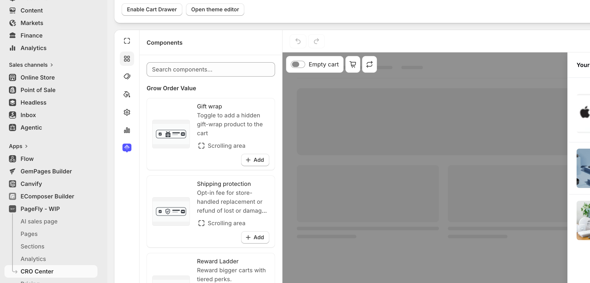
The builder's component picker is organized into six groups. Foundational components are always present in every drawer and can't be removed; everything else is optional — click **Add**, or drag it onto the canvas.
Builder layout: category rail, component picker, live preview
### Foundational (always present)
| Component | What it does |
| --------------- | ------------------------------------------- |
| Drawer Header | The drawer's title bar and close control. |
| Cart Items | The list of products currently in the cart. |
| Subtotal | Running subtotal, shown above checkout. |
| Checkout Button | Takes the customer to Shopify checkout. |
| Empty Cart | What shows when the cart has nothing in it. |
### Grow order value
| Component | What it does |
| --------------------------------------------------------- | ----------------------------------------------------------------------------------------- |
| [Reward Ladder](/cart-drawer/components/reward-ladder.md) | Shows a progress bar toward free shipping, a free gift, or a tiered discount. |
| [Bundle Offers](/cart-drawer/components/bundle-offers.md) | Suggests a discounted bundle of products, defined on a separate Bundles page. |
| Cart Recommendations | Shows hand-picked products that match what's already in the cart. |
| Gift Wrap | Lets the customer add a gift-wrap product to their order. |
| Shipping Protection | An opt-in fee covering store-handled replacement or refund for lost or damaged shipments. |
### Build trust
| Component | What it does |
| ------------- | -------------------------------------- |
| Trust Signals | Payment, security, and returns badges. |
### Add urgency
| Component | What it does |
| --------------- | ----------------------------------- |
| Countdown Timer | Counts down to the end of an offer. |
### Remove buying barriers
| Component | What it does |
| ------------- | -------------------------------------------- |
| Discount Code | A field for entering a discount code. |
| Order Note | Lets the customer add a note to their order. |
| Welcome Back | A message shown to returning customers. |
### Promote
| Component | What it does |
| ------------ | -------------------------------------------------- |
| Announcement | A promotional message or banner inside the drawer. |
### Content blocks
Beyond the components above, you can drag in plain layout blocks anywhere in the drawer: **Image**, **Rich text**, **Divider**, **Spacer**, and **Badge**.
{% hint style="warning" %}
**Reward Ladder and Bundle Offers apply real discounts at checkout.** The first time you add either one, the builder prompts you to grant PageFly additional Shopify permissions (`read/write_cart_transforms`, `read/write_discounts`). Until you grant them, the component previews in the builder but won't actually discount anything for real customers. See [Reward Ladder](/cart-drawer/components/reward-ladder.md) and [Bundle Offers](/cart-drawer/components/bundle-offers.md) for details.
{% endhint %}
---
# Agent Instructions
This documentation is published with GitBook. GitBook is the documentation platform designed so that both humans and AI agents can read, navigate, and reason over technical content effectively. Learn more at gitbook.com.
## Querying This Documentation
If you need additional information that is not directly available in this page, you can query the documentation by asking a question.
Perform an HTTP GET request on the following URL with the `ask` and `goal` query parameters:
```
GET https://help.pagefly.io/cart-drawer/components.md?ask=&goal=
```
`ask` is the immediate question: it should be specific, self-contained, and written in natural language.
`goal` is what the user is ultimately trying to achieve, the reason they need the answer. Sharing it helps GitBook give you a better, more relevant answer. A goal is most helpful when it describes the outcome the user wants rather than restating the question. For example, with `ask=how do I create an API token`, a goal like `automate deployments from our CI pipeline` lets GitBook tailor the answer to that use case.
The response will contain a direct answer to the question and relevant excerpts and sources from the documentation.
Use this mechanism when the answer is not explicitly present in the current page, you need clarification or additional context, or you want to retrieve related documentation sections.